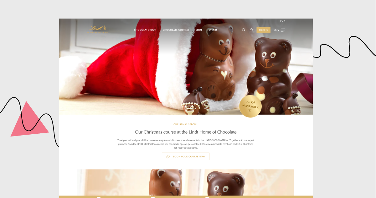
If you don’t like chocolate, stop reading this email immediately. Why is that? This week, we’re taking a look at Lindt’s landing page to dive deep into the world of delicious chocolate.
(And the world of Christmas specials, of course. What did you expect from the last December issue of any newsletter? ?)

Assuming you have a lot to do these days (“Home Alone” isn’t going to watch itself), let’s keep the review brief.
The purpose of this landing page is to get people to book a chocolate-making course.
What are its best bit(e)s? ✨
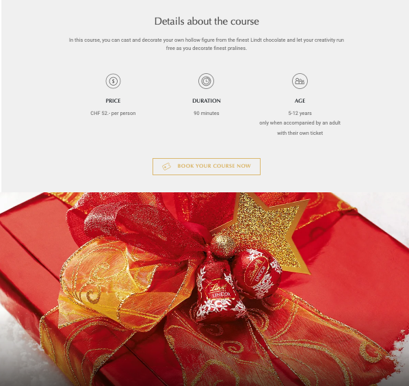
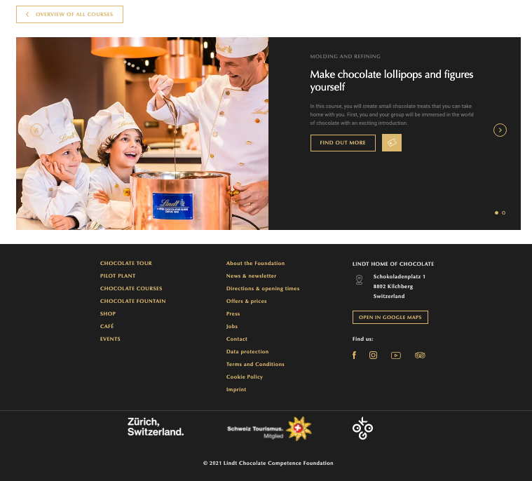
The sections are divided very clearly. Each one has its own text box and a corresponding image.
The copy is short but to the point. All of the important information is presented neatly and concisely.
The photos are of excellent quality: all in line with Lindt’s standards. And they clearly present the outcome of the course (you get your own chocolate figures!).
The landing page is responsive, so it displays well on all kinds of devices.
Is there anything that has left a sour taste in my mouth?
If I were to make any changes to make it convert better, I’d get rid of bottom footer links, and of sections about other courses (let’s stick to this one only).
The page lacks a registration form. The CTA button redirects to a different page, which is detrimental from the UX perspective.
If you want to immerse yourself in the sweetness of this landing page…
This is the last Landing Page of The Week in 2021. Thank you for reading this newsletter, for your feedback, and for your replies. Take care and have a lovely winter break. I’ll be back with the next email in this series on January 13.
Landing Page of the Week is a series where I review various examples of landing pages from the web.
