
One year ago, I reviewed Lindt’s landing page in this series.
This year, I thought it would be nice to look up the same topic and see if there were changes to the way Lindt communicates things.
Was it still worth it? Well, read on to find out.
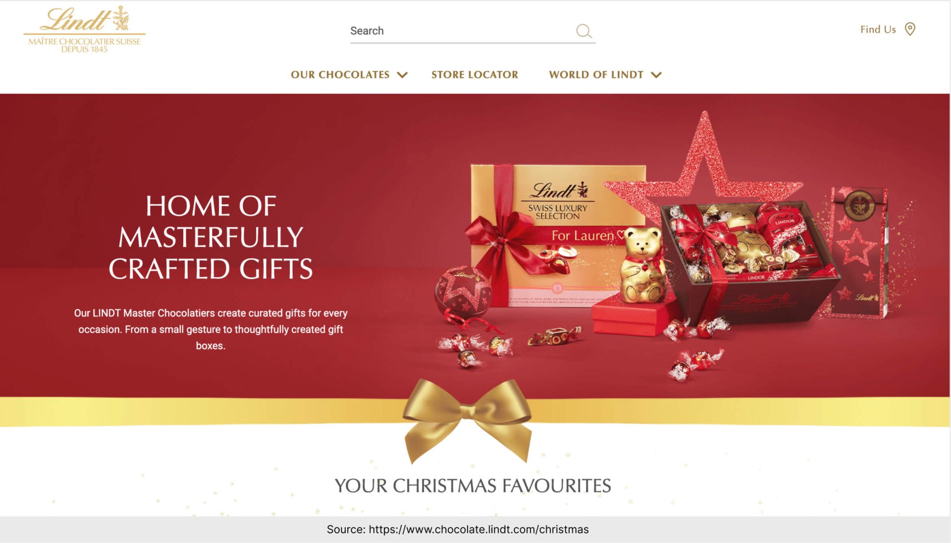
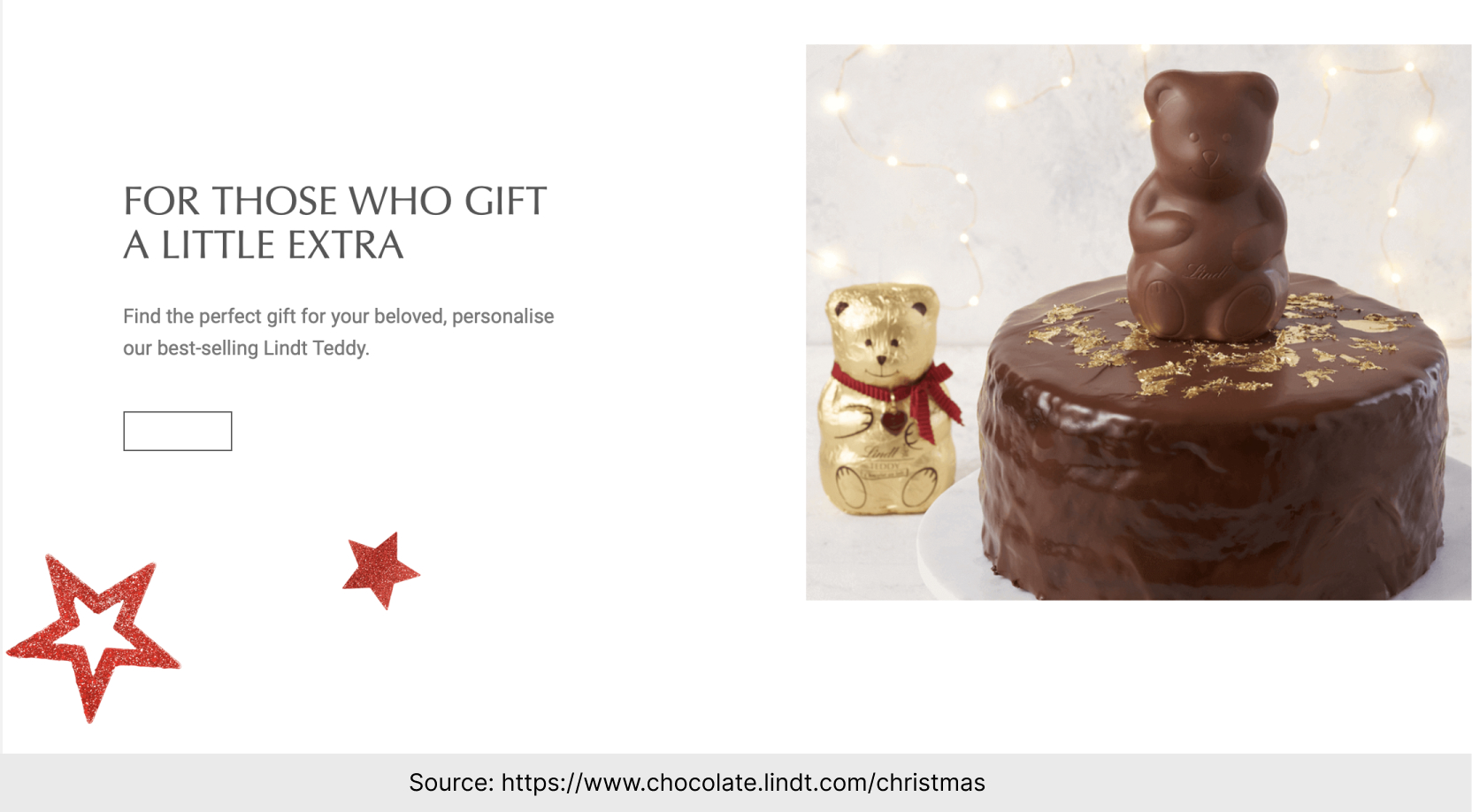
The best thing about this landing page is how consistent it is.
There are brands with little room left for improvisation, and Lindt is precisely such a brand.
Can you imagine what would happen if someone replaced the red and golden ornaments with neon colors? And how confusing would it be if a neat, classic font turned into ultra-modern letters?
What is crucial for consistency for a luxury chocolate brand, then?
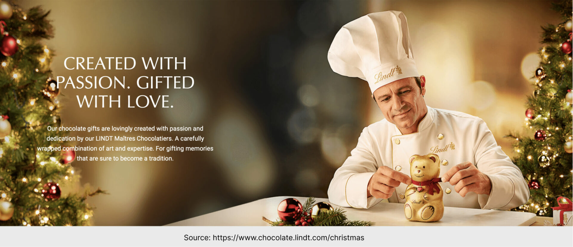
❄️ People behind the scenes. Chocolate masters are here for a reason: to show you that every single chocolate item is made by people with passion and experience.
❄️ Products for generations. This marketing strategy is focused around classic milk bears, truffles and pralines. We’re talking about the same product that serves the whole generation. And it’s a very heartwarming concept to build ads around.
❄️ Exquisite surroundings. Luxury brands (and we’re going to treat Lindt as such) usually create more distance between them and viewers than in the case of everyday products. Thus the magical setting, perfect Christmas trees, and golden ornaments. It’s meant to be out-of-reach (and to lure the customers).
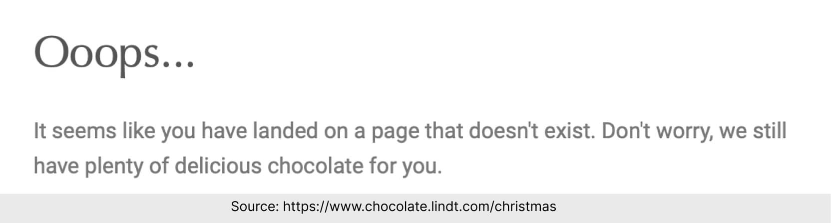
The worst thing about this landing page is that the links do not work.
❄️ If you sell products on a landing page, you – literally – can’t afford mistakes.
Always double-check links. Even better: ask someone else to give your landing page a fresh look and to test it on their device.
❄️ But mistakes happen to everyone. So, prepare a good error page for such cases.
It’s such a waste that, although there is an error message on Lindt’s page, there are no links to other places below the message.
Landing Page of the Week is a series where I review examples of landing pages from the web.