Is there enough marketing inspiration around you, or would you like some more?
In this week’s review, I’ll present to you a couple of creative ideas from Avatar’s landing page. It’s not a movie landing page per see, though. This page takes you to an online generator where you can create an imaginary animal. The more animals are created, the more money Disney will donate to endangered species.
Sounds like a cool idea, doesn’t it? What about its execution?
Let’s find out!

1. First impressions
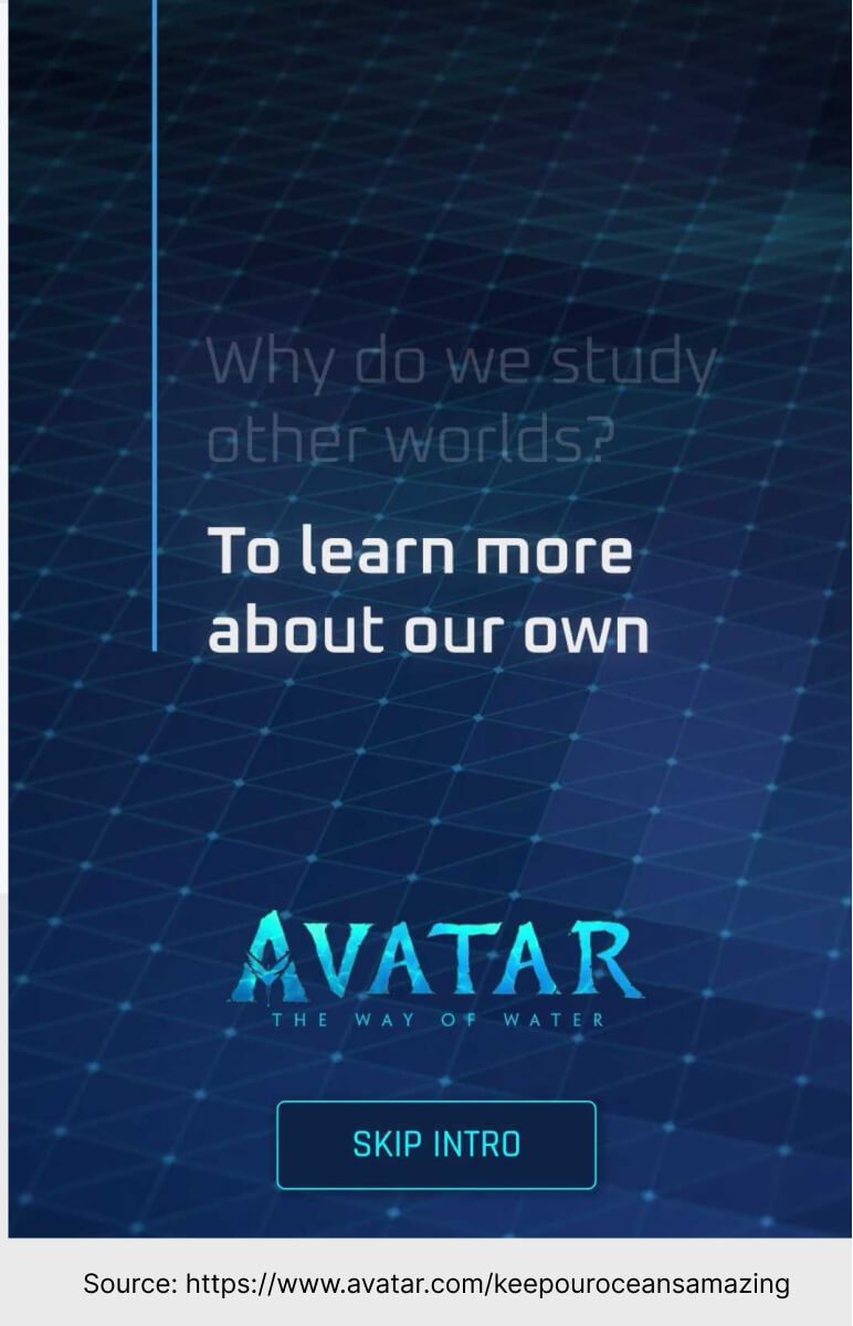
Aesthetically pleasing background, blue color, mysterious ocean. These were my first thoughts when I entered this page. Yours can be different, of course. What matters is that it’s not just the huge Avatar logo that reminds the visitors of the movie. The whole page is about water, nature and exploration.
2. Call to action
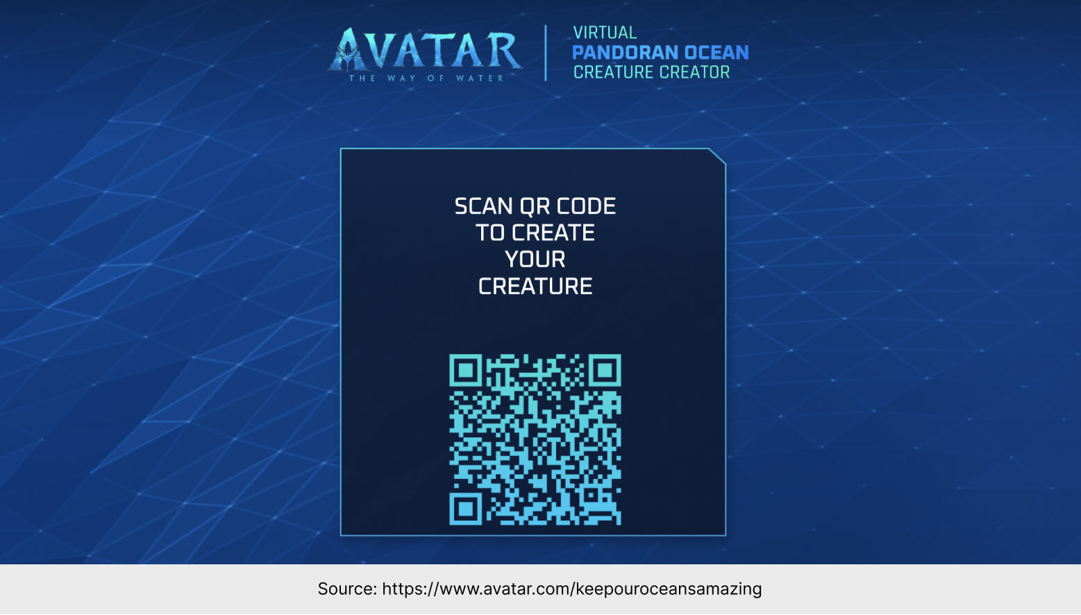
The goal of this landing page is simple – click the button, then scan the QR code, go to the creator and make your underwater creature.
Why should you even bother with some creator?
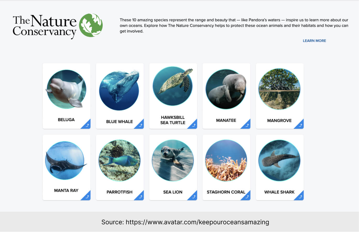
Well, there are sections of this page that explain it to you. The more creatures are created, the more money will be given to The Nature Conservancy US. This institution takes care of ocean animals and their habitats, protects the Earth and – generally – does really good stuff worth supporting.
What could have been a bit better? The scientific section looks a bit outdated and reminds me of a boring display at an old museum – in my opinion, the aminals’ descriptions are too brief and basic.
3. Next steps
If we follow the call to action, we will find ourselves in a creature creator.
This page is not just well-designed and interactive. It’s exactly what the visitors were expecting.
The landing page served its role perfectly – if the traffic was directed to the app without explanation, many visitors would be confused, overwhelmed, or not interested enough to stay.
Landing Page of the Week is a series where I review examples of landing pages from the web.


