
To say that Stranger Things is “a bit popular” show would be a massive understatement.
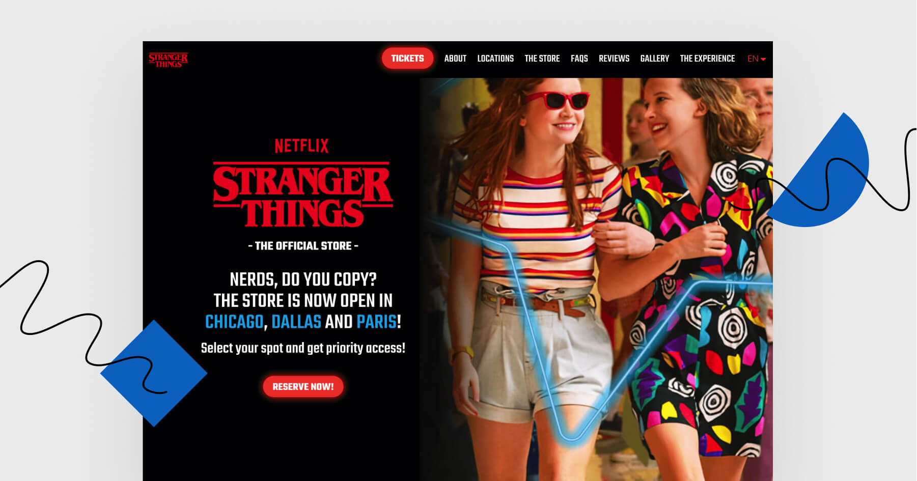
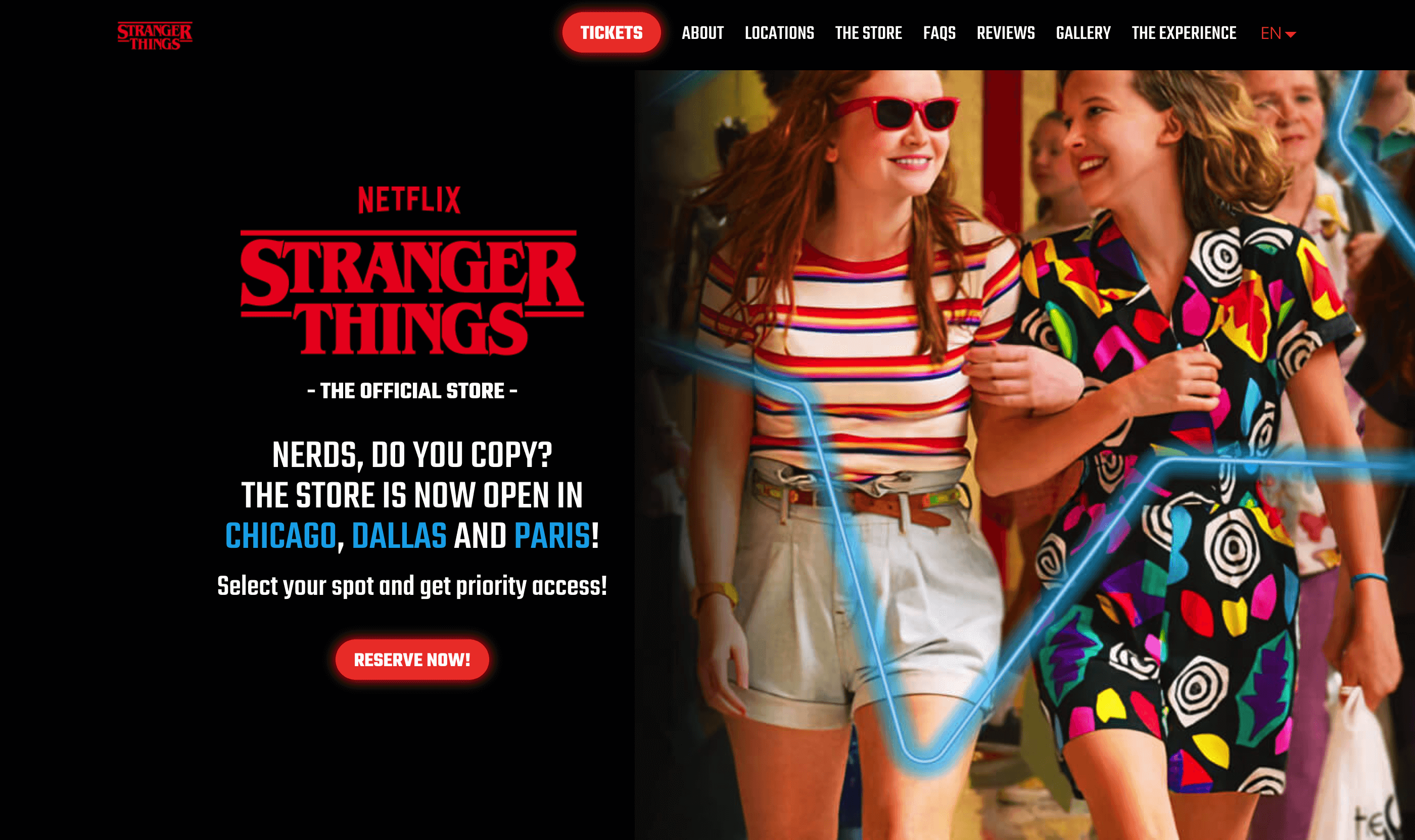
Let’s have a look at a landing page inviting us to reserve a spot and skip a line to the show’s one and only official store.
Click here and see this landing page.
Then, come back to this email and read the review.
Best findings

They’re taking things step by step. As for now, nobody makes you buy anything. They simply invite you to visit a unique shop.
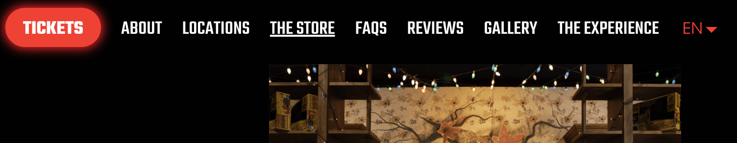
Links in the top section help to navigate between sections.
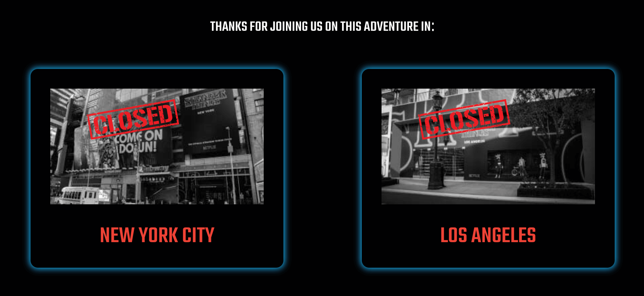
Mentions of previous locations being already closed evoke the feeling of urgency to visit the available stores.
Does this page need anything more?
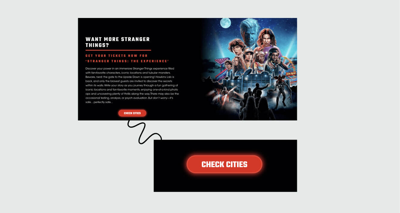
The last section invites us to learn more about a different project related to Stranger Things. However, without reading this section thoroughly, it’s easy to expect more store info and to get confused after clicking the CTA.

What I really don’t like is that there are no open stores near my area ?
Landing Page of the Week is a series where I review examples of landing pages from the web.