I’m a bit afraid to ask you how your Black Friday preparations are going. Chances are if you read this newsletter, you have something to do with marketing, and you are already tired of endless team discussions and clients asking for discounts.
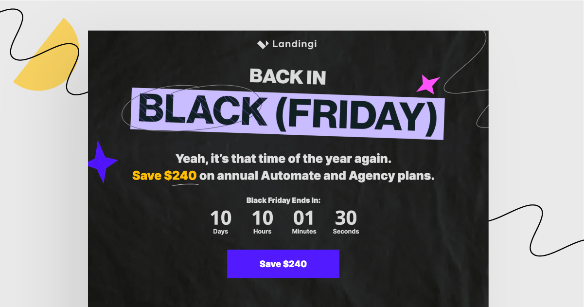
The bad news is, this week’s landing page I will review is… all about Black Friday just as well. And the even worse news is: it’s Landingi’s landing page. No shame in self-advertising, I guess. ?
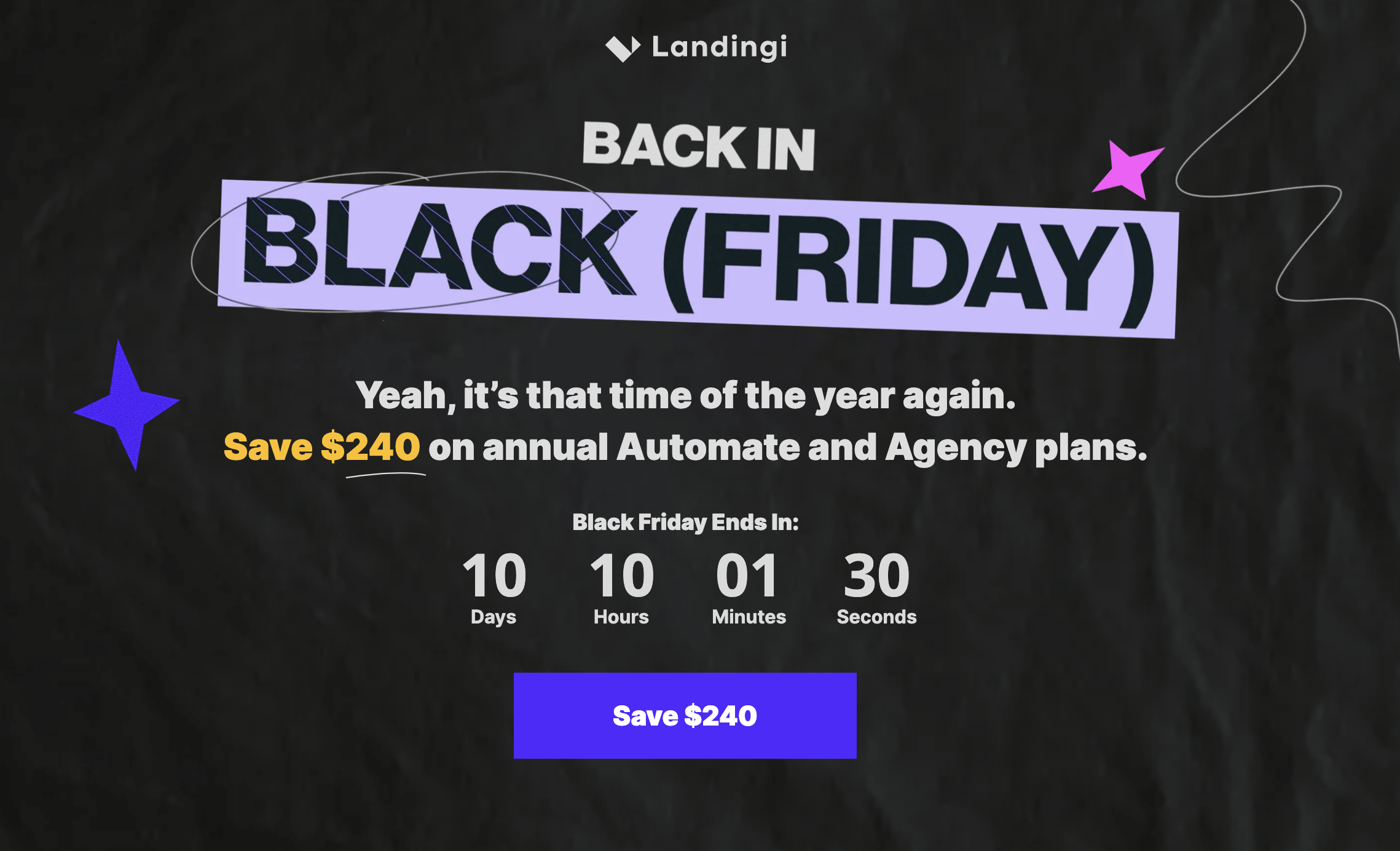
It would be a bit illogical to rant about a landing page coming from a company I work for… and it would be just as illogical to ignore its flaws in this honest review. Hoping that I won’t lose both my newsletter subscribers and my job after this email is sent, I’ll have a look at the landing page and point out what its major pros and cons are:
What works great:
The phrase “Black Friday” is highlighted in lilac (?) so that visitors immediately know what it’s all about.
The background photo isn’t distracting.
I like the fact that there are four identical CTA buttons leading towards one goal: saving $240.
What could have been better:
The landing page is not really directed to people unfamiliar with the Landingi brand. There is too little explanation of what you can achieve with our tool.
We shall see whether the lack of photos (aka, “the human factor”) on the landing page impacts the results negatively, or not.
Now that we’re done with the review, let’s make it personal.
How about a discount for a Landingi plan?
Save $240
