It’s not easy to find real-life examples of landing pages that serve their marketing purpose without making use of a contact form.
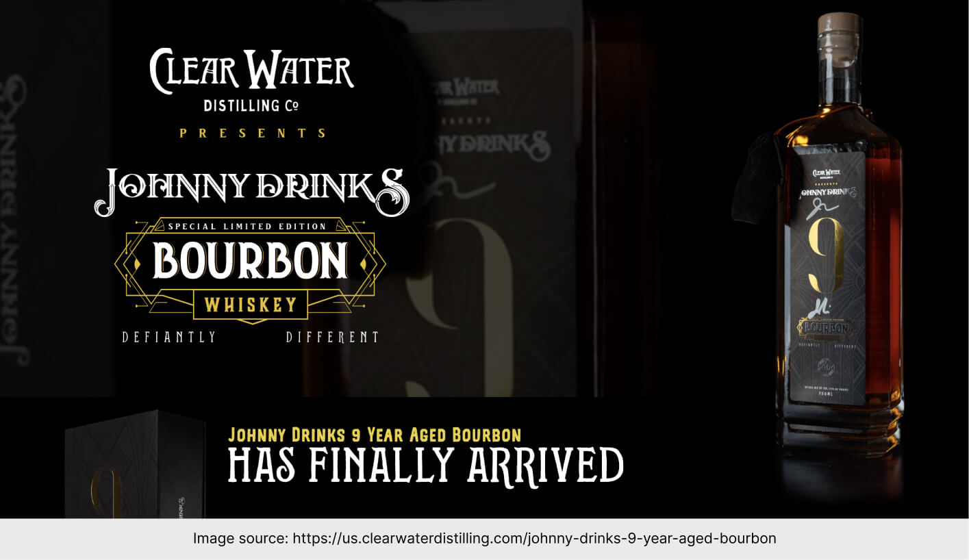
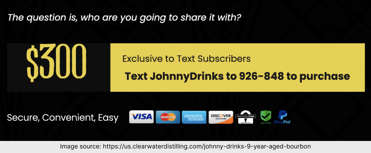
That’s why this week I’ve decided to share with you a landing page created for Johny Drinks. As you’ll see, there was no contact form included. Still, the page had performed so well that Clearwater Distilling sold out of a Limited Edition Product that was $300, within 5 days – as told by the people behind this page.
Let’s dive deeper.
What was the conversion goal?
If you make use of Landingi (or any other good landing page creator, actually) you know that there are integrations allowing you to sell products on landing pages.
But – as I said – Clear Water went for another option. The product is exclusive to text subscribers. To purchase a bottle, one needs to send a message to a phone number.
What helped?

It’s a limited-edition drink to celebrate 1 million YouTube subscribers. From the first section, we learn that it’s not just an ordinary drink available to everyone everywhere. The rule is simple: if it’s exclusive, it’s desirable.

Perks suit the target group. Frankly speaking, sometimes the free stuff that goes with a product is completely irrelevant and generic. Here, we have rocks glasses and a black ring. Both items look premium and match the look of an average bourbon enjoyer.
What might have been an obstacle?
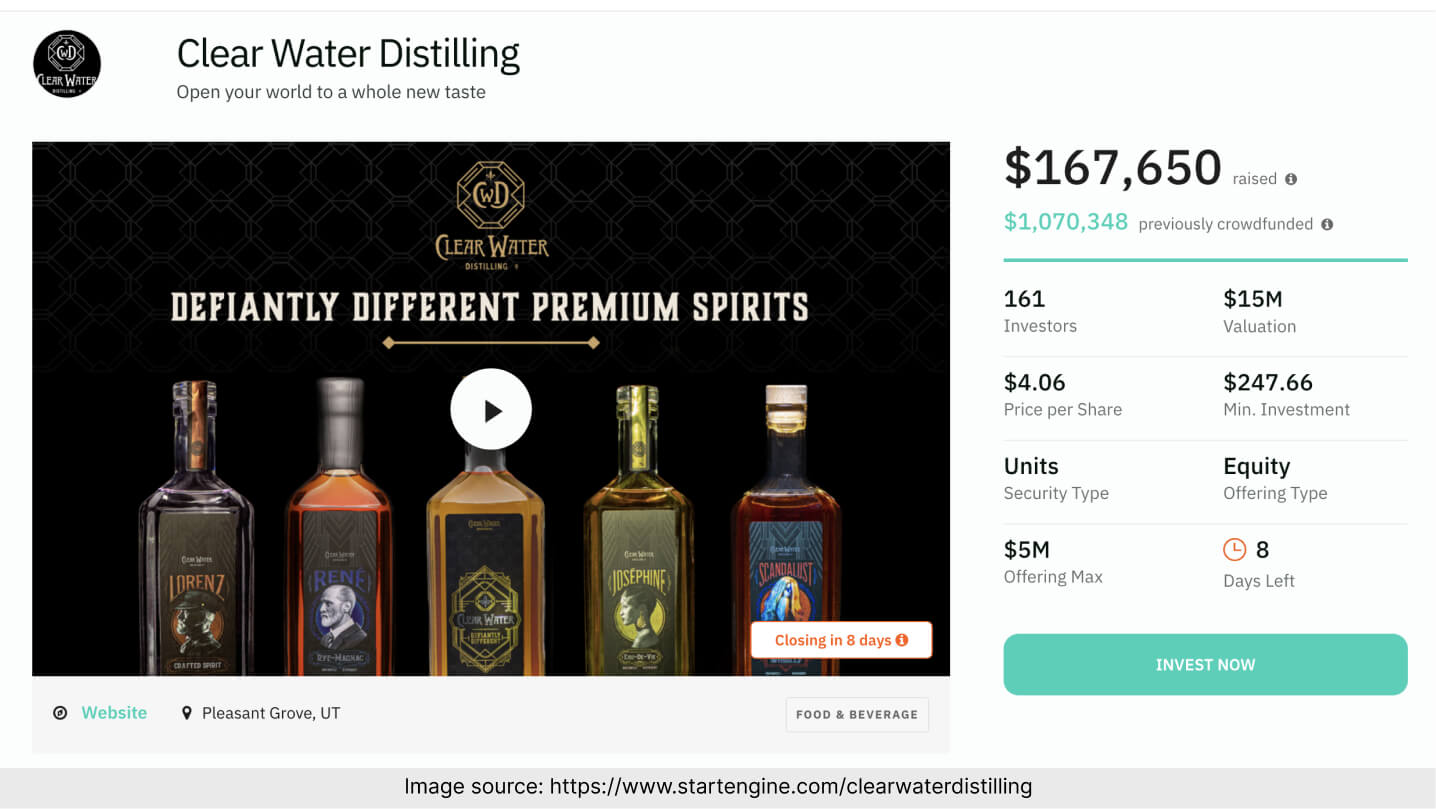
The top bar directs the visitors to a completely different page. Don’t get me wrong – it’s perfectly alright that Clear Water Distilling is growing. The issue is, when you add extra buttons on your landing page, your audience might be less interested in the page’s main conversion goal.
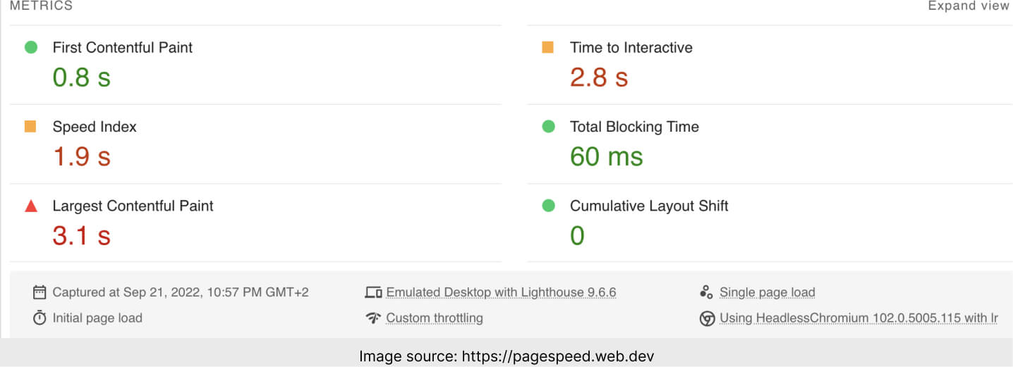
As we can see from the analysis made in PageSpeed Insights, the main issue is the time it takes for the page to become fully interactive. Truth be told, it could have been better, but 2.8 s is not bad, either.
A few more tips on landing page creation
To buy the product presented on this page, one should send a text message.
Let’s talk about the elements that are considered crucial for any landing page.
Opening section.
Black background, yellow accents and a very, very stylish and classy animation in the background. There’s no mistake that this product is luxurious and expensive.
Do you remember the landing page made by a dental surgery clinic? Go and read that review if you also promote premium services.
Copy and language.
There are a lot of expressions that bring attention to:
- the fact that this is a special offer (“Each bottle is hand-numbered”, “each bottle is signed”),
- the fact that the company cares about their audience (“Thanks to you, the Johnny Drinks community, we are celebrating the achievement of 1 million subscribers on YouTube”).
Landing Page of the Week is a series where I review examples of landing pages from the web.

