What’s the best time of the year to discuss doing pilates by the sea?
Yup, that’s right. Any time.
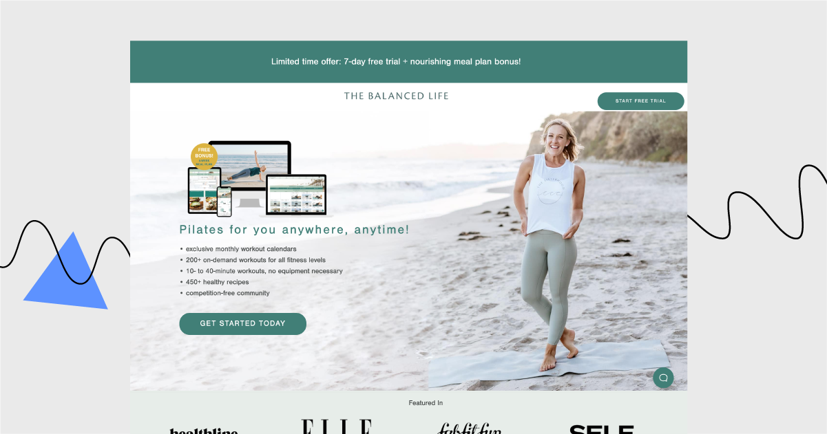
This week, we’re reviewing the landing page made by The Balanced Life, which presents their online pilates membership program.
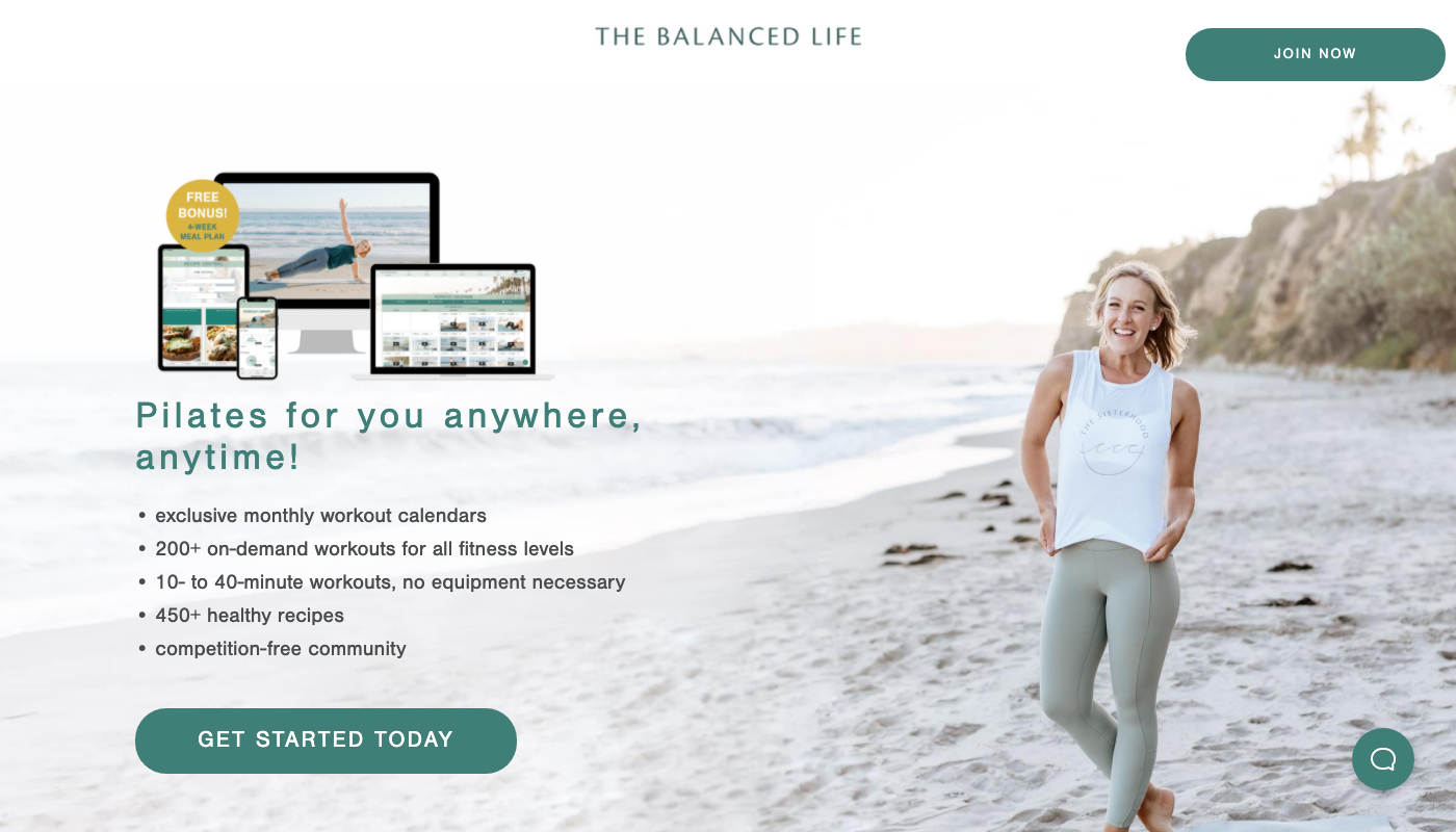
Click here to open this page in a new tab.
Let’s get down to it. What can we learn from analyzing this landing page?
Anchored elements should be convenient, not distracting. See the green button in the top right corner.
If you go for subscription services, focus your message on joining the community.
Long FAQ section helps to deal with visitors’ doubts and reluctance.
Video instead of long paragraphs of text. Great idea if you want to say a lot more about the brand.
What could have been done better?
To me, this page lacks more information on what exactly pilates is (and how it’s different from other types of workouts). Sadly, not everyone knows it.
There is a little explanation of what Girls on the run is. I had to google it to learn it was a non-profit organization for 8- to 13-year-old girls.
Landing Page of the Week is a series where I review various examples of landing pages from the web.
