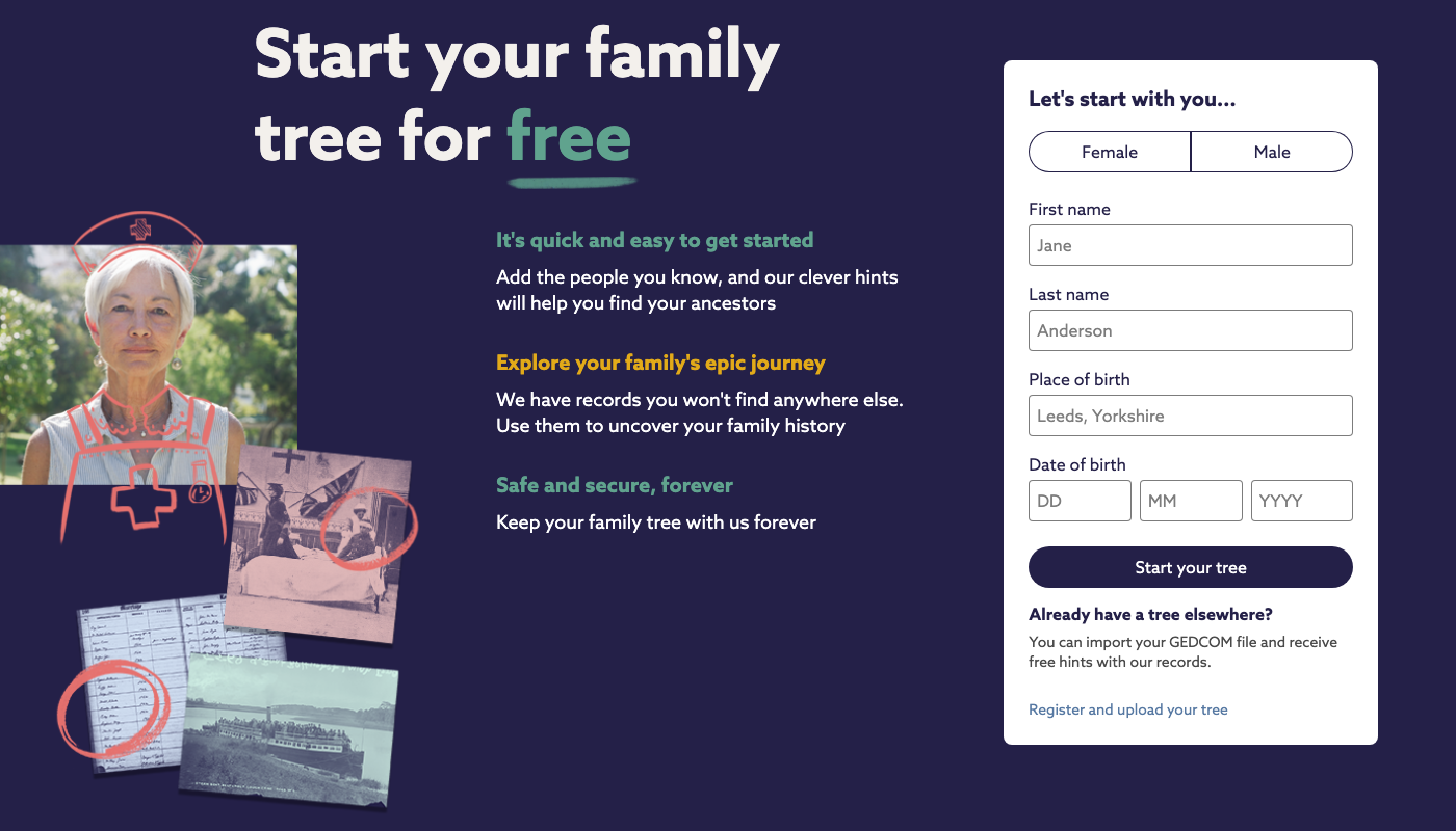
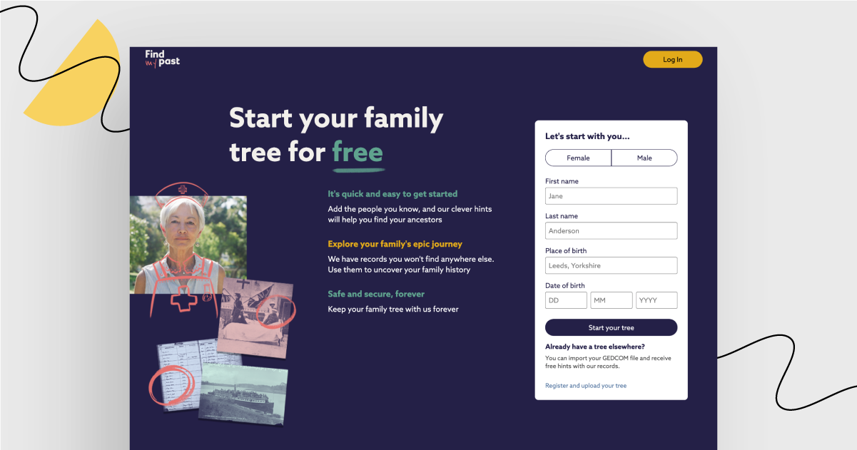
They say you can’t choose your family, but you can certainly find past relatives. This is what Findmypast’s landing page’s aim is: to encourage you to start such a journey.

Have you ever browsed through archives trying to find information on your ancestors? Well, if you haven’t, I can assure you that it is a complicated, time-consuming activity. Definitely not a walk in the park.
This is why I love Findmypast’s landing page design. It gives me the feeling that dealing with archives is as easy as drawing trees in kindergarten.
Pride and joy – what works great:
Copy in the header is just one sentence that focuses on what the visitors may do (start their family tree for free). There is no mention of what the company does, instead the copy focuses on what the clients may achieve.
There are two twin-like CTA buttons and no additional links.
Visitors may hesitate before they fill out the form. The solution? Below the form, there is reassurance that importing a tree from other sources is easy.
This page is directed to British and Irish residents. The target group is precise and could relate to the content of the landing page. Warning: if you retrace your roots and find something unexpected, it might cause some awkward family conversations in the future. ☘️
Black sheep – what could have been improved:
Truth be told, to me, it’s extremely hard to find its page’s flaws. If I were to choose something to improve, it would be the bottom of the page. The page could use an additional call to action below the “As seen on” section.
Curious to see the page yourself?
Get familiar with the landing page
Landing Page of the Week is a series where I review various examples of landing pages from the web.


