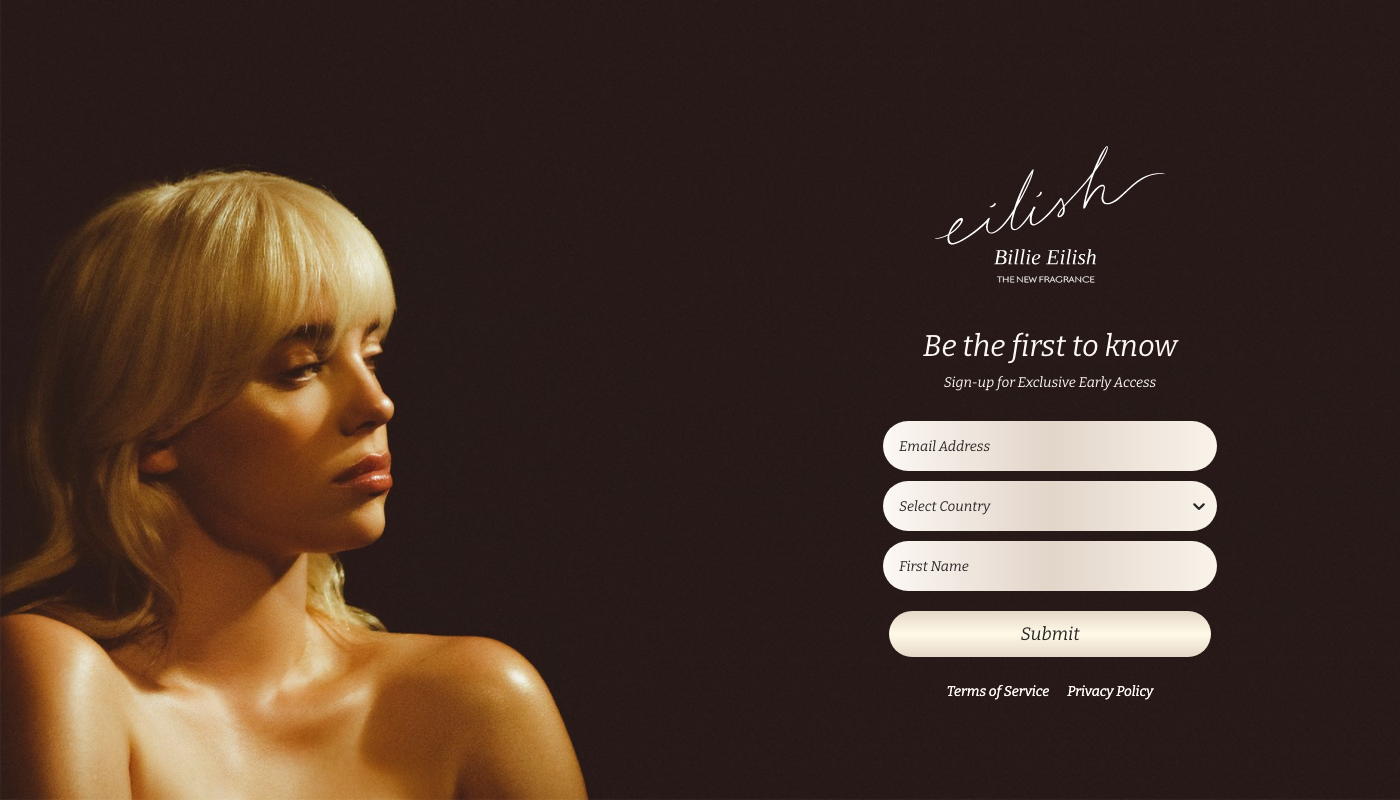
This week, we’re analyzing a very simple landing page that allows visitors to sign up for notifications about the forthcoming Billie Eilish’s fragrance.

What works great and what could have been improved:
The page follows landing page best practices, as it focuses on one goal – getting visitors to fill out the form. There are no additional links or duplicated CTAs.
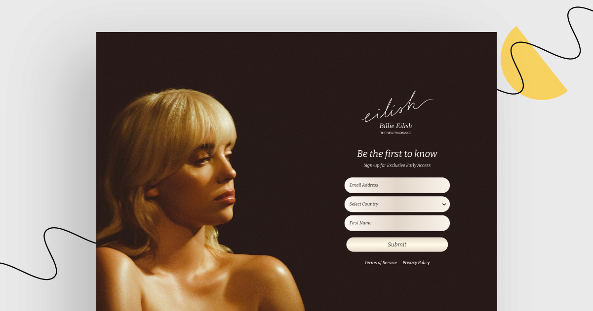
It serves as an example that you don’t need a complicated design, template or background image to make the page work. One simple portrait photo, one header, and one form to submit.
Once you click ‘Submit’, the next step is to enter your phone number (which is not mandatory). This may be discouraging for visitors (too much for them to read, or too much personal information to provide).
Sadly, the mobile version looks a bit worse (the hero image is cut off). Anyway, it’s brief and, more importantly, functional.
The drop-down menu allows visitors to choose from four countries only (US, UK, Canada, Australia), which may confuse people from abroad and discourage them from signing up.
Have a look at this week’s findings yourself!
Go to this landing page


