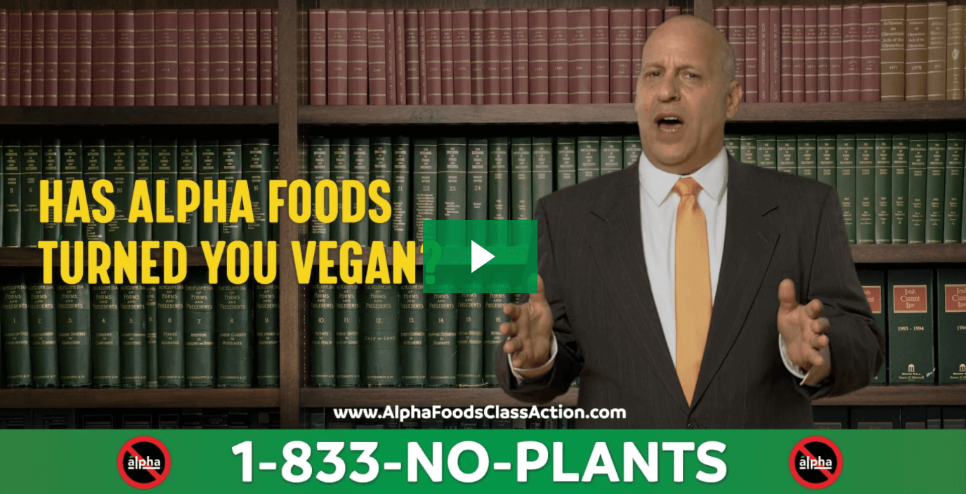
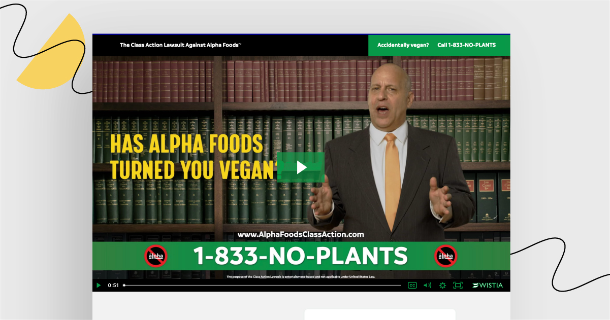
This week, I bring to your attention something a bit odd and definitely creative: a landing page advertising Alpha Foods… in the form of a fake lawsuit.
Shall we process their case, then? All rise! ?⚖️

Let’s present the trial evidence:
Technically speaking, the landing page is short and concise. Video in the opening section, a form to fill in, some company’s products, testimonials, and FAQ section. As simple as a landing page should be.
It’s super-creative to the point that it makes the visitors wonder what the hell is going on. There are ups and downs to this, as some will be entertained by the whole fake lawsuit thing, and some will probably just leave the page confused. Is it bad, though, that an ad or a product is directed to some customers only? I think not.
Testimonials are here to help with the credibility of the offer. Who wouldn’t believe a few well-known individuals who may or may not be associated with fast-food chains? Thumbs up.
I have mixed feelings about the form. That’s true that a two-step form is a better solution when you need many pieces of information from your future leads. The rule is not to discourage people from filling out the form by putting too many fields in there and making it too long or complicated.
Last but not least, the page could use an extra CTA at the bottom. There is only one form to fill, so once the visitors scroll down past it, they may just laugh at the whole lawsuit idea one more time… and then leave the page without taking any action.
Ready to judge Alpha Foods on their own merits?
Go to the landing page and give your verdict!


