You’ve researched how to create the perfect landing page, put in the time to build it, and linked to it from your ad campaign. Excited, you press publish, then eagerly wait for the results to pour in, only to be let down. Your click-through or conversion rates are not what you were expecting. Poor PPC message match may be to blame.
In this post, we’ll discuss what PPC message match is and why it’s beneficial. We’ll also break down the essential elements of effective PPC message match, as well as analyze a few good and bad examples.
Before you know it, you’ll be able to increase your conversion rates and decrease the cost of your PPC ads. So let’s get to it!
What is PPC Message Match?
PPC message match is when the messaging in a pay-per-click ad on Google, Facebook, or another ad platform is similar to the messaging on the connected landing page. This is accomplished by using similar copy, phrases, and even visual elements.
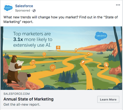
A good example of this is Salesforce, which recently ran a campaign to help generate leads for their software. Notice the similarities between their Facebook ad and landing page:
Facebook Ad:
Landing Page:
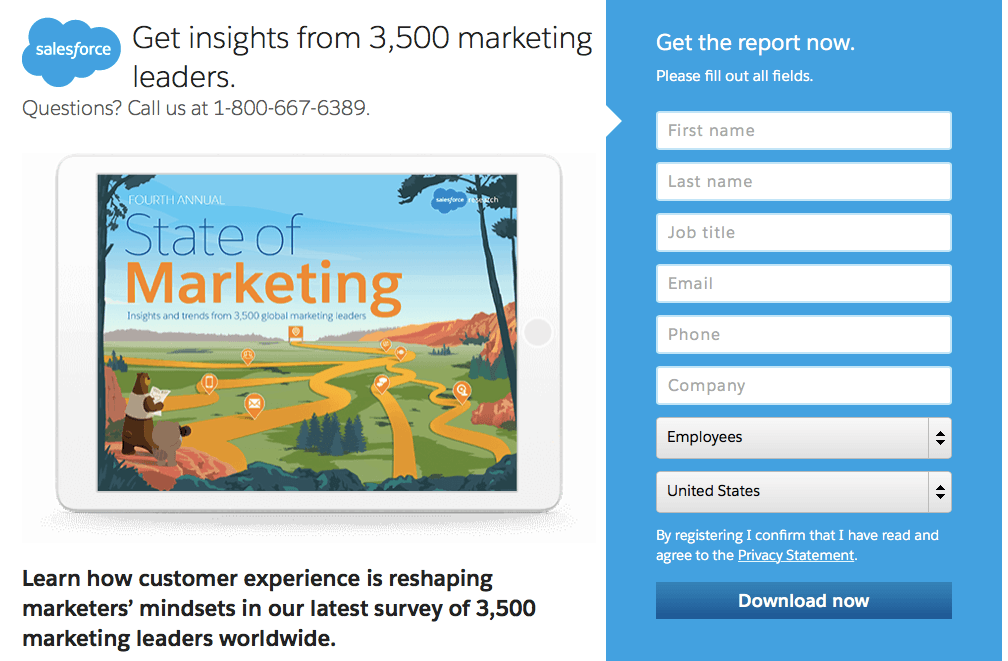
Keywords and phrases are repeated in both places, as are images, logos, and color schemes. Salesforce starts an experience in its ad, then physically extends it on the landing page in a way that is visually and verbally cohesive. That’s good message match.
Why is Using PPC Message Match Beneficial?
Without knowing the benefits of message match, this might just seem like a lot of extra work for your marketing or design team.
In that case, consider what it’s like to be a user who experiences poor PPC message match. If you click on an ad only to land on a page with markedly different messaging and visuals, you could be left feeling confused and misinformed.
In essence, poor PPC message match arises when what’s promised and what’s delivered are two very different things. It can confuse or even put off users, leading to higher bounce rates and lower ROI.
Good PPC message match, however, delivers exactly what it promises. This not only streamlines the user experience, but can also increase conversion rates, reduce ad prices, and lead to higher ROI.
In fact, in a case study posted by Moz, using proper message match across ads and landing pages increased conversion rates by over 200%.
Good message match can also decrease the price of PPC ads and increase their position in search results. This is because Google keeps a history of how well your ad performs in terms of click-throughs, then translates that history into a Quality Score. Quality Scores influence the cost and placement of your ads. Facebook ads have a similar measurement known as a Relevance Score.
In that same case study by Moz, the publisher also saw a decrease in the ad cost per conversion decreased by 69%.
With results as glowing like that, you’d assume that everyone follows message match best practices.
Oli Gardner, Co-Founder of Unbounce, found out that this is far from true. He sat down and analyzed over 300 Google ads and their landing pages, only to find that 98% of those PPC ads had poor or non-existent message match. As such, most PPC ads were likely wasting a lot of money.
While the results of optimizing message match will vary depending on your brand’s industry, it’s worth implementing for the simple fact that many people aren’t currently taking advantage of message match. By getting on board now, you can position your brand ahead of the curve and truly stand out.
How to Improve Your PPC Message Match
Ready to bring message match into your user experience? Asana, a project management tool in the same vein as Trello or Monday.com, has perfected the art of message match. Each step of their user journey follows best practices that you can easily replicate. Let’s take a look:
1. Make Sure Your Google Ad Keyword Matches Your Ad Copy
It’s not enough for the messaging in your ad copy to match your landing page. The search term a user enters needs to match your ad, too.
In this case, a user searching for “project management software” will be pleased to discover that Asana offers project management software. There’s no guesswork required about how Asana’s product can help them.

While this practice seems like it should be common sense, not everyone follows it. The following is an example of an ad keyword and copy match gone wrong. See if you can spot the reasons why:
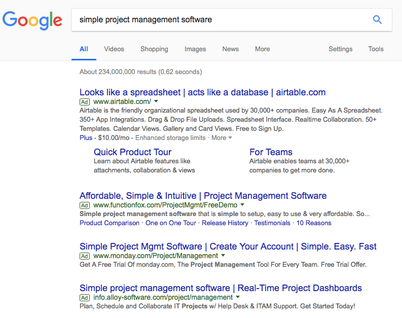
The first ad listed is for Airtable, but the price they paid for the space was likely a waste.
Not only does the ad lack any of the same words as “simple project management software,” but it boasts that the product “looks like a spreadsheet” and “acts like a database.”
What are the odds that someone looking for simple project management software will be drawn to the option that draws parallels between itself, spreadsheets, and databases?
Spreadsheets and databases aren’t usually synonymous with “simple.” More likely, that user is searching for simple project management software because they want to get away from spreadsheets.
The three ads listed below Airtable do a much better job of meeting a user’s expectations. All three use the keyword within the header or body of their ad, so a user is never confused about what kind of product each brand offers. If they’re looking for simple project management software, they’re likely to click through to the product that promises exactly that.
By matching the keyword and the ad copy, you can better attract customers who are at or near the bottom of the funnel and are simply looking for the first available solution to their needs.
There’s a bit more work involved in creating unique ads that match your specific keywords, but optimizing your ads in this way can increase your click-through rate, Quality Score, and ultimately reduce your costs. To get started, we recommend reading up on single keyword ad groups (SKAGs) first.
2. To Write the Best Ad Copy, Follow This Formula
Hopefully, by now you’re convinced that it pays to create a unique ad for each keyword, even if that means some extra work. Luckily, you can save time and increase click-through rates by following the same copywriting formula as Asana. Take a closer look at their ad from the previous section:

We can break down the ad into four simple parts:
- Header – this area uses the same text as the keyword you want to target.
- Value proposition – immediately after the keyword, establish what sets your product or service apart. In this case, you can “save time with Asana”.
- Description – the body of the ad is where you can go a bit more in-depth about how your product or service works. For instance, Asana works by helping you “meet deadlines, organize projects & hit goals”.
- Call to action – this is the hook that encourages users to click if they weren’t convinced already. With Asana, you can “start a free trial today”.
With that, your ad is complete. There’s no need to overthink copy when simple and straightforward will not only suffice but can outperform more “creative” ads.
3. Use the Copy From Your Ad on Your Landing Page
This may seem self-explanatory, but it’s so important that it bears repeating: elements from each ad should match elements on your landing page.
Asana’s user journey is yet again a great example of this. After clicking their “project management software” ad, you land on the following page.
The header immediately calls back to the ad with the words “manage” and “project”. The subheader does the same by reinforcing that Asana can help you achieve goals, then supports the claim with a quantifiable statistic.
The call-to-action to start a free trial is also the same as the call-to-action on the original ad. A user that came to this page for that hook alone is ready (or nearly ready) to convert.
4. Only Use One Call-to-Action Throughout Your Landing Page
Suppose the user clicks through to the landing page but isn’t quite ready to fork over their email or other information. As they scroll down the page to learn more about the product, limit the opportunities for navigating away from the page.
Scrolling down Asana’s page, users learn about how the product helps manage projects, but in the end, the only opportunity for continuing on is by answering the original call-to-action. Here’s what the bottom of the page looks like:
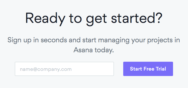
A unified call-to-action is only one element of a well-designed landing page. Strong copy, compelling visuals, social proof, and discounts or other offers all help keep and convert users. This guide with 35+ landing page examples will help you build a bounce-proof landing page.
5. Don’t Point the Ad to Your Homepage
Your homepage exists to convey the unique sales proposition (USP) of your brand as a whole. It provides a more general overview of everything your company offers.
Meanwhile, a landing page exists solely to message match with an ad and to convey a specific aspect of a product, also known as a unique campaign proposition (UCP).
Asana’s ads don’t point to the brand’s homepage but imagine if they did. Let’s take another look at the project management software ad and compare it to the homepage.
Ad:

Homepage:

Although the homepage is visually similar to the landing page example featured earlier, the messaging is completely different. The call-to-action is the same, but there’s no mention of the target keyword, “project management software”. If Asana were to point the ad to their homepage, a user could be left feeling confused by the sudden change in messaging.
5. Create a Unique Landing Page to Match a Unique Ad
You may have seen this coming (and were dreading what it meant for your to-do list), but it’s true: when you create separate ads to target different keywords, you’ll also need to build separate landing pages that message match each ad.
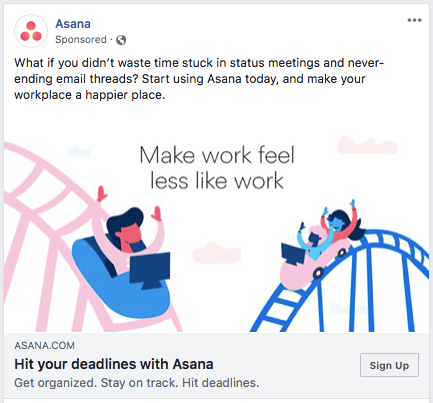
Asana already does this. Check out the message match between Facebook ad below, which appeals to a user who is interested in optimizing coordination between their coworkers, and its unique landing page:
Ad:
Landing Page:
The most noticeable connection between the Facebook ad and the landing page is the repetition of the word “work.” This helps assure users that they have in fact come to the right place. The subheader reinforces the team coordination aspect of the software’s functionality by stating, “Asana helps you coordinate all the work your team does together”.
PPC Message Match Examples
With the above points in mind, let’s take a look at a few message match examples, both good and bad:
Monday.com
Monday.com is a project management tool that is comparable to Asana or Trello. Here’s one of their Google ads (triggered after a search for “project management tool”) and the resultant landing page:
Ad:

Landing Page:
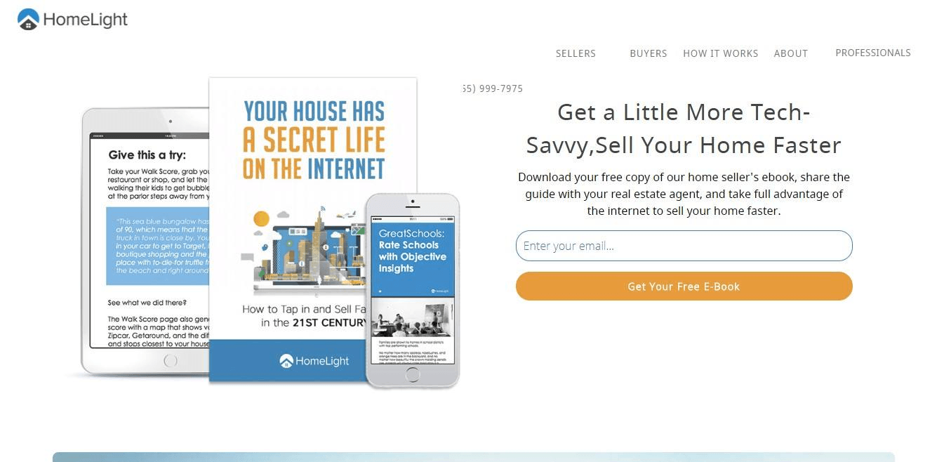
Pros: The keyword is used in the header of the ad and again in the header of the landing page. The “Free Trial Offer” call-to-action on the ad is also similar to the “Create Free Account” call-to-action on the landing page. Overall, the message match here is pretty good.
Cons: The Google ad lacks a value proposition that could help set it apart from other project management tools that might appear in the same search. Monday.com could’ve replaced “Create Your Account” in the ad header with a reference to how this particular software is more visual than its competitors.
Slack
Slack describes itself as a hub that is “built for every team,” from marketing to HR. However, the Google ad below (and connected landing page) was triggered during a search for a “sales process tool.”
Ad:

Landing Page:
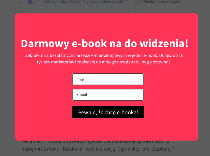
Pros: The ad focuses on the UCP that Slack is an ideal solution for sales. The landing page repeats the phrase “close more deals,” and unlike the brand’s homepage, makes no mention of the software’s other uses.
Cons: “Sign up for free” is the call-to-action on the Google ad, but “Get Started” is the call-to-action on the landing page. The two are dissimilar enough to keep this example from having complete message match.
Drip
Drip is an email marketing solution built with e-commerce in mind. The following ad and landing page were triggered during a search for “email marketing software”.
Ad:

Landing Page:
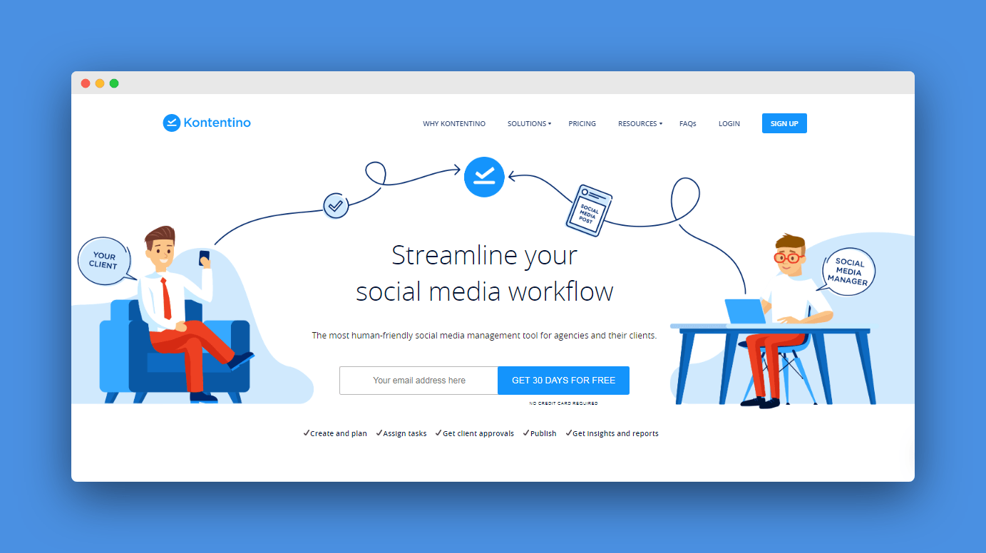
Pros: The header of the Google ad immediately matches part of the search term, so Drip is off to a solid start. However, the pros all but stop there.
Cons: The ad doesn’t have a call-to-action that could entice a user to click through. Even if a user does click through, they’re taken to Drip’s homepage, not a unique landing page. The header on the page and in the ad are completely different, which could throw some people off. Overall, the ad and the page have almost non-existent message match.
Rant & Rave
Rant & Rave is a customer engagement platform. The following ad and landing page were triggered during a search for “customer experience software”.
Ad:

Landing Page:
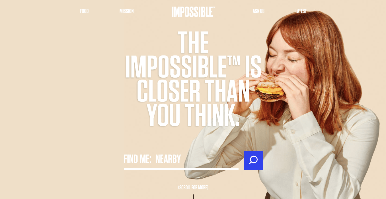
Pros: The keyword search term (“customer experience software”) is clearly repeated in the header of the ad and the landing page. There’s also a value proposition (“Award Winning CX Vendor”) and a description and hook in the body of the ad. The call-to-action to “book a demo” is also the same in both places. Overall, the message match is consistent.
Cons: There’s almost no mention of Rant & Rave’s brand name in the ad or on the landing page. It’s only by looking at the URL that you’re able to discover who they are. For an otherwise consistent example of message match, this is a big misstep.
Hubspot
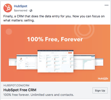
Hubspot offers a free CRM solution geared towards sales and marketing teams. Take a look at their Facebook ad and its landing page below.
Ad:
Landing Page:
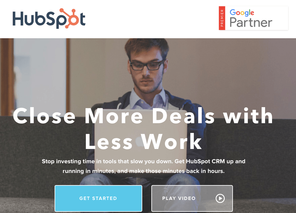
Pros: Facebook ads allow brands to reinforce message match through visual connections. In this case, Hubspot’s logo is prominently displayed in both the ad and on the landing page. There is also a reference in both places that Hubspot is a sales automation solution.
Cons: The Facebook ad highlights Hubspot’s free aspect, which could be a major boost to conversion rates. Unfortunately, this isn’t immediately reinforced on the landing page. Overall, the message match between the ad and the page could use some improvement.
Taboola
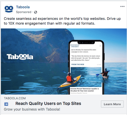
Taboola is a service that helps connect businesses to native advertising opportunities, although you might not immediately realize it after looking at their Facebook ad and landing page.
Ad:
Landing Page:
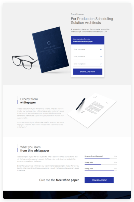
Pros: The Facebook ad promises up to 10x more engagement than regular ad formats, which is a strong value proposition if true. The landing page offers another value proposition by claiming that using Taboola can expand your content’s reach to 1 billion people every month.
Cons: Despite these ambitious value propositions, there’s little to no message match between the ad and the landing page. Even if the user is interested in a native advertising solution, there’s a chance the vague and poorly matched copy could cause them to leave before learning more. The mismatched visuals between the ad and the page don’t help matters, either.
Widen
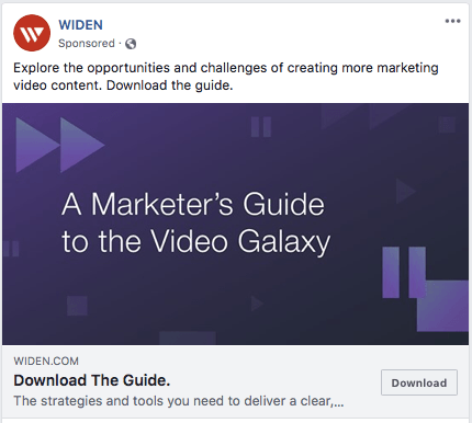
Widen offers digital asset management software to help brands organize their photos, videos, and other pieces of content. They created a Facebook ad and landing page designed to generate leads by offering a white paper.
Ad:
Landing Page:
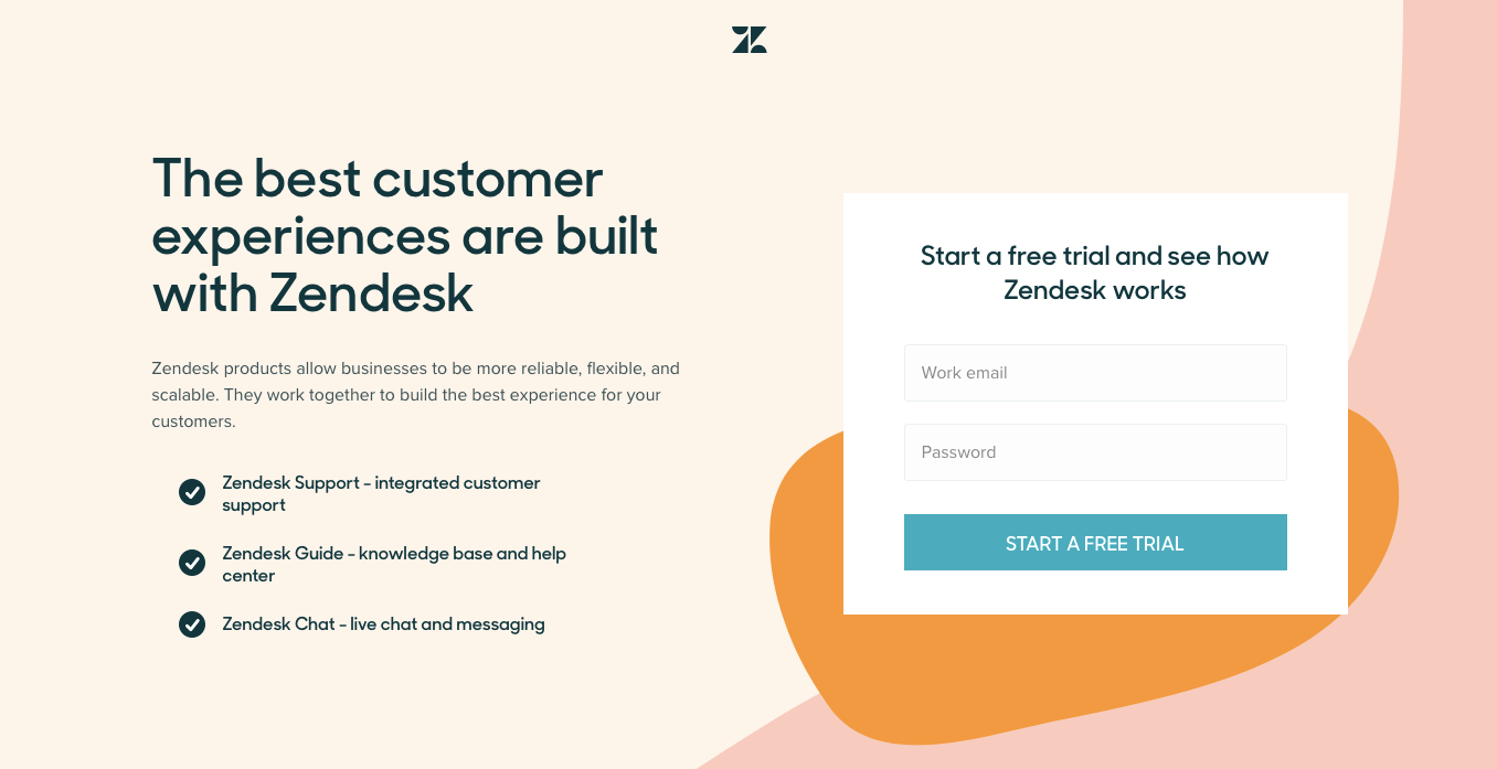
Pros: The “download the guide” call-to-action is immediately clear on the Facebook ad and on the landing page. “A Marketer’s Guide to the Video Galaxy” is also repeated, as are the purple arrows and other visual elements. Overall, the message match is solid.
Cons: While “A Marketer’s Guide to the Video Galaxy” is a fun nod to Douglas Adams, the header is wordy and the reference probably won’t register with the majority of people. It’s better to go with copy that is straightforward but descriptive. The landing page could also be improved by breaking up the block of text with more visuals.
SugarCRM
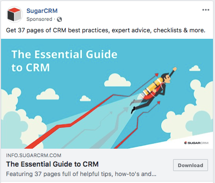
SugarCRM is, like Hubspot, a CRM tool for salespeople and marketers. Their Facebook ad campaign attempts to generate leads by offering a white paper.
Ad:
Landing Page:
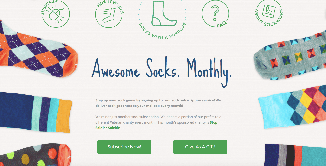
Pros: Between the ad and the landing page, the copy and visuals are incredibly uniform. The call-to-action to download a guide is also consistent. SugarCRM keeps the copy to a minimum, so it’s almost impossible to be confused about what the ad offers.
Cons: Although the message is well-matched, it feels a little bland. SugarCRM could make their message more compelling by including a quantifiable result, such as “increase sales by 100% with these best practices”.
Start Building Your Own Landing Page With Message Match
Good PPC message match has the potential to drastically increase your landing page’s conversion rates and decrease the cost of your ads. All of this translates into a better ROI for your campaigns. But message match requires that keywords are nearly identical to your ad and landing page copy, meaning that you have to create ads and pages that are unique to different keywords.
Although this can sound like a lot of work, the right tool can help automate the process of duplicating and modifying landing pages.
Landingi is one such tool. The platform provides a feature for duplicating pages in order to measure the effectiveness of different keywords. With Landingi, you can also copy and paste individual design elements between landing pages.
Even if you’re tight on time, Landingi makes it simple and automatic to build multiple landing pages with perfect message match. Start using Landingi today with a free 14-day trial.


