As digital marketers, we’re in the business of making connections. But before we can sell, support, or educate, we need to engage. Enter the opt-in page: the first handshake between a brand and its potential customers.
This comprehensive guide will take you through the process of creating opt-in pages that don’t just gather emails but build the foundation for relationships.
We’ll cover everything that weighs on the success of your opt-pages, as well as on the success of whole campaigns they contribute to. Namely: copywriting that speaks to the heart, the design that catches the eye, and the data-driven strategies that guide continuous optimization.
We’ll rely on real examples from the following companies:
- Ship
- Hyperproof
- HubSpot
- Wrike
- BambooHR
- Thoropass
- JobDiva
- Bloomreach
- CrashPlan
- Justworks
Let’s get started!
What is an Opt-In Page?
An opt-in page is a strategic asset in digital marketing, designed to capture leads by exchanging valuable content or offers for visitor information. It’s a focused approach to building a database of potential customers who express interest in your content or services.
It typically consists of a short form along with some copy persuading visitors to get it filled with their e-mail address.
Info: Opt-in pages are often confused with squeeze pages and, indeed, these terms are sometimes used interchangeably. The only subtle difference is that a squeeze page, apart from collecting e-mail addresses or other personnel data, may aim to redirect them to another page, have them watch a video, or download a PDF. It’s not always about getting an email; it could be any call to action that ‘squeezes’ the visitor into a sales funnel or sequence.
What Does an Opt-In Form Look Like?
An opt-in form is typically a minimalist and distraction-free component of the opt-in page, which includes a few form fields, such as an email address and possibly a first name, and a clear CTA button like “Join Now” or “Download Free Guide,” which stands out visually and invites the user to submit their information.
What Constitutes a Conversion on an Opt-In Page?
A conversion on an opt-in page is typically defined as a visitor completing the action the page is designed for, such as subscribing to an email list, downloading a resource, or registering for a webinar. This action usually involves the visitor filling out a form and submitting their information, indicating their interest and consent to engage further with the brand or service.
The key measure of success for an opt-in page, therefore, is the rate at which visitors complete this desired action, turning them from casual browsers into leads or potential customers.
What is the Difference Between a Landing Page and an Opt-In Page?
A landing page is a broad-focused standalone page designed for marketing campaigns, aiming to educate or persuade visitors about a product or service, with various calls-to-action, while, in contrast, an opt-in page has a narrower focus, aimed specifically at capturing visitor information through a form, usually to grow an email list or generate leads, by offering something valuable like a newsletter or ebook in return.
What Makes a Good Opt-In Page?
A good opt-in page combines a clear, attention-grabbing headline with concise, persuasive copy that highlights the benefits to the visitor. The design should be clean and visually appealing, featuring a prominent, action-oriented call-to-action (CTA) and a simple, straightforward form. Trust signals like testimonials, mobile responsiveness, and fast loading times are essential for credibility and user experience. The page should clearly articulate the value proposition and minimize distractions to keep the focus on subscribing. This approach ensures a seamless and engaging journey for the user, making the subscription process both easy and appealing.
What are the Rules for Opt-In?
The rules for creating an effective opt-in page are centered around legal compliance, user consent, and clear communication. Firstly, it’s crucial to adhere to legal frameworks like GDPR in the EU or CAN-SPAM Act in the US, which dictate how personal data can be collected and used. These laws typically require clear and explicit consent from users, meaning pre-ticked boxes or implied consent strategies are not permissible.
User consent should be obtained through a clear and affirmative action, such as ticking a box or clicking a button to subscribe. This action must be voluntary and well-informed, meaning the user should understand exactly what they are signing up for. Additionally, the opt-in form should include a link to a detailed privacy policy that explains how the collected data will be used.
Finally, providing an easy way to opt-out or unsubscribe is mandatory. Users should feel they have control over their subscription preferences, and making the process of unsubscribing as simple as subscribing is a best practice.
10 Opt-In Page Examples
Now, let’s check how this concept works in practice. Find below 10 opt-in page examples, along with some tips on what is perfect and what could be improved to convert more. Let’s get to it!
1. Ship
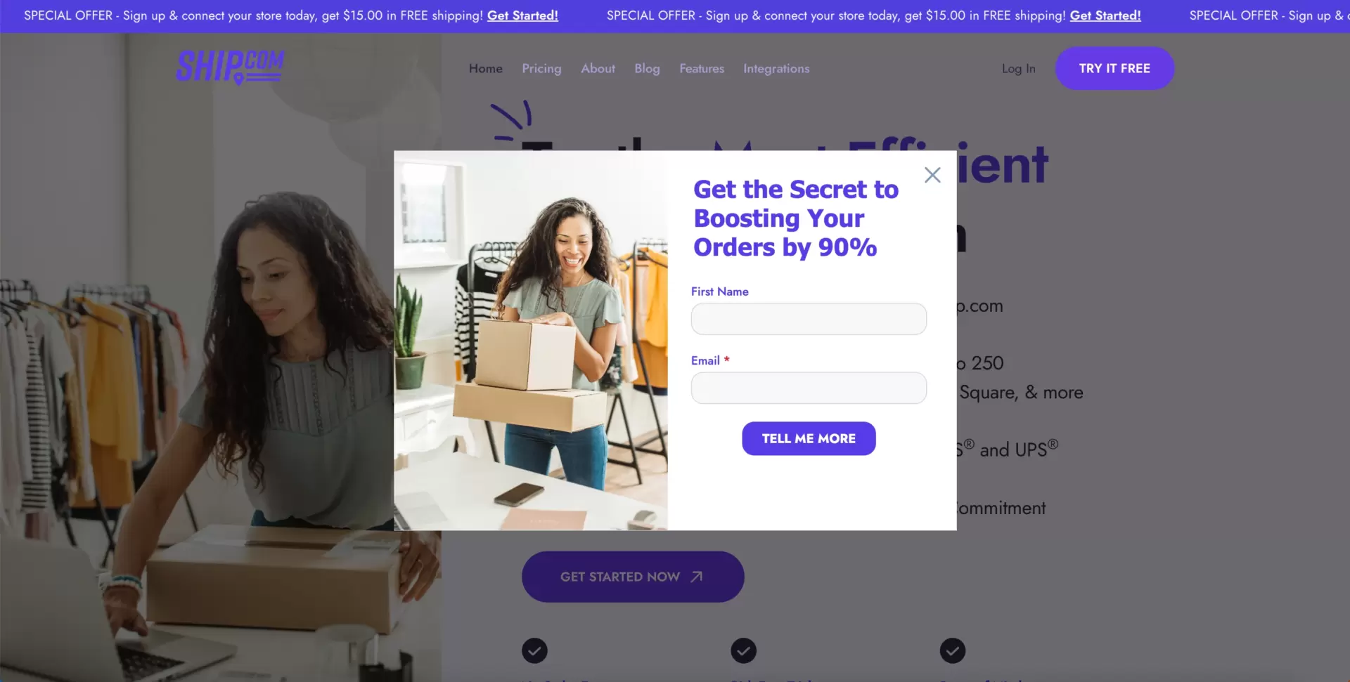
Ship is the platform created to manage shipping operations with e-commerce stores owners as a target audience. They entice users at the very beginning when they land on the page with a pop-up promising a 90% increase in orders.
Numbers always look favorable, and if paired with the pledge to disclose the secret to success, they may prove extraordinarily convincing.
2. Hyperproof
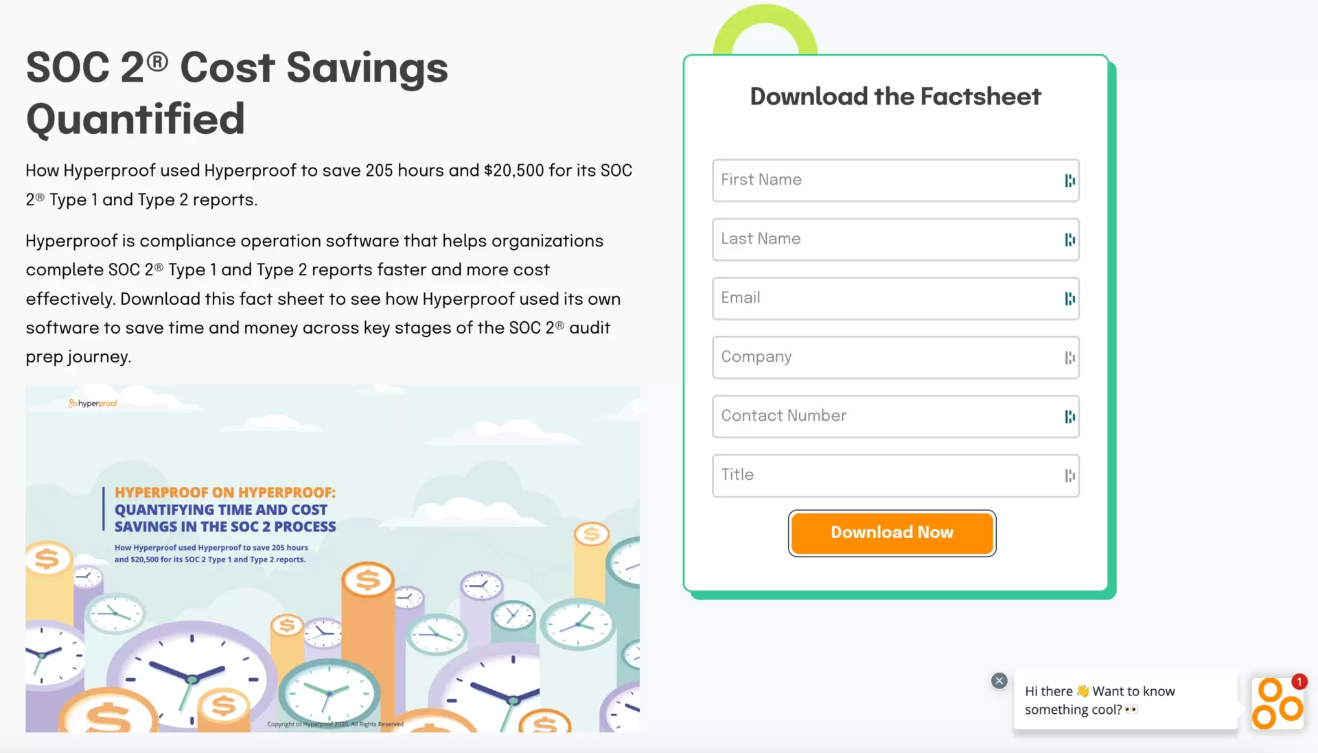
Hyperproof is a rapidly growing company specializing in automated compliance management software. Incentives they use to get data from potential customers are free resources like ebooks, guides, reports, and datasheets.
The idea is great since expert knowledge is invaluable amidst the (dis)information age we live in.
The only drawback is the form, which is too long. Its fields should be limited to two or three at the max.
3. Hubspot
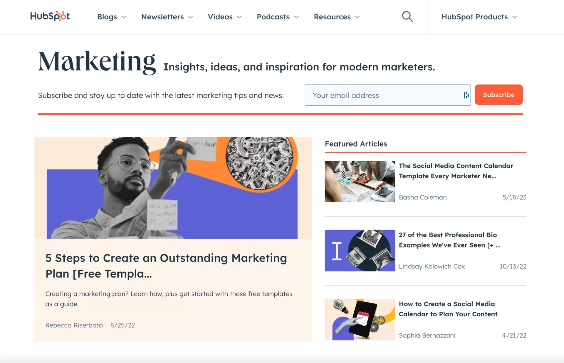
HubSpot is one of the leading players in digital marketing. They are renowned for creating high-converting landing pages.
Surprisingly, the one below seems not to be one of them. It resembles a newspaper’s front page more than a landing page. With so much buzz around (different colors, fonts, copy, visuals, etc.), it looks like a gold recipe for distracting the user!
Only the call to action, standing out in a lush orange color from the background, is crafted appropriately.
What’s more, the copy next to the “Subscribe” button is too general and doesn’t convey UVP.
4. Wrike
Wrike is commonly known as a provider of professional project team management tool. To catch some leads they give out guides dedicated to issues relevant for their target audience.
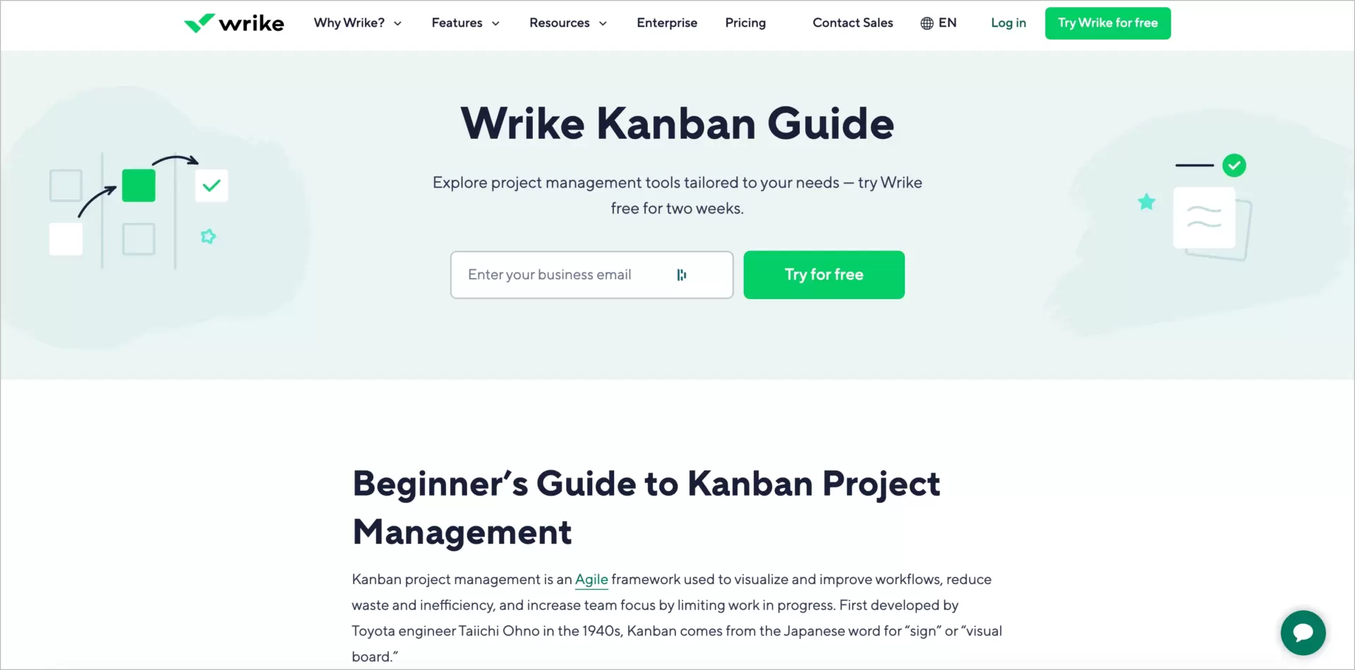
What is advantageous: the call to action button is well-exposed with a shining green – it grabs attention in seconds.
Extra points for these clever tiles used instead of a traditional table of contents. It’s highly informative and looks great from a UX standpoint. It is a lure for high-quality leads, as they usually seek expert knowledge.
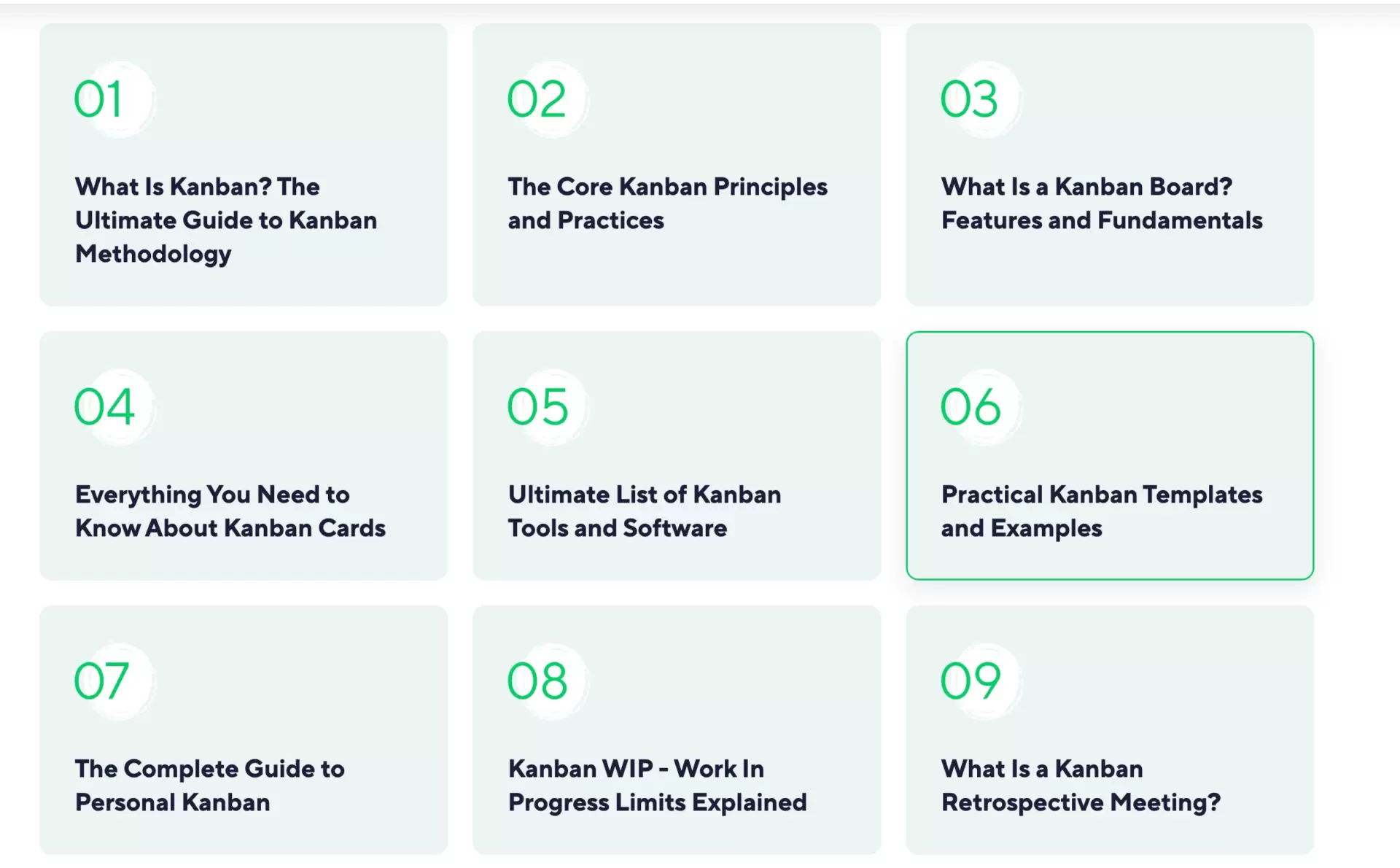
Where is the weak spot? “Try it for free” is not the best messaging for the CTA button. Firstly, because it’s the same as the main CTA, which stirs up confusion. Secondly, it suggests that you can only try this guide. What does it mean? Will you be subsequently required to make a purchase? It’s not clear. Simple “Download” or “Download Your Guide” would work better here.
5. BambooHR
Bamboo is one of the key players in the HR apps market.
They persuade visitors by offering a Demo in exchange for e-mail. Good points on this opt-in landing page are:
- the layout is compliant throughout the whole page,
- the bar with a set of logos of big companies with copy communicating that the platform is suitable for each business (no matter its size),
- a visual preview of the demo on the right, serving as an enticement for the visually driven (i.e., most of us!).
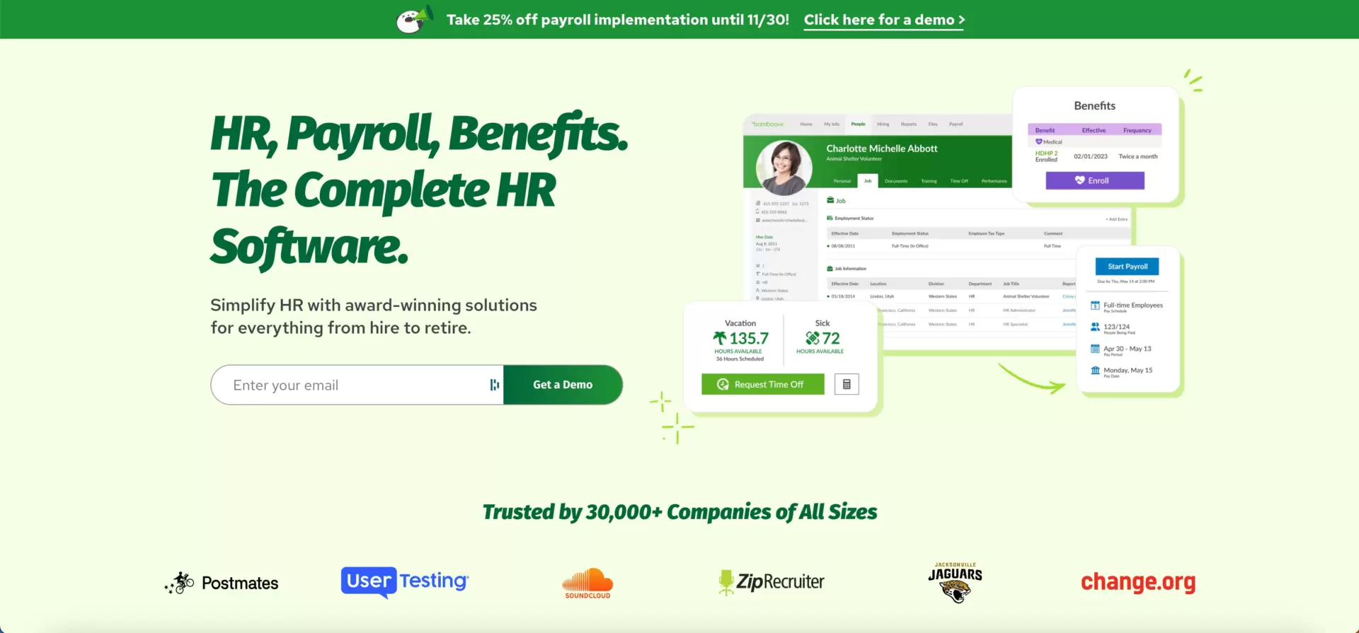
Is there any room for improvement? Let’s not force it. This page is really well done!
6. Thoropass
Now for the worst opt-in page example. Let’s tactfully omit the company’s name (anyway, it’s a really big player in the stack…).
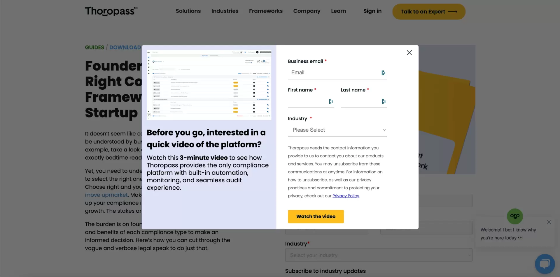
The opt-in form has too many fields, and – what is worse – it’s doubled. The first one pops out every time a visitor lands on the page, while the second appears once they close a pop-up.
The copy is verbose and overwhelming. It may be good for search engines but, at the same time, fails to encourage prospects to share personal data (which is its essential role).
If you decide to build your own opt-in page, for inspiration scroll down to the next examples.
7. JobDiva
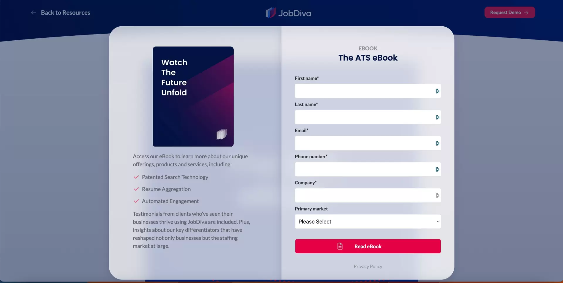
The layout looks clean, so the site navigation is easy as pie. The call-to-action button stands out from the whole, which means no one gets lost.
A free e-book with some professional insights is a practical gift, but it’d be great to highlight it with a benefit-driven headline because it’s the first detail that catches the eye of a website visitor. Instead, “The ATS eBook” and “Watch the Future Unfold” communicate nothing.
Another weakness is the opt-in form. It’s too lengthy, leading visitors to opt out rather than type in data to so many lines.
8. Bloomreach
Bloomreach offers a vast range of customer journey personalization tools. Their resource library on this topic is quite extensive. It includes, among others, reports like the one presented below.
Though the title “AI in E-Commerce Fashion” sounds intriguing itself, it might be beneficial to elaborate it a bit more with some copy pieces or enrich with one or two relevant images to improve UX.
What works well is limiting the top bar menu to one CTA button so that website visitors won’t get distracted on their path to conversion.
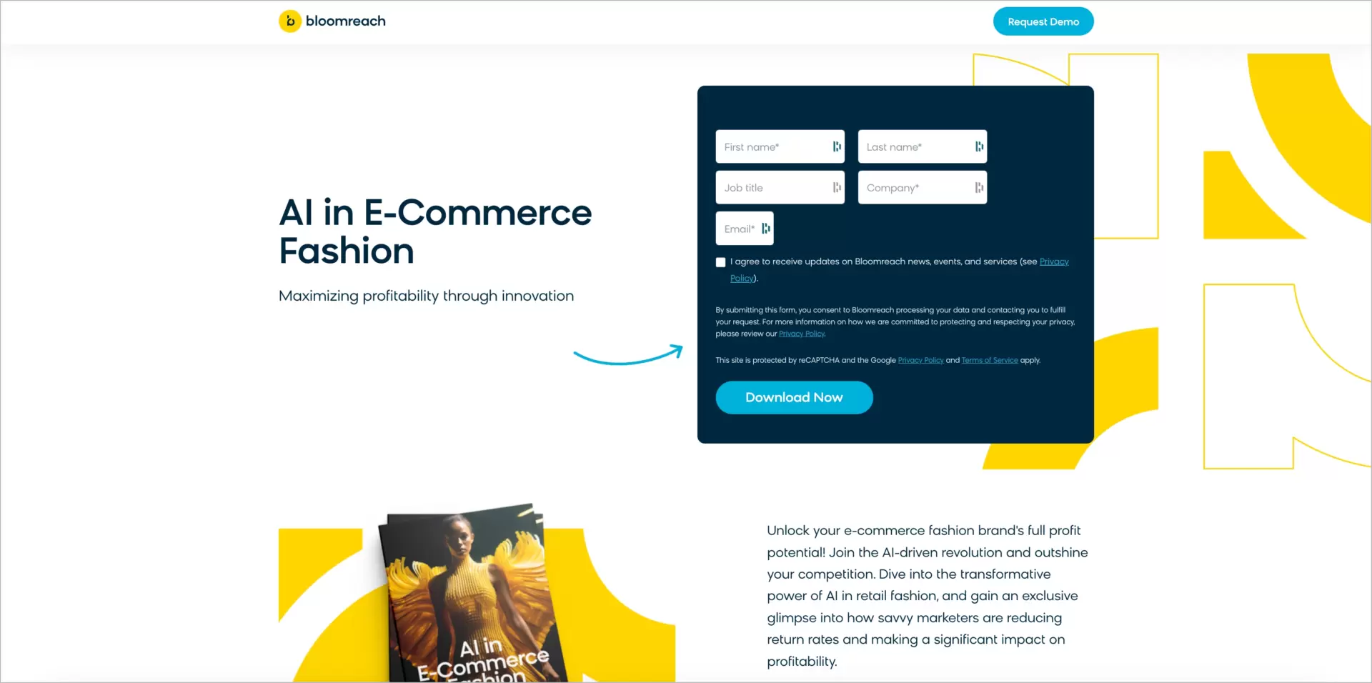
On the other hand, the below-the-fold section looks somewhat… unfinished. It’s a perfect place to give a voice to customers. Their opinions and/or testimonials provide social proof potent enough to persuade visitors who are not already familiar with the company.

9. CrashPlan
CrashPlan is a data resiliency platform delivering pro security solutions for online business audiences.
They bank on the whitepaper as a lead magnet. The title-bearing headline is informative and clarifies the value of the offered item. It’s well-developed in the copy below. Each bullet point addresses one essential pain point, and each one may speak effectively to another potential customer.
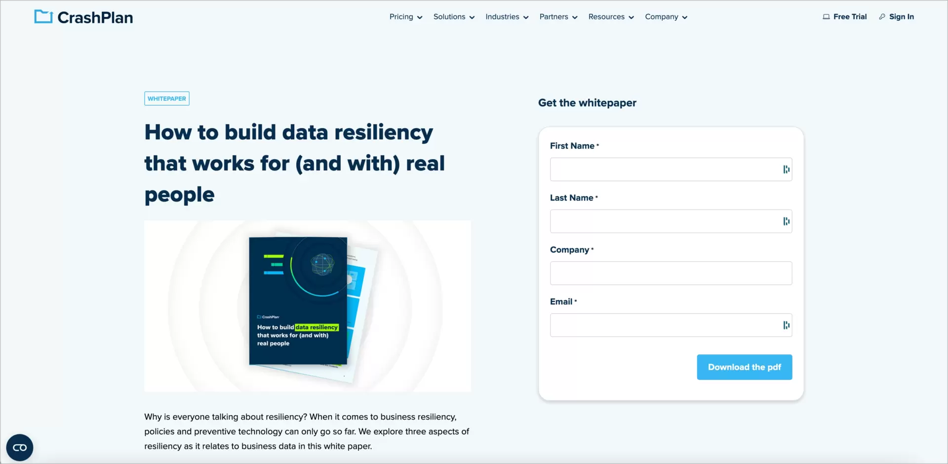
A 30-minute webcast with experts talking on data resiliency stands as the ultimate introduction to the subject for newcomers and an additional lead magnet as well.
One thing to improve: on the right of it, there is so much empty space, which looks kind of strange (except for mobile devices). Besides, it’s a lost chance to include more elements leading users to conversion, e.g., reviews or other social proof items.

10. Justworks
Finally, Justwork, a growing HR technology brand.
Their landing page is magnificent in almost all points. It has a compelling headline, clear call-to-action, well-chosen images, and short, one-field form.
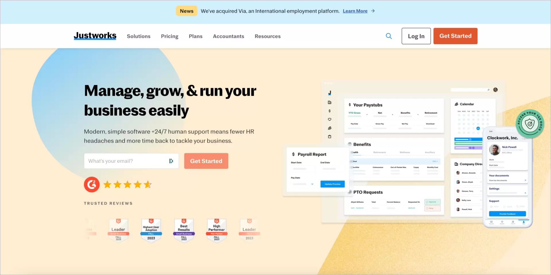
Surprisingly, they go without lead magnets. Instead, however, they deliver many social proof elements to showcase their product in the best light. Have a look, for example, at this vital logos section:

Is there something to be done to increase opt-in rates? This landing page is so excellent that we can leave this question unanswered.
FAQ
Is Mobile Optimization Crucial for Opt-In Pages?
Absolutely, mobile optimization is crucial for opt-in pages, because a significant portion of web traffic comes today from mobile devices. Exploding Topics reports that 92.3% of internet users go online via mobile phones, and mobile devices account for more than 55% of all website traffic (J. Howarth, Internet Traffic from Mobile Devices (Nov 2023))
Mobile optimization ensures that your opt-in page loads quickly, displays correctly, and provides a user-friendly experience on smaller screens. This is vital because mobile users have different expectations and behaviors compared to desktop users. They prefer quick, easy-to-navigate pages with straightforward CTAs. If your opt-in page isn’t optimized for mobile, you risk high bounce rates and low conversion rates, as users may get frustrated with poor navigation and slow load times.
Furthermore, Google’s mobile-first indexing means that the mobile version of your website is considered the primary version. If your opt-in page isn’t optimized for mobile, it could negatively impact your search engine rankings, making it harder for potential subscribers to find your site.
Can a Slow-Loading Opt-In page Decrease Conversion Rates?
A slow-loading opt-in page can significantly decrease conversion rates. Page load time is a critical factor in user experience and can dramatically impact the effectiveness of your opt-in page. A delay in page load time from 1 second to 3 seconds results in a 32% higher probability of users bouncing (Google/SOASTA Research, 2017)!
This delay can be particularly damaging for opt-in pages, where the primary goal is to convert visitors into leads or subscribers. A slow-loading page not only frustrates users but, at the same time, diminishes the credibility and professionalism of your brand. Users may perceive a slow site as untrustworthy or insecure, which is detrimental to building the trust necessary for someone to provide their personal information, such as an email address.
Moreover, search engines like Google consider page speed as a ranking factor, so – just like in the case of mobile optimization – leaving this issue unaddressed may influence badly your SEO.
What are the Essential Components of an Effective Opt-In Page?
An effective opt-in page must include several key components (like headline, copy, CTA, opt-in form, and social proof) to unleash its conversion potential fully. These elements work together to create a clear, compelling, and user-friendly experience that encourages visitors to take action. Let’s examine this more closely.
- Compelling HeadlineThe headline is the first thing visitors see. It should be attention-grabbing and clearly state the value of what you’re offering. A good headline prompts the visitor to stay and learn more.
- Clear and Concise CopyThe copy should be straightforward and to the point, explaining what the offer is, why it’s valuable, and how it can solve the visitor’s problem or improve their situation.
- Visually Appealing DesignA clean, uncluttered design helps keep the focus on the key message and call-to-action (CTA). Use colors and images strategically to draw attention and create a positive emotional response. And remember the hint by Steve Jobs, “Design is not just what it looks like and feels like. Design is how it works” (P. Rao, Design Elements and Principles, 2021).
- Strong Call-to-Action (CTA)Your CTA should be prominently displayed and easy to find. Use action-oriented language that creates a sense of urgency or excitement. The CTA button should stand out from the rest of the page in color or size.
- Opt-In FormThe form should be simple and not ask for more information than necessary. Each additional field can decrease the likelihood of someone completing the form.
- Social ProofIncluding testimonials, customer logos, or social media shares can increase trust and credibility. People are more likely to opt-in if they see that others have had positive experiences.
- Privacy StatementAssure visitors that their information is safe and will not be shared or sold. This can be a simple sentence near the opt-in form.
By incorporating these elements, you can create an opt-in page that not only captures attention but also effectively converts visitors into leads.
What Types of Offers can be Presented on Opt-In Pages?
Opt-in pages can be used to present a variety of offers, such as free e-books, newsletters, trials or demos, discounts and promos, webinars, etc., each tailored to attract and engage your target audience effectively.
The type of offer you choose should align with your business goals, the interests of your audience, and where they are in the customer journey.
In which domains do certain offers perform the best and what is their essential goal? We’ll attempt to present it more specifically in the table below.
- Free E-books or Whitepapers: These are great for providing valuable information and establishing your expertise in your field. They work well for audiences seeking in-depth knowledge on a specific topic.
- Newsletters: Offering a subscription to a newsletter is a straightforward way to gather email addresses while promising ongoing valuable content in return.
- Free Trials or Demos: For software or service-based businesses, offering a free trial or demo can entice users to experience your product firsthand, increasing the likelihood of conversion to paid services.
- Discounts or Special Offers: Encouraging sign-ups by offering a discount on a first purchase or exclusive deals can be a powerful motivator, especially for e-commerce sites.
- Webinars or Online Courses: These can be an effective way to gather leads while providing educational content or in-depth information about a particular subject or product.
- Free Consultations or Assessments: For service-oriented businesses, offering a free consultation or assessment can be a compelling offer, drawing in potential clients who are at the decision-making stage.
- Interactive Content: Quizzes, assessments, or interactive tools that provide personalized results or recommendations can be highly engaging and a unique way to gather leads.
- Contests or Giveaways: These can create excitement and encourage users to sign up for a chance to win something valuable.
- Exclusive Access: Offering early access to products, services, or information, or access to an exclusive community, can appeal to users’ desire for exclusivity.
- Downloadable Resources: Tools like templates, checklists, or planners offer practical value and can be a strong incentive for users to provide their contact information.
Each of these offers has the potential to be highly effective, depending on your audience and what stage of the buying process they are in.
For example, whitepapers and reports are particularly effective in the B2B sector for lead generation. Demand Gen Report’s 2020 Content Preferences Survey Report revealed that 49% of B2B buyers said they rely more on content to research and make purchase decisions than they did the year before.
If you’d like to offer long-form video content, note that webinars had the highest conversion rates (70%) in GetResponse’s study by Michal Leszczynski (Best Lead Magnets for Lead Generation: 2020 Study Report), and outperform access to online conferences (38.3%), product demos (25.5-31.9%) and tutorials (23.4%).
What Metrics are Important to Track for Opt-In Page Performance?
To track opt-in page performance, you should simultaneously monitor opt-in rates and metrics such as conversion rate, traffic sources, form abandonment, and much more. The extensive list of metrics you should consider to track is below, along with reasons why they are important and what kind of information they can provide in regards to your opt-in landing page performance.
- Conversion Rate: This is the percentage of visitors who complete the desired action (e.g., submitting their email address) out of the total number of visitors. A high conversion rate indicates that your opt-in page is effective at persuading visitors to take action.
- Traffic Sources: Understanding where your visitors are coming from (search engines, social media, email links, etc.) can help you tailor your marketing strategies and identify the most effective channels for attracting your target audience.
- Bounce Rate: This metric shows the percentage of visitors who leave your site after viewing only the opt-in page. A high bounce rate could indicate that your page isn’t engaging enough or isn’t meeting the expectations of the visitors.
- Average Time on Page: This indicates how long visitors are staying on your page. Longer times can suggest that visitors are engaging with your content, while shorter times may imply that your page isn’t capturing their interest.
- Form Abandonment Rate: If your opt-in form is multi-step or requires several fields to be filled, tracking how many users start but don’t complete the form can provide insights into where they are dropping off and why.
- Mobile vs. Desktop Conversions: Since user behavior varies between devices, it’s important to track conversions from mobile and desktop separately to optimize the user experience on each.
- Click-Through Rate (CTR) of Call-to-Action (CTA): This measures how many visitors click on your CTA button. A low CTR could indicate that your CTA is not compelling or visible enough.
- Lead Quality: Assess the quality of the leads generated from your opt-in page. Are they turning into customers? This can be tracked through CRM systems and sales data.
- A/B Testing Results: If you’re running different versions of your opt-in page (A/B testing), tracking the performance of each version is crucial to understand what works best.
Which Type of Opt-In Offer Typically Results in the Highest Conversion Rates?
The most effective opt-in offers typically include free trials and discounts, as they directly address the user’s desire for risk-free experiences and immediate value.
Free trials, especially popular in software and services, allow users to experience a product before committing financially, thereby boosting conversion rates. Evan Bailyn from First Page Sage informed that in the SaaS sector, offering free trials (opt-in) converts 7.1 to 8.5% (depending on traffic source) of site visitors. In some businesses, it’s even more: in Healthcare / Medtech – 12.3%, in Environmental / CleanTech – 11.1%
Similarly, discounts and coupons in e-commerce are compelling incentives, offering immediate savings and encouraging sign-ups. BigCommerce reports that in the Home & Garden e-commerce realm, the average conversion rate is 1.04%, while CR with active promotions jumps to 10.02% (B. Choy, Promotional Effectiveness Metrics & Email Capture Benchmarks Across 10 Ecommerce Industries, 2022).
The success of these offers hinges on their alignment with the audience’s interests and needs, making them more relevant and attractive to potential subscribers.
Which is more Effective for E-mail List Quality: Double Opt-In or Single Opt-In?
Double opt-in, where subscribers sign up and then must confirm their subscription through a follow-up email, is often considered more effective for ensuring a high-quality email list. This method guarantees that the email address is valid and that the subscriber is genuinely interested in receiving emails. As a result, it typically leads to a more engaged audience, lower bounce rates, and fewer spam complaints. This is crucial for maintaining a healthy sender reputation and ensuring better email deliverability.
On the other hand, single opt-in, where users are added to your email list as soon as they sign up, has the advantage of simplicity and convenience, which can lead to a larger list more quickly. However, this method may result in lower engagement rates and higher chances of spam complaints, as it can include subscribers who are less interested or who inadvertently signed up.
How can an Opt-In page Enhance a Business’s Relationship with its Customers?
An opt-in page plays a pivotal role in enhancing a business’s relations with its customers by serving as the initial step in a journey of personalized communication and engagement. When a customer opts in, they express interest in what the business has to offer, opening the door for a more targeted and meaningful interaction.
An opt-in page allows a business to collect valuable information about its customers. This data can include basic contact details, but also preferences and interests based on the content of the opt-in. With this information, businesses can tailor their communication, making it more relevant and personal.
Additionally, an opt-in page can be the start of a feedback loop between the customer and the business. Through newsletters or updates, businesses can encourage feedback, ask for opinions, and involve customers in the development of new products or services. This provides valuable insights for the business and makes customers feel valued and heard, fostering a stronger emotional connection.
In what Ways does an Opt-In Page Help Segment and Target the Right Audience?
By collecting specific information during the opt-in process, businesses can identify and categorize their audience based on shared characteristics, interests, or behaviors. This segmentation is crucial for tailoring marketing efforts to different groups within the broader audience.
Info: According to NotifyVisitors, 80% of companies that use market segmentation report increased sales (2021).
For instance, on the opt-in page, businesses can ask subscribers to select their areas of interest or provide demographic information. This data enables the creation of distinct audience segments, each with its own set of preferences and needs. As a result, businesses can develop targeted marketing campaigns that resonate more effectively with each segment rather than adopting a one-size-fits-all approach.
Additionally, the way users interact with the opt-in page itself offers insights for segmentation. The specific offers or content that users respond to can indicate their preferences, guiding businesses in creating more personalized and relevant communication.
How does an Opt-In Page Contribute to a Reduction in E-mail Marketing Spam Reports?
An opt-in page effectively reduces email marketing spam reports by ensuring that recipients have willingly subscribed to receive emails. This voluntary sign-up process means that emails sent by the business are anticipated and welcomed rather than being seen as unsolicited or spammy. Furthermore, the use of a double opt-in method, where subscribers confirm their email address after signing up, adds an extra layer of consent.
How do the Benefits of Opt-In Pages Compare with Other E-mail Collection Methods?
Opt-in pages offer distinct advantages over other email collection methods in terms of building a more engaged and committed subscriber base. Unlike methods such as purchasing email lists or using passive sign-up forms embedded in website sidebars, opt-in pages actively require the user’s action and consent. This active engagement typically results in a higher quality list of subscribers who are genuinely interested in the brand or product, leading to better open and click-through rates in email campaigns.
How can Businesses Ensure Their Opt-in Page Adheres to Global Data Protection Regulations?
To ensure their opt-in page adheres to global data protection regulations like GDPR, businesses must focus on clear and explicit consent. This involves avoiding pre-ticked boxes and ensuring users actively opt-in, coupled with providing an easily accessible and understandable privacy policy that details how subscriber data will be used. Data collection should be limited to only what is necessary, and users must have a straightforward way to unsubscribe at any time.
Regular audits and updates of data protection practices are essential to stay compliant with evolving regulations, thereby building trust and maintaining legal integrity in their digital marketing efforts.
How do Retargeting Strategies Complement Opt-In Page Conversions?
Retargeting strategies significantly enhance opt-in page conversions by re-engaging visitors who showed initial interest but didn’t subscribe. This method targets these users with tailored ads on different platforms, reminding them of the offer and potentially presenting alternative incentives. Such targeted reminders increase the likelihood of converting previously interested visitors, making retargeting a valuable tool in maximizing the effectiveness of opt-in pages.
How Often should Businesses Update or Refresh their Opt-In Page Design?
Businesses should ideally review and refresh their opt-in page design every 6 to 12 months to ensure it remains effective and aligned with current design trends and user expectations. Continuous monitoring of performance metrics (like conversion rates and bounce rates) can guide the timing of these updates. If these metrics show a decline, it may indicate a need for a design refresh. Regular updates, while maintaining a consistent brand image, ensure the opt-in page continues to effectively engage and convert visitors.
How can A/B Testing Improve the Efficiency of an Opt-In Page?
A/B testing improves the efficiency of an opt-in page by allowing businesses to systematically compare different elements of their page to see which versions perform better. This process involves creating two versions of an opt-in page (A and B) and testing them with a segment of the audience to determine which one has a higher conversion rate. For example, the first version with a form in a pop-up, and the second with a pop-up placed directly on the opt-in page.
To perform A/B tests, you may use traditional landing page platforms featured with this function or bet on various individual A/B testing tools.
What Role do Pop-Up Opt-in Forms Play in User Experience and Conversions?
Pop-up opt-in forms play a significant role in user experience and conversions, balancing the fine line between being an effective tool for audience engagement and a potential disruption to user experience.
From a conversion perspective, pop-up opt-in forms are highly effective. They grab the user’s attention immediately, making them hard to ignore. This direct approach often results in higher visibility for your call-to-action, leading to increased conversion rates compared to other, more passive forms of sign-up prompts. For instance, a well-timed pop-up that offers a relevant and valuable incentive (like a discount code or a free ebook) can encourage users to subscribe to your mailing list.
However, the impact of pop-up forms on user experience can be double-edged. If not implemented thoughtfully, they can be perceived as intrusive and annoying, potentially harming the user’s perception of the website and the brand. To mitigate this, it’s crucial to consider the timing, frequency, and ease of closure of these pop-ups. For example, a pop-up that appears after a user has spent a certain amount of time on the site or is about to exit can be less intrusive than one that appears immediately upon entry.
How to Build Opt-in Page in Landingi?
It’s simpler than you think if you have a potent landing page builder. Here is the recipe:
1) Create your opt-in landing page using one of over 300 conversion-driven templates to save some time, or build one starting from scratch to get full control over the process.
2) Choose and personalize an opt-in form regarding layout, number of fields, or input data type. If needed, integrate it with over 170 marketing tools, including Google Analytics, Hotjar, GetResponse, and much more.
3)Take care of the design and craft some compelling copy. No worries, you’ll be supported at every step with hints and professional tools such as AI copy generator, Smart Sections, or automated mobile view builder.
4) Once your site is live, use A/B tests and EventTracker to measure the performance and make data-driven adjustments, which make your conversion rates shoot up!

