With Landingi, you can edit landing pages in a desktop and mobile view. If you select an empty template, you have to enable and customize the mobile view yourself. Other templates contain a built-in mobile view, which you can still modify freely. The mobile view is automatically created based on the desktop view (however, the desktop view won’t be automatically created based on the mobile one). We recommend starting with the desktop view and then adjusting the mobile view.
The mobile view of an empty template is created automatically based on the desktop view, however, some elements may require manual adjustment. If the mobile display does not look the way you want it to look – you can easily adjust it by extending the height of some sections or moving the objects. Remember that changes introduced in the mobile view do not affect the arrangement of elements and sections in the desktop view.
Mobile view
The default view in the editor is the desktop view. The mobile view is closely related to the type of sections you use on the landing page, which is why you have to start planning the mobile view at the very beginning. You can enable the mobile view at any time – all previously used elements will be automatically loaded.
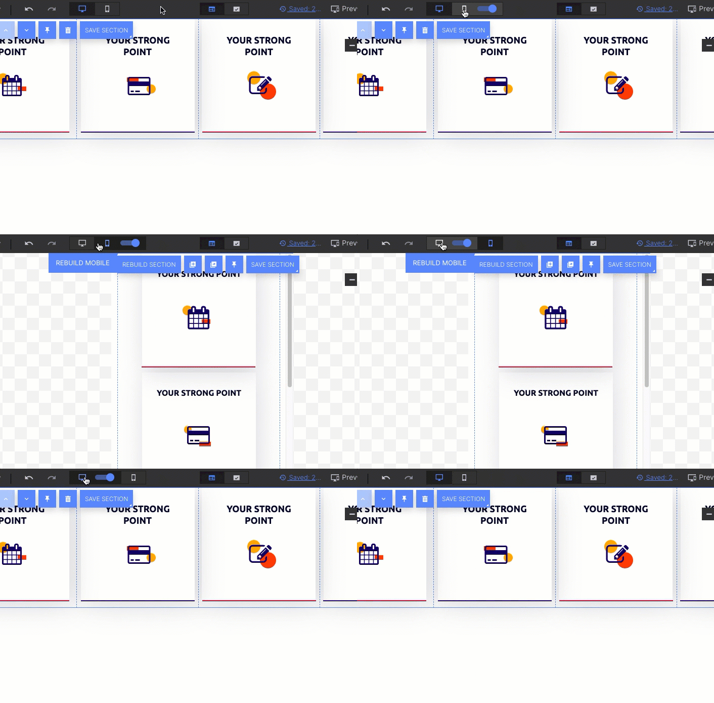
If the mobile view is turned off, find the smartphone icon on the top bar of the editor and use the slider to activate the mobile view.

Hide elements on the mobile view
In the mobile view, you can add new elements and hide the ones that you don’t want in the desktop view (the same the other way). The desktop view does not have to be reflected in the mobile view exactly the same.
REMEMBER: If you delete an item in the desktop view, it will also be deleted in the mobile view. That is why instead of deleting, you can hide elements. Learn more about hiding elements.
Edit the mobile view
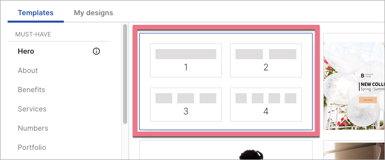
Once you add a section to the editor, you can choose between a single section or a section divided into two, three, or four columns. When planning to add a mobile view, we recommend using few sections with more than one column. The columns are not visible on the page after publication (there are no frames).
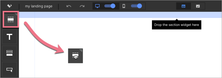
1. Find the Section widget on the left side of the editor, then drag and drop it into the active area of your landing page.
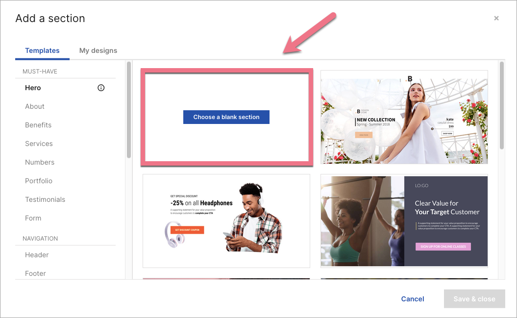
2a. In an Add a section window, hover over Choose a blank section.
2b. Select a section with one, two, three, or four columns.
This is what you can get with three columns:
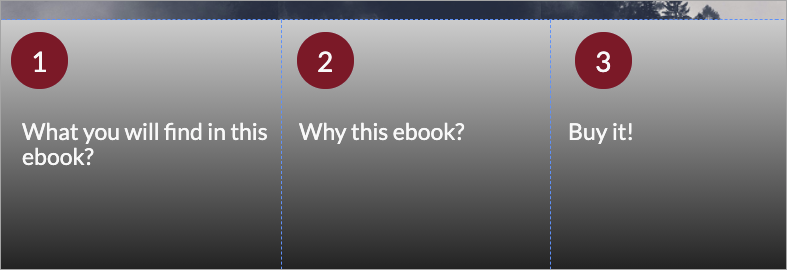
3. Elements in the section with division into columns are pre-arranged. In the mobile view, the columns are arranged one above the other, starting from left to right vertically. You can move them freely – this does not affect the layout of the columns in the desktop view.
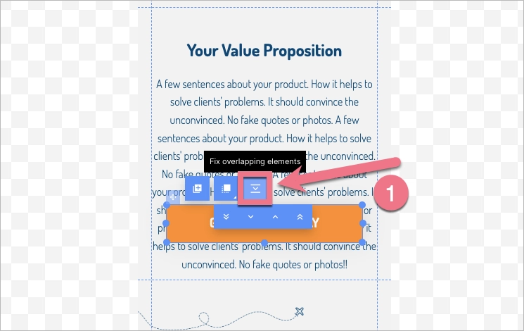
4. If one element (e.g. long text) overlaps another element, you can use the Fix overlapping elements (1) option available in the widget context menu.
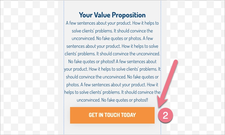
With just one click, the editor automatically moves the element in the section and, if required, the section extends (2).
5. Remember that it is not possible to edit the text of the desktop view from the mobile view panel. Instead, you can drop any widget that will only be visible in the mobile view. Additionally, it is not possible to remove widgets from the mobile view panel or move them between sections.
You can also work with the desktop view disabled. Find the monitor icon on the top bar of the editor and use the slider to turn off the desktop view. After you have finished editing the text, you can turn on the desktop view again.
6. Verify the mobile view of the thank you page before publishing.

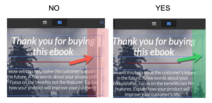
7. The blue frame of the element (continuous line) should not go beyond the editor’s working area (vertical dashed line). If the element is framed outside the working area, your landing page may not display correctly on mobile devices.
Rebuild the mobile view automatically
The rebuild mobile view option allows you to automatically reposition elements in the mobile view if the layout does not meet your expectations after applying changes in the desktop view. You can choose to rearrange the elements for the whole landing page or for an individual section.
1. Click on Rebuild mobile (1) – for the entire landing page. Or click on a section and, in the context menu, click on Rebuild section (2) – for a single section.
If you don’t like the final effect, you can always undo the changes using the arrow (3).

2. After making major desktop mode changes, a red dot may appear next to the mobile view icon. This means that the mobile view may need to be adjusted.

Mobile view specification:
Smartphone: display smaller than 764 px (most smartphones).
