Before you even start your email list, though, there’s something else you need to get right:
The landing page.
My checklist for landing page excellence is not (very) complicated, but that doesn’t make it easy. If you address each point when you create your next landing page, expect your results to blow up.
1. Be Crystal Clear in Your Message
I know you think you’re being clear.
You’re probably not.
You’re probably only being clear about the WHAT. People don’t care yet. First, they need to buy into the WHY.
Why should the readers spend their precious time interacting with your brand?
If you can answer the question above in 5 words, you’re on your way to the kind of clarity that compels people to action.
2. Benefits Up Front, Features in the Back
Once you’re clear about why you exist and why the reader should care, you can flesh it out.
Not with your features, though. Not yet.
Flesh it out with benefits.
Will they feel great about being a part of your philanthropic movement? Will they rest easier when your A.I. virtual lawyer service is working around the clock to protect them from lawsuits? Whatever you offer, people join because of a feeling.
How they will feel is paramount. That’s benefits
How you will deliver that feeling is secondary. That’s features.
I like to put the majority of the feature-talk behind a micro-commitment, such as an email opt-in. Once someone has shown you a small sign of trust, they’re magnitudes more likely to sit through a list of feature comparisons.
3. Focus the Eye with Tidy Design
“Perfection is achieved not when there is nothing more to add, but when there is nothing left to take away.”
– Antoine de Saint-Exupéry
Anything more than what you need is probably a distraction.
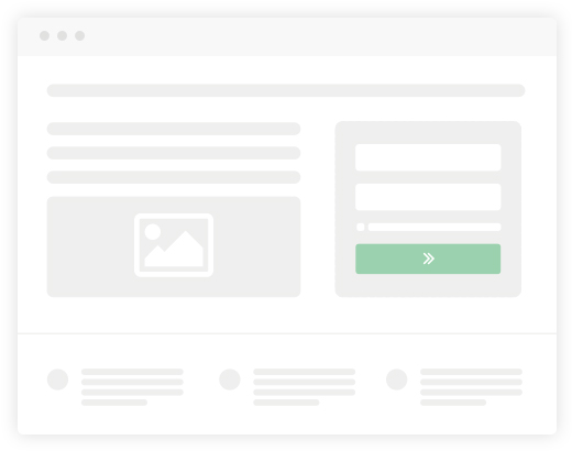
Ergo: no sidebar. Use a clean, single-column design that visitors can easily scroll over until their gaze fixes on your all-important CTA.
An uncluttered design is much more effective at leading the eye where you want it to go. Everyone skims. Use that to your advantage with thoughtful white space. Spacing content liberally leads to pleasing designs that are easy to consume.
4. Perfect Spelling & Grammar
I shouldn’t have to say this. (But sadly I do!)
No matter what grade you got in English Lit, get a proofreader to go over your landing page. This is the public front to your product, at least for now. It must be error-free.
5. Be Ready for the Data
The internet can leave you strangely blind if you’re not data-savvy.
So get data-savvy.
Otherwise, your page will need to be either a one-hit-wonder or dead in the water.
Install Google Analytics as a default. This will tell you whether people are coming from search results, from typing in your domain name, or through a backlink.
Use email automation software to track email addresses collected and (when you start sending emails) number of opens, which links are clicked, and much more.
Implement heatmapping software to see how far visitors scroll, where they click, and even where their mouse cursor hovers.
My heatmap recommendations would be Hotjar or Kissmetrics, though there are many options available.
6. Show Proof or Go Home
If you don’t prove your claims somehow, the only people who sign up will be people who already know and trust you.
A great landing page does not rely on your reputation preceding you. It convinces visitors on its own.
Examples of proof:
A testimonial or recommendation (preferably from someone your audience would know of).
Screenshots of your software or app in action.
Other behind-the-scenes content (ideally live-action video of you and your team explaining your vision and story).
7. Funk-up Your Call to Action
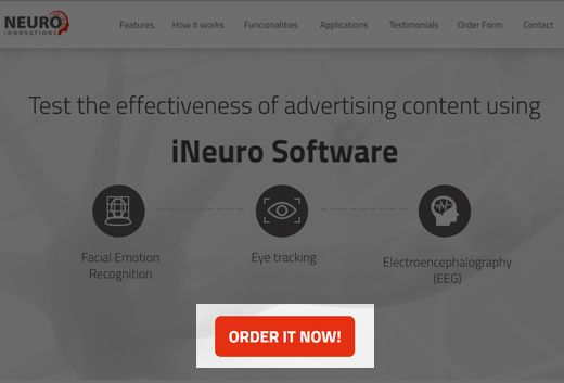
You must have only one Call To Action. If you must have two, then you need two landing pages!
Your clean design is primed to lead the eye smoothly down to the action you’d like the visitor to take. Don’t let a distraction slip in at the last moment!
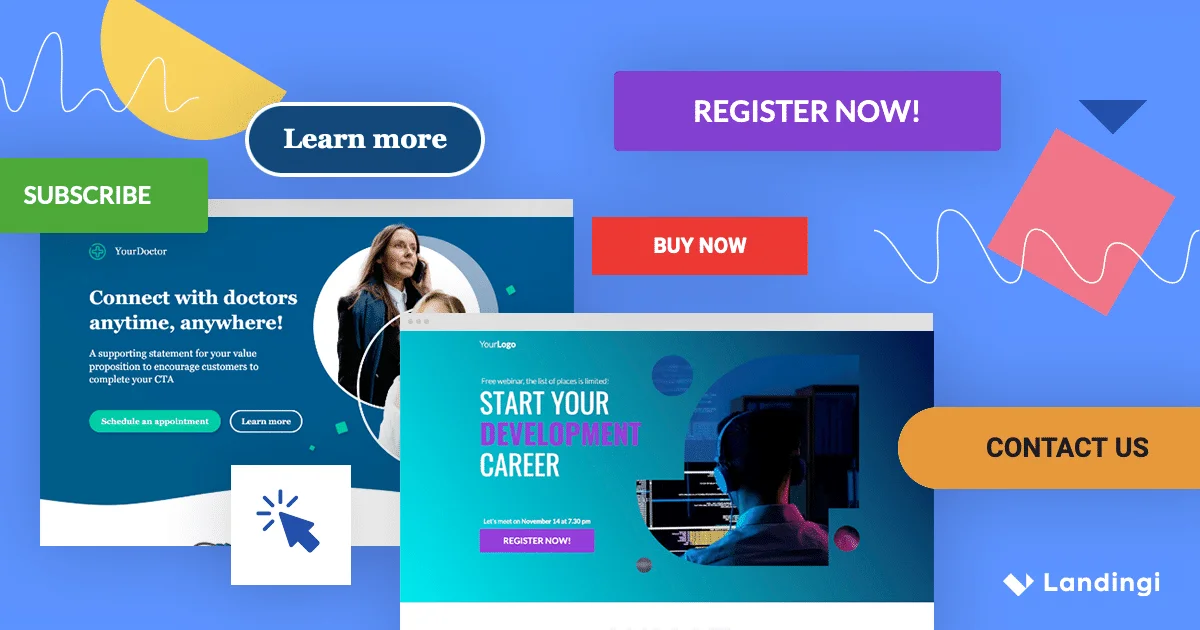
The best wording for a CTA is little original, even a little fun. The standard “Click Here” or “Learn More” won’t get optimum results.
It depends on the tone of your company, but even “Hell yeah! Count me in!” would at least grab a few more brain cells than “Subscribe”.
Better yet, make it specific to the offering. Example: “Yes, I Want My Free Time Back”, if your offering’s main value proposition is saving time.
8. End with the Headline
80% of people never make it past the headline.
According to some of the world’s best copywriters, up to half of the time it takes to write a persuasive content piece should be spent on the headline.
The headline is no small detail. It can easily make or break your success. Literally.
That’s why I’ll leave you with one last non-intuitive tip: If you’re struggling with the headline, try leaving it alone until you finish the rest of the page. Often, a flash of inspiration will come to you when you didn’t expect it.
[UPDATE 12/19]
The email pricing section is priceless
Have you ever considered the pricing as one of the most important elements on your email landing page? If you haven’t, you’d better start thinking about it immediately.
Why does it pay off to have a good pricing landing page?
Well, the pricing section is where all your efforts to bound with your visitors are turning into the sale process (that hopefully ends with purchase). The success depends on how your pricing section is built and what it consists of.
What encourages visitors the most to end the deal on a pricing section?
The key to email marketing effectiveness is simplicity and clarity. The same rule applies to the pricing section on an email landing page. Here’s what you can do to simplify visitor’s choice: Limit pricing plans to 3 or 4 options and present its features, bonuses and – what’s the most important – straightforward price per each plan. Highlight the most popular one! Remember to add a button with convincing CTA so that visitors become leads, and as a result, returning customers.
