As landing pages de vendas são excelentes para destacar produtos/serviços e incentivar mais conversões.
No entanto, se der uma impressão muito comercial, pode perder a confiança dos visitantes. Por outro lado, a comunicação não pode ser omissa. Uma landing page de vendas ineficaz não induzirá os visitantes a efetuarem uma compra.
Dito isto, neste artigo, você vai encontrar vários exemplos de landing pages de vendas para ter uma ideia do que deve e do que não deve fazer. Também partilharemos alguns modelos Landingi para exemplificar como pode criar esses tipo de pages facilmente.
Antes disso, visamos perceber o que são exatamente as landing pages de vendas.
O Que São Landing Pages de Vendas?
Sales pages aim to boost a product’s/service’s sales. Unlike other page types (e.g., squeeze and lead-capture pages), aimed to gather visitors’ contact details, sales pages strictly focus on monetary conversions.
There are two types of sales landing pages:
- Landing pages de vendas de formato curto: estas pages incluem uma descrição curta e cativante de um produto/serviço. Têm como objetivo incentivar as compras rapidamente e oferecer todas as informações essenciais para os visitantes compreenderem o que vão adquirir. As pages de formato curto são ideais para produtos simples e econômicos, que têm como alvo clientes potenciais.
- Landing pages de vendas de formato longo: estas pages incluem uma descrição pormenorizada de um produto/serviço. Têm como objetivo familiarizar integralmente os visitantes com os produtos/serviços promovidos, estabelecer confiança e encorajar mais compras. As pages de formato longo são excelentes para produtos mais complexos e de qualidade superior, que visam um “público frio”.
Landing Pages de Vendas vs. Landing Pages Comuns: Qual é a Diferença?
Como referido anteriormente, as landing pages comuns podem visar vários tipos de conversões, seja persuadindo os utilizadores a enviarem as respectivas informações de contacto, a descarregar uma oferta, etc.
Em contrapartida, as landing pages de vendas são inteiramente dedicadas a gerar conversões monetárias.
Adicionalmente, as landing pages de vendas são, por vezes, mais extensas do que as suas homólogas comuns – pois têm de apresentar o produto/serviço detalhadamente para esclarecer os visitantes e orientá-los para uma conversão.
Dito isto, vejamos alguns exemplos, na prática.
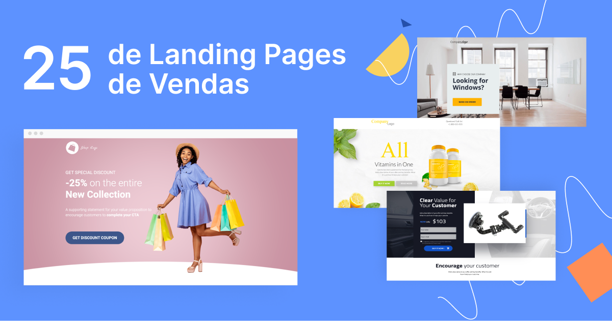
25 Exemplos de Landing Pages de Vendas
1. NordVPN
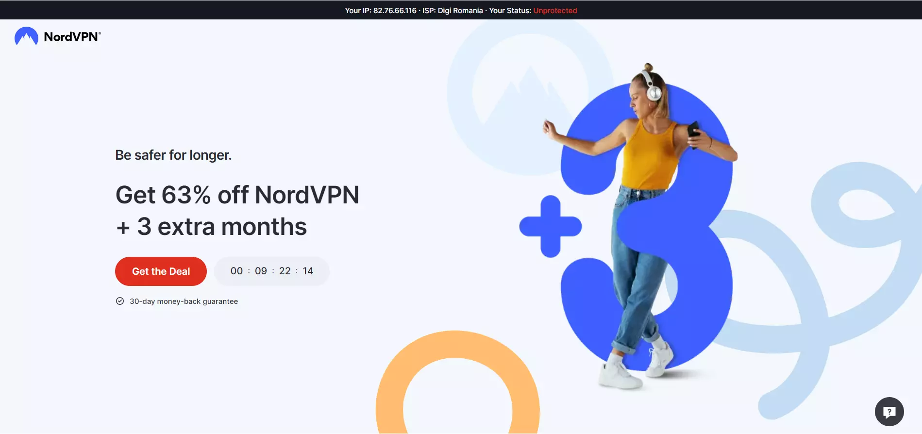
Ver página inteira: NordVPN
O conteúdo acima da dobra da NordVPN incita os utilizadores a comprarem o software. O cabeçalho apresenta uma oferta difícil de recusar – um desconto de 63% + 3 meses extra.
O temporizador de contagem decrescente abaixo infunde “o medo de ficar de fora” (FOMO, Fear of Missing Out), enquanto o botão CTA se destaca pelas suas cores contrastantes. A garantia de reembolso de 30 dias é mais um incentivo para que os visitantes se inscrevam. A barra superior revela um endereço IP desprotegido, impelindo os visitantes a agir rapidamente.
O conteúdo abaixo da dobra compara a NordVPN com as concorrentes, promove algumas vendas incrementadas e menciona sucintamente as vantagens do produto.
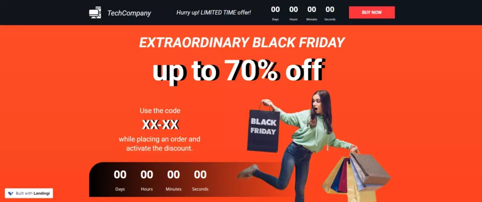
Crie uma page como esta com o modelo Black Friday Sale da Landingi.
2. Surfshark
Ver página inteira: Surfshark
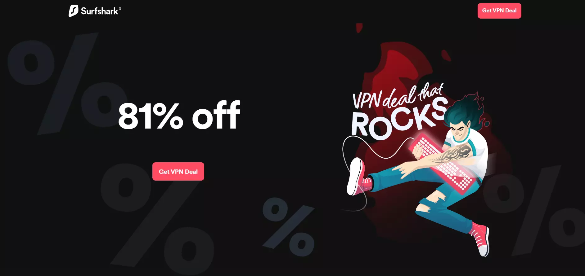
A Surfshark leva o minimalismo a outro nível. O grande cabeçalho, branco sobre preto, é chamativo e direto.
O botão CTA também se destaca pela sua cor intensa, enquanto o texto enuncia concretamente o que a Surfshark quer que os visitantes façam.
Parte da ilustração à direita é animada, chamando a atenção para o texto contíguo.
O conteúdo abaixo da dobra da Surfshark compara a plataforma com as concorrentes, inclui a prova social e apresenta mais pormenores sobre as vantagens da plataforma.
3. Keeper
Ver página inteira: Keeper
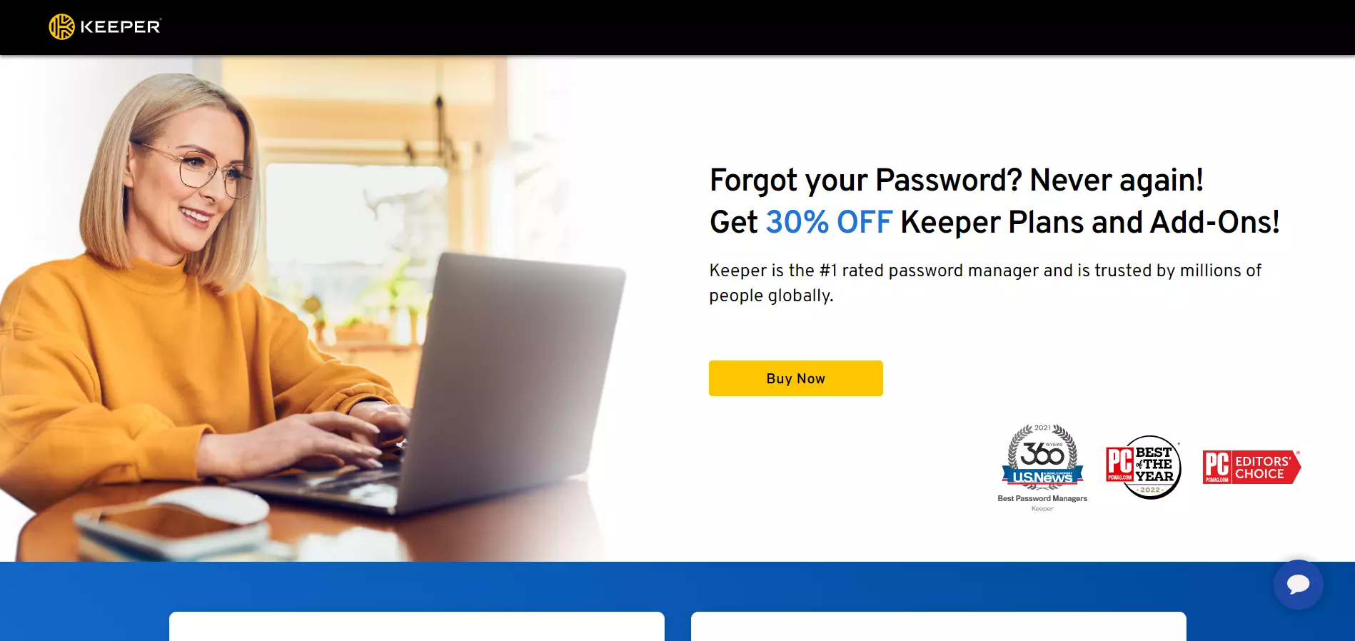
Ao contrário dos dois exemplos acima, o Keeper opta por uma abordagem menos agressiva, mas nem por isso menos persuasiva. O cabeçalho da page começa com uma pergunta que visa cativar os visitantes, enquanto o resto do texto apresenta a oferta.
O slogan acrescenta um elemento de confiança, reforçado com distintivos de confiança abaixo.
O conteúdo abaixo da dobra do Keeper apresenta os planos de preços da plataforma (com os descontos em destaque), inclui depoimentos e disponibiliza informações sobre as vantagens da plataforma.
Crie uma page como esta, com o modelo da Page de Vendas Business da Landingi.
4. Kaspersky
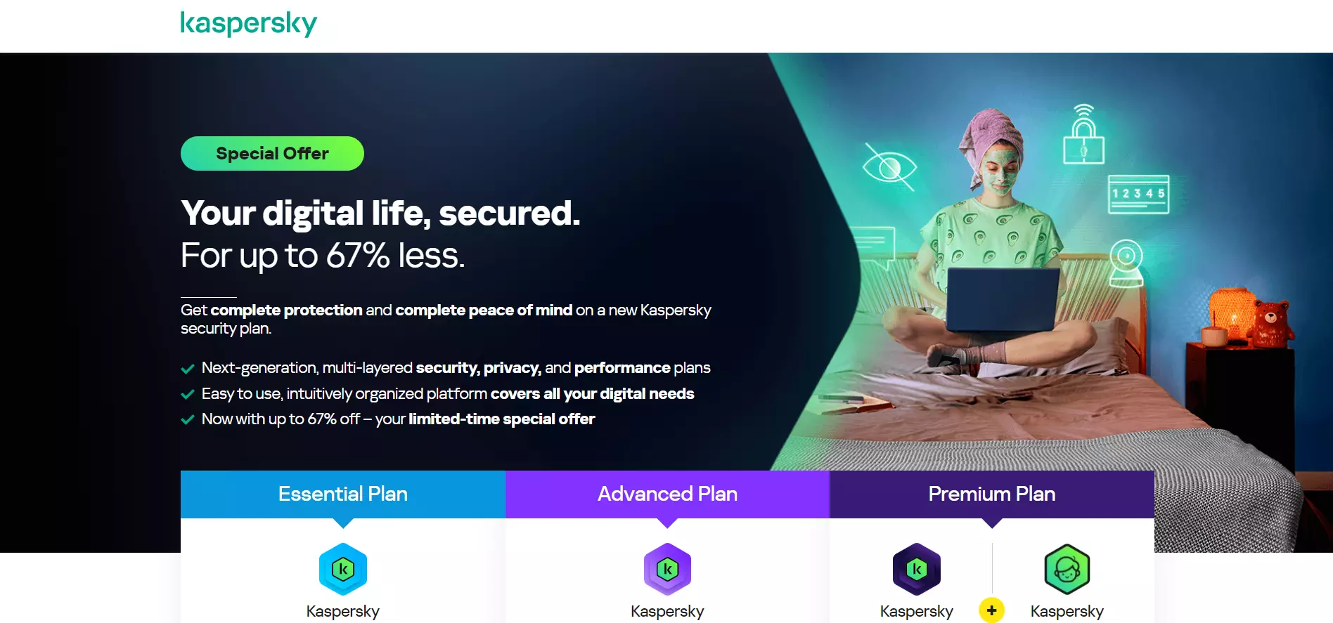
Ver página inteira: Kaspersky
O cabeçalho da Kaspersky capta a atenção com um desconto em 67%. O texto de acompanhamento sublinha as vantagens do produto numa lista com marcadores e induz o “FOMO” (“oferta especial por tempo limitado”).
Seguidamente, são apresentados aos visitantes os planos de preços da plataforma, estimulando-os a fazer uma escolha e assegurando uma compra imediata.
5. Rosetta Stone
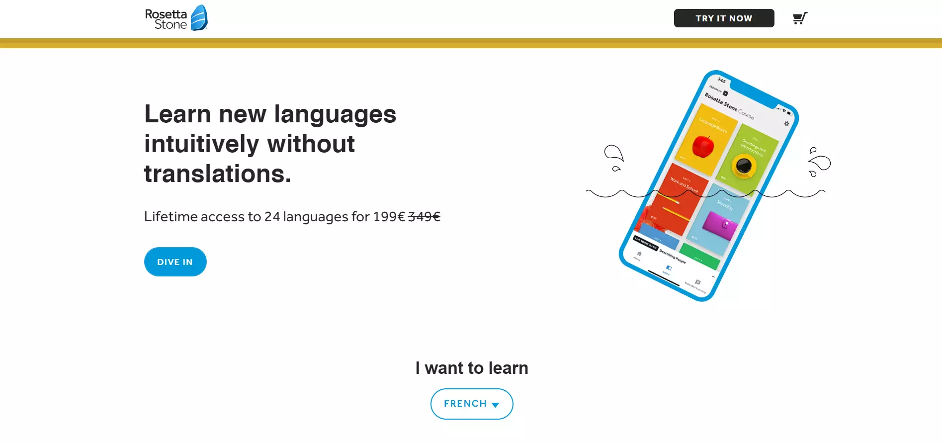
Ver página inteira: Rosetta Stone
A Rosetta Stone destaca as vantagens únicas da plataforma, o desconto e o CTA através de elementos de design minimalistas.
Os visitantes podem aceder a informação adicional relativa aos preços e às vantagens mais abaixo na page. Também há distintivos de confiança e testemunhos à medida que se avança. Além disso, a page inclui uma secção de perguntas frequentes.
6. Spotify
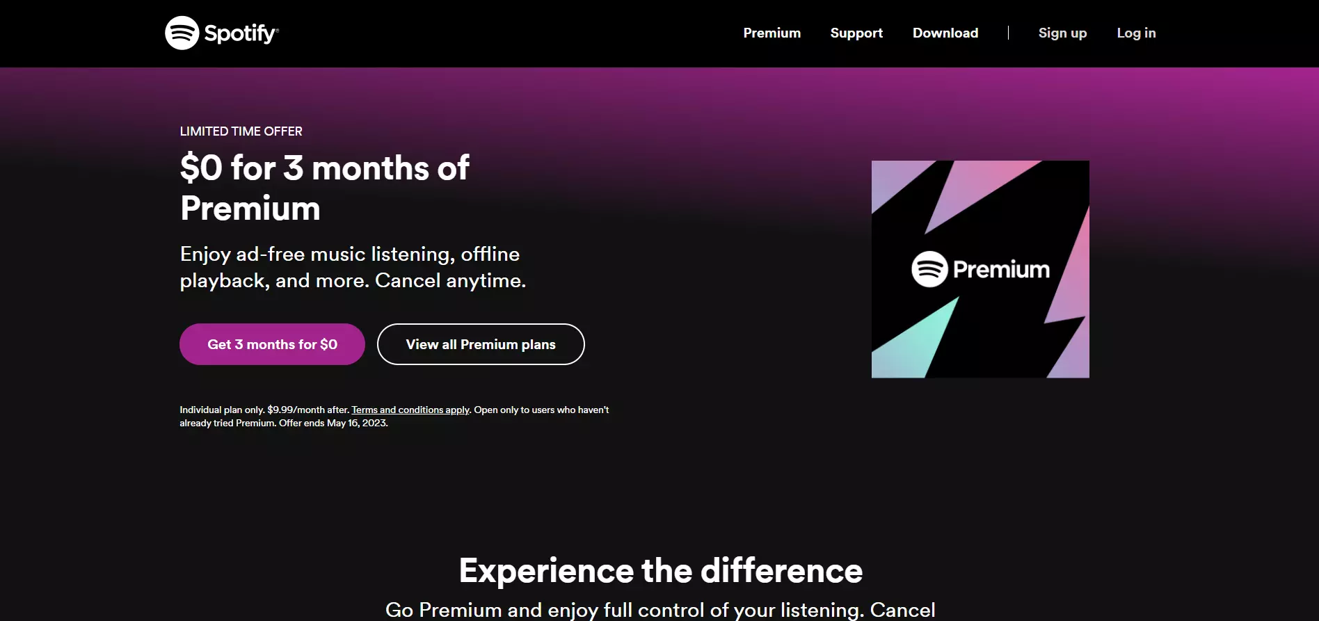
Ver página inteira: Spotify
O Spotify incentiva os visitantes a experimentarem gratuitamente a versão Premium da plataforma, para persuadir os utilizadores a optarem por planos pagos após o fim do período de teste. O cabeçalho da page destaca-se e apresenta a oferta de uma forma convincente.
O texto de acompanhamento descreve as principais vantagens da versão Premium, enquanto o CTA reproduz o texto do cabeçalho e capta a atenção com a sua cor vibrante.
O Spotify compara os planos Gratuito e Premium para incentivar os utilizadores a subscreverem o período de teste gratuito ao fundo da page.
Crie uma page como esta com o modelo Your Music App da Landingi.
7. Bluehost
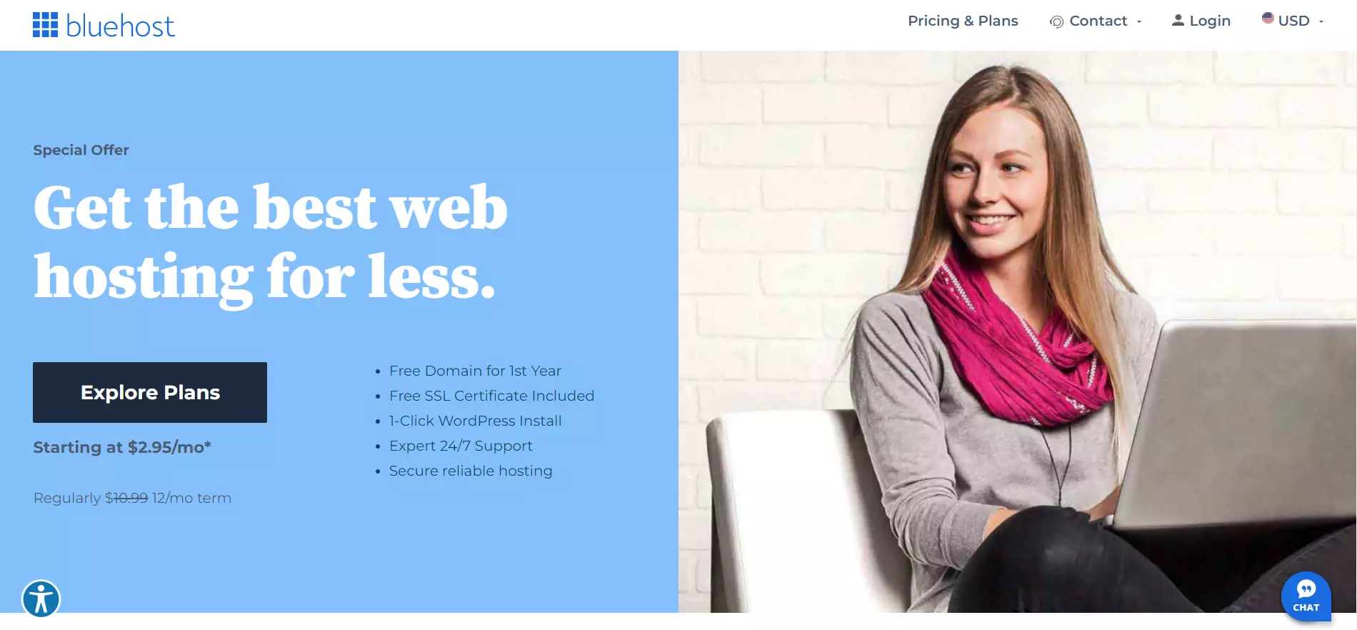
Ver página inteira: Bluehost
A Bluehost utiliza um design de duas tonalidades para enfatizar o cabeçalho da page e o CTA, e apresentar a oferta da plataforma. O cabeçalho destaca-se pelas suas cores contrastantes e promove a principal vantagem da plataforma.
Os visitantes ficam sabendo o que está incluído na oferta mediante uma lista com marcadores, e os planos de preços da Bluehost são referidos mais abaixo.
Crie uma page como esta com o modelo Hosting Service da Landingi.
8. Apple
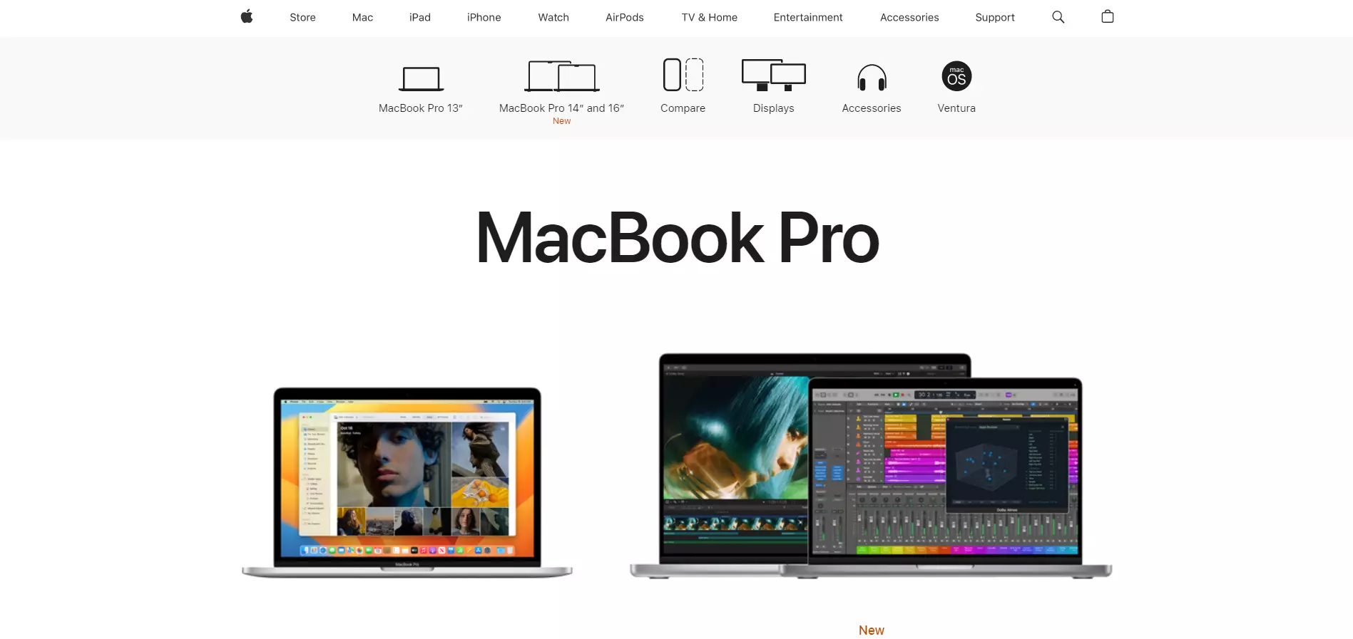
Ver página inteira: Apple
A page de vendas da Apple exprime eficientemente a identidade da marca: simples, mas elegante.
Esta page de vendas promove os produtos MacBook Pro. Os utilizadores são recebidos com duas opções e podem aceder a informações sobre outras variantes à medida que descem na page.
Embora o design simples da página chame a atenção para os produtos, não apresenta as suas vantagens ou destaques. Isto pode confundir os visitantes no momento da escolha.
9. Xbox
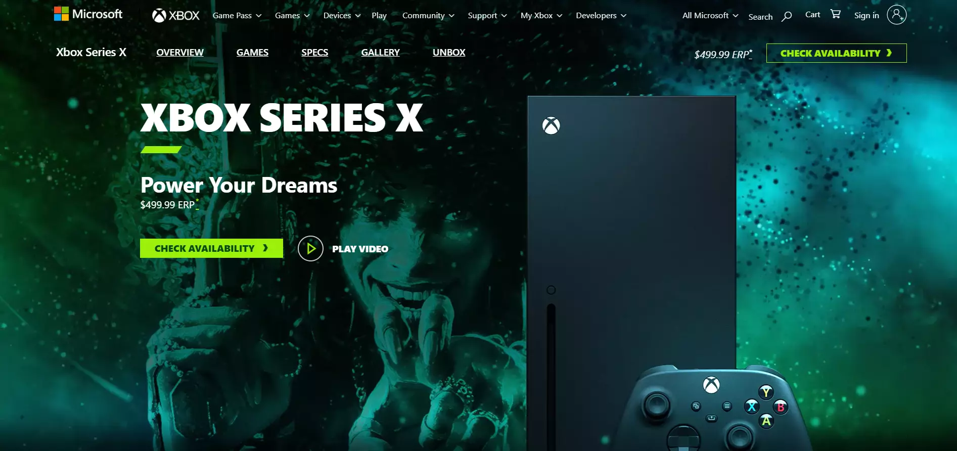
Ver página inteira: Xbox
A página da Xbox direciona a atenção para o produto e para o CTA com o seu design minimalista. O fundo é animado em toda a página, conferindo uma sensação de dinamismo.
Os visitantes encontram uma longa descrição pormenorizada das especificações e vantagens do produto abaixo da dobra. A página inclui vídeos e efeitos de deslizamento para captar a atenção dos visitantes durante a navegação.
10. Logitech
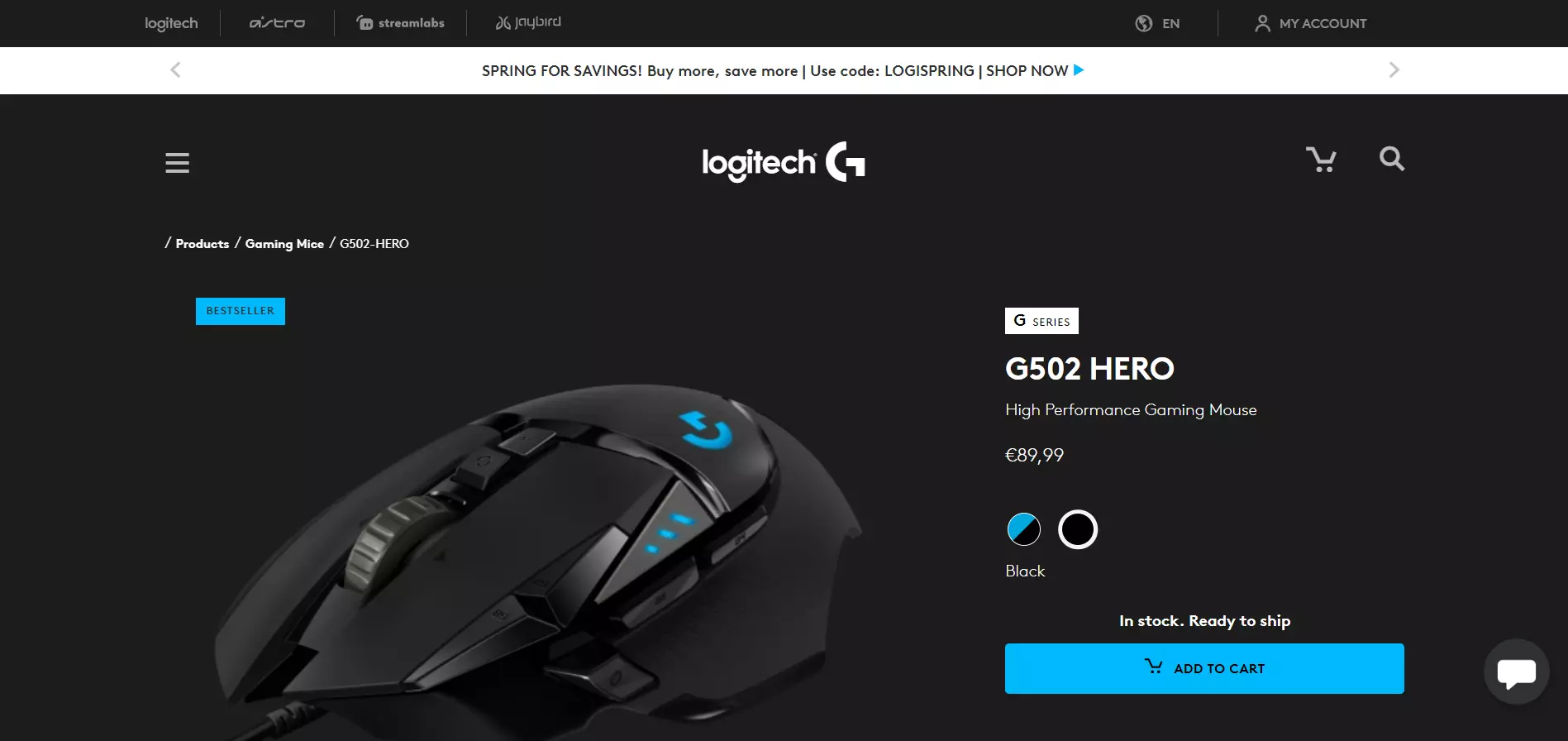
Ver página inteira: Logitech
A Logitech chama a atenção para o seu produto através da simplicidade da página e uma imagem grande do produto. A caixa de texto azul intenso salienta que o rato é um best-seller, incentivando os utilizadores a comprá-lo.
O CTA destaca-se pelo tamanho e pela cor viva. A página menciona ainda o envio gratuito, eliminando eventuais fatores que dissuadam os utilizadores de efetuarem uma conversão.
Crie uma página como esta com o modelo Selling a Product da Landingi.
11. Jotter
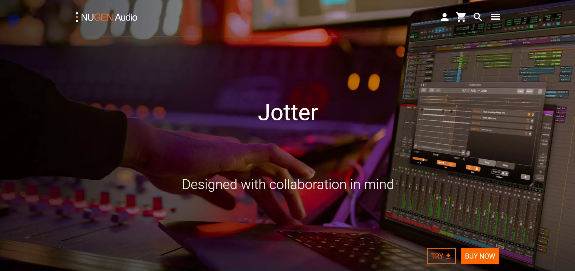
Ver page inteira: Jotter
A página de vendas da Jotter é direta, contudo muito atrativa. O cabeçalho e o slogan aparecem no centro e transmitem uma mensagem simples – o nome e o slogan do produto.
Ao mesmo tempo, o fundo mostra o produto em ação. Embora colocados no canto inferior direito, os CTAs destacam-se pelas suas cores vivas. Os botões chamam a atenção sem serem demasiado intrusivos.
Crie uma página como esta com o modelo Buy Software da Landingi.
12. Restream
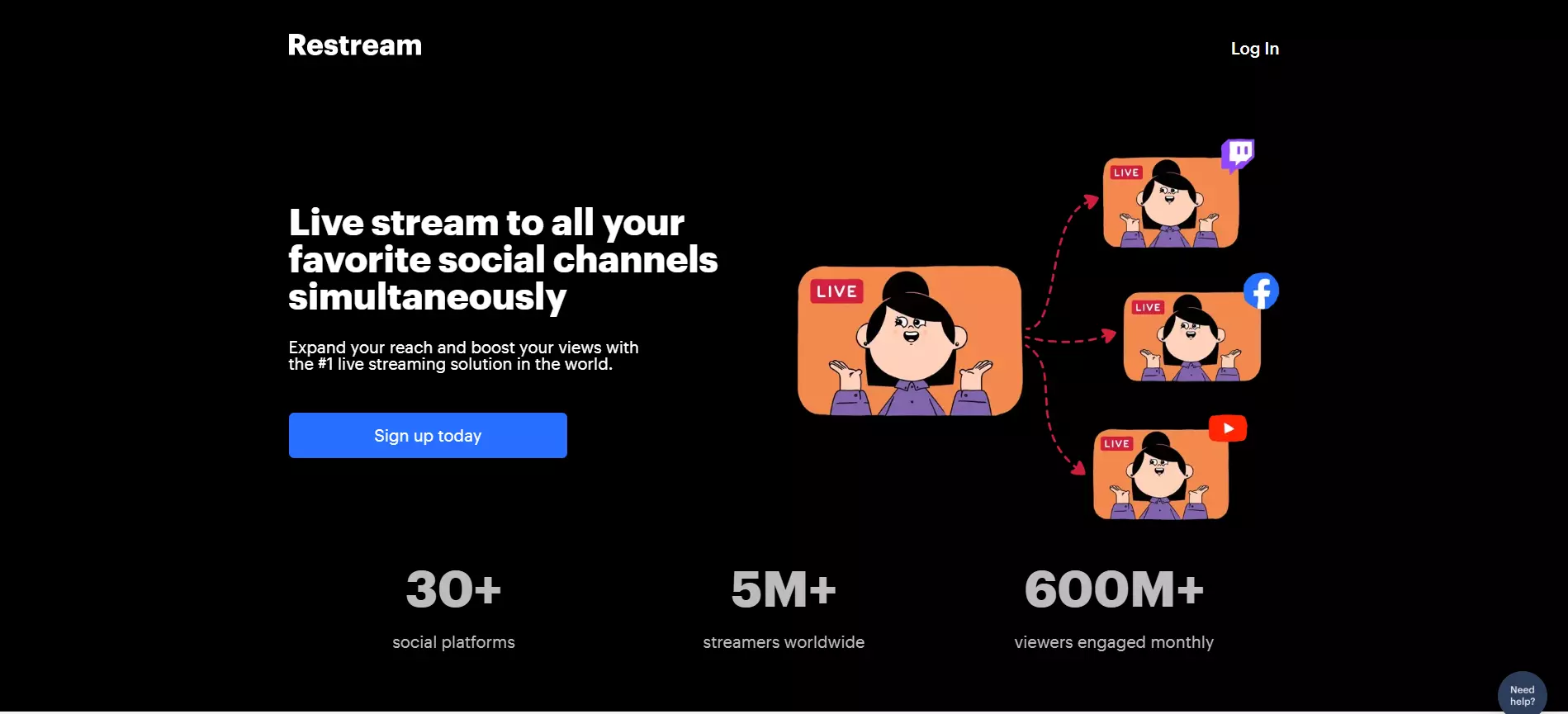
Ver página inteira: Restream
O cabeçalho, o slogan e o CTA do Restream estão em sintonia. Isto complementa os padrões naturais de leitura dos visitantes, assegurando uma leitura integral e incentivando os utilizadores a uma conversão.
O cabeçalho destaca claramente a principal vantagem da plataforma, enquanto o texto de acompanhamento acrescenta um elemento de confiança. O conteúdo acima da dobra termina com um CTA altamente visível e claro. Adicionalmente, a ilustração à direita faz alusão aos recursos da plataforma.
13. Adobe Creative Cloud
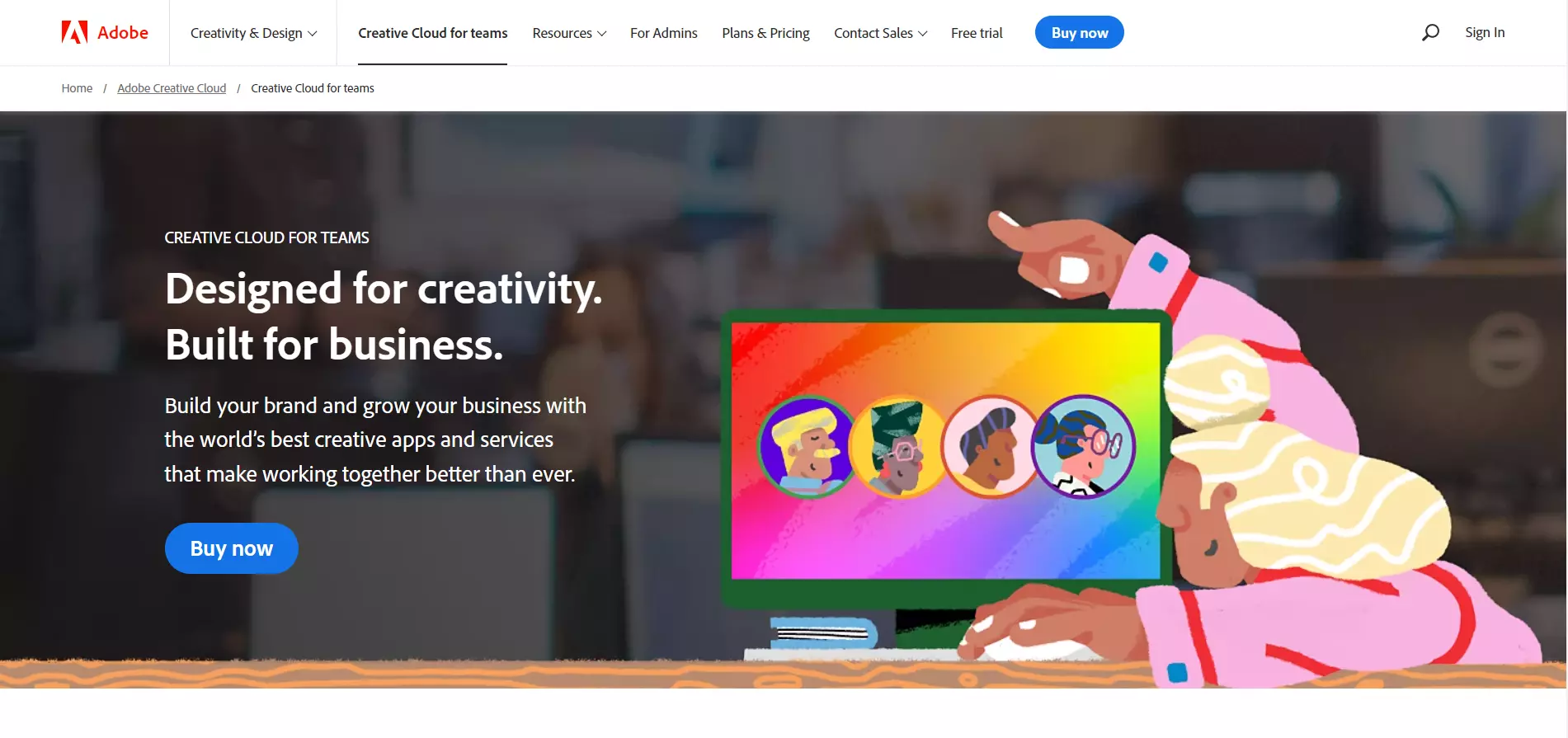
Ver página inteira: Adobe Creative Cloud
O cabeçalho e o texto de acompanhamento da Adobe Creative Cloudsão indicativos dos destinatários do software e das vantagens que apresenta para os utilizadores. As ilustrações de fundo mostram aos visitantes o que podem concretizar com o software da Adobe.
O conteúdo abaixo da dobra disponibiliza mais informações sobre as vantagens do produto, termina com um plano de preços e uma secção de perguntas frequentes.
14. CorelDRAW
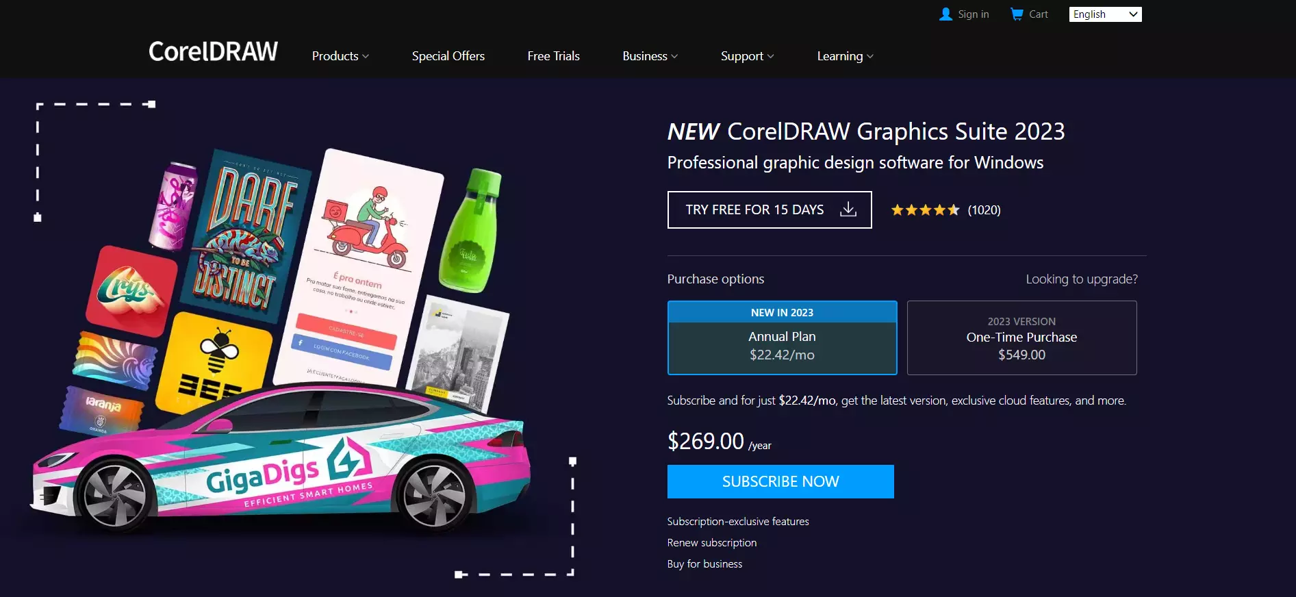
Ver página inteira: CorelDRAW
Em contrapartida, o CorelDRAW é mais agressivo. Os planos de preços são visíveis de imediato quando os utilizadores entram na page. O CTA destaca-se e inclui um texto a negrito. A página tem como objetivo conquistar a confiança dos visitantes, apresentando a classificação da plataforma abaixo do cabeçalho.
Além disso, o CorelDRAW incluiu um CTA menos visível para o período de teste gratuito. Isto funciona como um último estímulo para levar os visitantes não interessados na compra do produto a uma conversão.
15. SmartDraw
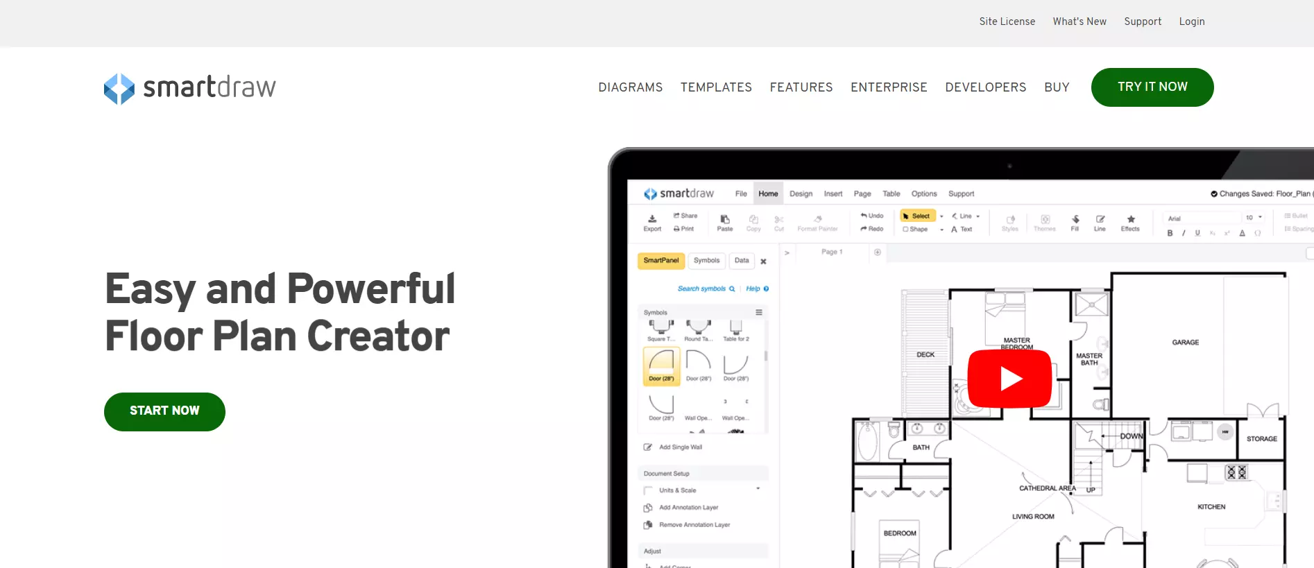
Ver página inteira: SmartDraw
O SmartDraw é moderado relativamente ao texto e aos elementos de design. Em vez disso, recorre a um vídeo à direita para transmitir as vantagens do produto. A page também é minimalista abaixo da dobra – explica sucintamente as vantagens do produto, inclui distintivos de confiança e conclui com testemunhos.
16. AutoCAD
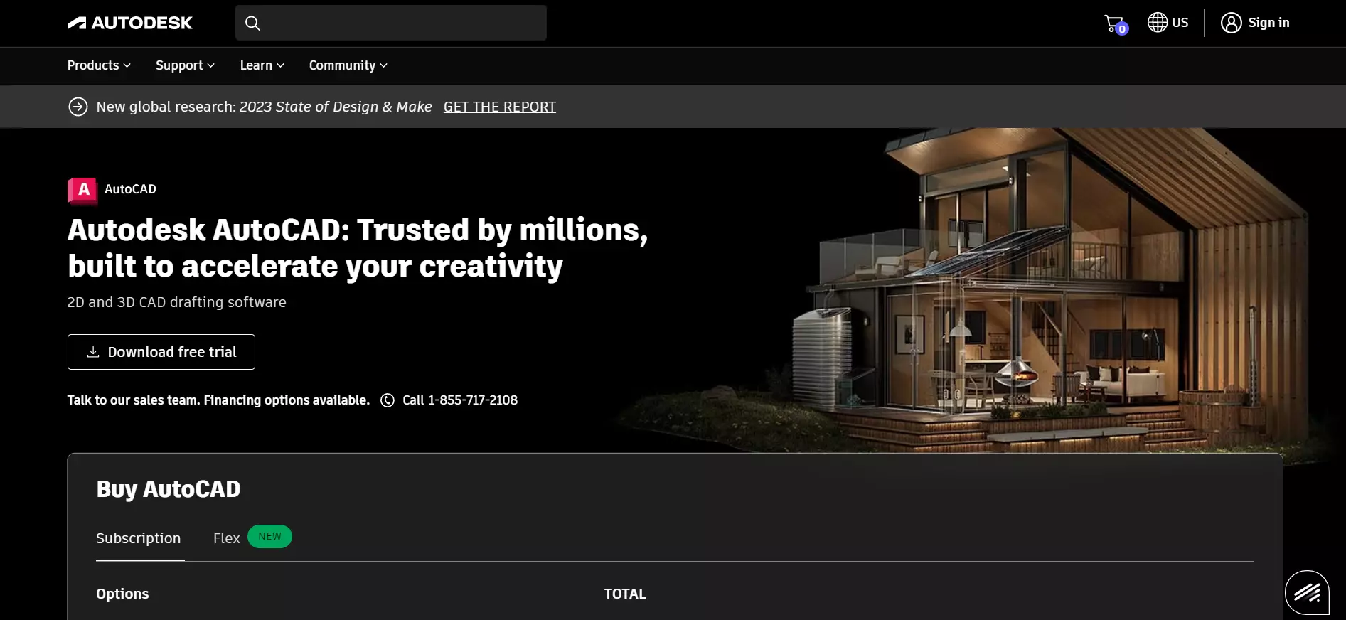
Ver página inteira: Autodesk
Embora a página da Autodesk inclua os planos de preços do software, os visitantes têm também a opção de descarregar uma versão de teste gratuita. A imagem de fundo sugere aquilo que os utilizadores podem fazer com o software, em simultâneo, o cabeçalho acrescenta um elemento de confiança.
O conteúdo abaixo da dobra apresenta mais pormenores sobre o produto, para que serve e quais as suas vantagens.
17. Yoast SEO
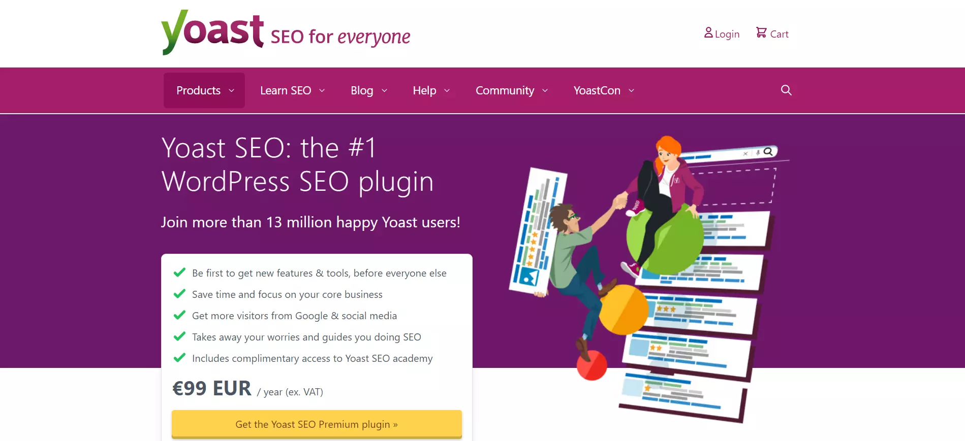
Ver página inteira: Yoast SEO
A Yoast SEO acrescenta um elemento de confiança no cabeçalho e no texto de acompanhamento (“The #1 WordPress SEO plugin,” ”Join more than 13 million happy Yoast users.”) A página de vendas destaca as vantagens do produto em formato de lista – perfeito para a legibilidade.
O CTA destaca-se e utiliza um texto claro. Os visitantes podem saber como funciona o produto mediante um vídeo abaixo da dobra.
18. AdRoll
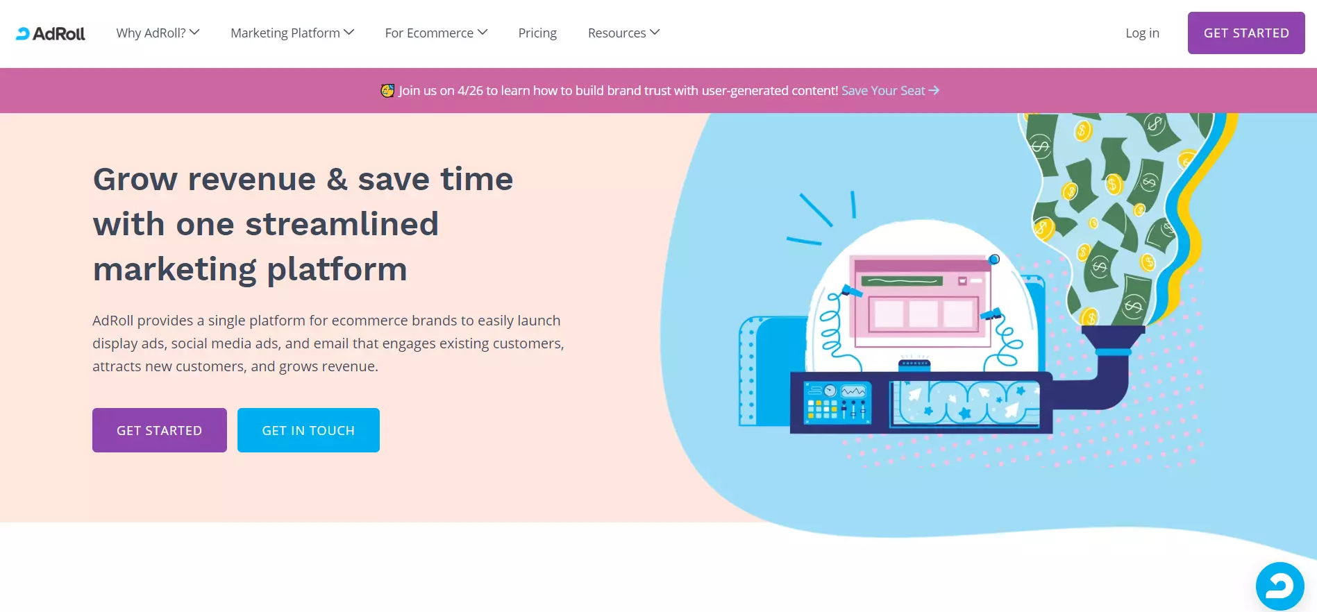
Ver página inteira: AdRoll
A AdRoll utiliza a cor pastel para tornar a página de vendas apelativa e agradável à vista. O cabeçalho da página refere claramente a utilidade do software, por sua vez, o texto de acompanhamento explica concisamente os recursos da AdRoll.
A página inclui logótipos de empresas que trabalharam com a AdRoll e uma descrição pormenorizada das vantagens do produto abaixo da dobra.
Crie uma page como esta com o modelo Pro Services da Landingi.
19. Constant Contact
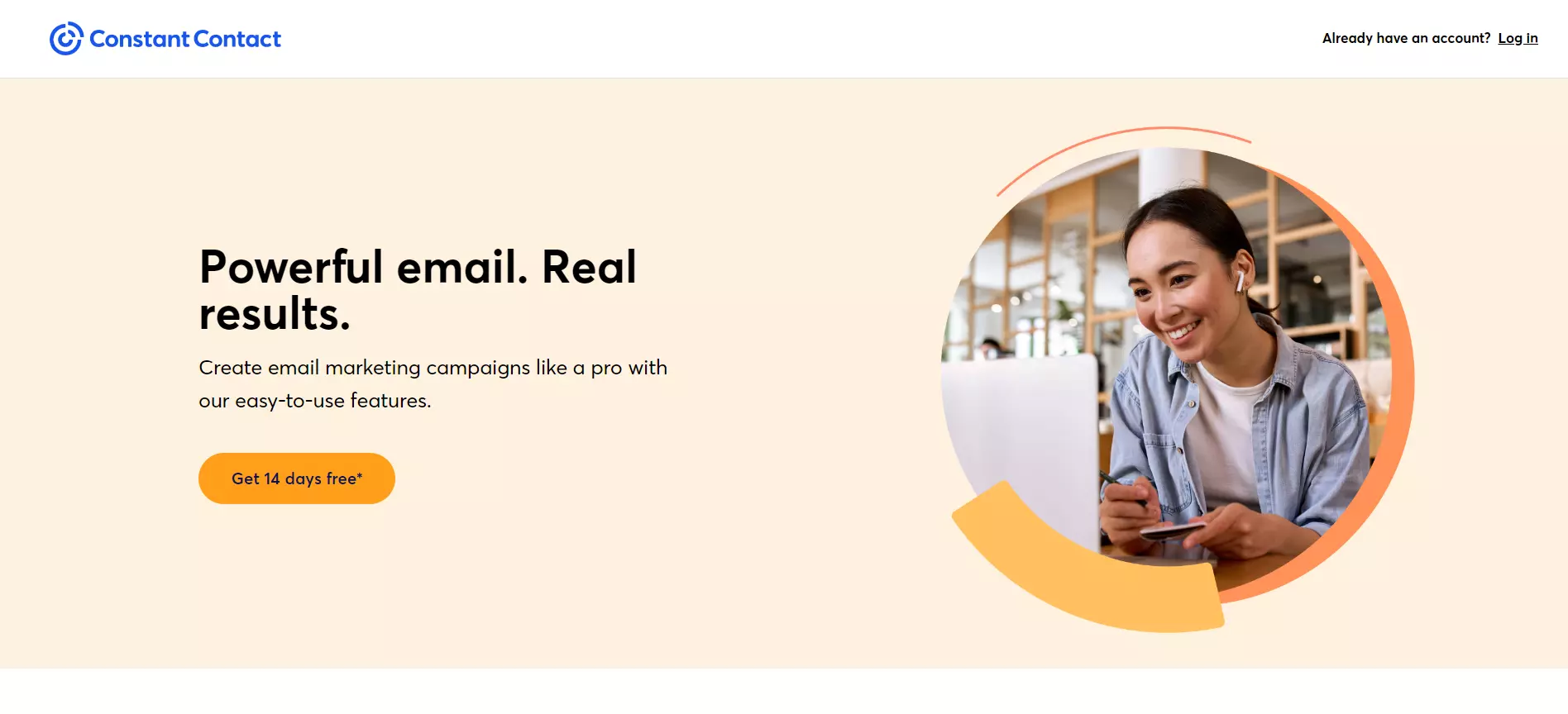
Ver página inteira: Constant Contact
Em vez de induzir os utilizadores a optar por um plano pago, a Constant Contact convida os visitantes a fazerem um teste gratuito. Isto elimina a fricção e maximiza as conversões a longo prazo, ao ser mais provável que os utilizadores subscrevam um plano pago após o fim do teste.
A página de vendas é muito minimalista. O cabeçalho é cativante, o slogan descreve resumidamente as vantagens do produto e aquilo os utilizadores podem fazer com ele.
20. Scrivener
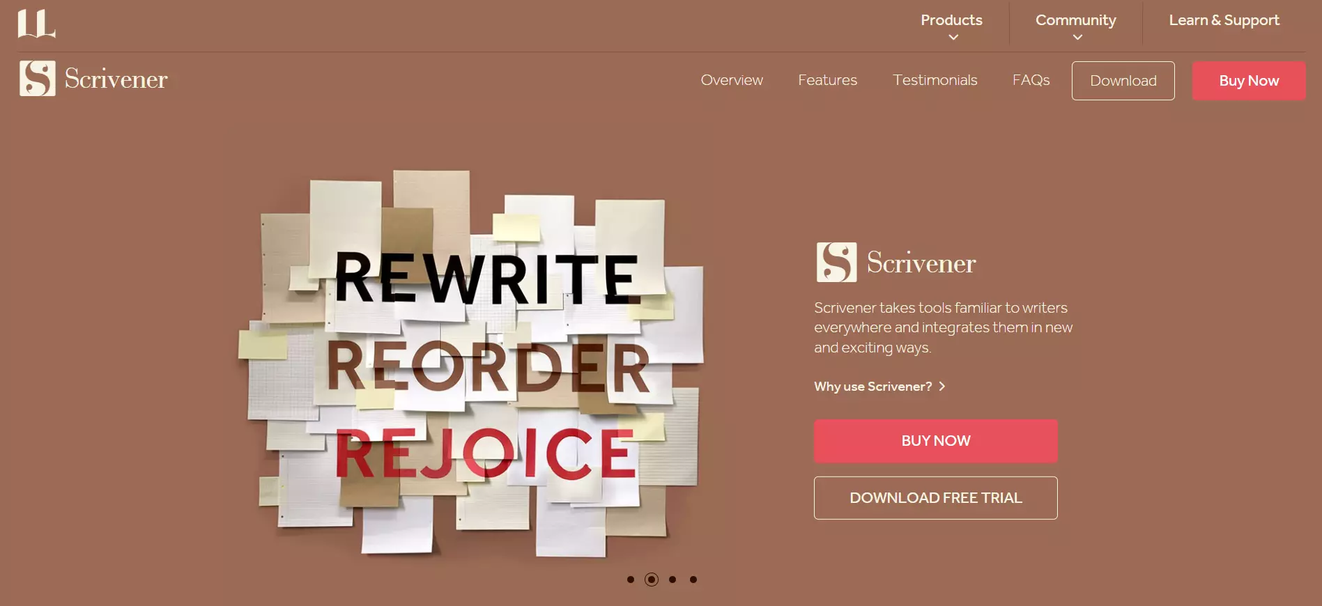
Ver página inteira: Scrivener
O texto de acompanhamento do Scrivener descreve em resumo aquilo que o software pode fazer, simultaneamente a página proporciona aos visitantes a opção de comprar o produto ou descarregar uma versão de teste gratuita. O CTA “Buy Now” destaca-se pelas suas cores contrastantes.
Os utilizadores podem ler uma descrição pormenorizada das principais funcionalidades do produto percorrendo a página.
21. MTE
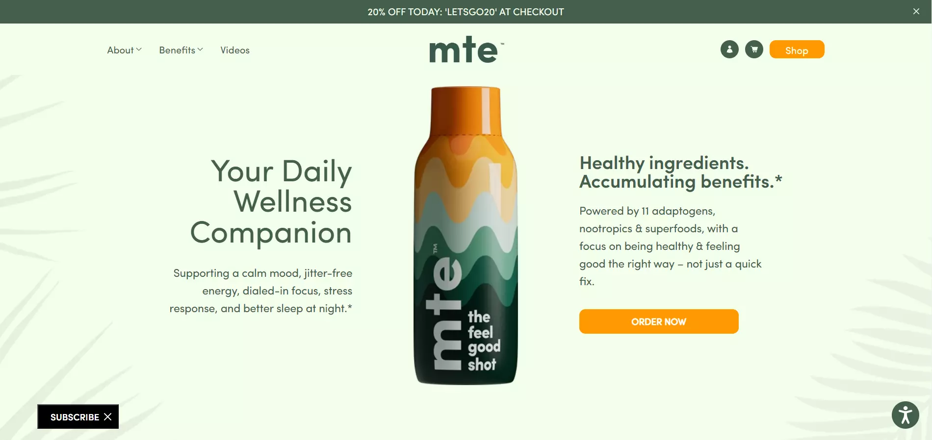
Ver página inteira: MTE
A MTE capta a atenção para o produto, colocando-o no centro da página web. O texto circundante apresenta as principais vantagens do produto, enquanto o CTA é apelativo. A barra de navegação fixa informa os utilizadores do desconto, incentivando-os a fazer uma compra.
O conteúdo abaixo da dobra inclui testemunhos de clientes e mais informações sobre os componentes do produto.
Crie uma page como esta com o modelo Vitamins & Dietary Supplements da Langdini.
22. Air up
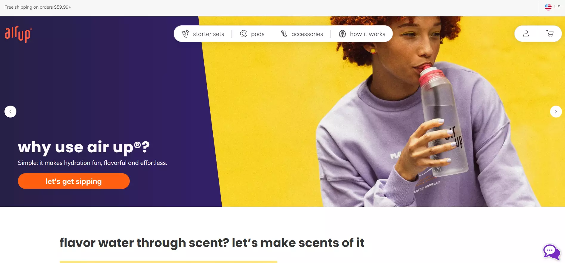
Ver página inteira: air up
O design em duas tonalidades da air up torna a página mais atraente, o CTA e o cabeçalho captam a atenção.
O cabeçalho utiliza uma pergunta para cativar os visitantes, enquanto o texto de acompanhamento dá a resposta, persuadindo os utilizadores a clicar no CTA. Os visitantes podem deslizar para baixo na página para saber como funciona o produto e consultar outras ofertas.
A página termina com testemunhos, distintivos de confiança e uma secção de Perguntas Frequentes.
23. HBO Max
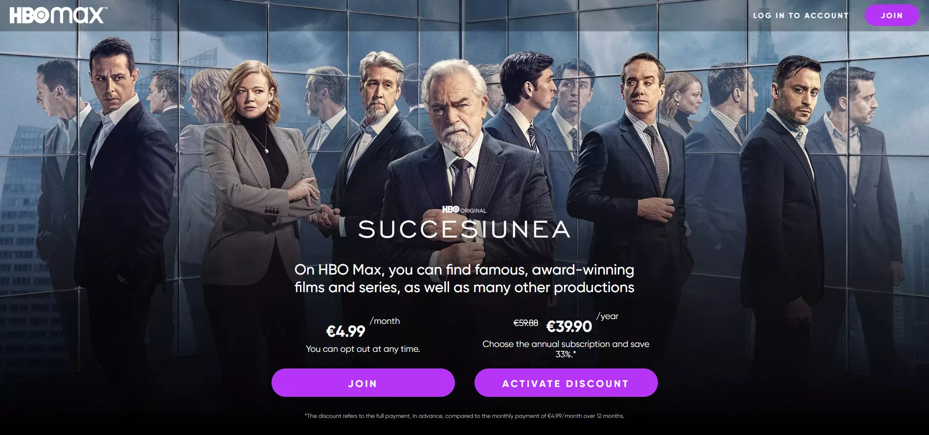
Ver página inteira: HBO Max
A HBO Max anuncia prontamente aos visitantes os géneros de filmes e séries disponíveis.
Repare nos dois botões CTA para as subscrições mensais e anuais. Os utilizadores obtêm um desconto substancial se subscreverem uma assinatura anual. No entanto, se não quiserem esse compromisso, podem facilmente optar por uma subscrição mensal.
24. Crunchyroll
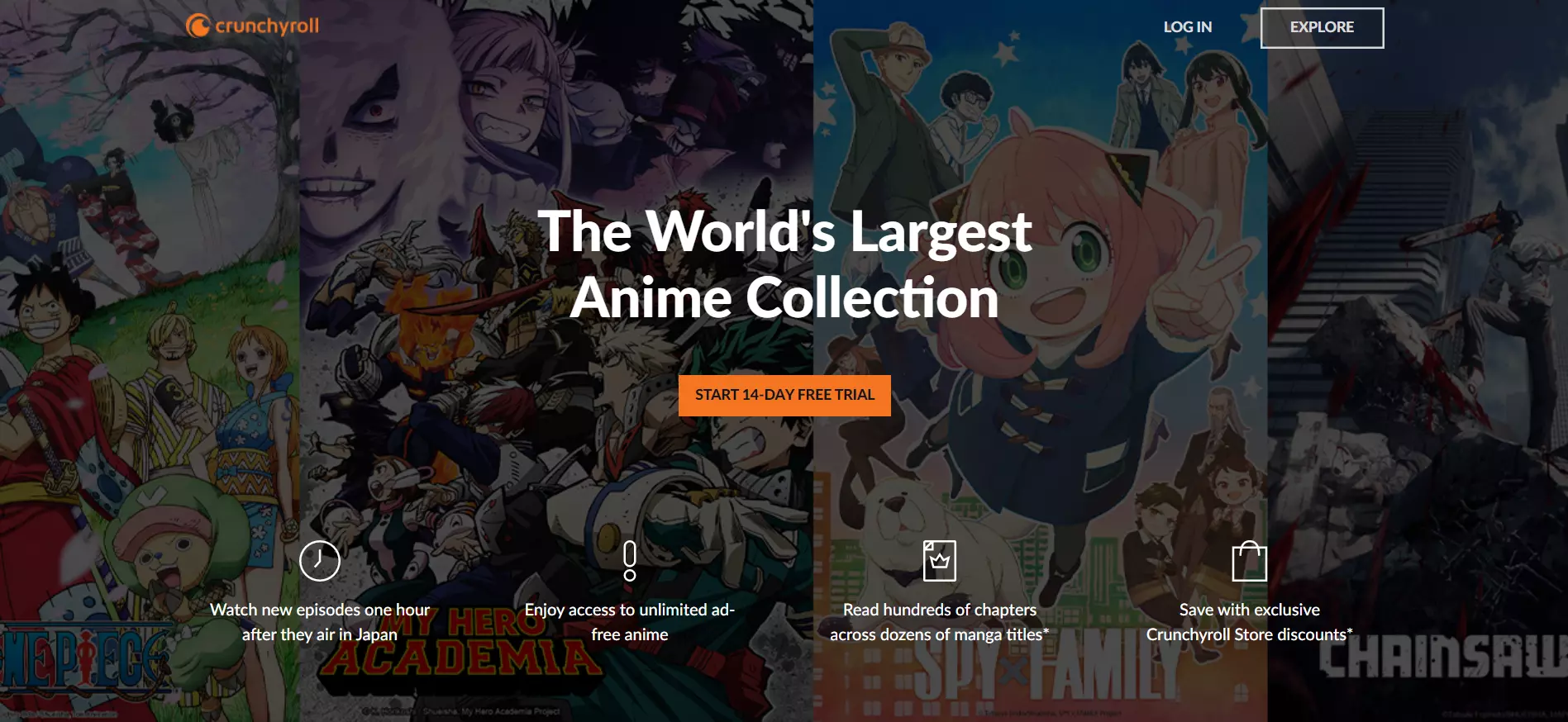
Ver página inteira: Crunchyroll
O cabeçalho da Crunchyroll refere explicitamente o ponto de venda exclusivo da plataforma, enquanto o CTA abaixo incentiva os visitantes a registarem-se para um período de teste gratuito, o que, posteriormente, pode originar potenciais subscrições pagas.
Os visitantes encontram mais informações sobre os planos de preços da plataforma abaixo da dobra.
25. Curiosity Stream
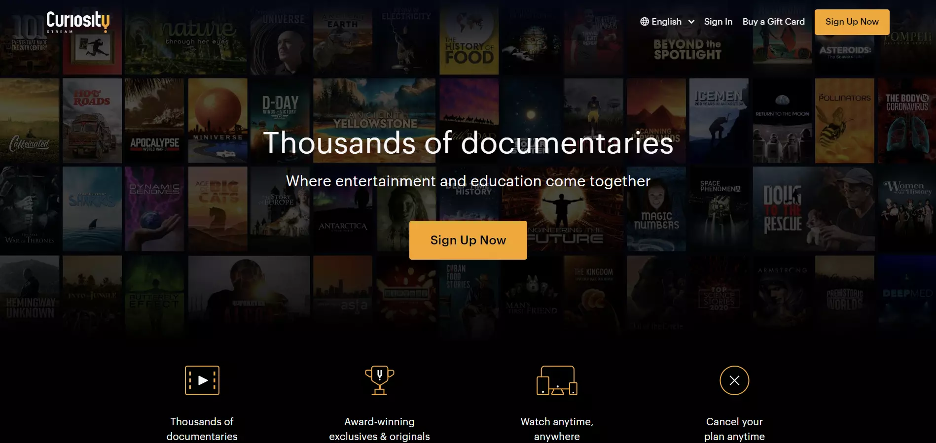
Ver página inteira: Curiosity Stream
Embora o Curiosity Stream partilhe um formato e um estilo bastante semelhantes ao Crunchyroll, esta page de vendas não disponibiliza um período de teste gratuito – em vez disso, persuade os utilizadores para uma conversão monetária direta.
Os planos de preços são também apresentados abaixo da dobra, mas o Curiosity Stream enfatiza o “Smart Bundle”, a sua subscrição mais cara.
Conclusão
Esperamos que estes 25 exemplos de landing pages de vendas sejam inspiradores e úteis na criação da sua própria page. A propósito, considere a utilização da Landingi.
A plataforma oferece mais de 400 modelos orientados para a conversão em vários setores, cada qual concebido para objetivos específicos (por exemplo, venda de produtos/serviços, venda incrementada, recolha de dados de contacto, etc.)
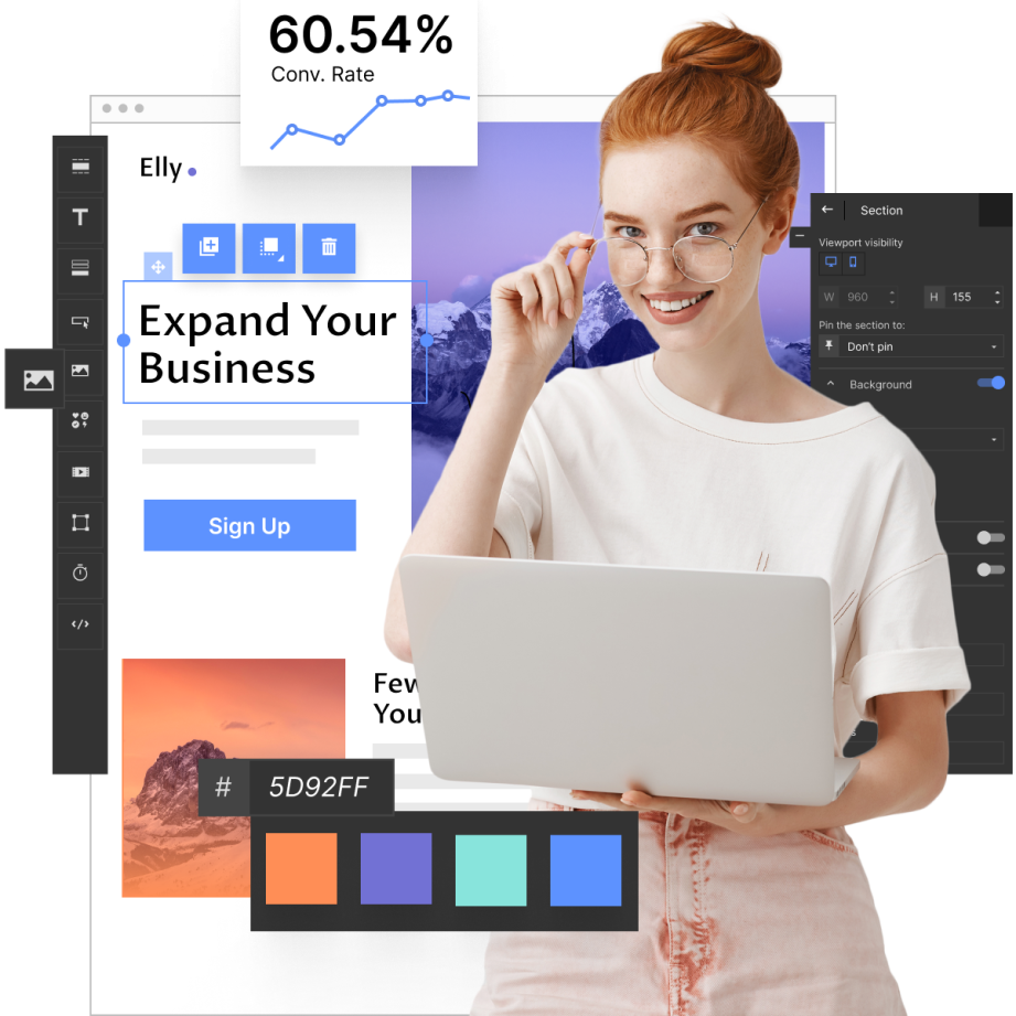
Adicionalmente, a perfeição visual da interface de arrastar e largar e as secções inteligentes da plataforma auxiliam numa personalização rápida e em série das pages, enquanto o rastreamento e a análise do comportamento do usuário permitem tomar decisões de design baseadas em dados.
Melhor ainda, pode começar de forma totalmente gratuita!