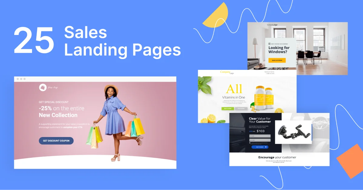
Sales landing pages are excellent for highlighting products/services and encouraging more conversions.
However, sounding too “salesy”, may lose visitors’ trust. But you can’t be too indirect either. An ineffective sales landing page won’t lead visitors down the path to making a purchase.
That said, this article will share various examples of sales landing pages to give you an idea of what you should do and what you shouldn’t. We’ll also share a few Landingi templates to show you how easy it is to set up these types of pages on your own.
But before we get into that, let’s first understand what sales landing pages are exactly.
What Are Sales Landing Pages?
Sales pages aim to boost a product’s/service’s sales. Unlike other page types (e.g., squeeze and lead-capture pages), aimed to gather visitors’ contact details, sales pages strictly focus on monetary conversions.
There are two types of sales landing pages:
- Short-form sales landing pages: These pages include a short yet catchy description of a product/service. These aim to drive purchases as quickly as possible and offer all the essential information for visitors to understand what they’re getting. Short-form pages are ideal for simple, affordable products that target warm leads.
- Long-form sales landing pages: These pages offer a detailed description of a product/service. They aim to thoroughly familiarize visitors with the promoted products/services, establish trust, and encourage more purchases. Long-form pages are excellent for more complex, premium products that target a cold audience.
Sales Landing Pages Vs. Regular Landing Pages: What’s The Difference?
As mentioned, regular landing pages can focus on multiple types of conversions, be it by persuading users to submit their contact details, downloading a freebie, etc.
In contrast, sales landing pages are fully dedicated to generating monetary conversions.
Additionally, sales landing pages are sometimes longer than their standard counterparts — they need to showcase the product/service in detail to educate visitors and get them to convert.
That said, let’s see some real-life examples.
25 Landing Sales Page Examples
1. NordVPN

View Full Page: NordVPN
NordVPN’s above-the-fold content rushes users to purchase the software. The headline shows an offer that’s hard to refuse — 63% off + 3 extra months.
The countdown timer below instills the Fear of Missing Out (FOMO), while the CTA button pops out through contrasting colors. The 30-day money-back guarantee further incentivizes visitors to signup. The top bar reveals an unprotected IP address, pushing visitors to act quickly.
The below-the-fold content compares NordVPN with its competitors, promotes a few upsells, and briefly states the product’s benefits.
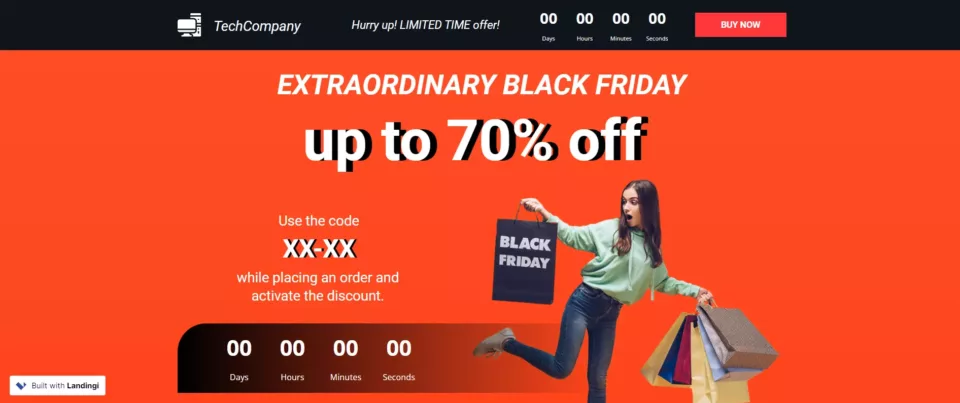
Build a page just like this one with Landingi’s Black Friday Sale template.
2. Surfshark
View Full Page: Surfshark
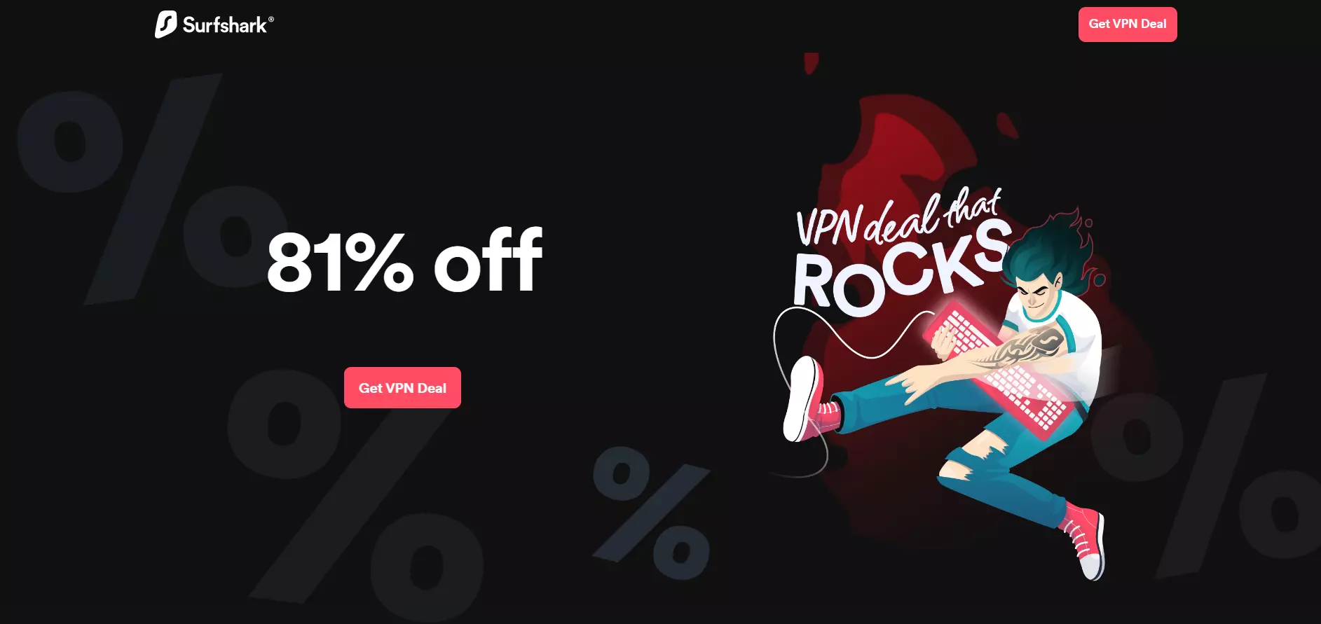
Surfshark takes minimalism up a notch. The large, white-on-black headline is attention-grabbing and straightforward.
The CTA button also stands out through its bright color, while the copy states exactly what Surfsharks wants its visitors to do.
Part of the illustration on the right is animated, attracting attention to the copy next to it.
Surfshark’s below-the-fold content compares the platform against its competitors, includes social proof, and goes into more detail about the platform’s benefits.
3. Keeper
View Full Page: Keeper
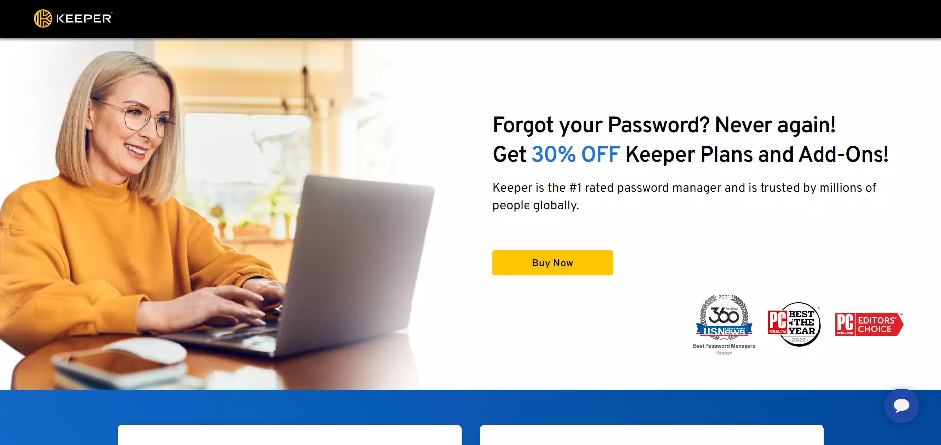
Unlike the other two examples above, Keeper goes for a less pushy approach, yet remains persuasive. The page’s headline starts with a question to engage visitors, while the rest of the copy presents the offer.
The tagline adds a trust element, which is reinforced with the trust badges below.
Keeper’s below-the-fold content showcases the platform’s pricing plans (with highlighted discounts), includes testimonials, and offers details about the platform’s benefits.
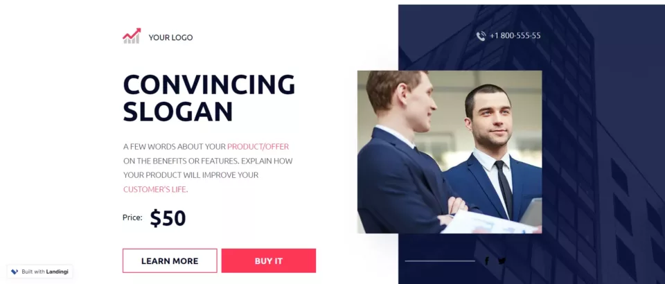
Build a page just like this one with Landingi’s Business Sales Page template.
4. Kaspersky
View Full Page: Kaspersky
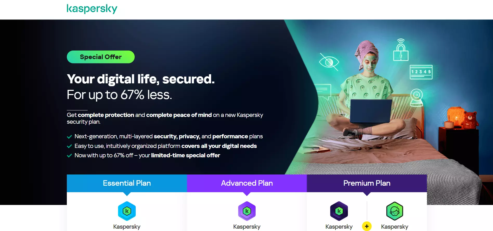
Kaspersky’s headline grabs attention by mentioning a 67% discount. The supporting copy highlights the product’s benefits under a bulleted list and instills FoMO (“limited-time special offer.”)
Visitors are then shown the platform’s pricing plans, nudging them to make a choice and secure a purchase on the spot.
5. Rosetta Stone
View Full Page: Rosetta Stone
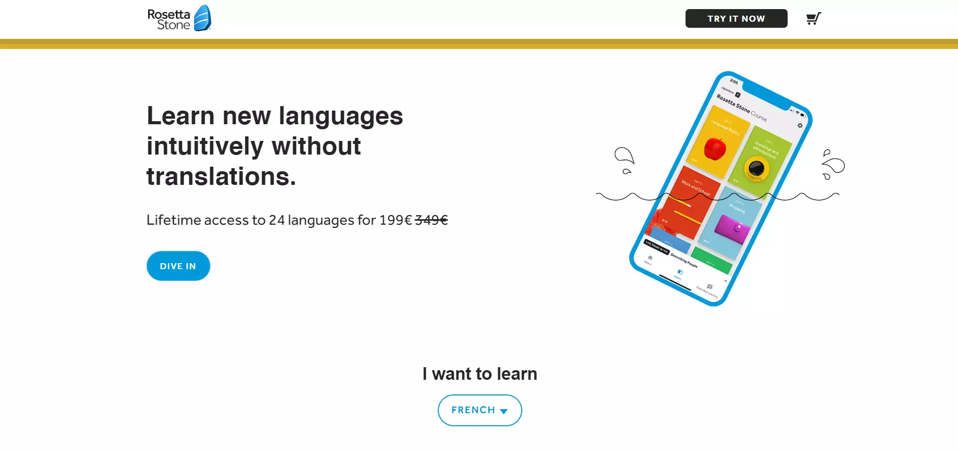
Rosetta Stone drives attention to the platform’s unique selling point, discount, and CTA through minimal design elements.
Visitors can learn more about pricing and benefits further down the page. Trust badges and testimonials are also found along the way. Moreover, the page includes an FAQ section.
6. Spotify
View Full Page: Spotify
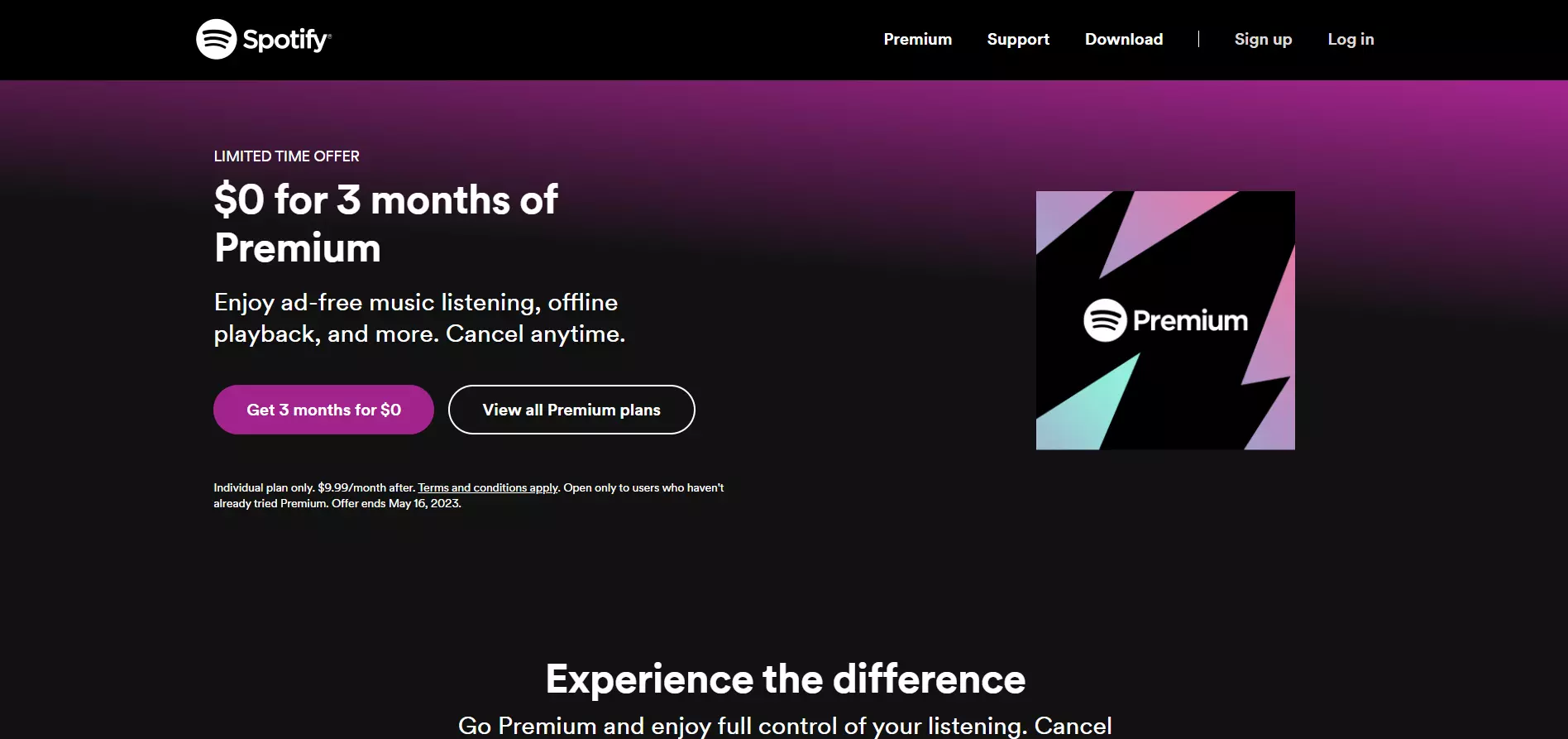
Spotify encourages visitors to try the platform’s Premium version for free to persuade users into opting for paid plans after the trial ends. The page’s headline stands out and presents the offer in a convincing manner.
The supporting copy shows the Premium version’s key benefits, while the CTA mirrors the headline’s copy and attracts attention through its vibrant color.
Spotify compares the free and Premium plans to further nudge users into signing up for the free trial below the fold.

Build a page just like this one with Landingi’s Your Music App template.
7. Bluehost
View Full Page: Bluehost
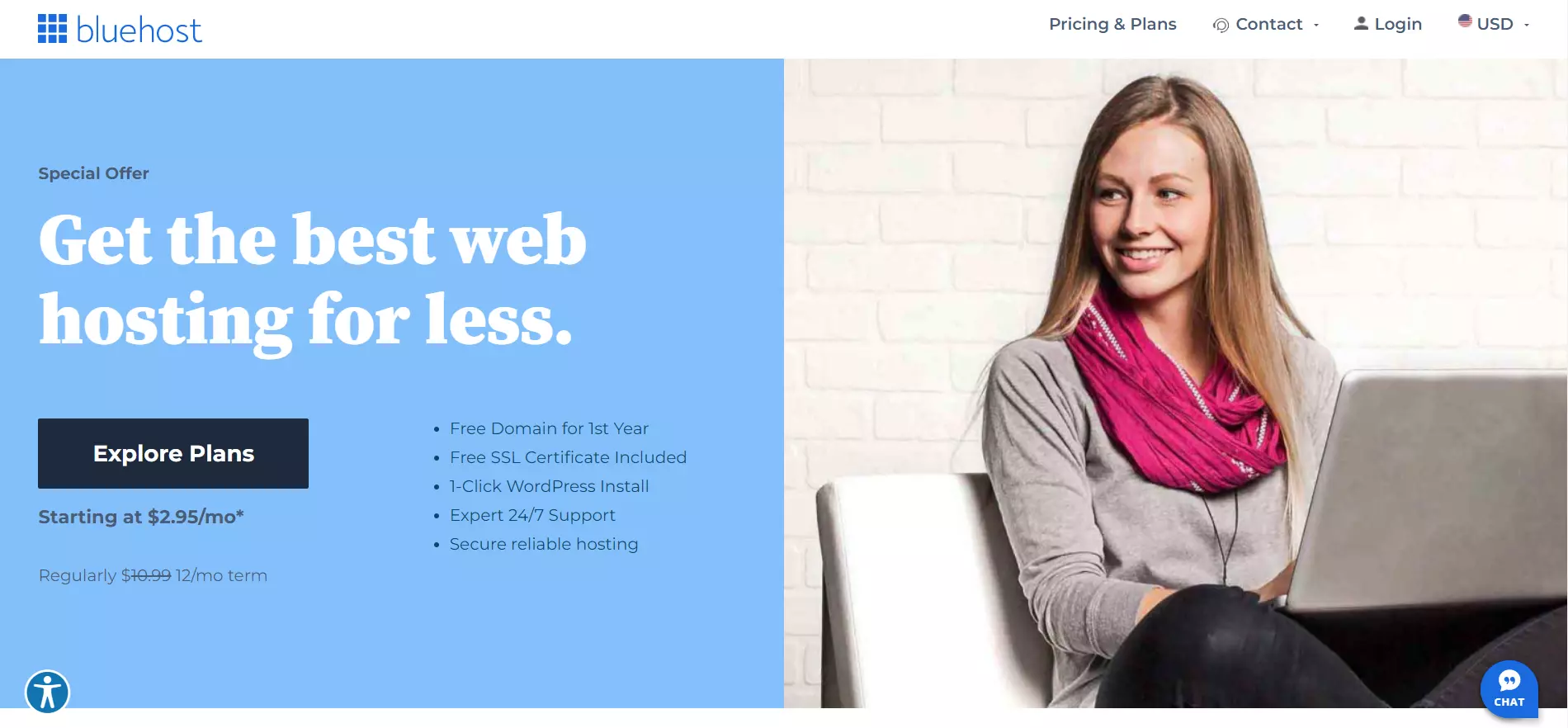
Bluehost uses a two-tone design to highlight the page’s headline, CTA, and showcase the platform’s offer. The headline stands out due to contrasting colors and promotes the platform’s main benefit.
Visitors can learn about what the deal includes through the bulleted list, while Bluehost’s pricing plans are included below the fold.
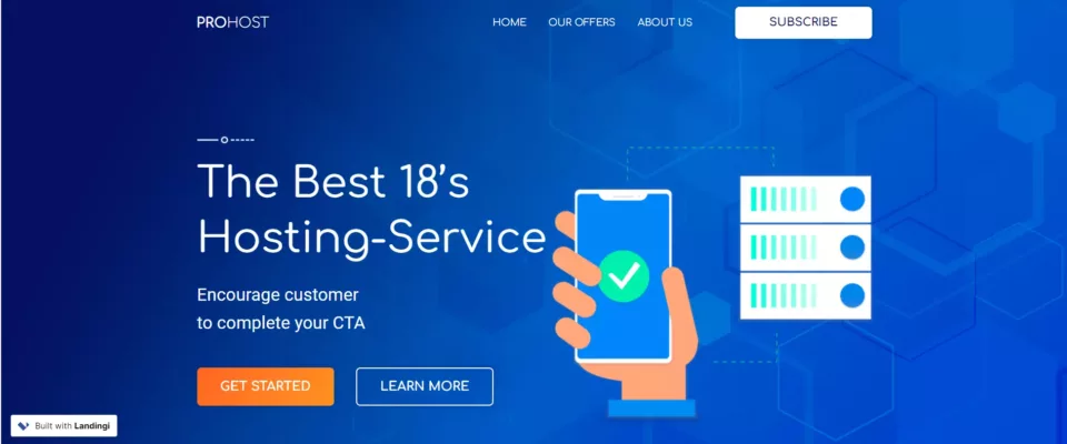
Build a page just like this one with Landingi’s Hosting Service template.
8. Apple
View Full Page: Apple
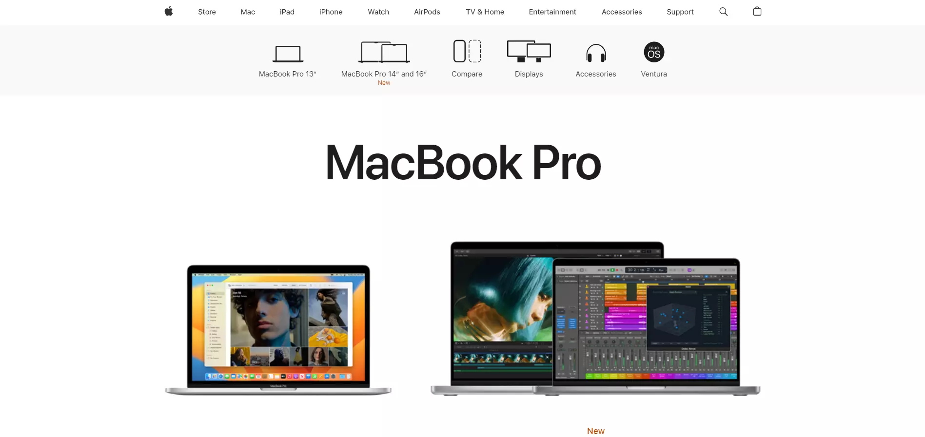
Apple’s sales page successfully reflects its brand identity — simple yet elegant.
This sales page promotes the MacBook Pro products. Users are greeted with two options above the fold and can learn more about other variants and their specifications as they scroll down.
Although the page’s simple design draws attention to the products, it doesn’t highlight their benefits or standouts. This may confuse visitors about what to choose.
9. Xbox
View Full Page: Xbox
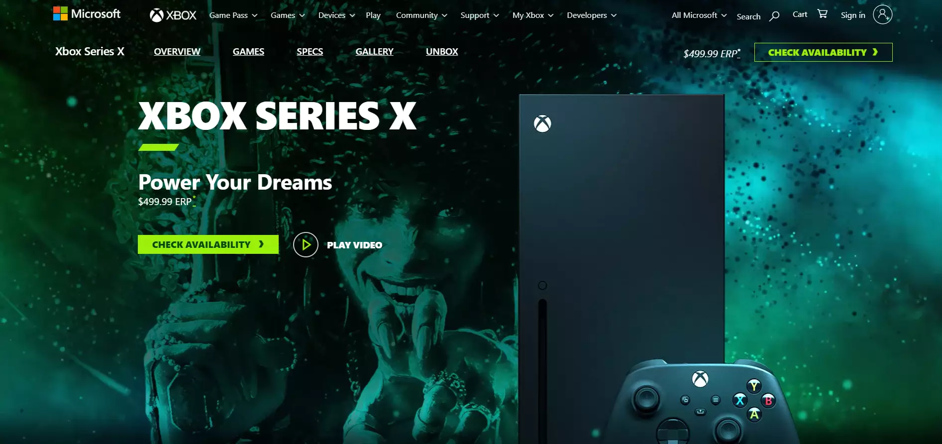
Xbox’s page drives attention toward the product and CTA through its minimalist design. The background is animated throughout the whole page, making it feel dynamic.
Visitors will find a long detailed description of the product’s specifications and benefits below the fold. The page includes videos and scrolling effects to maintain visitors’ attention as they scroll down.
10. Logitech
View Full Page: Logitech
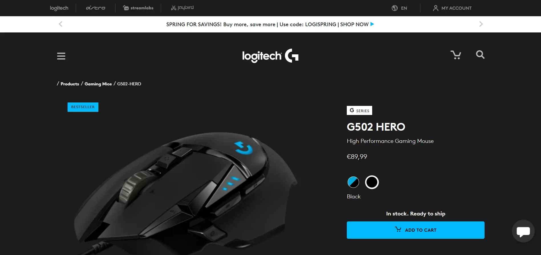
Logitech draws attention to its product through the page’s simplicity and large product image. The bright blue text box indicates that the mouse is a best seller, nudging users to purchase it.
The CTA stands out due to its size and lively color. The page also mentions free shipping, eliminating any factors that may deter users from converting.
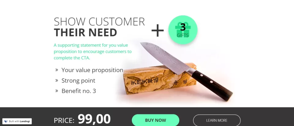
Build a page just like this one with Landingi’s Selling a Product template.
11. Jotter

View Full Page: Jotter
Jotter’s sales page is straight-to-the-point, yet highly attractive. The headline and tagline are placed in the center and convey a simple message — the product’s name and slogan.
Meanwhile, the background shows the product in action. Although placed on the bottom right, the CTAs stand out through bright colors. As such, the buttons attract attention without being too obtrusive.
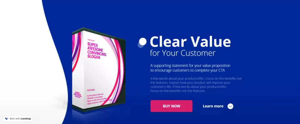
Build a page just like this one with Landingi’s Buy Software template.
12. Restream
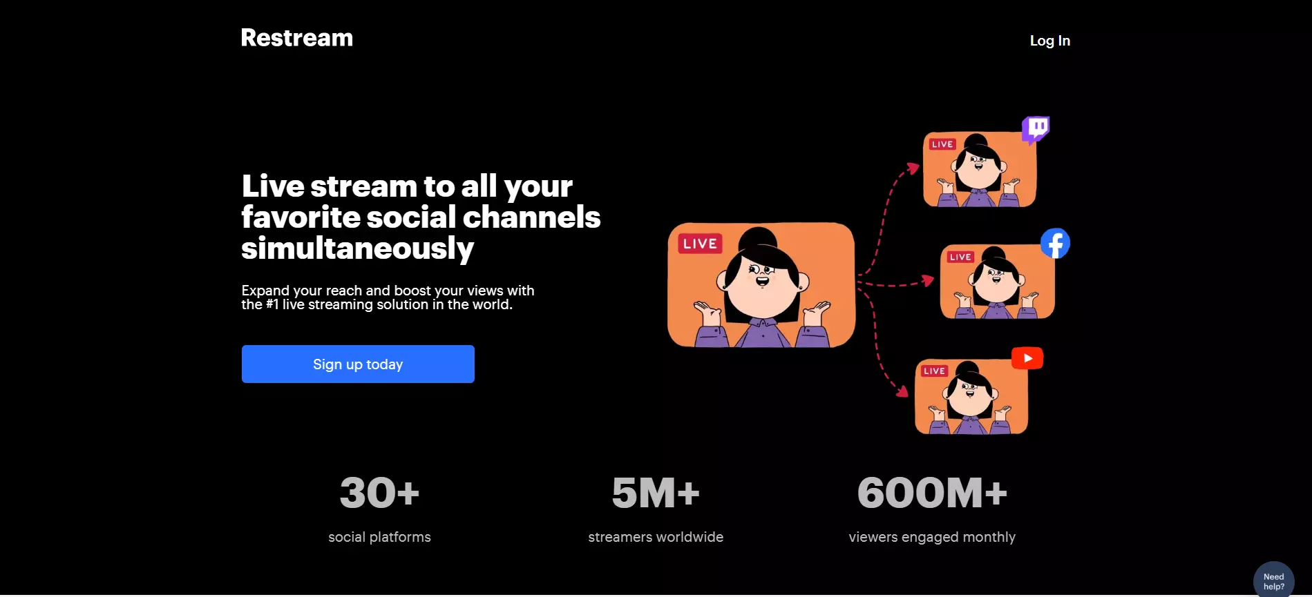
View Full Page: Restream
Restream’s headline, tagline, and CTA are in-line. This complements visitors’ natural reading patterns, ensuring that everything is read-through and nudging users to convert.
The headline clearly highlights the platform’s main benefit, while the supporting copy adds a trust element. The above-the-fold content closes with a highly visible and clear CTA. Additionally, the illustration on the right alludes to the platform’s capabilities.
13. Adobe Creative Cloud
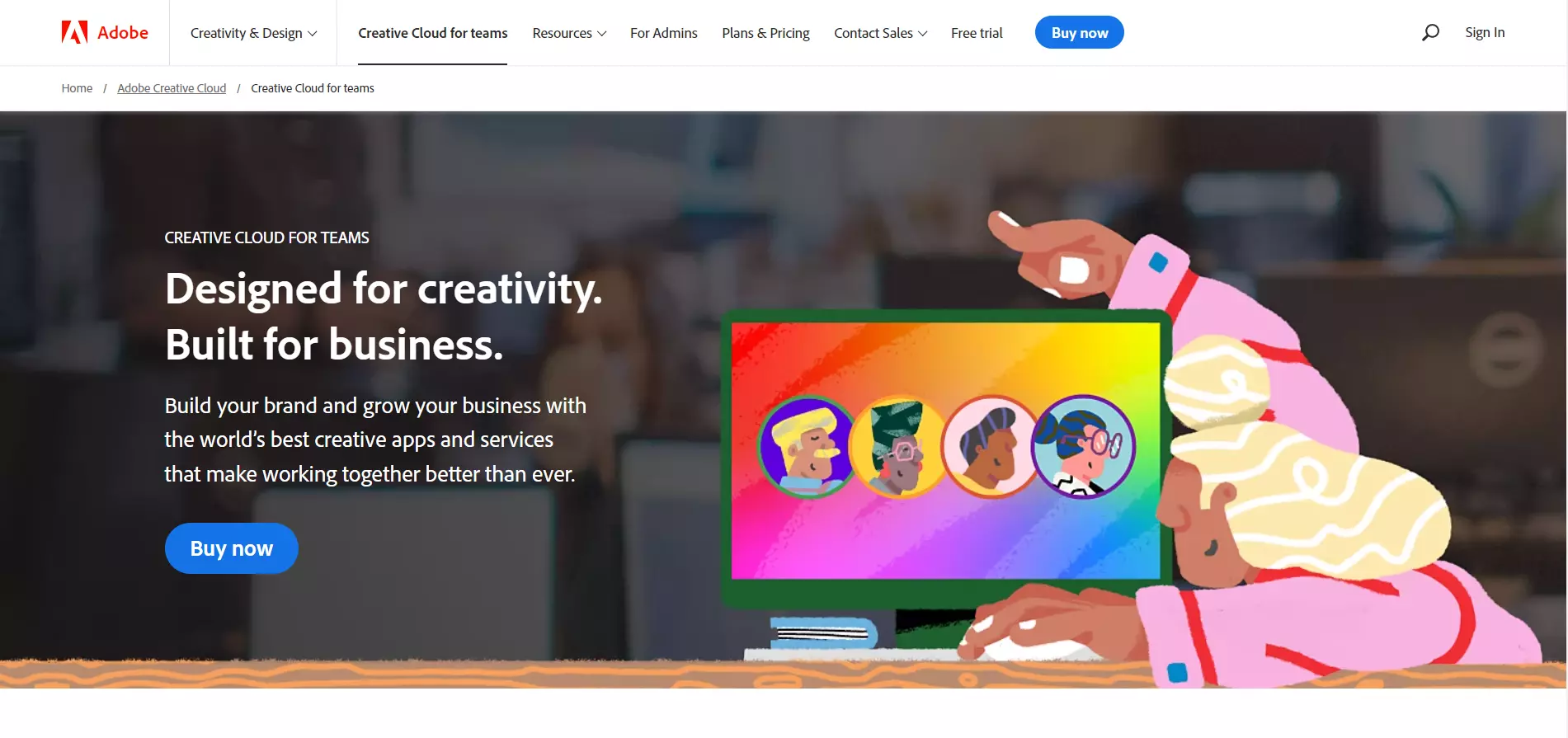
View Full Page: Adobe Creative Cloud
Adobe Creative Cloud’s headline and supporting copy express who the software is for and how it can benefit users. Meanwhile, the background illustrations show visitors what they can achieve with Adobe’s software.
The below-the-fold content further educates audiences about the product’s benefits and ends with a pricing plan as well as an FAQ section.
14. CorelDRAW
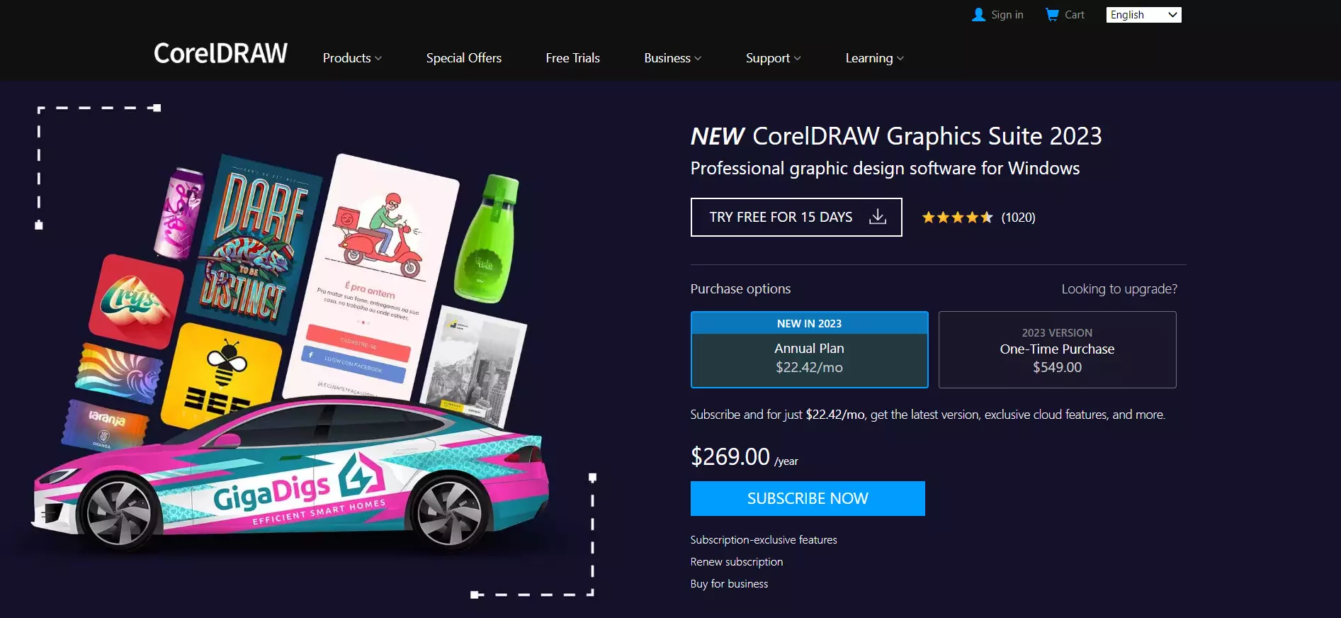
View Full Page: CorelDRAW
In contrast, CorelDRAW is more pushy. Pricing plans are visible as users land on the page. The CTA stands out and includes bold copy. The page aims to earn visitors’ trust by displaying the platform’s rating under the headline.
Also, CorelDRAW included a less visible CTA for the free trial. This acts as a last push to drive visitors who aren’t interested in purchasing the product to convert.
15. SmartDraw
View Full Page: SmartDraw
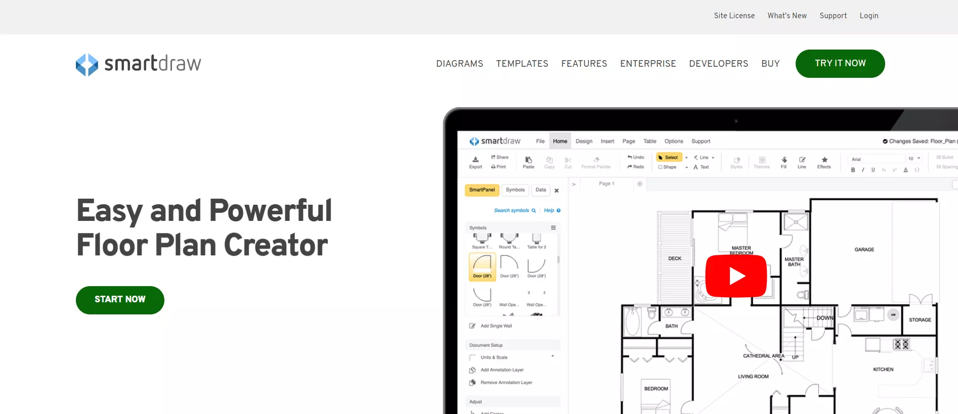
SmartDraw is light on copy and design elements. It instead relies on the video on the right to convey the product’s benefits. The page is also minimalist below the fold — it briefly explains the product’s benefits, includes trust badges, and concludes with testimonials.
16. AutoCAD
View Full Page: Autodesk
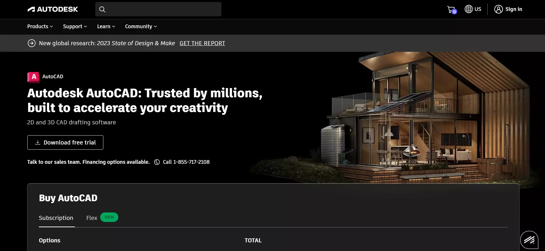
Although Autodesk’s page includes the software’s pricing plans, visitors also have the option to download a free trial. The background image suggests what users can achieve with the software, while the headline adds a trust element.
The below-the-fold content goes into more detail about what the product is, what to use it for, and its benefits.
17. Yoast SEO
View Full Page: Yoast SEO
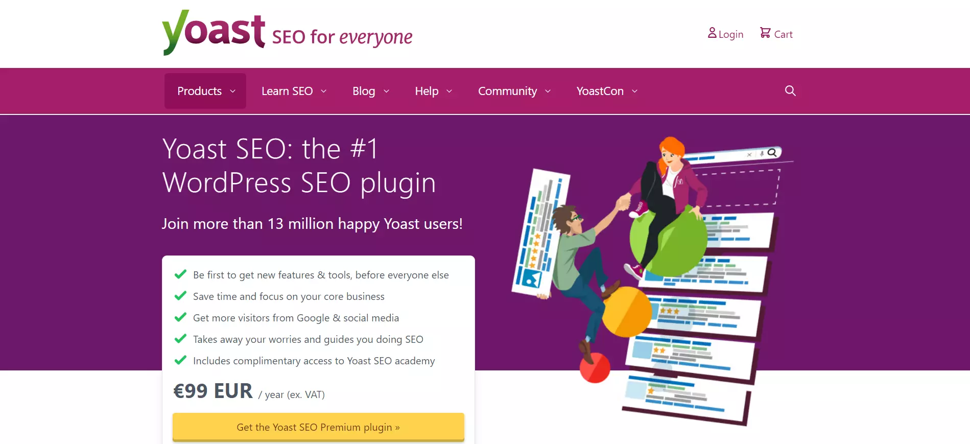
Yoast SEO adds an element of trust in the headline and supporting copy (“The #1 WordPress SEO plugin,” ”Join more than 13 million happy Yoast users.”) The sales page highlights the product’s benefits under a list format — perfect for readability.
The CTA stands out and uses clear copy. Visitors can learn how the product works via a video placed below the fold.
18. AdRoll
View Full Page: AdRoll
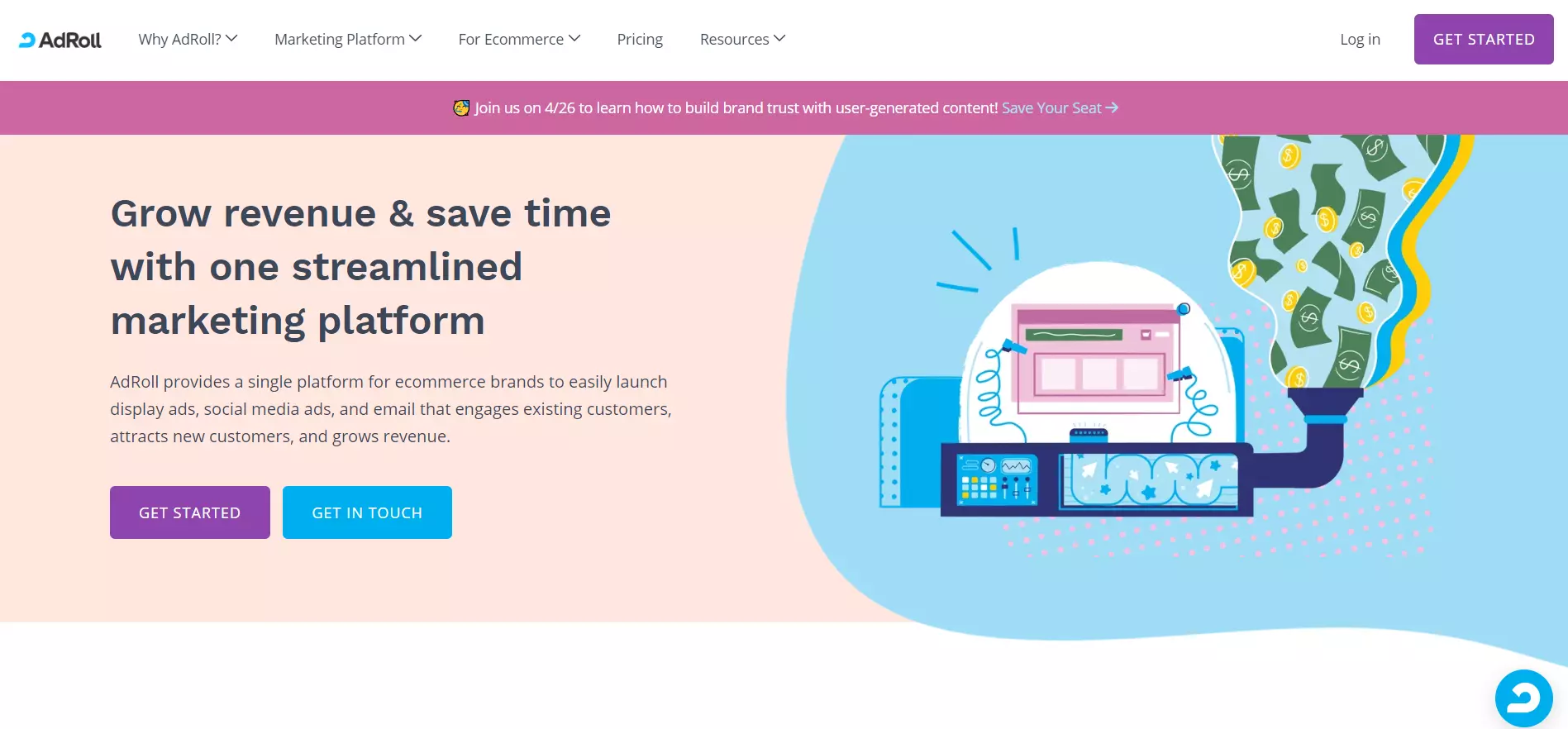
AdRoll uses pastel colors to make the sales page inviting and easy on the eyes. The page’s headline clearly states how the software can help, while the supporting copy concisely explains what AdRoll does.
The page includes logos of companies AdRoll worked with and a detailed description of the product’s benefits below the fold.
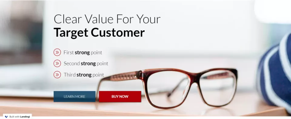
Build a page just like this one with Landingi’s Pro Services template.
19. Constant Contact
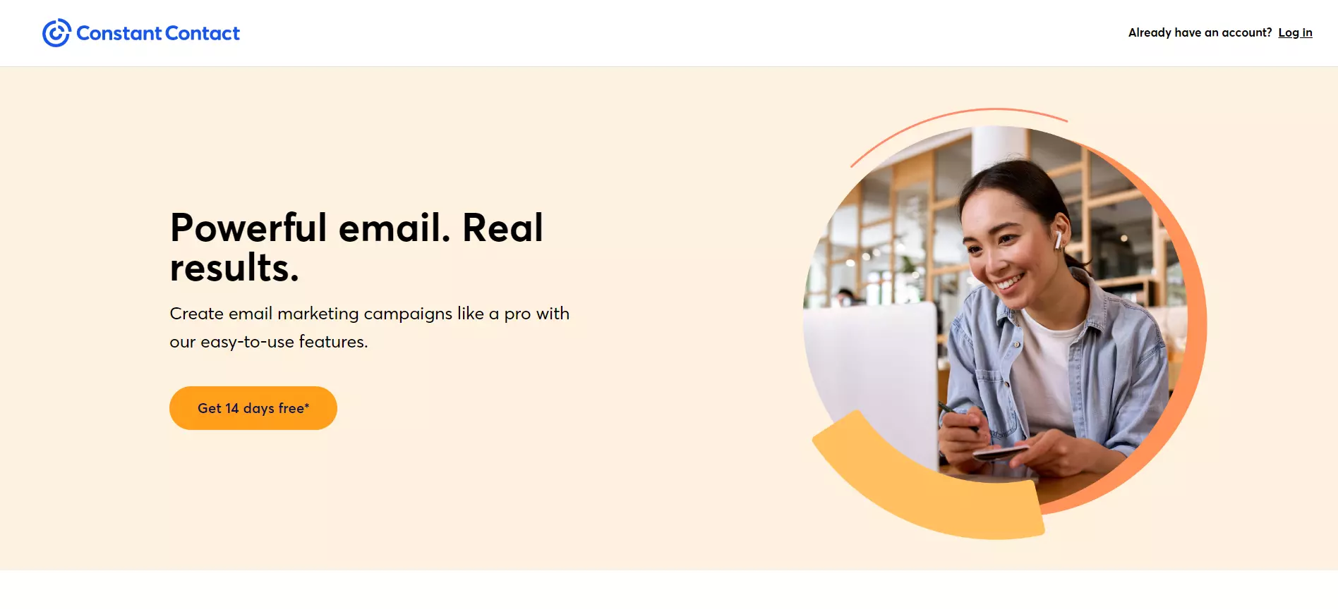
View Full Page: Constant Contact
Rather than pushing users to opt for a paid plan, Constant Contact invites visitors to a free trial. This eliminates friction and maximizes conversions in the long run, as users are more likely to subscribe to a paid plan after the trial ends.
The sales page is highly minimalist. The headline is catchy while the tagline briefly describes the product’s benefits and what users can do with it.
20. Scrivener
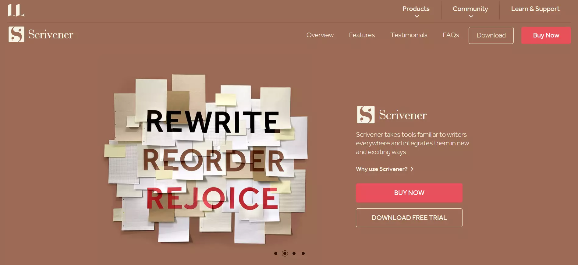
View Full Page: Scrivener
Scrivener’s copy briefly states what the software does, while the page gives visitors the option to either purchase the product or download a free trial. The Buy Now CTA stands out due to its contrasting colors.
Users can read a detailed description of the product’s key functionalities by scrolling down the page.
21. MTE
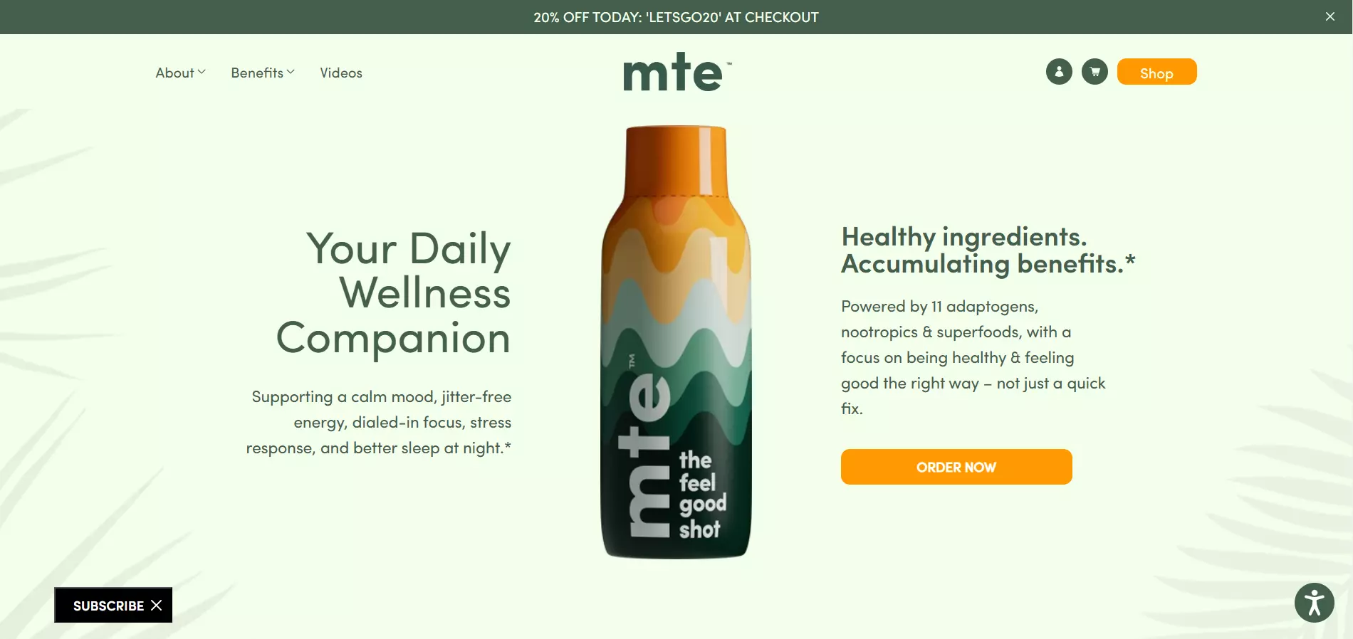
View Full Page: MTE
MTE draws attention to the product by placing it in the center of the webpage. The copy surrounding it shows the product’s main benefits, while the CTA is eye-catching. Also, the sticky bar notifies users of a discount, incentivizing them to make a purchase.
Below the fold content includes customer testimonials and more information about the product’s ingredients.
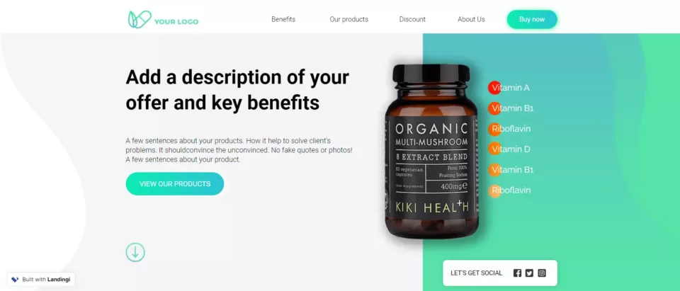
Build a page just like this one with Landingi’s Vitamins & Dietary Supplements template.
22. Air up
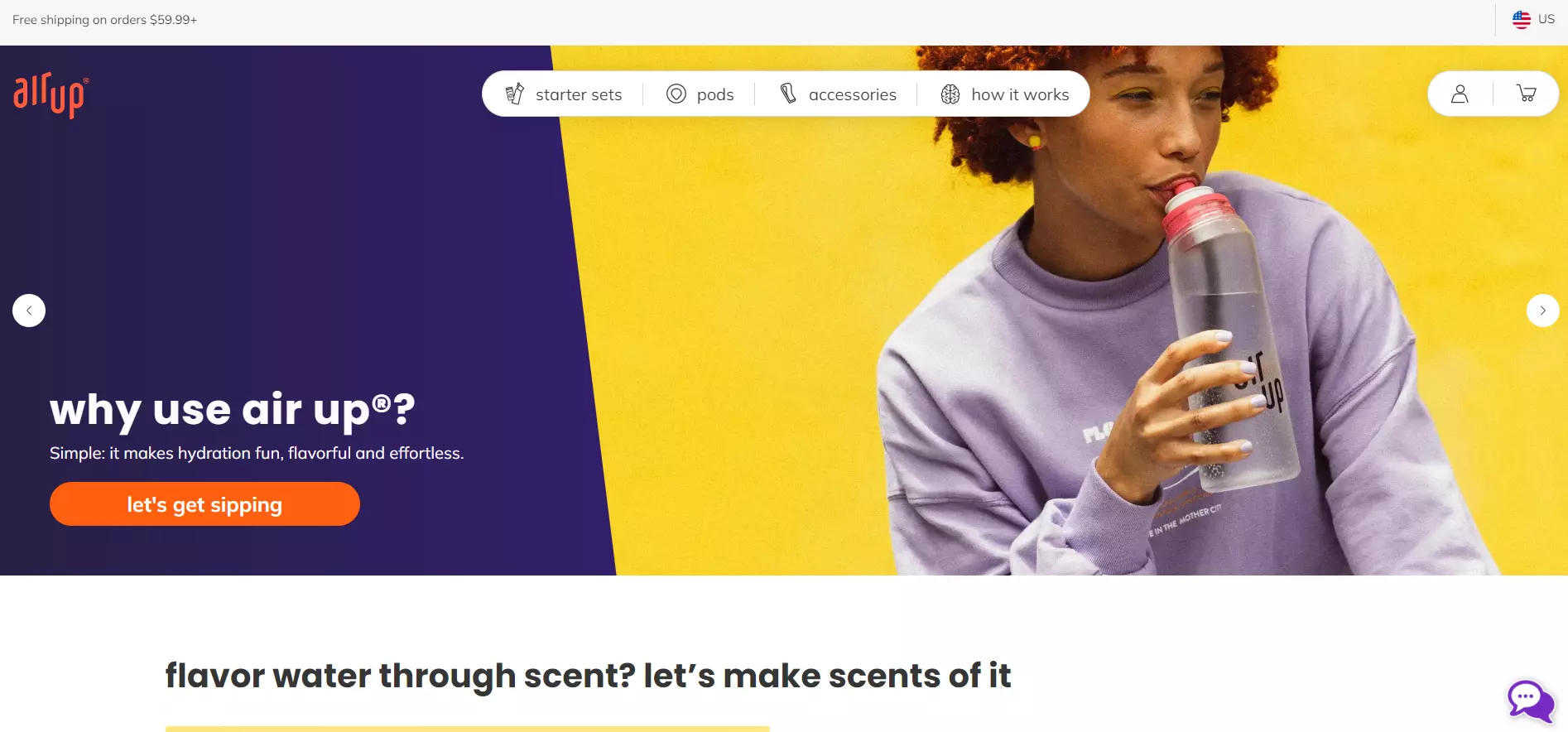
View Full Page: air up
Air up’s two-tone design makes the page more attractive and drives attention towards the CTA and headline.
The headline uses a question to engage visitors, while the supporting copy provides the answer, persuading users to click the CTA. Visitors can scroll down to learn how the product works and browse other offers.
The page closes with testimonials, trust badges, and an FAQ section.
23. HBO Max
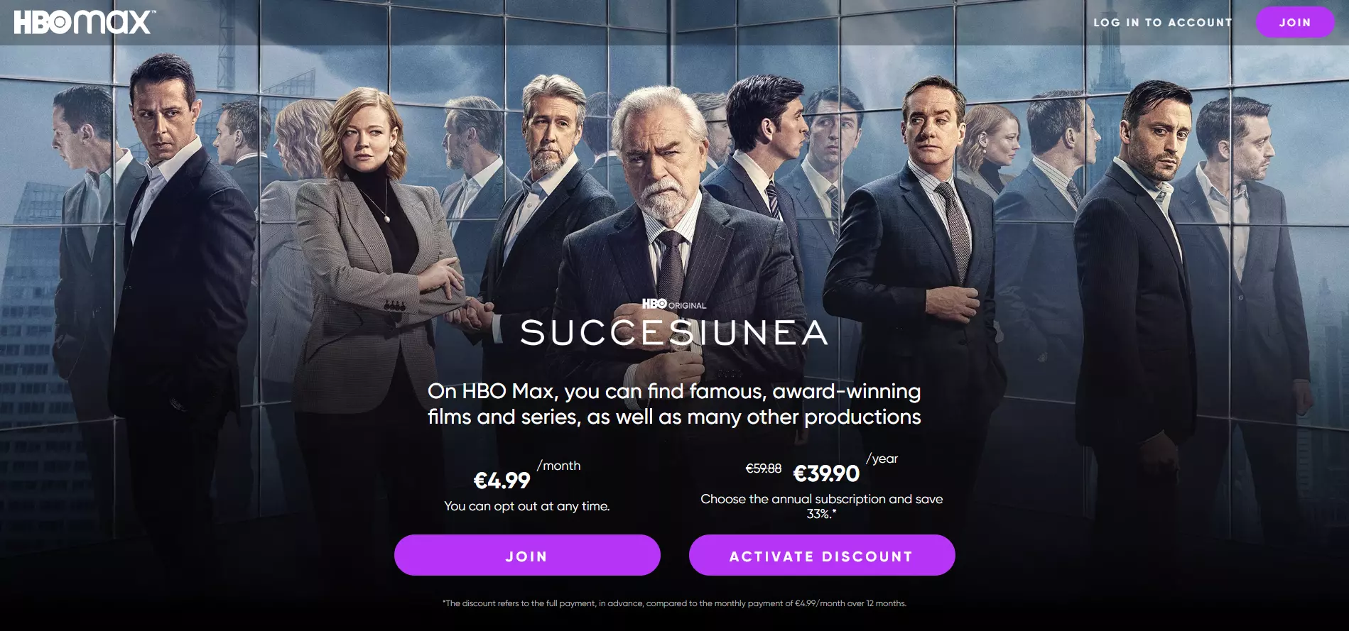
View Full Page: HBO Max
HBO Max immediately lets visitors know what types of movies and TV shows are available.
Notice the two CTA buttons for monthly and yearly subscriptions. Users get a substantial discount if they signup for a yearly subscription. However, if they aren’t ready to commit, they can easily opt for a monthly subscription instead.
24. Crunchyroll
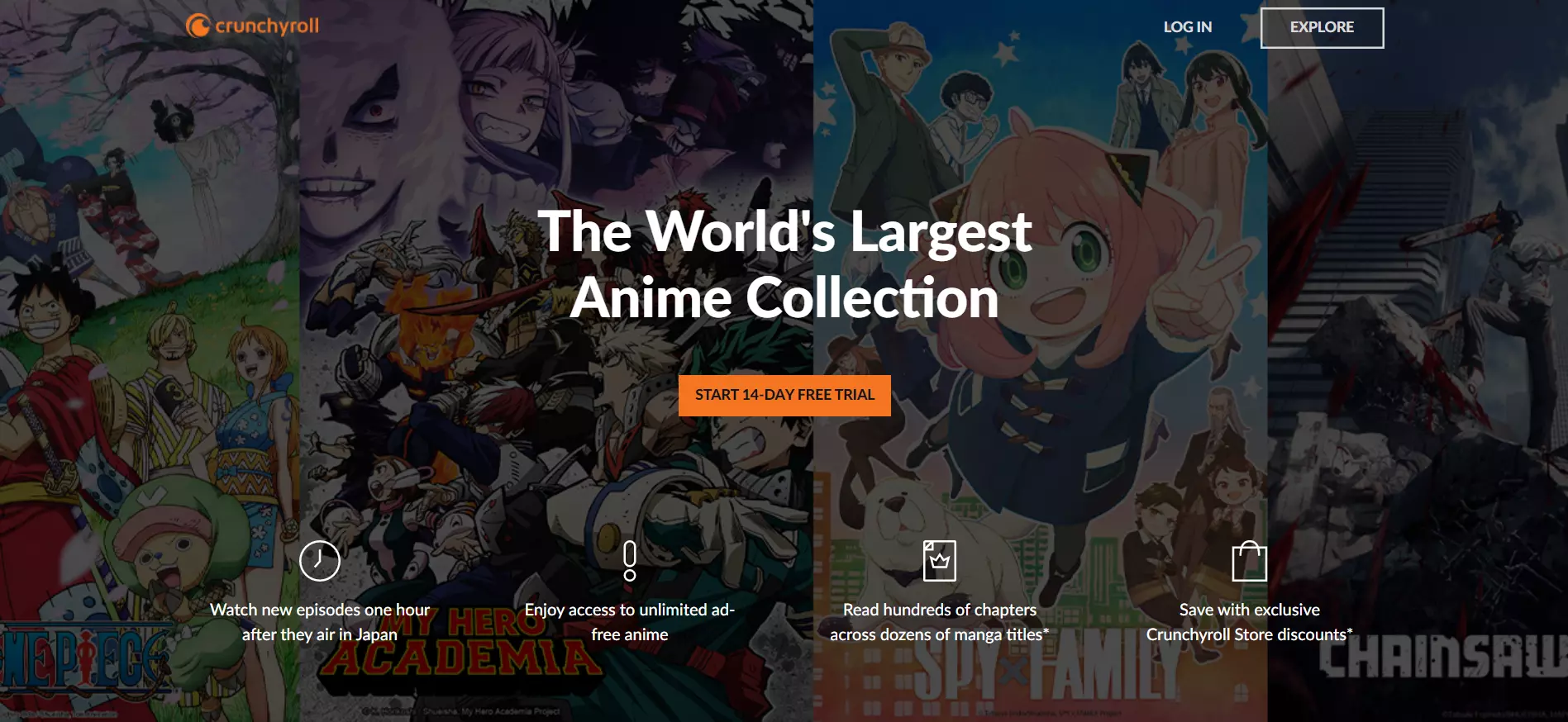
View Full Page: Crunchyroll
Crunchyroll’s headline clearly states the platform’s unique selling point, while the CTA beneath encourages visitors to signup for a free trial, leading to more potential paid subscriptions further down the road.
Visitors can find more information about the platform’s pricing plans below the fold.
25. Curiosity Stream
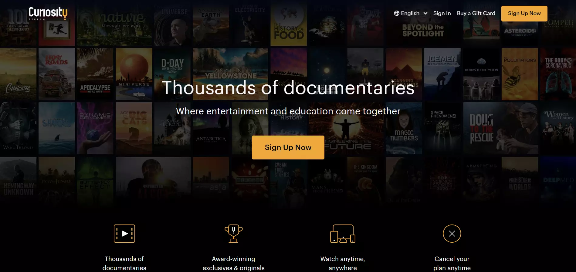
View Full Page: Curiosity Stream
Although Curiosity Stream shares a rather similar layout to and style to Crunchyroll, this sales page doesn’t offer a free trial — it instead pushes users straight to a monetary conversion.
The pricing plans are also present below the fold, but Curiosity Stream heavily emphasizes the Smart Bundle, its most expensive subscription.
Conclusion
These 25 sales landing page examples will hopefully inspire you and guide you in creating your own. Speaking of which, consider using Landingi.
The platform covers 400+ conversion-driven templates spanning multiple industries, each built for specific goals (e.g., selling products/services, upselling, gathering contact data, etc.)
Additionally, the platform’s pixel-perfect drag-and-drop interface and Smart Sections help you customize your pages quickly and at scale.
