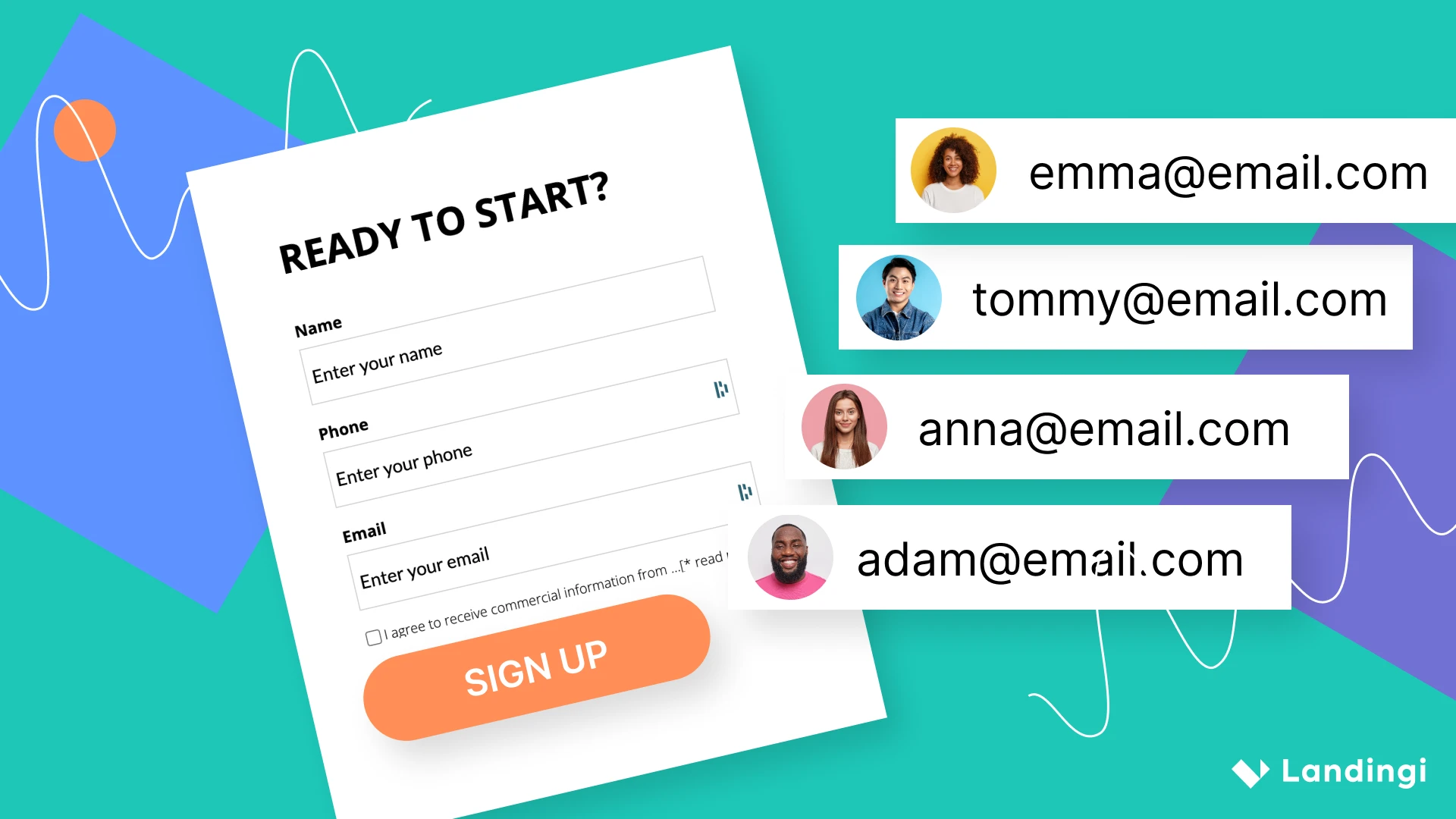
Struggling to turn form views into actual submissions? Improving form conversion is one of the fastest ways to capture more leads when your forms live on well-optimized landing pages. A high-converting landing page doesn’t just display a form – it reinforces it with clear messaging, a clean layout, and strong alignment with visitor intent.
This guide provides actionable tactics for increasing form completions without frustrating your users. You’ll discover how to simplify form design, eliminate friction, and make smart tweaks that work seamlessly within your landing page experience.
According to Formisimo, average form conversion rates are 17.5% on desktops, 16.9% on tablets, and 12.7% on mobile. With the right adjustments, you can outperform these benchmarks and capture more value from every visit.
From mobile responsiveness and intuitive layouts to personalized elements and continuous optimization, this article will help you transform your forms into powerful lead-generating tools, so every click has a better chance of becoming a customer.
What Is the Meaning of Convert Form?
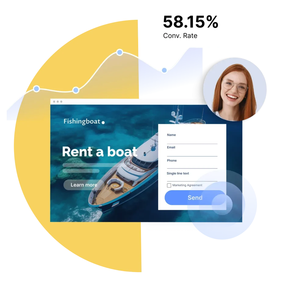
A convert form is a webpage element used to turn visitors into leads, subscribers, or customers. Its main purpose is to collect visitor information (such as name or email address) in exchange for something of value, like a free trial, downloadable guide, newsletter signup, or product offer.
The effectiveness of a convert form is often measured by its conversion rate, which indicates the percentage of visitors who complete the form out of the total number of visitors to the page.
To better understand the meaning of convert forms, check out the following 8 examples of how they are used:
1. Email Newsletter Sign-Up
Purpose: Collect email addresses for sending newsletters, updates, or promotional content.
Example: A form prompting users to subscribe to a weekly newsletter for the latest industry news.
2. Free Trial Registration
Purpose: Gather information to provide access to a free product or service trial.
Example: A software company offering a free trial of its product through a sign-up form.
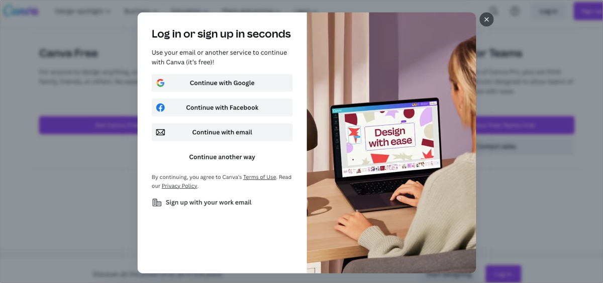
3. Ebook or Whitepaper Download
Purpose: Capture details in exchange for access to downloadable resources like ebooks, whitepapers, or reports.
Example: A form where users submit their email to receive a free downloadable guide or research paper.
4. Webinar or Event Registration
Purpose: Collect attendee information for online webinars, workshops, or events.
Example: A registration form for an upcoming webinar on digital marketing trends.
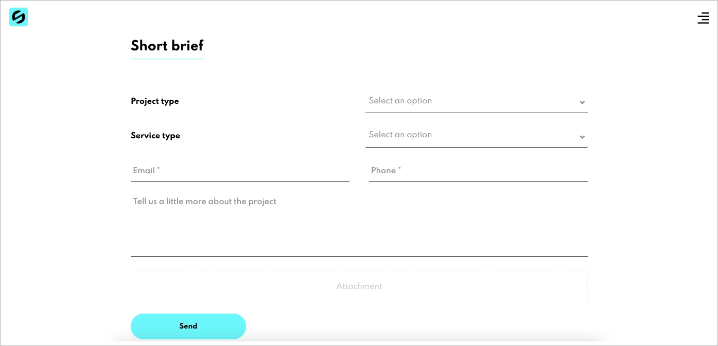
5. Contact or Inquiry Forms
Purpose: Allow visitors to ask questions or request more information about products or services.
Example: A “Contact Us” form for inquiries or support requests.
6. Product Purchase Checkout
Purpose: Facilitate the process of buying products or services online.
Example: An e-commerce checkout form where customers provide shipping and payment information.
7. Membership or Subscription Sign-Up
Purpose: Register users for memberships or paid subscriptions.
Example: A sign-up form for a monthly subscription box or a premium content platform.
8. Feedback or Survey Forms
Purpose: Collect customer feedback or survey responses for market research or customer service improvement.
Example: A post-purchase feedback form asking customers to rate their shopping experience.
In essence, form conversion refers to the process of a user completing and submitting an online form on a website or app. A higher conversion rate generally leads to more leads, customers, or subscribers, depending on the form’s purpose.
Simplify your forms, cut the noise, and guide visitors straight to “submit.” Clean design = better results.
Each type of conversion form serves a specific goal, such as generating leads or making direct sales. To increase effectiveness, use clear instructions, limit the number of fields, and add a strong call to action.
One important metric is the contact form conversion rate, which reflects how well the form generates potential clients. Focusing on form conversions helps improve the user experience and overall results. This aspect is often the most challenging, as explained below.
Why Landing Page Design Shapes Your Form Conversion Rate?
Landing page design directly impacts whether visitors complete your form or leave without converting. Even a well-crafted form can underperform if it’s buried in a cluttered layout, hard to locate, or misaligned with user intent.
High-converting landing pages prioritize the form as the central goal. This includes using clean layouts, compelling headlines, and visuals that guide users toward the form. Removing distractions like menus or excess content keeps users focused. Strategic placement (such as above the fold or immediately after the key message) can significantly improve conversion rates.
Landingi’s built-in form builder makes it easy to create forms that work seamlessly with your landing pages. Add multi-step fields, drop-downs, checkboxes, file uploads, and validation tools like reCAPTCHA – all without writing code. You can sync form data with CRMs, marketing automation platforms, or email tools to automate lead management and follow-up.
You can fully customize your form and landing page to match your brand, and all forms are mobile-friendly by default. Combined with thoughtful landing page design, these tools help you capture more leads, streamline your workflow, and create better experiences for every visitor.
Your form deserves the spotlight! Create landing pages that guide users straight to action—with zero friction.
What Is a Good Form Conversion Rate?
A good online form conversion rate averages 21.5%, according to WPForms. However, this number varies by industry, form type, and business goals.
The 5 essential factors that influence form conversion rate include the following:
1. Form length
Form length plays a key role in conversion rates. Shorter forms with fewer fields are more likely to be completed. Users tend to avoid forms that seem time-consuming or overly complex. The goal is to balance information gathering with user convenience, as shown in the example below.

For instance, multi-step lead generation forms, such as a sign-up form, are known to be more user-friendly and yield higher conversion rates. By breaking a long form into multiple pages, each asking for a bit more information, users are less likely to feel overwhelmed by too many form fields. This approach blends ease of use with a playful experience, which is especially beneficial when extensive data collection is required.
2. Clarity of the CTA
The call to action (CTA) directs users on what to do next. A clear, action-oriented CTA increases the chances of form completion. The submission button should be concise, visually distinct, and easy to understand. In some cases, design elements like shape and color can convey the message without words, as shown below.

3. Page design
The overall page design influences user engagement and trust. A clean layout, appealing visuals, and intuitive navigation encourage users to complete the form. Techchak’s landing page, for example, shows how a well-designed interface can lead to higher form completion. In contrast, cluttered or poorly designed pages often reduce conversions.

4. User trust
Building trust is essential for strong form conversion rates. This involves protecting user data and clearly communicating privacy and security practices. Trust can be reinforced through security badges, transparent privacy policies, and other credibility signals. Users must feel confident that their sensitive data, such as birth date, is safe and handled responsibly.
Avoid asking for sensitive information unless absolutely necessary. If certain fields aren’t needed for your marketing goals, remove them or mark them as optional.
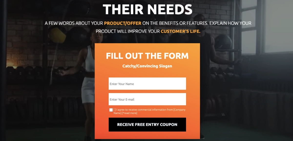
5. Incentives offered
Offering incentives can increase form conversion rates. These might include exclusive content, contest entries, discounts, or free trials. Incentives motivate users to complete the form by offering something of value. The key is to align the offer with the audience’s interests, as shown in the example below.
Businesses must understand their industry benchmarks and continuously optimize their forms to enhance user experience and maximize conversions.
Feathery statistics showcase the 4 main reasons for form abandonment as the following:
- Security concerns – representing 29% of form abandonment, users often leave forms due to worries about the security of their personal information.
- Form length – for 27% of abandonment, long forms can overwhelm or discourage users from completing the process.
- Advertisements or upselling – this causes 11% of users to abandon forms, as they may feel distracted or annoyed by such marketing tactics.
- Unnecessary questions – making up 10% of the abandonment rate, users often leave when faced with questions they perceive as irrelevant or intrusive.
How Can I Improve My Form Conversion?
To improve form conversion, give users a clear reason to complete the form (such as exclusive content, discounts, free trials, or contest entries) and apply these five strategic steps:
- Personalization,
- Mobile optimization,
- User-friendly design,
- Accessibility,
- Continuous improvement.
1. Personalization
Personalization plays a key role in improving form conversion because it enhances the user experience. Tailoring the form to individual users increases the likelihood of completion. It also reveals what resonates with your audience, helping you design forms that drive more conversions.
To implement personalization, try several techniques:
- User data utilization – make use of existing data about the user (like name, location, past interactions) to pre-fill form fields. This reduces the effort required by the user and makes the form feel more relevant and engaging.
- Segmentation-based forms – create different versions of the form for different segments of your audience based on demographics, behavior, or past purchases. This ensures that the form’s content, language, and offers are tailored to the specific needs and interests of each group.
- Dynamic form fields – implement fields that change based on the user’s selections or responses within the form. This creates a more interactive and responsive experience, adapting to the real-time user’s needs.
- Personalized CTAs – tailor the CTA based on the user’s journey or past interactions with your site. Personalized CTAs are more compelling and can significantly increase the likelihood of form submission.
- Contextual forms – place forms in a context that aligns with the content the user is currently engaging with. For instance, a form on a blog post could be related to the topic of the post, making it more relevant to the reader.
- Feedback-driven adjustments – use feedback or data from form interactions to continuously refine and personalize the form experience. This can include adjusting the form based on user drop-off points or questions that frequently lead to abandonment.
- Localized content – customize the form based on the user’s location, using local language, currency, or region-specific offers. Localization makes the form more relatable and easier to understand for different audiences.
By integrating these personalization strategies, you can make your forms more relevant, engaging, and practical, leading to higher conversion rates and better user experiences.
Tailor your landing page content and forms to where they are and what they want. Small tweaks, big conversions.
2. Mobile optimization
Mobile optimization is essential as most users now access the internet through mobile devices. A mobile-friendly form improves the user experience and boosts conversion rates.
To optimize forms for mobile devices, realize the following examples:
- Responsive design – ensure the form adjusts automatically to fit different screen sizes and resolutions. Responsive forms provide a seamless experience across devices, from desktops to smartphones.
- Simplified layout – use a simple, clean layout that is easy to navigate on a smaller screen. Minimize the use of columns and ensure that form fields are large enough to be easily tapped.
- Larger form fields and buttons – make form fields and buttons large enough to be easily tapped on a touch screen. This reduces the likelihood of errors and frustration for the user.
- Minimized typing requirement – reduce the amount of typing required by using dropdowns, sliders, or switches. Offer options like autofill and remember user details for returning visitors.
- Quick load times – optimize for fast loading on mobile devices by compressing images and using mobile-friendly code. Fast loading times are crucial for keeping mobile users engaged.
- Clear and concise content – use clear, concise language and avoid long paragraphs of text. Mobile users often skim content, so key points should be immediately apparent.
- Accessible error messages – provide clear, easy-to-understand error messages that guide users on how to correct mistakes. Ensure these messages are visible without needing to zoom in or scroll excessively.
- Optimized CTA buttons – ensure CTA buttons are prominently displayed and accessible to click on a mobile device. Consider the thumb-friendly zone for ease of access.
- Touchscreen-friendly navigation – ensure all navigation elements are optimized for touchscreen use. Avoid hover elements, which are not practical for touch screens.
- Testing on multiple devices – regularly test the form on various mobile devices to ensure consistent performance. Identify and fix any device-specific issues.
By implementing these mobile optimization tactics, you can significantly improve the experience of filling out forms on smartphones and tablets, thereby boosting user engagement and increasing conversion rates.
3. User-friendly design
The third step is to remember that easy to use and navigate form encourages more users to complete it.
To achieve a user-friendly form design, implement the following:
- Intuitive layout – arrange fields logically and in a natural flow, typically from the simplest to more complex information. It helps users complete the form without confusion or frustration.
- Clear labels and instructions – use clear, concise labels for each field and provide instructions where necessary. It reduces user errors and the need for them to guess what is required.
- Consistent field formats – use consistent field formats across your forms, such as the date and phone number inputs. Consistency helps users input information more quickly and accurately.
- Visually appealing design – employ a clean, attractive design with enough white space to avoid clutter. A visually appealing form can make the completion process more enjoyable.
- Progress indicators – use progress indicators for multi-step forms to show users how much they have completed and how much is left. This can motivate users to complete the form.
- Minimize load times – optimize forms for quick loading, especially on mobile devices. Faster load times reduce the chance of users abandoning the form due to impatience.
- Error detection and helpful feedback – provide immediate, clear feedback when users enter incorrect information. It helps them correct errors on the spot and proceed without frustration.
- Regular testing and updates – continuously test the form with real users and update based on feedback. Regular improvements keep the form aligned with user needs and preferences.
Focusing on user-friendly design improves the form’s completion rate and enhances the overall user experience, reflecting positively on your brand and potentially increasing customer satisfaction and loyalty.
4. Accessibility
Ensure your forms are accessible to all users, including people with disabilities. Accessibility improves usability and expands your reach to a broader audience.
To enhance form accessibility, implement the following:
- Screen reader compatibility – create forms to be fully compatible with screen readers used by visually impaired individuals. Use proper HTML tags and ARIA (Accessible Rich Internet Applications) labels for form elements.
- Keyboard navigation – ensure that all form elements are navigable using a keyboard, catering to users who cannot use a mouse. This includes tabling through fields, selecting items, and submitting the form.
- Clear, high-contrast text – use text with sufficient contrast against its background to aid users with visual impairments. Ensure fonts are clear and sizes are adjustable for readability.
- Alternative text for images – include descriptive alternative text for any images, especially for crucial buttons like the submit button. This text is essential for screen reader users to understand the image content.
- Accessible form controls – use form controls that are accessible, including labeled fields, proper button tags, and dropdown lists. Avoid custom controls that are not accessible or familiar to assistive technology users.
- Responsive design – ensure forms are responsive and usable on various devices, including those with assistive technologies. This includes compatibility with different screen sizes and orientations.
- Avoid time-limited responses – refrain from using time-limited responses, which can disadvantage users who need more time to complete the form. If timers are necessary, provide ample time and the ability to extend it if needed.
- Simple language and instructions – use clear, straightforward language and provide unambiguous instructions. This assists users with cognitive disabilities in understanding and completing the form.
- Regular accessibility audits – remember about regular audits of your forms for accessibility, and make improvements based on findings. Staying updated with accessibility standards ensures ongoing compliance and usability.
By focusing on these aspects of accessibility, you can make your forms more inclusive, thereby potentially increasing your form conversion rates by making them usable for a broader range of people.
5. Continuous improvement
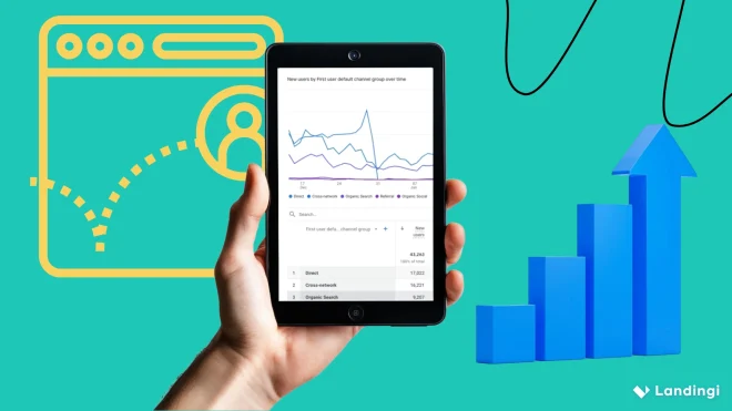
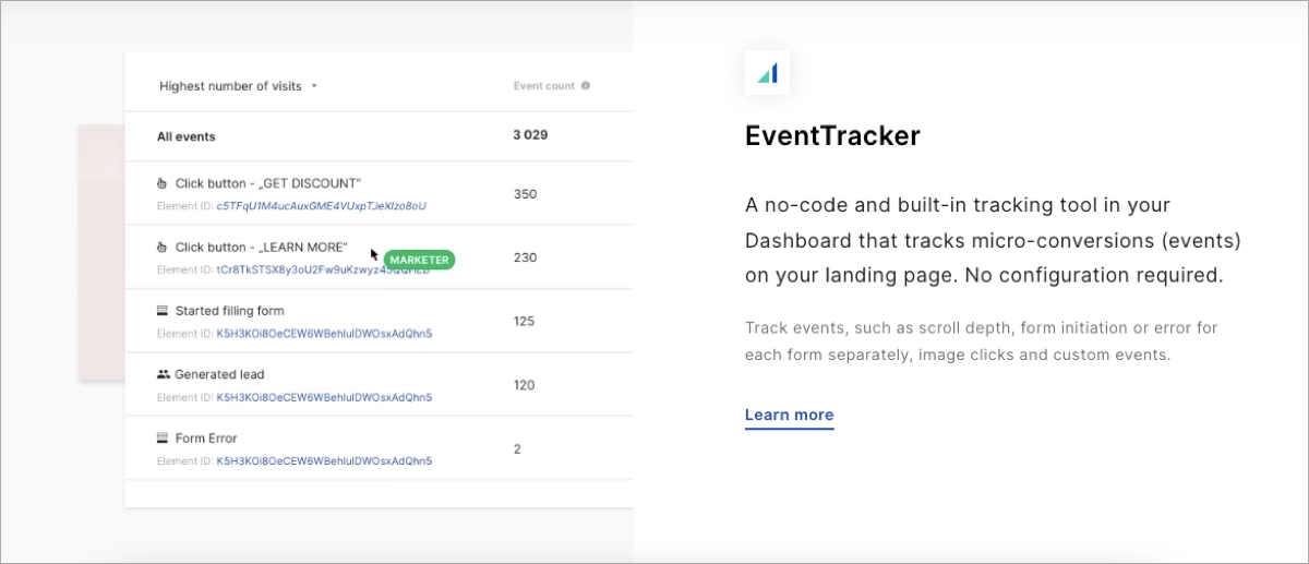
Continuously monitor, analyze, and improve your online forms. Use tools that track conversion rates, identify user behavior, highlight pain points, and support A/B testing. This data helps you determine which forms perform best.
Form optimization may seem complex, but success in digital marketing requires data-driven decisions. For small businesses, platforms like Landingi offer built-in tools to create forms, test, and measure them. With its user-friendly editor, you can customize forms and run A/B tests, then measure the performance of each variant using the EventTracker tool.
By adopting a continuous improvement approach, you ensure that your online forms remain effective, user-friendly, and aligned with your audience’s evolving needs and expectations.
How To Improve Form Conversion With A/B Testing?
To improve form conversion using A/B testing, choose a tool that fits your needs and base your ideas on both creativity and data. Avoid guessing – your hypothesis should be grounded in audience insights and business goals.
Platforms like Landingi make this process easier by allowing you to build customizable forms directly on landing pages and test different versions using their built-in A/B testing feature.
Build smarter forms and test what truly converts—directly on your landing page.
The process relies on comparing two versions of a form to see which one performs better. To effectively use A/B testing for improving form conversion, follow the 10–step guide:
- Identify the element to test – choose one element of the form to test at a time. This could be the CTA button color, form length, field labels, or any other variable.
- Create two variants – design two versions of the form (A and B). Change only the selected element in version B, keeping everything else identical to ensure accurate results.
- Define your success metrics – decide what metric you will use to measure success, such as completion rate, time taken to complete the form, or the number of quality leads generated.
- Use an A/B testing tool – implement your A/B test using a tool or platform that can display the different form versions to different segments of your audience and track results. The best choice for small businesses is Landingi, as it provides all necessary tools compressed in one user-friendly platform, appropriate for both advanced and inexperienced users.
- Run the test simultaneously – launch both versions of the form at the same time to a statistically significant number of users. This helps to mitigate the influence of external factors.
- Collect and analyze data – gather data on how each form variant performs according to your success metrics. Analyze this data to identify which version is more effective.
- Implement the successful elements – once you determine which version performs better, implement the successful elements from that version into your main form.
- Continue testing and improvement – A/B testing is an ongoing process. After testing one element, move on to another element and repeat the process to optimize your form continually.
- Consider user feedback – in addition to quantitative data, consider qualitative feedback from users for insights into why one version may outperform the other.
- Ensure statistical significance – make sure your test results are statistically significant to determine which version is more effective confidently.
A/B testing is a data-driven approach, allowing you to make informed decisions based on actual user behavior rather than assumptions. Testing various aspects of your form – from the color and placement of the submit button to the wording of the form fields – can help identify which version resonates more with your users and leads to higher conversion rates.
Bear in mind that A/B testing is a continuous process. Trends change, and what worked yesterday may not work today. Regularly conducting A/B tests and making necessary adjustments based on the results can help maintain and improve your form conversion rates over time.
Create High-Converting Forms Inside Optimized Landing Pages with Landingi
As explored throughout this post, improving form conversion rates requires a strategic, multi-faceted approach. Key techniques include personalization, mobile optimization, user-friendly design, accessibility, and continuous improvement. Each tactic enhances the user experience and increases the chances of form completion.
While improving form performance can seem challenging, platforms like Landingi simplify the process. Landingi enables marketers to build customized forms directly on optimized landing pages and test different versions using its built-in A/B testing feature. With these tools, you can make informed changes based on real data – not guesses.
The results are worth the effort: higher conversion rates mean more leads, more customers, and ultimately, greater business growth.
By applying the strategies discussed in this post, you’ll be on track to unlock the full potential of your web forms. Try Landingi now to create high-converting forms, test variations, and optimize every step of the user journey with measurable results.

