Introduction
Ecommerce stores continue to see typically low conversion rates on mobile, despite smartphone being the most common method of browsing the Internet. That means there is a lot of room for improvement and increased conversions for most businesses.
You already know the basics, but here are some lesser-known tips to help you get ahead of the competition and boost your conversion rates:
- Multi-Step Opt-ins
- Incentivize SMS Opt-ins
- Create More Scannable Copy
- Improve the Checkout Process
- Give Users Feedback
- Get Users to Start Scrolling
- Differentiate Between Browsing Behavior and Buying Behavior
Multi-Step Opt-ins
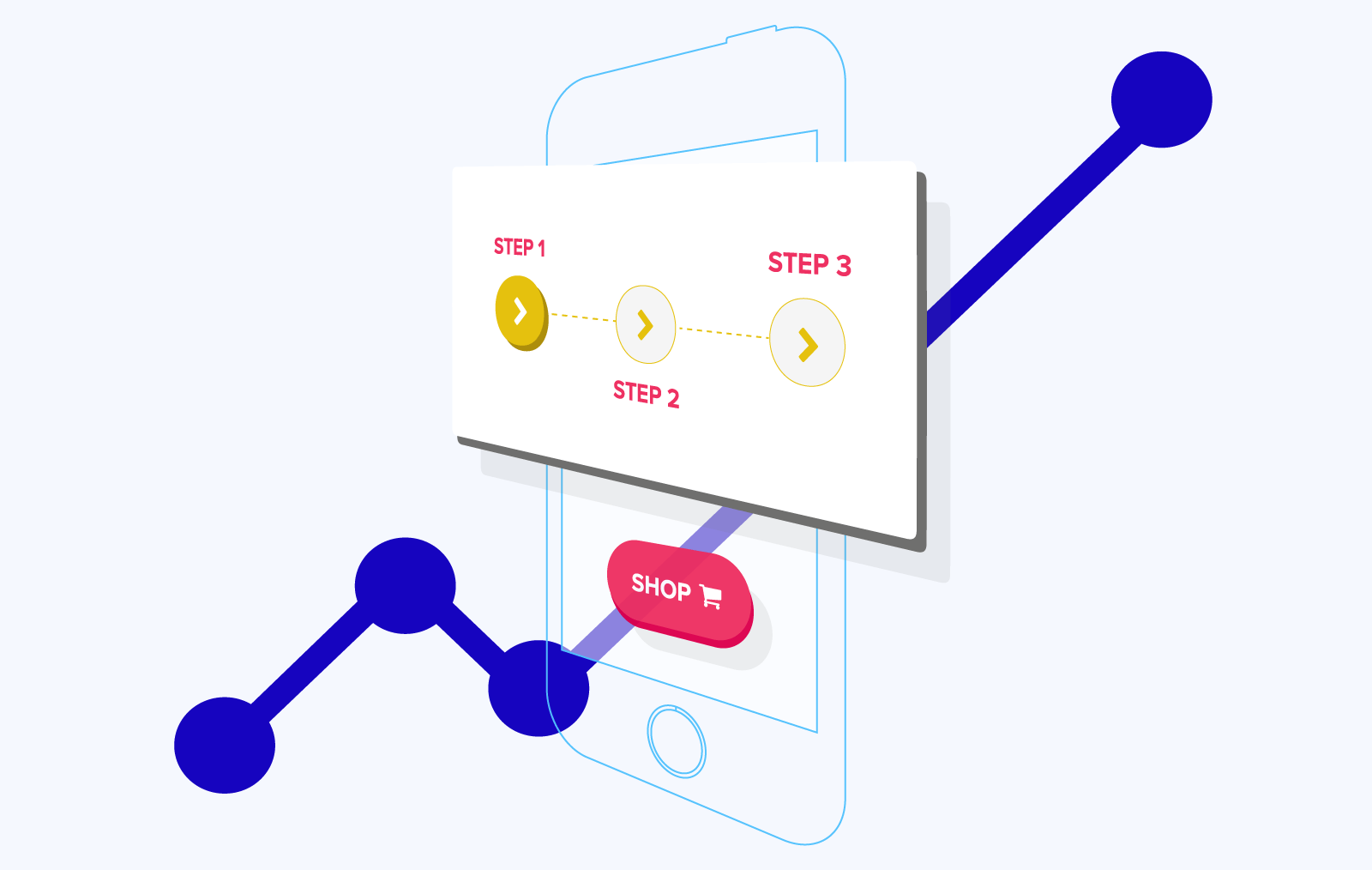
One way to immediately increase your conversions is to replace your lengthy opt-in form with a multi-step process. These look less overwhelming to visitors as they are initially asked for only a few pieces of information. Once they have filled in the brief first stage, visitors will be more likely to continue and complete the rest of the process, as they have already invested time into it.
Multi-step opt-in forms can generate more than 52% more conversions than single-step forms.
Step-by-step process is also better suited to small phone screen, as you only need to fit a couple of form fields on each page.
Incentivize SMS Opt-ins
Texting is an ideal method of sending promotions and offers to customers, and has a high conversion rate due to texts being sent and opened immediately. SMS also allows you to send personalized marketing based on customer information. Personalized content is 48% more effective than other forms of marketing.
- Promotions and discounts.
This also allows you to further incentivize conversions by using time-sensitive discounts requiring customers to act now in order to avoid missing out. 77% of consumers opt-in to text marketing to receive coupons and deals. - SMS ordering.
Accepting orders via text means customers can immediately respond to your SMS promotions, even if they don’t have a data connection. - Referrals.
Besides increasing conversions among your mailing lists, SMS can also be used to convert new customers by making your referral system more convenient, letting customers easily text their friends with referral links and sign-up discounts.
Create More Scannable Copy
In order to convert customers, first your site and marketing copy must get visitors and recipients who will actually read it. The way your copy is formatted can have a major impact on your audience’s willingness to interact with it.
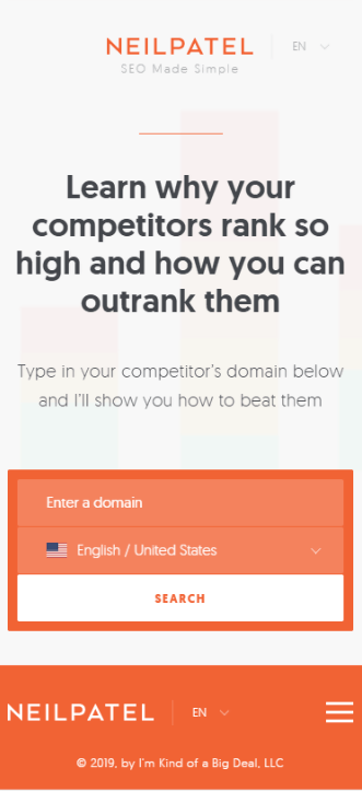
Users are more engaged by content when they can tell at a glance what you are offering and what is its value. In this example from Neil Patel, the opening sentence is impossible to ignore due to occupying more than 25% of the screen, and cuts straight to the point of what visitors are looking for and what they need to do:
Whether you are writing a product description, your landing page or a marketing email, the reader should have an accurate idea of the rest of the content. Without a clear summary, your audience is unable to decide if they want to keep reading.
This is important especially for email marketing, as on a mobile screen you’ll have just a couple of sentences to convince the reader. The only job of these is to make the recipient read the next line.
Similarly, many readers will also quickly scan down the page to decide if they are interested in your content. Use of subtitles, short paragraphs and bullet points makes this easier and increases the chances something will catch their eye and convince them to read the full page or message.
Improve the Checkout Process
Mobile shoppers value convenience, and are often browsing and shopping with limited time. Reducing the number of steps in your checkout process can increase conversions by enabling more users to buy immediately instead of waiting for more free time.
- Guest checkout.
Little is more frustrating to online shoppers than picking out and customizing their items, then heading to checkout only to be instructed to create an account along with email confirmation. A guest checkout option solves this problem, and once the purchase is complete you can ask if they want their details saved for later. 34% of abandoned carts are due to being asked to create an account. - Preserve cart between logins.
Starts browsing before they have logged in or created an account, make sure the contents of their shopping cart are saved as they log in. Customers placing large orders may need to spend a lot of time rebuilding their previous cart, which can lead to abandonment of the purchase entirely. - Progress indicators.
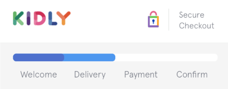
The process of creating an account and providing billing and delivery information can be more frustrating when the user has no idea how much more they need to do to complete their purchase. A progress percentage or bar helps reduce cart abandonment by showing customers they only have a couple of steps left to finish.
This example from Kidly splits their payment process into 4 simple steps, and indicates to the user how much they have left to do. The first ‘step’ is simply a welcome message, which means users are already on step 2 by the time they need to enter any information:
Give Users Feedback
A frustrating user experience can cause visitors to leave your store and shop elsewhere. On mobile devices, clear visual feedback confirming user actions is vital to avoid this. In addition to making sure buttons and other clickable elements are large enough to easily tap, they should also give a clear visual cue that they have been pressed.
Touch screens offer no tactile feedback like a mouse or keyboard, and are also less precise. These factors increase the possibility of misclicks, and without clear visual cues the user has no idea this has happened. Unreliable mobile data connections can also cause inputs failing to register.
This can frustrate users, who will often interpret these as issues with your site rather than the device. Clear feedback makes your store less prone to user error, and more customer-friendly.
Get Users to Start Scrolling
Once a visitor has started to scroll through your page, they are more likely to continue, increasing your opportunity to convert them. Splitting content above and below the fold can entice users to scroll down to see the rest of a message or image. Besides being intrigued by this element, they might spend more time browsing your site afterwards.
While it feels wrong to design pages that deliberately don’t fit everything neatly onto the first screen, this is not the same as just poor formatting. Splitting specific elements on the page such as a call to action attaches a clear value to scrolling down, while a large product image could have users starting to scroll just to see what the rest of the image is. This tactic is particularly popular with online clothing stores, due to the highly visual nature of clothes shopping:
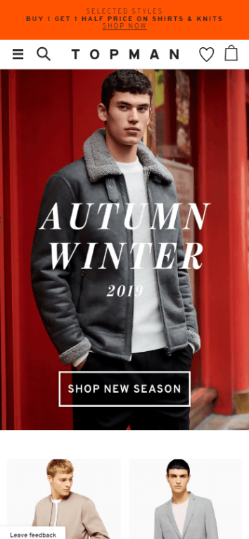
This technique also helps your landing page avoid having a ‘false bottom’ that makes the user think there is nothing to scroll down to
Differentiate Between Browsing Behavior and Buying Behavior
Customers who are ready to buy will likely use search functions to find the products they want and compare details. Conversely, users who want to browse will be more interested in large, attractive images and descriptions than detailed information.
A successful e-commerce store needs to be able to differentiate between and respond to these differing user intents in order to provide an ideal experience for both groups. Sales can increase by as much as 225% when your site is able to provide the right information at the right time.
Browsing
Your store’s front page and product category pages should be optimized for browsing customers, prioritizing images and basic product descriptions over details. These are the pages browsing users will look at, as they don’t want a specific item and are waiting for something to attract their attention.
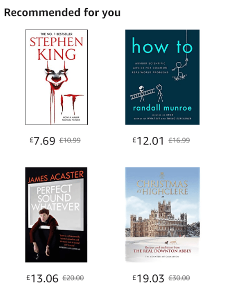
This is how books are displayed when the user browses by category. Since the user doesn’t know what they want, the most important thing is to grab their attention, so no space is wasted on information about the books. Instead, the page format lets the book covers do the talking.
Buying
On the other hand, search functions are used more by those who are ready to buy, in order to find the items they need. They might not have an exact product in mind though, which is why items should be displayed with more detailed information and product specifications during searches, making it easier to compare between similar items.
Let’s look at Amazon again:
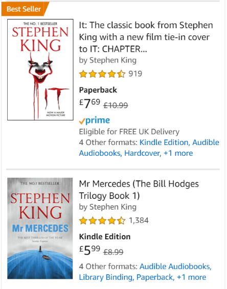
This time instead of browsing by category, the search term “Stephen King” was used. The user has a clearer idea of what they want, and the store responds appropriately with additional information, ordering options and reviews. These are all extremely useful for visitors who are ready to buy, but clutter the page for those who are just browsing.
Conclusion
Focus on making it easier for users to browse and buy by reducing the number of steps between them and their purchase, and improving the usability of your site with better feedback.
Engage visitors with a reason to start scrolling and reading, and incentives to opt-in to further marketing. Both of these tactics will improve your conversion rate among both new and existing customers.
