Financial institutions have really opened up to the idea of online advertising, and they are willing to put their money where their mouths are. In the last five years, the industry has significantly increased online advertising spending, and surely that’s just the start.
However, all the money in the world means nothing if you don’t know how to use it to reach your goal. One of the marketing tools that financial companies are warming up to is a landing page.
We’ll explore everything you need to know about landing pages for finance, including their benefits, best practices, and examples to follow.
What are the Benefits of Financial Landing Pages?
The financial sector has gone through the same transformation as other industries in the last few years. For instance, most people tend to handle their banking needs online instead of going to a physical location. The same can be said about looking for new services related to their financial needs.
There are plenty of finance-related ads online, and marketing departments constantly look for optimizations in terms of conversion rate as it’s one of the main performance indicators.
Landing pages are known for converting higher than regular websites. Their power lies in simplicity, which is especially important in lead generation campaigns. The visitors are more likely to fill out a form and click the CTA button if they aren’t distracted by other links that lead elsewhere.
The creation of landing pages is also easier and cheaper since marketers can build them on their own, even if they have no coding skills. Landing page builders like Landingi make the creation process simple thanks to the use of a drag and drop editor and a host of other features.
The alternative would be to leave it to a web developer, which is more expensive, and you’re never certain that the end result is exactly the way you wanted it to be.
Landing pages made in Landingi are also optimized for mobile devices. Considering the fact that mobile traffic is comparable to its desktop counterpart, it’s a must-have feature for any digital marketing campaign.
Best Practices for Financial Landing Pages
Obviously, the very fact that you have made a business landing page is not a guarantee of leads or new sales coming in. While the format itself has been known to work, it’s all about the way you use it. Don’t worry, it’s not all that difficult – I’m going to show you what you need to include to get viewers to convert.
Keep it short
Landing pages aren’t supposed to convey all the details of your offer or service. Their goal is to spark interest rather than have the viewer read through a myriad of rules and regulations. Large blocks of text are off-putting, especially in the digital age of the ever-shorter attention span.
The most important pieces of information presented in the shortest and most interesting way possible – that should be your goal.
Make your sections smartable and let go of mundane manual tasks with Smart Sections! An easy way to manage bulk changes.
Avoid Financial Jargon
The financial services industry has its own jargon that might be well-known to you and the people you work with, but it’s not the same for an average Joe.
Use terms that are clear for everyone who is looking for your service, even those who have never had contact with financial services before. How can someone sign up for your offer if they can’t understand it?
Offer a Solution
This is the part of a landing page that needs to speak to the viewer’s needs. Show how your offer fits them. By adopting this approach, you present yourself as a business that is aware of the problems, on top of offering a solution.
Include a Call to Action
Without a solid CTA, landing pages have no chance of getting a large number of leads. What does it need to convert? First of all, it needs to be short. It is a button, after all.
Secondly, it should include a reference to some sort of benefit. For instance, take a look at XTRADE’s landing page and pay close attention to the CTA:

The point of this landing page is to get visitors to sign up to a trading company. A “register” button would have sufficed. Or would it? Signing up to a trading service is not as beneficial as getting a bonus, at least if we consider short-term actions.
I’m sure this CTA alone has been responsible for a solid increase in registrations. When it comes to the rest of the landing page, it has its ups and downs, with heavy reliance on the gold theme being the latter, but the CTA here is on point. It’s even placed right. No scrolling required to get there – great stuff.
Four are not enough? Go check out other solutions for the financial industry. On top of that, we have some financial landing page templates for you to use if you don’t feel like making one from scratch.
7 Examples of Finance Landing Pages
1. Feyapp
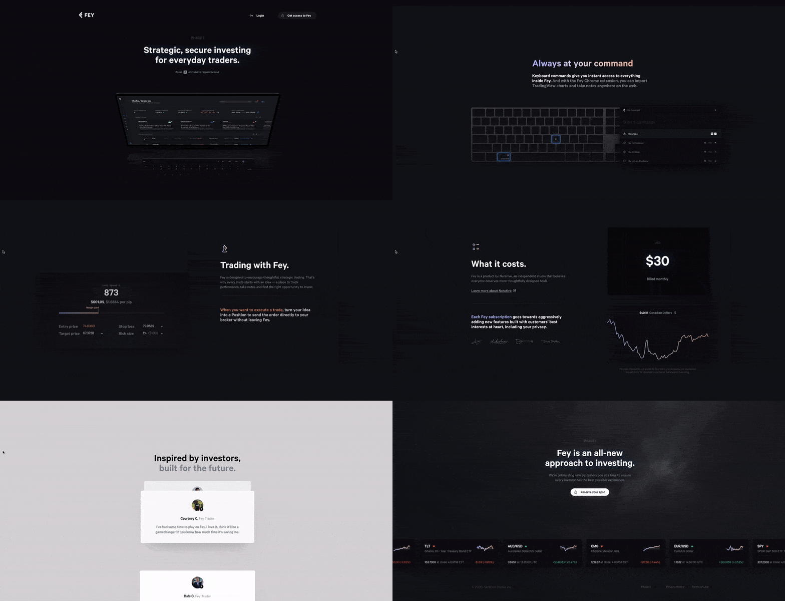
This one is a bit of a mixed bag. On one hand, it’s very sharp in terms of design, colors (unless you’re Team Light Mode), and, most importantly, technical solutions. The animations are smooth as butter. The “a” key opens the form on any part of the page, which sounds nifty, but it’s a two-edged sword.
It’s a feature that most visitors aren’t familiar with and it’s easily forgettable, and that is something you do not want on your landing page, especially with the sign-up form being the sole focus of your page.
Now for the other part of the mix. It’s not a full-fledged finance landing page. There are certain webpage parts here, such as the login and access buttons on top and external links that take you away from the page, therefore causing a distraction.
Copy-wise, it focuses on features, rather than benefits, and the copy is more straightforward than catchy. There are some aspects of this page that need to be worked on, but the overall feeling is a positive one. As long as viewers remember to “summon” the form, Fey is going to be okay conversion-wise.
2. XTRADE

Remember XTRADE’s landing page from the previous section? Now take a look at their default one:
It almost looks like a different company, doesn’t it? So, what exactly has changed here? The background, obviously, now looks much more professional. Bye, bye, gold. The heading is, well, basic. There is nothing here that tries to entice you to register for the service. Even the CTA button is as ‘beige’ as it gets. Any mention of a bonus has been eradicated.
At least the form is well-structured and easy to fill out. Good job on that front. One thing that trading landing pages suffer from is the disclaimer.
It takes up at least a quarter of the whole page. The font and the background are not consistent with the rest of the page. It is noticeable, though.
3. CEX
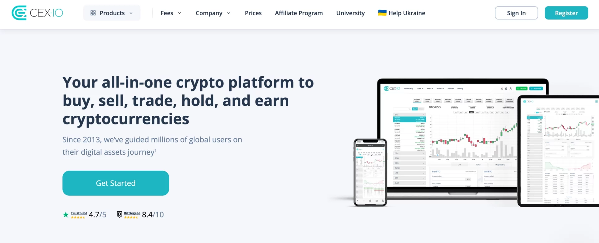
The cryptocurrency trading platform starts off pretty well, aside from the top bar filled with distractions. The heading is cohesive, conveying clear customer value.
The CTA button is visible and located in the appropriate place. The numbers and benefits sections focus on the right things without taking up too much space with text.
The trust badges include big names (Forbes, Business Insider, Bloomberg, etc.) to build up the company’s credibility, which is crucial in this business niche.
However, it’s not all rainbows and butterflies. First of all, the spacing of the page could use some work. The elements, such as divisions between sections, are a bit too long, which translates into more scrolling.
The final, but the most crucial problem is that it’s a multipurpose landing page with elements of a homepage. Sure, the layout suggests the former, but the top bar and the footer might give off a different impression. Too many links disturb users and make the path to target action more complicated.
4. PointApp
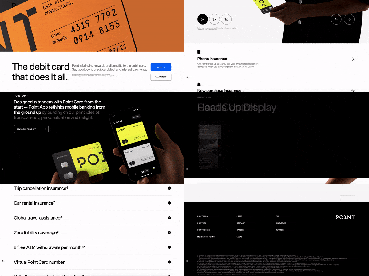
The sleek-looking debit card has an equally sleek landing page. No links on a top bar, as it doesn’t exist. A nice, sharp animation showing the product from multiple angles. A CTA button located way before the fold line is a nice touch, too.
Some sections use vertical sliders to convey information in a compact way. All the images show either of the products – the credit card or the app – a great strategy.
The bad parts? First of all, the “learn more” button under the CTA. It’s distracting and all it does is scroll down to the next section. A shot in the foot in my opinion.
Secondly, there is so much scrolling to do here if you want to get through all the information. The FAQ section, located at the very bottom of the page, is just a link to a different website. Expandable tabs would help a lot.
The benefits section of this finance landing page should be higher. It is much more important than color options. Another thing that should be exposed a bit better is the price. It is barely mentioned next to the CTA, but the full pricing is almost at the very end, which requires a lot of scrolling.
The idea is great, the design is even better, but the execution just wasn’t all there in the end.
5. GTL S.A.
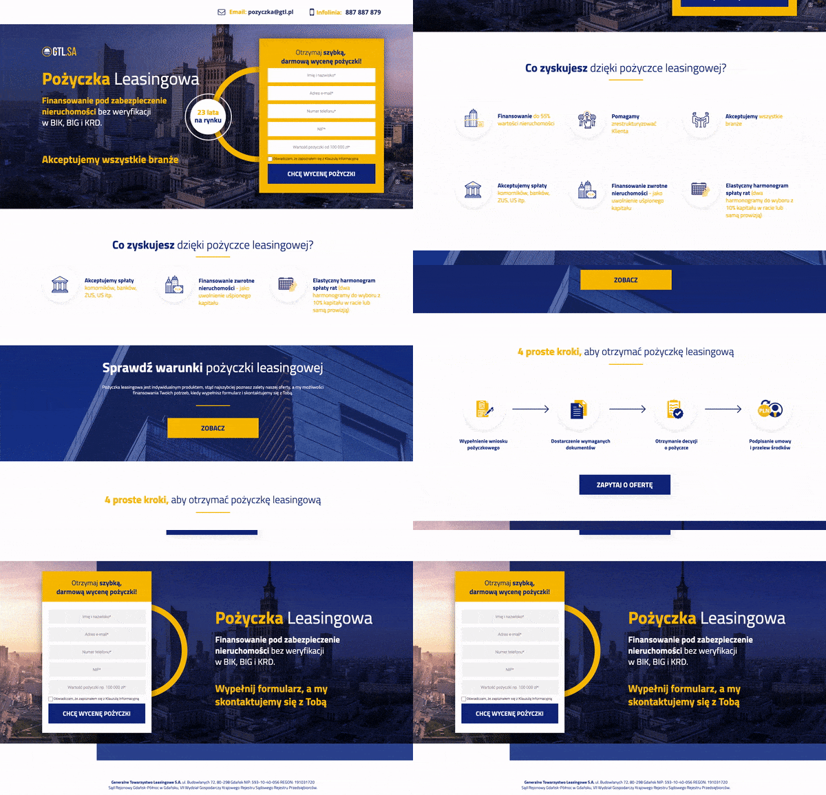
Even if you don’t understand the copy of this page, probably due to the fact that it’s in Polish, there are still things to learn from this one. The goal of this page was to get a quote for a loan. The form is clear, short, and impossible to miss.
All of the sections are clearly separated and the background and font colors make it easy to read the copy. Both the benefits and the application process are explained without using too much text.
Most of the information is clear, maybe with the exception of the abbreviations in the very first section.
That might pose a problem, though. Viewers can get discouraged quickly, and the mission of a landing page is to make sure that doesn’t happen. Although it’s possible using the full names would have made the heading a bit too long. Sometimes, you just have to sacrifice one thing in favor of another.
Overall, it’s a solid finance landing page with all the right moves in all the right places. I might be a bit biased, though, since this landing page was created by Landingi as part of the Lead Generation service
6. Tieto EVRY
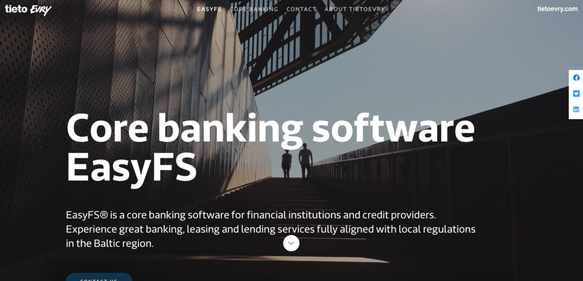
This landing page does a lot of things right. The division between sections is clear, and each part has its place on the page. The benefits section looks great, it’s clear and concise.
The menu at the top bar scrolls down to the desired part of the landing page instead of taking the visitors to a different page. The number of sections is kept to a minimum, which means that there won’t be too much scrolling.
That is unless the visitors decide to expand the FAQ section. Once all the answers are expanded, the page becomes a bit too long. Not to mention that there are 13 questions in this section, so it’s not really the most minimalist of parts.
The other thing is the form. While contact information fields like name and email address are standard, the boxes such as phone number, company, and job title seem a bit redundant at this stage of the funnel.
The additional comment is the first I’ve ever seen on a form in this case, although it’s a good thing it’s not required, unlike the other fields (with the exception of the phone number).
7. Signature Analytics
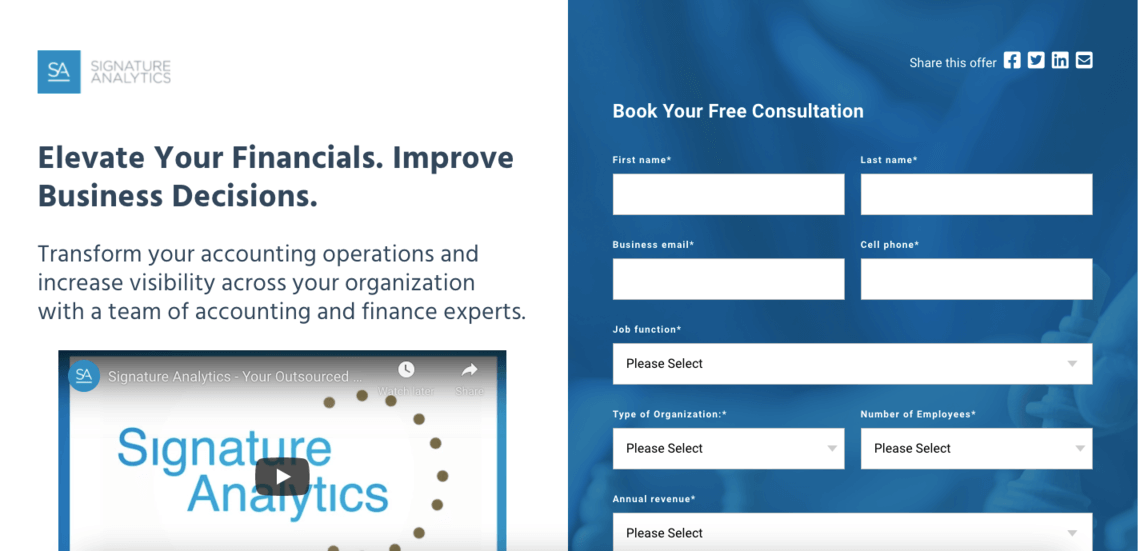
Let’s start with the good things, though they are certainly overshadowed by the bad stuff. Using a video to get most of the message across is a great decision. It allows the rest of the page to be as lean on content as possible.
There is a benefits section, which is short, but it gets straight to the point in an understandable way, even for someone who is not a financial expert.
And now, let’s focus on the bad. First off, the form. It is incredibly long. If you thought the previous one was too much (I did), this example takes it to a whole new level. Twelve fields, eight of which are required.
Some of them refer to things that businesses might not want to divulge at the first point of contact. Keep in mind that this is a landing page for an ad, so a large chunk of the visitors might be early in the research phase.
The form is so long that it doesn’t fit on a regular laptop screen. Maybe 2/3rds are visible above the fold line, and it takes up half of the space in terms of width. Also, there is an image of a building with the Signature Analytics logo below the benefits logo that is way too large.
All in all, this page is very inconsistent. On the one hand, it’s not too long and it follows some of the landing page best practices, but the form is a monstrosity, and I fail to see how it might encourage anyone to fill it out. Hopefully, with some optimizations, it’s going to look better and convert higher.
Financial Landing Page Templates
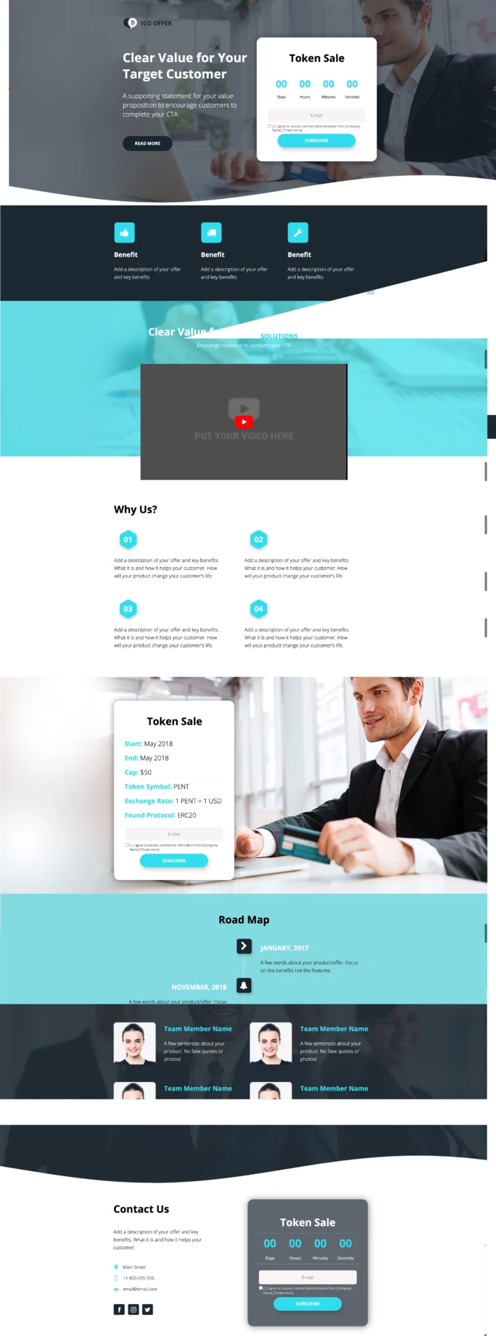
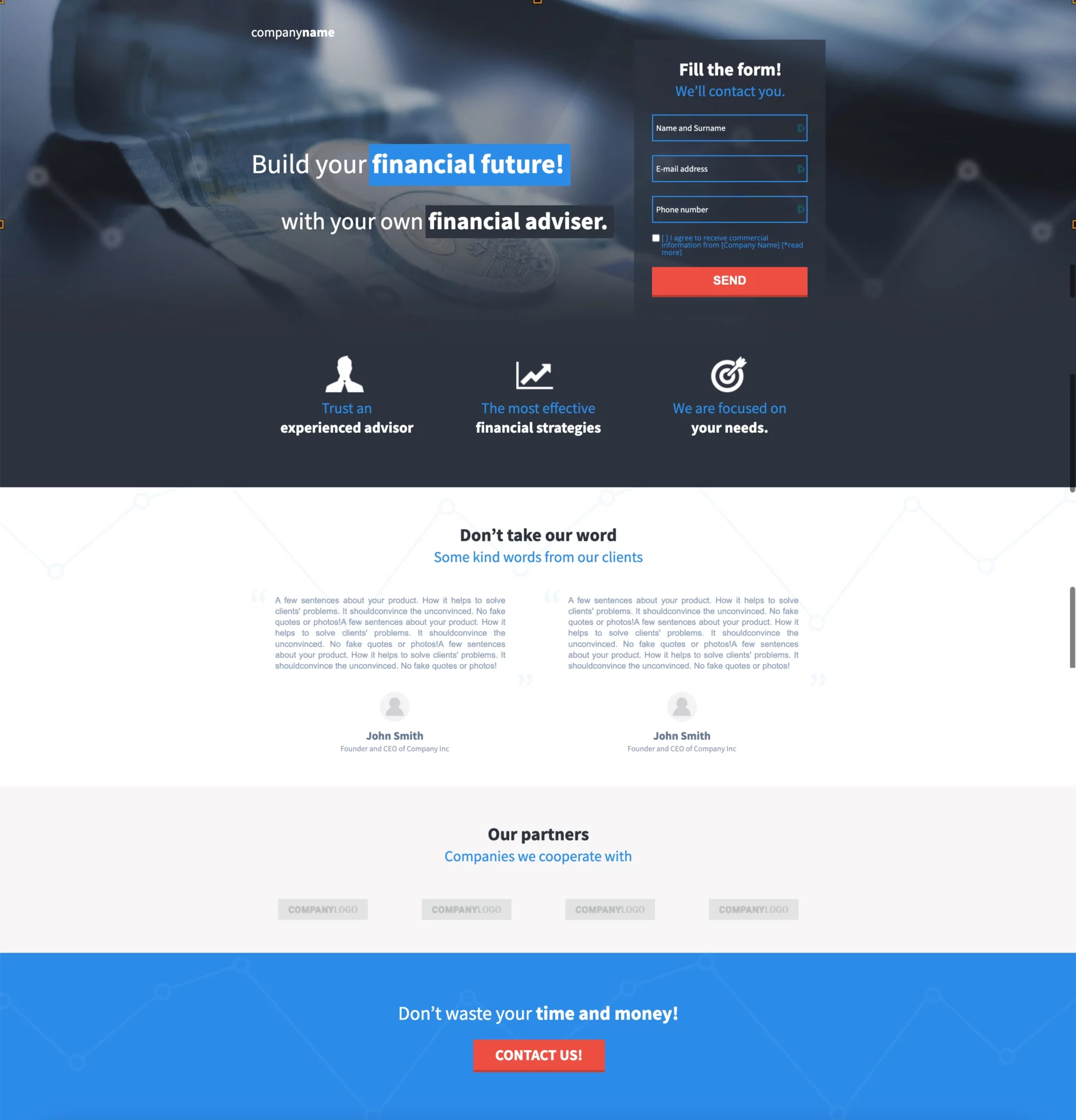
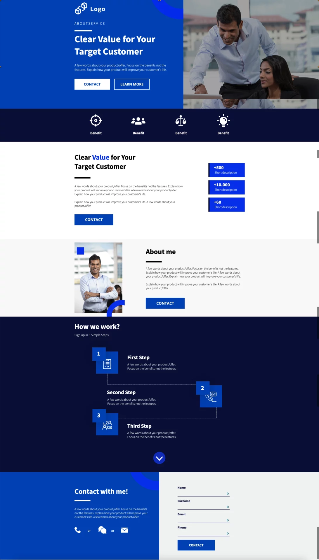
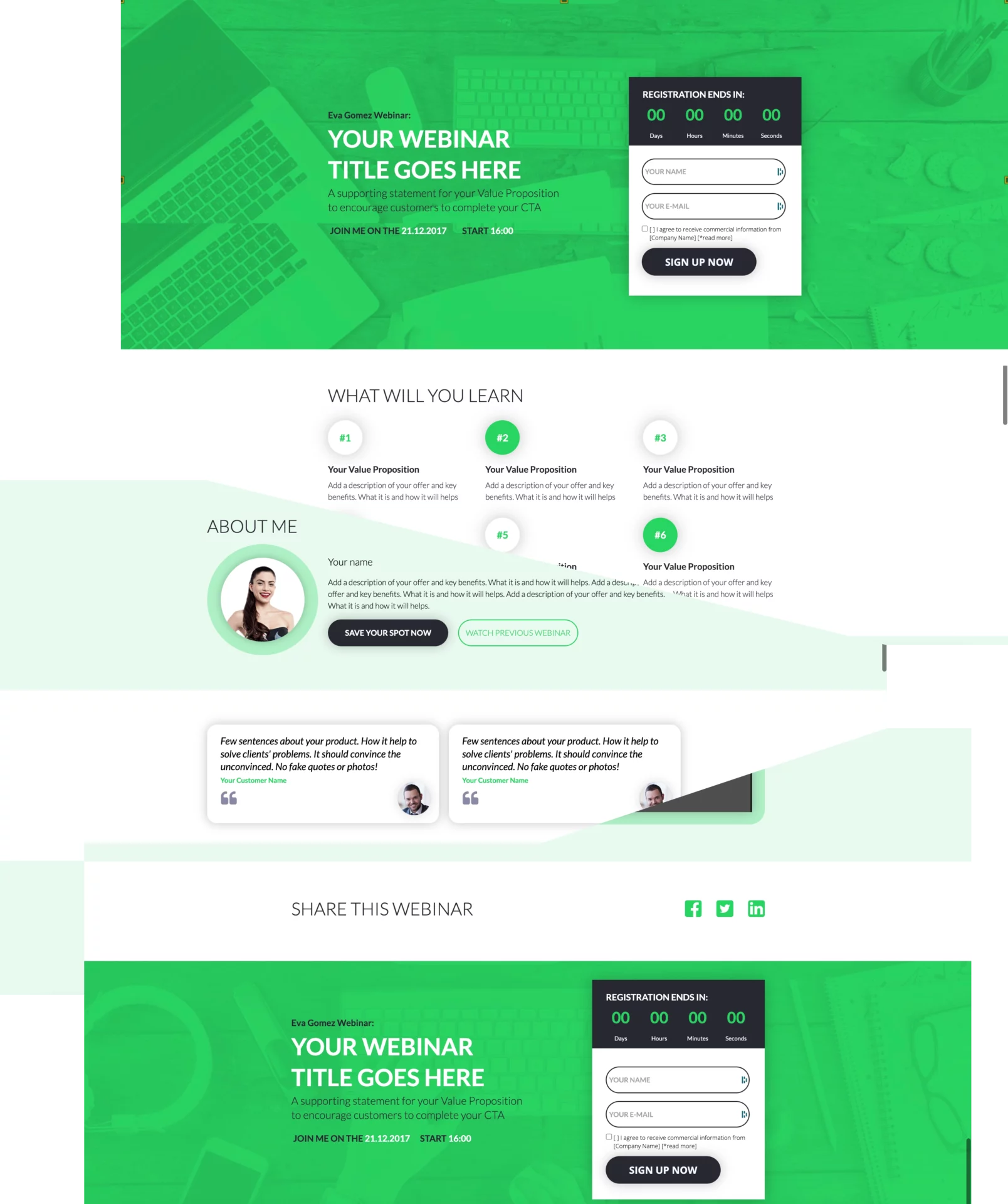
If you need a landing page for your financial service, there is no need to start from scratch. Landing page builders (Leadpages, ConvertKit, etc.) or platforms (like Landingi or Instapage) offer a variety of templates dedicated to each business type. They allow you to create high-converting pages like the above with no time. Simply choose the design and fill it with your own unique content and brand messaging.
Let’s explore some real examples. All of these templates are available in the Landingi gallery, along with 300+ others.
Start Creating Finance Landing Pages with Landingi
There you have it. A short overview of the use of financial landing pages with templates for new ones.
As you can see, a landing page is a tool that has multiple applications in the world of finance. Use its advantages wisely and your conversion rate goes up. And your client list and profits will follow suit.
You should keep in mind that landing pages are as good as the platform you use to create them. Our landing page builder has a host of useful features (from A/B tests to AI copy generation and elaborate analytics) that speed up the process and help you analyze the performance of your pages.
Now, all that’s left for you to do is start building landing pages yourself. Have fun!
