Kickstarter landing pages are pages dedicated to driving pre-launch campaigns, focusing solely on presenting a project in a way that motivates visitors to pledge their support. These pages serve as the campaign’s front line, aiming to convert interest into action by highlighting the unique aspects of a project, its goals, rewards, and the story behind it. Recognizing the pivotal role these pages play in the success of a Kickstarter campaign, it becomes evident that crafting a compelling landing page is essential.
This article will explore the essential elements that make Kickstarter landing pages effective, delve into industry best practices, and provide actionable insights for creating a landing page that converts curiosity into pledges.
Starting off on the right foot, check out the following 4 critical strategies for developing an influential kickstarter landing page:
- Craft a compelling narrative that encapsulates your project’s essence,
- Utilize vibrant, eye-catching visuals that tell your project’s story,
- Highlight unique rewards and incentives to pledge,
- Ensure the page is responsive and accessible across all devices, enhancing user experience.
Immerse yourself in exemplary kickstarter landing page examples that strike a chord with their audience, and discover how to bridge the gap between a project’s vision and its potential backers’ support.
- CLVX 1 Keyboard and Touchpad in One Device
- eufy x Robot Vacuum Omni S1 Pro
- LOOI Robot
- Runaway Cow (Vegan Ice Cream Shop)
- The Piggy Tales Book
- S.T.A.L.K.E.R. 2: Heart of Chornobyl
- Firsty

What Is a Kickstarter Landing Page?
A Kickstarter landing page is crafted to introduce a new product or service, sparking interest among potential backers or customers and motivating them to engage in particular actions. Its primary aim is to secure investments, encourage pre–orders, or gather sign–ups for updates, among other objectives. This page type is strategically developed to captivate an audience, converting their curiosity into tangible support for the project.
Unlike regular landing pages that might focus on a broad range of actions from visitors, kickstarter landing pages have a singular focus: to secure pledges. This specificity demands a high level of creativity and clarity when presenting the project. The best kickstarter landing pages skillfully blend the following:
- compelling narratives,
- stunning visuals,
- detailed project descriptions,
- clear CTAs to encourage contributions,
- insights into the team behind the project,
- the development process,
and the impact the project aims to have, fostering a sense of community and shared purpose.
These landing pages are an essential tool in the pre–launch phase, helping to build anticipation and gather a following even before the campaign goes live. Through effective storytelling, social proof, and the presentation of enticing rewards for backers, kickstarter landing pages aim to transform casual browsers into committed supporters.
In essence, a well-designed Kickstarter landing page not only serves as the campaign’s promotional hub but also as a bridge connecting creators with a community of backers eager to bring innovative ideas to life.
Ready to launch your Kickstarter? Build a compelling landing page with Landingi!
How Do I Create a Kickstarter Landing Page?
To create a landing page that serves as a perfect tool in your kickstarter campaign, define the objective you‘re aiming for and understand your audience, craft your story and supplement it with high–quality visuals, include rewards and incentives, create a strong CTA, and remember about responsiveness. While building an effective kickstarter landing page, blend clarity, usability, and persuasive elements that encourage visitors to take the desired action. Learn how to achieve the best results and follow the 8-step instructions below:
1. Define your objectives
Firstly, define your objectives – clarify your landing page’s goal. Whether it’s to raise a certain amount of funds, attract a specific number of backers, or create buzz around your project, having clear goals will guide your design and content strategy.
2. Know your audience
Secondly, know your audience – understand who your potential backers are. What are their interests, needs, and motivations? This insight will help you tailor your messaging and design to resonate with them, making your campaign more compelling.
3. Craft your story
Thirdly, craft your story – your kickstarter landing page should tell the story of your project. Why is it important? What problem does it solve? How did it come to be? A compelling narrative connects emotionally with visitors, making them more likely to support your campaign.
4. Design with visuals in mind
Fourthly, design your landing page with visuals in mind – use high-quality images, videos, and graphics to bring your project to life. Remember that visuals are not just decorative, they’re an integral part of your storytelling, helping to convey the essence of your project more effectively than words alone.
5. Highlight rewards and incentives
Fifthly, highlight rewards and incentives – clearly showcase the rewards backers will receive in exchange for their support. Be creative and ensure the rewards are valuable and relevant to your audience. This could be anything from the product itself to exclusive experiences or acknowledgments.
6. Optimize for conversions
Sixthly, optimize your landing page for conversions and craft a strong CTA – it should be prominent and persuasive, guiding visitors toward pledging. Whether it’s a “Back this Project” button or an invitation to sign up for updates, your CTA should be clear and easy to find.
7. Ensure mobile responsiveness
Seventhly, ensure mobile responsiveness – most users are accessing the web through mobile devices, so your landing page must be responsive, ensuring a seamless experience across all devices and screen sizes.
8. Test and refine
Eighthly, regularly test and refine your kickstarter landing page. Before going live, test your landing page with a small group of users to gather feedback. Use this insight to refine and optimize the page. But it’s not a one-time action – to achieve the best efficiency, you should regularly test and adjust your strategy based on user behavior and conversion rates throughout your campaign.
By following these steps, you can create a landing page for a kickstarter campaign that stands out and effectively turns visitors into backers, moving you closer to achieving your campaign goals.
Create a Kickstarter landing page that drives backers—start with Landingi!
7 Best Examples of Kickstarter Landing Pages
Check out how theory meets practice and explore the 7 best examples of kickstarter landing pages with various main objectives. Each example showcases a different approach to a kickstarter campaign. Still, all of them include key elements that drive high conversions – gather essential insights and get great inspiration on creating your own kickstarter landing page.
1. CLVX 1 Keyboard and Touchpad in One Device
The CLVX 1 landing page stands out as an excellent example of an effective kickstarter landing page, seamlessly blending innovation with user engagement. The page introduces the CLVX 1, a groundbreaking device that combines a keyboard and touchpad into one, catering to the efficiency and productivity needs of its users. With a clear, compelling headline and a background video in the hero section, the landing page quickly captures visitors’ attention, succinctly communicating the product’s unique selling proposition.

The page excels in storytelling, detailing the evolution and benefits of the CLVX 1 without overwhelming the reader. It employs crisp, engaging visuals and animations that showcase the keyboard’s sleek design and functionality, effectively demonstrating how the device integrates into a user’s workflow for enhanced productivity and convenience. Key features are highlighted in an easily digestible way, ensuring that potential backers can quickly grasp the value the CLVX 1 brings. The main call to action invites visitors to buy a product thanks to its clear messaging and strategic placement on a sticky bar, leading to its Kickstarter page.
Key takeaways to learn from this example:
- Stunning design,
- High-quality visuals and videos,
- Concise and informative messaging, including storytelling elements,
- Outstanding CTA button,
- FAQ section.
Improvement areas:
- Mobile optimization – while the page is designed to be responsive, continuous testing and optimization for mobile devices are crucial to cater to the growing number of users accessing the page via smartphones, ensuring a seamless experience across all devices.
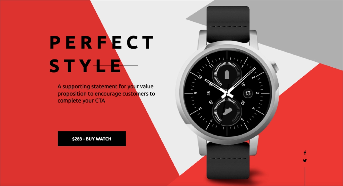
Pick a Watch Sale template, build your kickstarter landing page, and customize it easily with Landingi to drive a successful campaign – it takes minutes!
Boost your Kickstarter campaign’s success—design your landing page with Landingi!
2. eufy x Robot Vacuum Omni S1 Pro
The eufy S1 Pro landing page exemplifies a highly effective kickstarter landing page, masterfully blending technological innovation with user-centric design to present the world’s first floor washing robot vacuum. This effective page design allowed inventors to get interest from over 2400 backers in the first 10 days after the Kickstarter launch, gathering over 25 000% established foundation goals.

The page captures visitors’ attention right from the start, leveraging a powerful combination of striking visuals, succinct and compelling copy, and persuasive call-to-action elements. Its design showcases the eufy S1 Pro’s unique selling points, including high-quality images and videos demonstrating the product in action. The narrative is focused and engaging, efficiently conveying the vacuum’s innovative features and benefits without overwhelming visitors with excessive details. Clear information about the Kickstarter launch date and an outstanding CTA button encourages visitors to take the desired action and back the project. The page also includes social proof in the form of award badges and endorsements.
Key takeaways to learn from this example:
- Attractive yet intuitive layout,
- Outstanding CTA button,
- High-quality visuals and immersive videos,
- Concise descriptions,
- Social proof section with award badges and endorsements.
Improvement areas:
- Page loading speed – although the page is engaging, it should load faster to prevent bounce rates and maximize conversions.
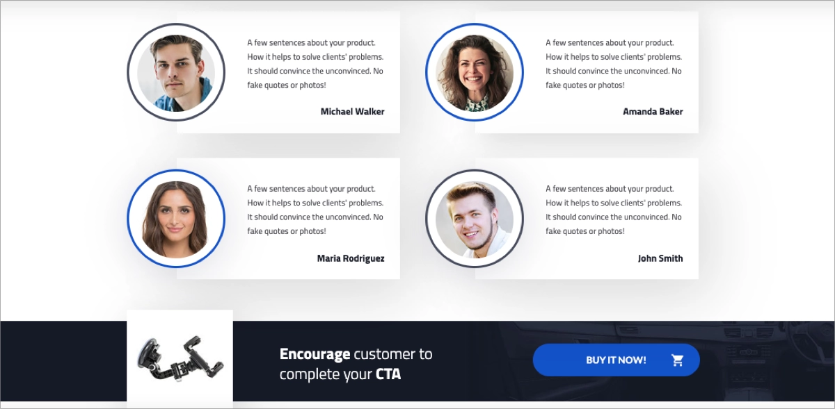
Choose the Car Gadget template from Landingi’s gallery and customize it effortlessly with its drag-and-drop editor to promote your new idea and engage potential backers in your project.
Want more backers? Build a high-converting Kickstarter landing page with Landingi!
3. LOOI Robot
The LOOI Robot page is an exemplary kickstarter landing page, masterfully capturing the essence and appeal of turning a smartphone into a desktop robot. From the outset, the page draws visitors in with a vibrant and engaging banner that seamlessly integrates with the overarching theme of innovation and interaction. The narrative and visual elements work harmoniously to introduce LOOI as a product and a lively companion powered by advanced technology, including ChatGPT, to offer a unique blend of entertainment, assistance, and emotional connection.

The page’s strength lies in its ability to vividly showcase LOOI’s functionalities and features through dynamic content, including videos and images that highlight the robot’s capabilities in real-world scenarios. Whether showcasing LOOI’s ability to play games, charge devices, or simply keep users company, the page ensures that potential backers can envision how LOOI would fit into and enhance their daily lives. They use an outstanding CTA button in strategic red, with a 21% higher performance rate than green CTAs, as confirmed by HubSpot statistics.
Key takeaways to learn from this example:
- Intuitive layout,
- Attention-grabbing imagery and immersive videos,
- Well-written content,
- Product info section,
- Outstanding CTA button.
Improvement areas:
- User testimonials – incorporating testimonials or reviews from beta testers or early users could further enhance trust and provide social proof, potentially increasing the likelihood of backing.
Create a kickstarter landing page for your product using the Application template from Landingi – add high-resolution images and outstanding call-to-action buttons, and give visitors a compelling reason to back your project!

Attract more supporters to your Kickstarter—create a stunning page with Landingi!
4. Runaway Cow (Vegan Ice Cream Shop)
The Runaway Cow landing page emerges as an exemplary kickstarter landing page, masterfully leveraging the power of storytelling, visual appeal, and clear call-to-action to engage potential backers. The landing page’s design is intuitive and user-friendly, ensuring that visitors can easily navigate through the content and understand the project’s value proposition.
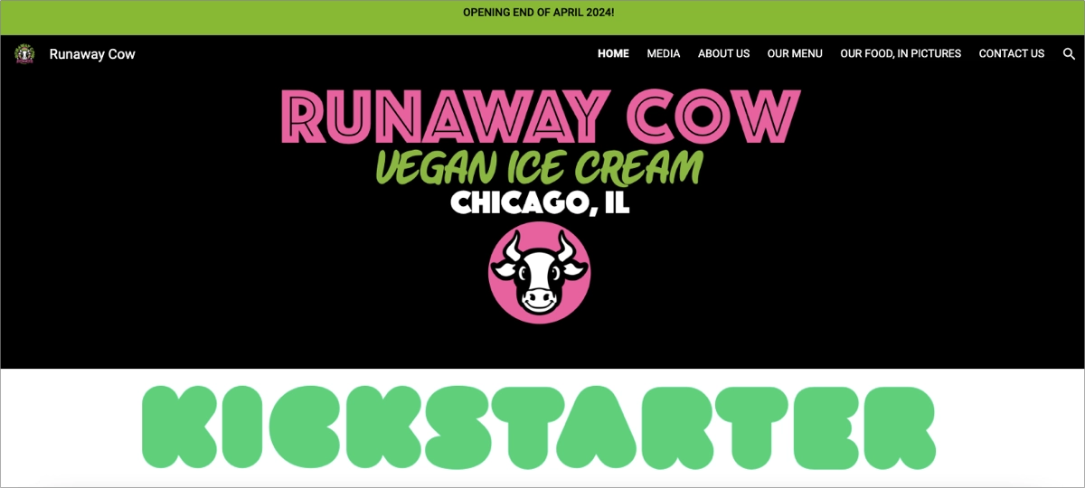
Key strengths of the Runaway Cow landing page include its compelling narrative that instantly grabs attention, high-quality images that visually communicate the project’s goals and passion, and strategically placed CTAs that guide users toward pledging. The page also details the rewards for backers, making it clear what backers will receive in exchange for their support, which is crucial for converting interest into action.
Key takeaways to learn from this example:
- Clear layout,
- Attractive visuals,
- Effective storytelling,
- Social media section,
- Outstanding CTA.
Improvement areas:
- Interactive elements – incorporating more interactive elements, such as video testimonials or a virtual tour of the project’s development process, could further enhance engagement, providing a more immersive experience for visitors.
Pick the Restaurant template from Landingi and customize it effortlessly with its user-friendly editor to run a successful campaign and drive a high conversion rate.

Maximize your Kickstarter potential—design a professional landing page with Landingi!
5. The Piggy Tales Book
The “The Piggy Tales Book – The Amazing Journey to Apricot Farm” landing page sets a high standard as an exemplary kickstarter landing page, masterfully utilizing storytelling, engaging visuals, and clear, compelling CTA to captivate potential backers. The vibrant and playful imagery with concise and captivating narrative descriptions effectively showcases what readers can expect from the book.

The landing page’s layout is thoughtfully designed, ensuring that information about the book, including its themes, characters, and the unique value it offers, is easily accessible. Highlights include a bold headline that succinctly presents the book’s premise, enticing pre-order CTAs strategically placed to catch the visitor’s attention, and beautifully rendered illustrations that give a sneak peek into the book’s artistic style.
Key takeaways to learn from this example:
- Clear layout with strategic white space,
- Compelling headlines,
- Immersive visuals,
- Well-matched colors,
- Outstanding CTA button,
- Social media button.
Improvement areas:
- Video – adding video content to the kickstarter landing page ensures audience engagement and boosts the likelihood of conversion.
Choose the E-book Squeeze Page template from Landingi’s gallery, show your product, and attract users to complete your CTA and back your project – high-converting landing pages are within your reach.

Showcase your project with style—build your Kickstarter landing page with Landingi!
6. S.T.A.L.K.E.R. 2: Heart of Chornobyl
The landing page for S.T.A.L.K.E.R. 2: Heart of Chornobyl is another exemplary model of a kickstarter campaign done right, showcasing the best practices for engaging potential backers and fans. This page stands out for its immersive design, leveraging atmospheric visuals and engaging multimedia elements to captivate visitors immediately. Vivid screenshots, gripping trailers, and detailed concept art highlight the game’s post-apocalyptic theme, promising an enthralling experience in the Chornobyl Exclusion Zone.

The immersive narrative of the landing page directs visitors to clear and compelling CTAs strategically placed throughout the page. These CTAs guide visitors toward supporting the project through pre-orders or following the game’s development updates. Integrating social proof, through developer diaries and community engagement statistics further enhances the page’s ability to convert interest into pledges.
Key takeaways to learn from this example:
- Stunning layout,
- Compelling headlines with storytelling narrative,
- Immersive visuals,
- Social proof sections,
- Partner badges,
- Outstanding CTA button.
Improvement areas:
- Interactive elements – adding more interactive features, like a virtual tour of the game’s environment or interactive character introductions, could further enhance engagement.
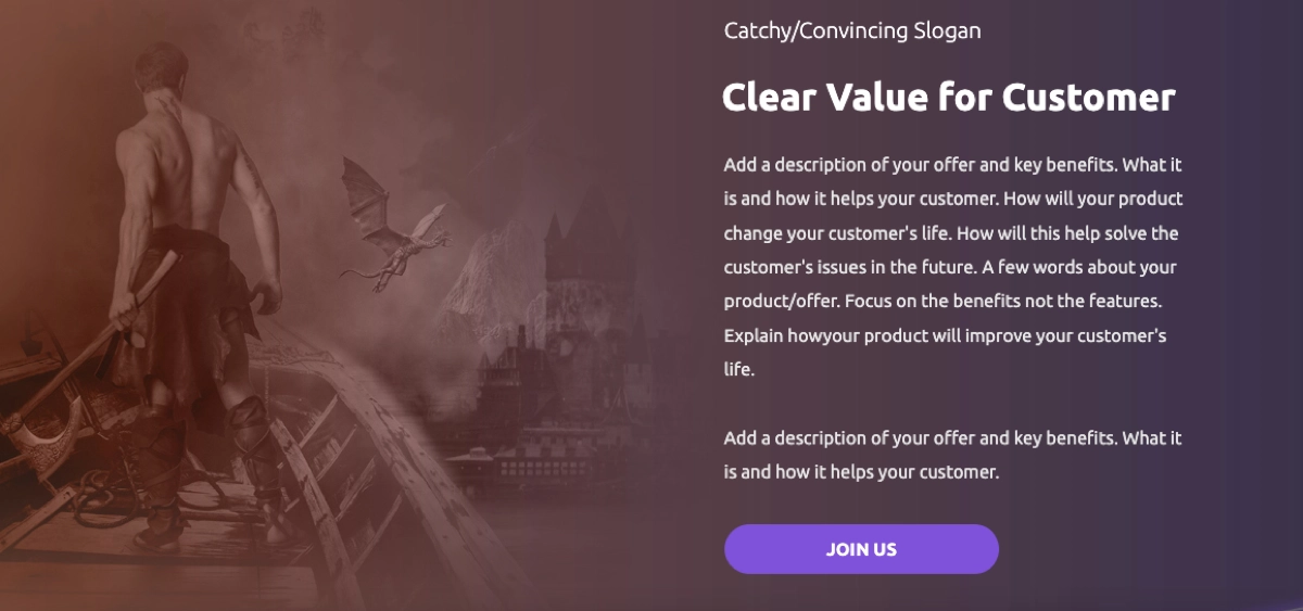
Choose the Game Shop Newsletter template from Landingi and customize it to generate email subscribers by adding eye-catching visuals, storytelling content, and an outstanding CTA button.
Drive excitement for your Kickstarter—start creating your landing page with Landingi!
7. Firsty
The Firsty landing page exemplifies an outstanding kickstarter landing page tailored to travelers seeking seamless global mobile data connectivity. The page stands out for its clarity, inviting design, and persuasive call-to-action, all essential in capturing the interest and support of the target audience. Even though the page seems like a classic app landing page, as the CTA leads to downloading the app, users have to wait for the product launch after registration.
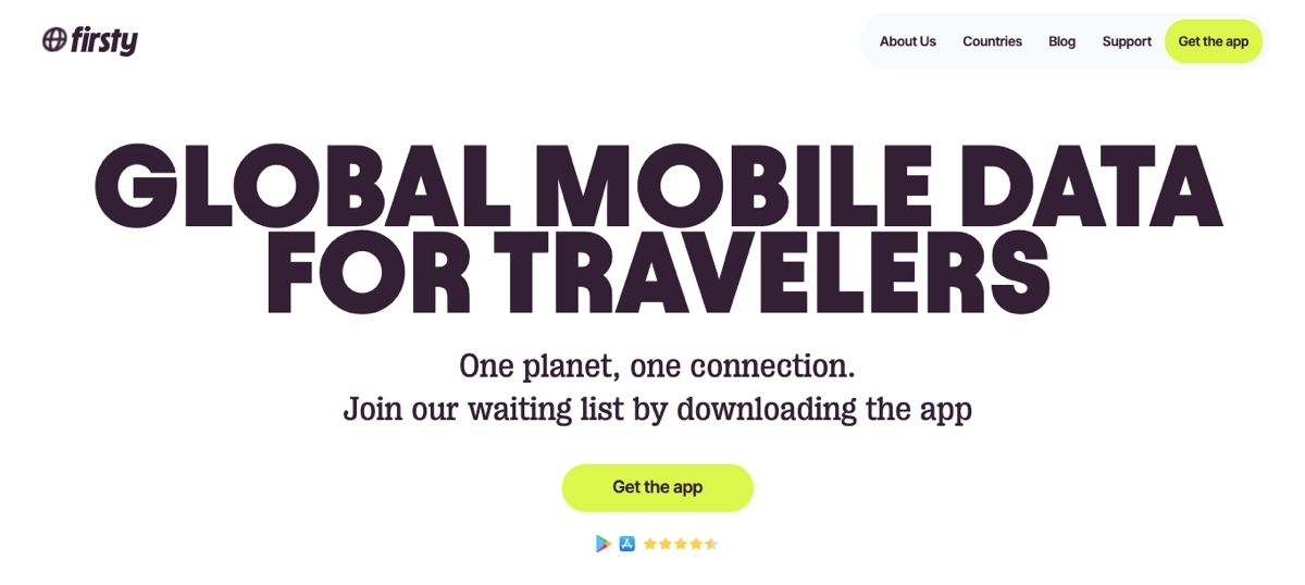
From the outset, the page sets a compelling narrative – a simple yet powerful message immediately resonates with the target audience. High-quality visuals and a clean, modern design aesthetic align with the innovative nature of the Firsty, reinforcing the product’s value proposition. The landing page does an excellent job of detailing the features and benefits of the Firsty app, using engaging visuals and concise, impactful copy.
Key takeaways to learn from this example:
- Intuitive, clear layout,
- Compelling headlines,
- High-quality visuals,
- Outstanding CTA button,
- Informative content,
- Social proof section,
- FAQ section.
Improvement areas:
- Expanded testimonials – adding a section featuring testimonials from early adopters or beta testers could enhance credibility and trust, providing social proof that can be crucial in the decision-making process.
Turn engaged audience into potential backers with an excellent kickstarter landing page – choose the Mobile App template and customize it with Landingi’s editor to boost sign-ups!

Ready to fund your project? Build your Kickstarter landing page with Landingi!
5 Kickstarter Landing Page Best Practices
To create an effective kickstarter landing page, implement the 5 best practices that allow you to gather backers, build an email list, engage visitors in your innovative idea, and build a strong brand even before launching. These proven practices will turn your casual product or service landing page into a focused, immersive, and helpful tool in your kickstarter campaign.
#1 Include simple form
The first best practice for a kickstarter landing page is to include a simple form, serving as a crucial element in the conversion funnel. The primary purpose of this form is to streamline the process for visitors to express their interest, subscribe for updates, or directly pledge their support for the project.
Take a look at the example below:

A well-designed, straightforward form minimizes barriers to entry, making it effortless for potential backers to take the next step. Encourage visitors to complete the form with an attractive value proposition in exchange for their e-mail address or create a special offer for those who decide to pledge to your project.
Turn visitors into backers—design your Kickstarter landing page with Landingi!
#2 Set a strong CTA
The second best practice for a kickstarter landing page is to set a strong CTA, acting as a guiding light for visitors to follow through with an action that aids in the campaign’s success. A compelling CTA captures attention and clearly communicates the action you want the visitor to take, whether it’s to make a pledge, sign up for updates, or learn more about the project.
Take a look at the example below:

The effectiveness of your CTA can significantly increase conversions and overall success of your kickstarter campaign. The call to action should be outstanding with its design and include a straightforward and personalized message. Think about its prominent placement on the page – repeat the CTA in the hero section, on a sticky bar, and in strategic sections to make completing action super easy for page visitors.
Need a Kickstarter landing page? Build one in minutes with Landingi!
#3 Include video content
The third best practice for a kickstarter landing page is to include video content. It’s a highly effective strategy to captivate and engage potential backers, making it a best practice for those looking to maximize their campaign’s impact. Videos provide a dynamic way to showcase your project, tell your story, and convey the passion behind your initiative. They offer a richer, more immersive experience than text or images alone, allowing creators to connect with their audience on a deeper level.
Take a look at the example below:
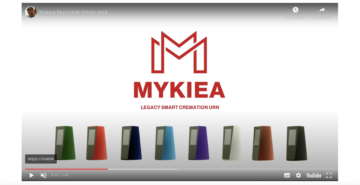
Moreover, implementing a video can be a great idea to shorten your page and deliver maximum information in a minimal form. Still, the video must be short – the average human attention span is 8 seconds, so the video content can work well for your landing page performance, as long as you’re able to build interest in the first seconds and close all information in a maximum of 2 minutes.
Launch a winning Kickstarter campaign—create your landing page with Landingi today!
#4 Showcase value proposition
The fourth best practice for a kickstarter landing page is to showcase a value proposition, as it directly communicates to potential backers why your project is worthy of their support. A clear, compelling value proposition answers the fundamental question: “What makes this project unique, and why should I care?” It distills the essence of your project into a persuasive argument, highlighting the benefits and unique advantages that set it apart from anything else on the market.
Take a look at the example below:

Clearly articulate what sets your project apart from competitors or existing products. This could be a unique design, an innovative feature, or an unusual approach to solving a common problem. Explain why your project is the better choice. You can use bullet lists, eye-catching visuals, or icons to point out the features and benefits of your project. Your value proposition should be immediately understandable. Avoid jargon and complex language. The goal is to convey the core benefits of your project in a straightforward manner that anyone can grasp without requiring additional explanation.
Engage backers with a professional Kickstarter landing page—get started with Landingi!
5. Add FAQ section
The fifth best practice for a kickstarter landing page is to add a FAQ section. An effective FAQ section anticipates and addresses potential backers’ common questions and concerns, reducing uncertainties and building confidence in your project. By providing clear, concise answers to questions about your product, service, campaign details, or company, you can:
- alleviate hesitations,
- clarify your value proposition,
- and streamline the decision-making process for potential backers.
Take a look at the example below:
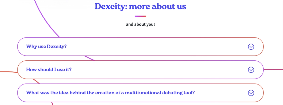
A well-organized FAQ section improves the overall user experience on your landing page. It helps visitors find the information they need quickly and easily, making their decision process smoother and more informed. FAQs can be used strategically to reiterate and emphasize important aspects of your campaign that you want to ensure visitors understand and remember, such as unique features, benefits, and the impact of your project. Remember to set CTA near the FAQ section to use its influence on the decision-making process and boost conversions efficiently.
Supercharge your Kickstarter campaign—design a landing page with Landingi!
How Can I Optimize My Kickstarter Landing Page for Higher Conversion Rates?
To optimize your kickstarter landing page for higher conversion rates, combine strategic content placement, engaging design elements, and user experience enhancements. The goal is to captivate potential backers’ attention, communicate your value proposition clearly, and guide them toward pledging. Take a look at the detailed 8-step instructions below:
1. Showcase your value proposition prominently
Firstly, showcase your value proposition prominently, highlighting what makes your project unique and why it deserves backing. This should be evident from the moment a visitor lands on your page. Use concise language and impactful visuals to reinforce your message.
2. Include a clear and strong CTA
Secondly, include a clear and strong CTA – these crucial buttons should stand out and encourage visitors to take action, whether making a pledge or signing up for updates. Use persuasive language that motivates action and ensure the CTA is visible without scrolling too much (keep it above the fold).
3. Create an engaging campaign video
Thirdly, create an engaging campaign video. It can communicate your story, mission, and the people behind the project in a way that text and images alone cannot. It’s a crucial tool for building emotional connections and encouraging pledges.
4. Optimize for mobile
Fourthly, optimize your kickstarter landing page for mobile to ensure your landing page is responsive and looks great on all screen sizes. Mobile optimization can significantly affect your page’s accessibility and conversion rates, as most traffic will come from mobile.
5. Use loading speed optimization techniques
Fifthly, use loading speed optimization techniques to ensure your kickstarter landing page performs well. A fast-loading page improves user experience and helps retain visitors’ attention. Optimize image sizes, leverage browser caching, and minimize the use of heavy scripts to ensure quick load times.
6. Conduct A/B testing
Sixthly, conduct A/B testing using dedicated external tools or choose a landing page builder with built-in A/B testing features, like Landingi. Regularly test different versions of your landing page to see which elements (e.g., CTAs, forms, images) perform better in engagement and conversion rates. Use this data to refine and optimize your page continuously.
7. Highlight rewards and incentives
Seventhly, highlight rewards and incentives to encourage visitors to take desired action. Clearly outline the rewards backers will receive at different pledge levels. Use appealing visuals and descriptions to make these rewards irresistible.
8. Engage with your backers
Eighthly, engage with your backers. Encourage questions and feedback on your idea, and actively engage with your backers. This engagement can foster a community around your project and encourage more pledges.
These proven optimization strategies can quickly enhance your kickstarter landing page’s effectiveness, ultimately leading to higher engagement, more pledges, and a successful campaign.
Create a Kickstarter landing page that converts—start using Landingi today!
What Are the Key Elements of an Effective Kickstarter Landing Page?
An effective kickstarter landing page involves key elements, like engaging videos, compelling headlines with immersive content, high–quality imagery, social proof elements, an FAQ section, encouraging reward tiers, and clear timelines, all leading to strong CTA or single opt-in form. Take a look at the detailed explanation of key kickstarter landing page elements shown below and consider using them to boost the overall page performance and drive higher conversions.
#1 Compelling headline
The first key element of an effective kickstarter landing page is the compelling headline, instantly grabbing attention and clearly conveying the essence of the project. It’s the first thing visitors see, so it should be impactful and summarize what your project is about.
#2 Engaging video
The second key element of an effective kickstarter landing page is an engaging video that tells your story, showcases the product or idea, and explains why it matters. The video is often the most engaging part of the landing page, providing a dynamic way to connect with potential backers.
#3 Clear and concise copy
The third key element of an effective kickstarter landing page is a clear and concise copy. The text on the page should be straightforward and to the point, explaining what the project is, why it’s important, and how backers can help. Every word counts, so focus on your value proposition and what makes your project unique.
#4 Striking visuals
The fourth key element of an effective kickstarter landing page is its visual side. Beyond the video, use high-quality images and graphics to illustrate your project. Visuals can help convey the benefits of your project more effectively than text alone.
#5 Social proof
The fifth key element of an effective kickstarter landing page is social proof. Testimonials, press mentions, award badges, endorsements from recognizable figures, and evidence of community interest (such as social media shares or pre-campaign interest) can significantly boost credibility.
#6 Reward tiers
The sixth key element of an effective kickstarter landing page is the reward tiers section. These, clearly outlined, help backers understand what they will receive in exchange for their pledge. Use compelling descriptions and visuals to make the rewards as enticing as possible.
#7 FAQ section
The seventh key element of an effective kickstarter landing page is a FAQ section that addresses common questions and concerns, reducing uncertainties and making it easier for visitors to decide to support your project.
#8 Strong CTA
The eighth key element of an effective kickstarter landing page is a strong CTA, placed prominently and designed with persuasive messaging that encourages visitors to back your project. Use action-oriented language that makes the next steps clear.
#9 Creator bio
The ninth key element of an effective kickstarter landing page is the creator or company bio. Introduce yourself and your team, highlighting your background, expertise, and passion for the project. Connecting on a personal level can build trust and support.
#10 Project timeline
The tenth key element of an effective kickstarter landing page is a project timeline that outlines key milestones, including the campaign’s duration, production schedule, and estimated delivery dates for rewards.
#11 Updates section
The eleventh key element of an effective kickstarter landing page is the update section that keeps potential backers informed about the project’s progress and developments, fostering a sense of involvement and community.
#12 Clear form
The last key element of an effective kickstarter landing page is a clear form, encouraging visitors to leave their e-mail addresses in exchange for exclusive content. It not only helps you generate leads but can build a community around your project and keep interest high.
By carefully integrating these elements, your kickstarter landing page can effectively communicate your project’s value, engage potential backers, and ultimately lead to a successful campaign.
Ready to hit your funding goals? Design a standout Kickstarter page with Landingi!
What Is the Best Kickstarter Landing Page Builder?
The best kickstarter landing page builder is Landingi, a platform that empowers users to craft, test, and refine landing pages tailored to their crowdfunding campaign. Renowned for its user-friendly interface and comprehensive digital marketing toolkit, Landingi caters to the needs of both novices and seasoned marketers alike, providing an unparalleled solution for achieving conversion goals.
Constructing a kickstarter landing page with Landingi begins with selecting a template from the platform’s extensive library. Each template is engineered to enhance conversions, requiring only customization of the design and the addition of content to move closer to your fundraising objectives. Customization goes effortlessly thanks to its user-friendly editor, where users can quickly add their own imagery, create compelling content, and implement key conversion-driving elements.
However, the journey doesn’t stop at page creation. Landingi’s suite of optimization tools, including A/B testing, EventTracker for user behavior analysis, and AI Assistance, transforms a basic landing page into a powerful digital marketing asset. Continuous optimization is vital, and Landingi equips users with all the necessary resources to optimize effortlessly and achieve superior results.
Through A/B testing, users can explore different iterations of their kickstarter landing page to gauge effectiveness. The EventTracker functionality enables precise tracking of user interactions, providing valuable insights through a comprehensive dashboard for subsequent optimization efforts. Additional features, such as AI Assistance, customizable forms, popups, and widgets, enhance the page’s search engine visibility, meet user expectations, and drive lead generation for future campaigns.
Landingi’s platform is budget-friendly and ideal for individual creators but also boasts advanced features designed to support marketers and agencies in their digital marketing endeavors. This blend of accessibility and sophistication establishes Landingi as the optimal choice for anyone looking to create a high-performing kickstarter landing page.
Kickstart your project’s success—build a landing page with Landingi now!
Craft Your Kickstarter Landing Page with Landingi
A well-crafted kickstarter landing page is a powerful digital marketing tool that allows you to connect with potential backers, create a buzz around your idea, and build your brand strength even before launching. The kickstarter landing page is also your gate to measure and scale your business.
As kickstarter campaigns ignite the imagination, your landing page should equally reflect the spirit of creativity and potential. Yet, creating a visually appealing page is just the beginning. Ongoing optimization is essential – from captivating design elements and persuasive narratives to strategic SEO practices – you can develop online platforms that embody your project’s innovative vision, enhance engagement, and encourage funding.
With the appropriate tools and insights, you can elevate a simple page into an effective kickstarter landing page. Seize the opportunity to begin shaping your Kickstarter landing page today – try Landingi now and transform an ordinary page into an exceptional conduit for conversions, turning your visionary project into a reality that captivates and convinces your audience to support your journey.

