A download white paper landing page is a page designed to capture contact information from users by offering them a downloadable resource. Also referred to as lead capture pages or resource download pages, they are critical in B2B marketing for capturing high-intent leads through valuable gated content like white papers or reports. According to a 2023 Content Marketing Institute report, 71% of B2B marketers rank white papers as a top lead generation tool.
However, creating a white paper landing page that effectively generates leads can be challenging. This article closely examines the best white paper landing page examples, breaking down the key components that drive their success. Learn what is essential on white paper landing page and use the proven methods to drive high conversions.
- Business of Fashion
- Restore
- La Devanture
- Arena CAD
- ISS UK & Ireland
- Brewers INSIGHT
- LG
- GetInData
- JobElephant
- Inspira Marketing
- EQUEST ASIA
- GSPANN
- Seuss+
- IGNITE CTRM
- EY
- HAMILTON
- Mitie
- Reaktor
- World Economic Forum
- Future foHRward
- 3SS

What Is a White Paper Landing Page?
A white paper landing page is a dedicated space that promotes a particular white paper. It’s a one-page stop designed to provide a snapshot of the white paper’s content while enticing visitors to download the full version. These pages are unique in that they exist independently of your website’s navigation, focusing solely on the promotion of your white paper.
White papers contain comprehensive, research-backed content. They are seen as a valuable way of generating leads and establishing the company as an authority in its field. A white paper landing page, therefore, plays a crucial role in this process by providing a platform for visitors to access this valuable content. In the context of creating white papers, the white paper landing page is an essential component for successful lead generation and brand positioning.
But it’s more than just a launchpad for your white paper download. A well-crafted white paper landing page acts as a lead generation tool. It captures visitor information, usually in exchange for the white paper, turning a curious visitor into a potential lead. The white paper content, therefore, needs to be compelling enough to warrant this exchange, making the landing page the first crucial step in the lead generation process.
Create a high-converting white paper landing page—get inspired by 5 ideas with Landingi!
What Are the Key Elements of an Effective White Paper Landing Page?
The key elements of an effective white paper landing page are harmoniously blended to generate leads effectively. Creating a white paper landing page must adhere to principles of clarity and intuitiveness, as it’s a critical component in the realm of professional and educational content marketing. It employs the 10 essential elements:
1. Engaging headline
The headline captures attention and clearly conveys the white paper’s topic, acting as a lighthouse, drawing in the reader’s interest and spotlighting the subject of the white paper. It’s the hook that reels in professionals and enthusiasts alike, promising them valuable insights and knowledge. An effective headline is often the difference between a visitor skimming past or stopping to take action, making it a pivotal landing page element.
2. Concise description
A short description provides an overview of the white paper’s contents and benefits, succinctly presenting the core topics and key takeaways that the reader can expect to gain. This summary not only informs but also piques potential leads’ interest by highlighting the unique insights and valuable knowledge contained within the white paper, encouraging further engagement and the decision to download.
3. Strong CTA
Prominently displayed CTA encourages visitors to download. Picture this: the call to action isn’t just a button; it’s your virtual salesperson working tirelessly to convert interest into action. It should be positioned in such a way that it becomes the natural next step for visitors who have been engaged by the compelling content and are now ready to commit to reading the full white paper. It guides users towards the ultimate goal of the landing page: the valuable exchange of their contact information for the insight-packed white paper that awaits them.
4. Lead capture form
The form collects essential information without being overly intrusive, yet it should be designed to be smartly positioned and visually appealing to encourage user interaction. The form must be streamlined to request only the most critical details, such as name and email address, ensuring a frictionless user experience.
5. Visual Elements
Relevant images or graphics complement the content, enhancing visual appeal and supporting the textual information presented. By incorporating visual elements directly related to your white paper’s key points, you can create a more engaging experience for visitors. They can help break up large blocks of text, making your landing page more digestible and attractive to visual learners.
6. Credibility indicators
By highlighting the experience and qualifications of the authors, or the awards and testimonials that the company has received, visitors are more likely to view the white paper as a credible and valuable resource. Endorsements from well-known figures or organizations within the industry can further elevate the perceived value of the white paper, making it more enticing for visitors to download and read.
7. Testimonials or reviews
Incorporating testimonials or reviews on your white paper landing page can significantly enhance credibility and foster trust with potential leads. It’s a powerful way to demonstrate your white paper’s impact and encourage visitors to become part of your success story.
8. Responsive Design
Responsive design ensures usability across various devices and screen sizes, adapting the layout and functionality to provide an optimal experience whether the user is on a desktop computer, a tablet, or a smartphone. In today’s mobile-first world, this is not just an enhancement; it’s an essential feature for any successful white paper landing page.
Implementing a responsive design for websites can lead to a significant uplift in conversions on mobile devices, potentially increasing them by up to 30%, as said by Neil Patel, digital marketing expert.
Ready to promote your white paper? Build a landing page with Landingi today!
How Do I Create a White Paper Landing Page?
To create a landing page for your white paper, define your objective, design the page, create engaging content, include a strong CTA, add a lead capture form, and incorporate relevant visuals. Choose the proper tool, like the Landingi platform, to craft a white paper landing page effortlessly. Its user-friendly drag-and-drop editor allows for seamless template customization. Thanks to the checklist, you won’t forget about essential elements affecting higher conversions. AI landing page features help create well-matched content and simplify SEO optimization. Thanks to the built-in side tools, you can effectively conduct A/B tests, and measure your experiments’ efficiency within EventTracker, allowing you to track user behavior.
To ensure your download white paper page is designed for maximum engagement and conversion, follow the 7-step guide:
1. Define the Objective
Identify the main goal of the white paper and the target audience. Determine what you want to achieve with the white paper and know what the white paper is for. By clearly defining the objective and understanding the target audience, you can create a white paper that is both relevant and engaging, increasing its chances of success.
2. Design the Page
Pick the Create new landing page option to choose how you’ll build your page. You can craft your page from scratch in a drag-and-drop builder, choose a relevant, customizable template and tailor it to your brand and offer, leverage Composer to generate a page based on your requirements or import your page design from Figma.
While creating your page, ensure a professional and clean design that aligns with your brand’s identity. The page layout should be intuitive, with a clear path for users to follow, leading them towards the download CTA.

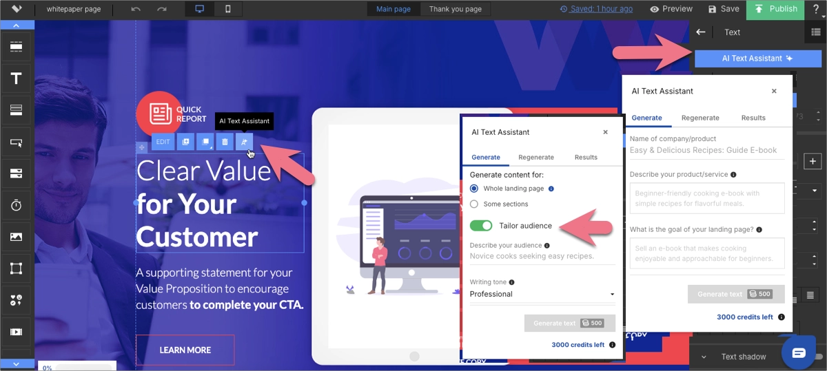
3. Create Engaging Content
Write a compelling headline and a concise summary of the white paper’s value. Once the audience is identified, tailor the white paper’s content to address their specific interests, challenges, and pain points. This ensures that the white paper resonates with its intended readers.
You can leverage the AI Text Assistant in Landingi’s editor to create engaging, persuasive, and SEO-optimized content for the entire page or its selected section. This feature helps create catchy headlines, informative, benefit-oriented content, and encouraging CTAs.
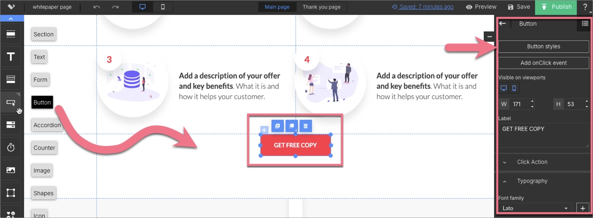
4. Include a Strong CTA
Add a clear call-to-action that encourages downloads. Crafting this CTA with precision and care is essential, as it can significantly influence the decision-making process of your visitors, nudging them closer to becoming not just leads but engaged and informed participants in the discourse your white paper initiates.
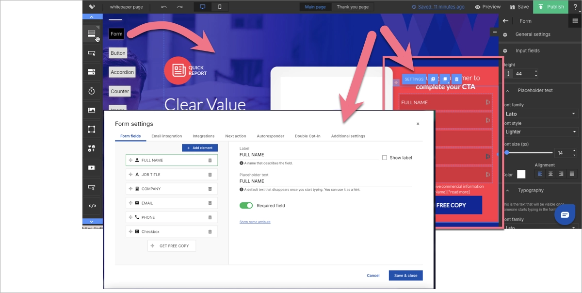
5. Add a Lead Capture Form
Incorporate a form to gather visitor information, keeping it simple. Make it clear what the user gains in return for providing their information, such as valuable insights from the white paper. A good practice is to include a brief note on privacy, reassuring users that their data is safe and will be used responsibly.
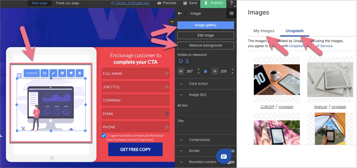
6. Incorporate Visuals
Use relevant images or graphics to enhance attractiveness – these visuals are an important part of building engagement. Leverage Landingi’s background removal to enhance your page’s visual appeal. Consider adding video content, as it’s the best way to wake interest and boost conversions.
7. Build Credibility
Add author credentials, testimonials, or social proof. Thanks to them, you can achieve better conversion results and build your brand’s position in the field, expanding in a broader audience.
To achieve the best results, don’t forget about the following:
- Optimize for SEO – use relevant keywords for better online visibility.
- Ensure Responsiveness – make sure the page is accessible across different devices.
- Test and Optimize – regularly perform A/B testing and use analytics to refine the page for better performance.
Turn visitors into leads—design a white paper landing page with Landingi!
21 Examples of White Paper Landing Pages
The 21 examples of white paper landing pages will help you visualize the concepts we’ve discussed. Each of these pages showcases various design and content strategies that make them effective in generating leads and promoting their respective white papers.
1. Business of Fashion
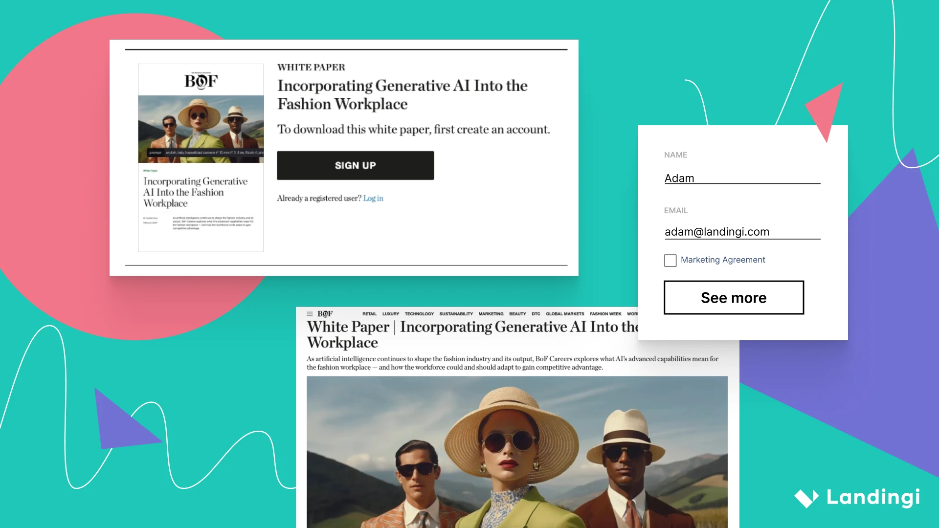
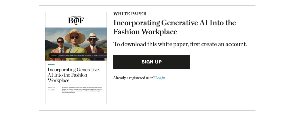
The white paper landing page of Business of Fashion offers insights on applying generative artificial intelligence in the fashion industry. The page captures visitor information through a short opt-in form, which potential customers fill out before accessing the white paper. Moreover, the page layout is meticulously designed to ensure that the sign-up button is both prominent and inviting.

The choice of colors, fonts, and images reflects the forward-thinking nature of the white paper’s subject matter while also aligning with the sophisticated aesthetic of the fashion industry. The strategic design aims to create a seamless user experience that guides visitors through the journey from initial curiosity to the decision to download the white paper, facilitating a higher conversion rate.
Key takeaways to learn from this example:
- Clean, professional look – aligns with its target audience
- High-quality images – enhance the visual appeal
- Consistent color scheme – makes the page eye-catching and engaging
- Outstanding CTA button – leads to download form
Improvement areas:
- Enhancing user interactivity – interactive elements could engage users more, providing an immersive experience. By allowing users to interact with content before downloading the white paper, the page can create a stronger connection and potentially increase the likelihood of conversion.
- Strengthening mobile user experience – improving the mobile experience can lead to better engagement and higher conversion rates from mobile users.
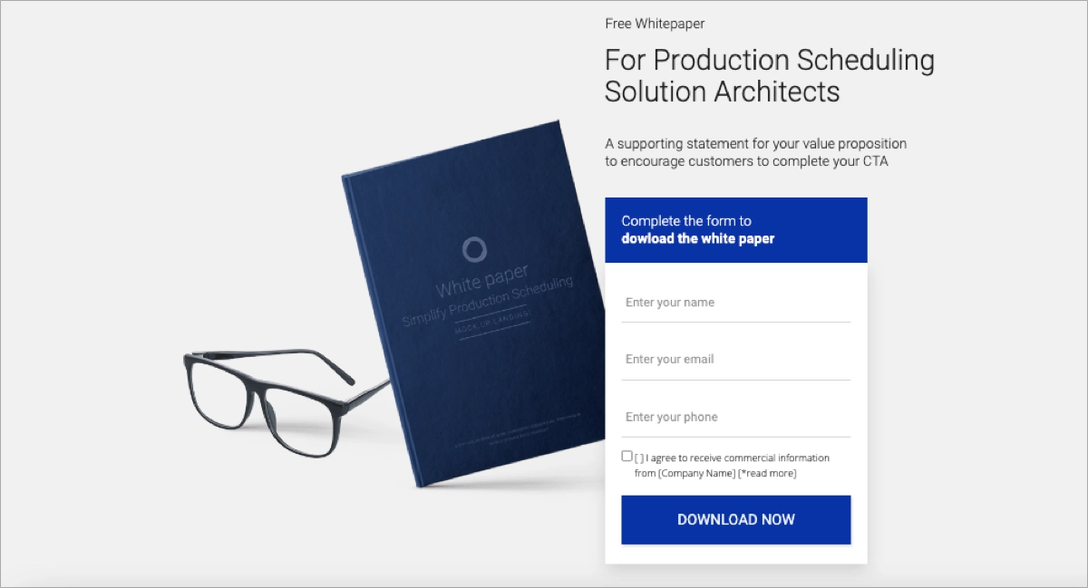
Check out the Landingi template gallery and choose the pattern to create your own download white paper landing page – with its drag-and-drop editor, it takes minutes!
2. Restore
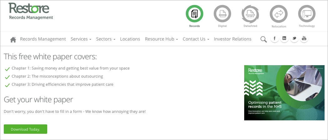
The white paper landing page for Optimising Patient Records by Restore focuses on enhancing data storage for improved patient care. The page design is simple, with the main focus being the download button. The layout highlights the ease of accessing the white paper with a straightforward CTA. This approach aligns with the company’s dedication to efficient and user-friendly solutions in data management for healthcar
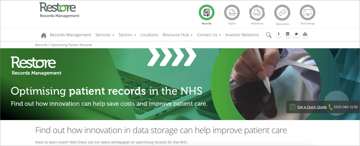
The page avoids using a form, reducing the friction for visitors and increasing the likelihood of conversions. The page also includes a testimonial from an industry professional, reinforcing the practical benefits of their services. A clear headline that succinctly communicates the white paper’s value proposition further entices visitors to download the content.
Key takeaways to learn from this example:
- Simple and direct approach – avoiding a complex form for white paper access
- Prominent download option – makes accessing the white paper straightforward and user-friendly
- Testimonial inclusion – emphasizes real-world application and trust.
- Focus on efficiency – aligns with Restore’s ethos of efficient data management solutions in healthcare
- Intuitiveness – simplicity minimizes distractions and allows visitors to focus on the main goal – downloading the white paper
Improvement areas:
- Enhanced visual elements – while the page is straightforward, incorporating more engaging visuals or graphics related to patient record optimization could enhance its appeal and better convey the content’s significance.
- More detailed preview – providing a brief preview or summary of the white paper’s key points on the landing page could help visitors understand its value and relevance more clearly before downloading.
Boost your white paper downloads—create a compelling landing page with Landingi!
3. La Devanture
La Devanture’s white paper landing page takes a different approach. It promotes a white paper on retail store design and customer experience, focusing heavily on visual attractiveness. The page is packed with high-quality images and design elements that immediately catch the visitor’s eye and provide a flash into the content of the white paper.
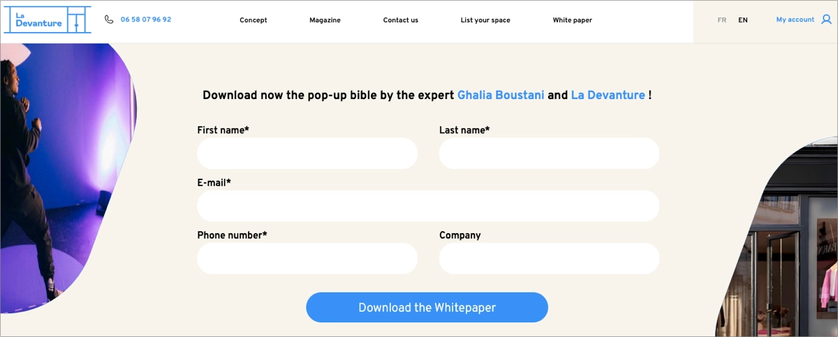
At first glance, the page seems simple, but it is strategically designed to guide the visitor’s journey through the sales funnel. As soon as a visitor completes the download form, they are immediately presented with the white paper download, creating a seamless transition from interest to download.
Key takeaways to learn from this example:
- Focused theme – aligning well with the target audience interested in retail and temporary store formats
- Engaging visuals – enhance the appeal and convey the topic effectively
- Intuitive design – delivering a user-friendly interface with clear navigation options and a straightforward layout
- Prominent download section – the download form is easily accessible, encouraging visitor engagement and white paper downloads.
Improvement areas:
- Enhanced content description – adding a more detailed summary or preview of the white paper’s contents could better inform visitors about what they can expect to learn, increasing the likelihood of downloads.
- Inclusion of testimonials – it could add credibility and practical insights, making the white paper more compelling.
Promote your white paper effectively—design an engaging landing page with Landingi!
4. Arena CAD
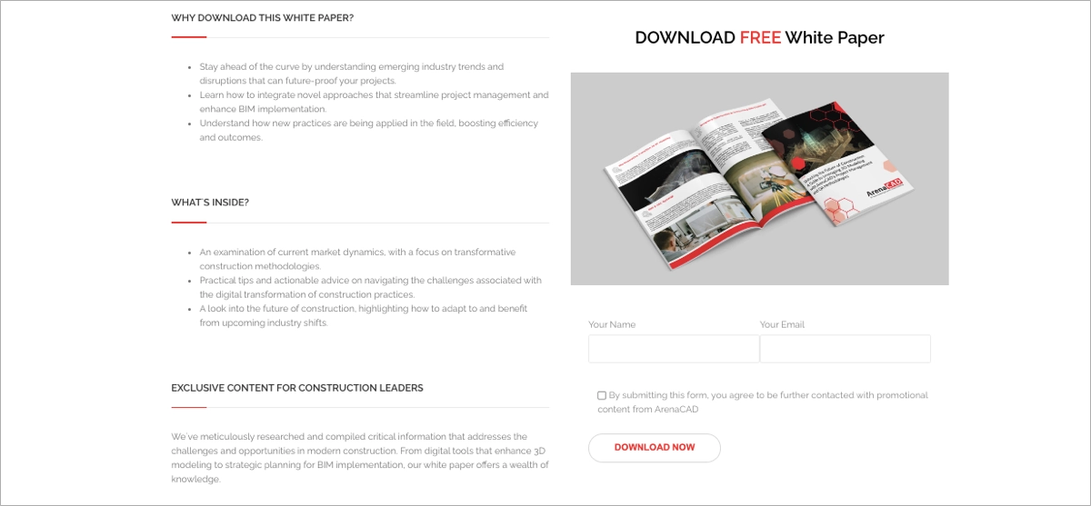
The white paper download page by ArenaCAD effectively presents a guide on leveraging 3D modeling in construction. The page is designed to attract project managers and senior engineers, emphasizing how the white paper can help them stay ahead in the industry. It details the contents, such as emerging trends and digital transformation in construction, and provides a simple form for downloading.
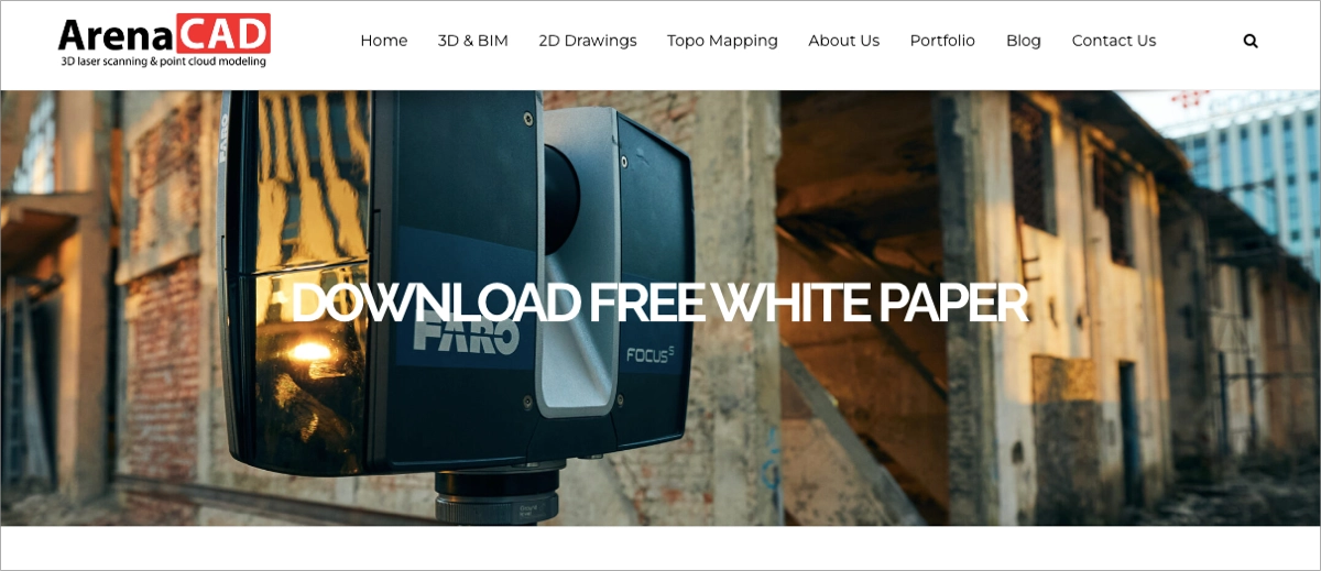
The layout and content are tailored to project management professionals, focusing on advancing skills and knowledge in 3D construction methodologies. The design elements on the page are minimal, which helps to keep the visitor’s attention on the content. A headline that immediately communicates the value proposition of the white paper, enticing visitors to learn more. The CTA button completes the short download form, which asks only for necessary information. This approach reduces friction and makes it easier for visitors to download the white paper, increasing the likelihood of conversions.
Key takeaways to learn from this example:
- Targeted professional design – aligns with its audience of project managers and construction engineers
- Informative content layout – provides a clear presentation of the white paper’s relevance to 3D modeling in construction
- Streamlined download process – short form makes it easy and quick for visitors to access the white paper
- Relevant visual elements – to enhance visual attractiveness and context
Improvement areas:
- Testimonials or case studies – adding testimonials from industry experts or case studies highlighting the successful application of 3D modeling in construction projects could bolster credibility and entice more downloads.
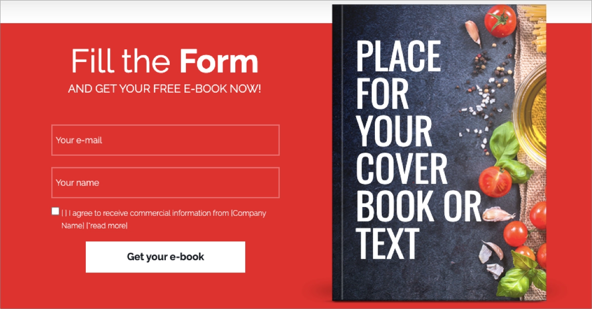
Use one of the Landingi templates and generate leads efficiently by promoting your white papers. Implement the white paper cover’s visual, use a clear form, implement an outstanding CTA button, and measure results with the built-in EventTracker tool!
5. ISS UK & Ireland
The Rising Above The Noise white paper webpage by ISS focuses on the application of Artificial Intelligence in the built office environment. It targets C-suite executives and directors, offering insights for strategic planning in areas like energy, sustainability, workplace experience, and information security. The webpage features a form for downloading the report and highlights the expertise of the author, Inma Martinez, a recognized thought leader in AI.
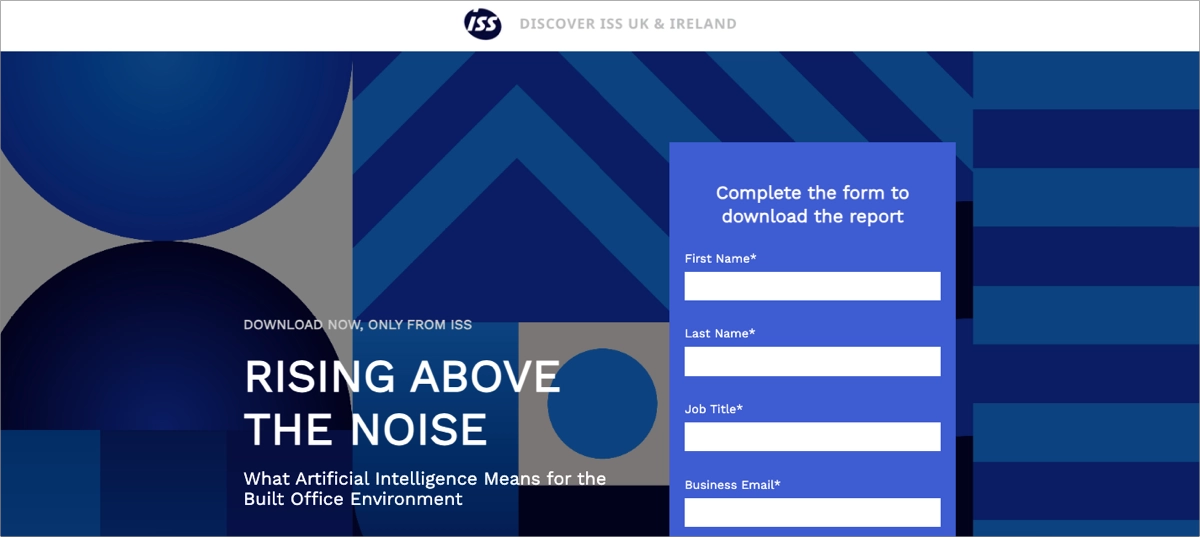
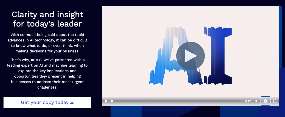
The design and content are tailored to appeal to leaders making crucial business decisions in a technology-driven landscape. Their landing page includes video content, which boosts users’ engagement and improves conversions. One of the essential elements is also the author’s note, which builds trust among visitors.
Key takeaways to learn from this example:
- Clean and professional layout – aligns well with its intended audience of C-suite executives and directors.
- Video content – boosts visitor’s engagement
- Author note – a trust-building element that increases credibility
- Clear call-to-action – a prominent CTA button for downloading the white paper
Improvement areas:
- More detailed content preview – providing a more comprehensive preview can help visitors understand the depth and scope of the insights offered, potentially increasing their interest in downloading the document.
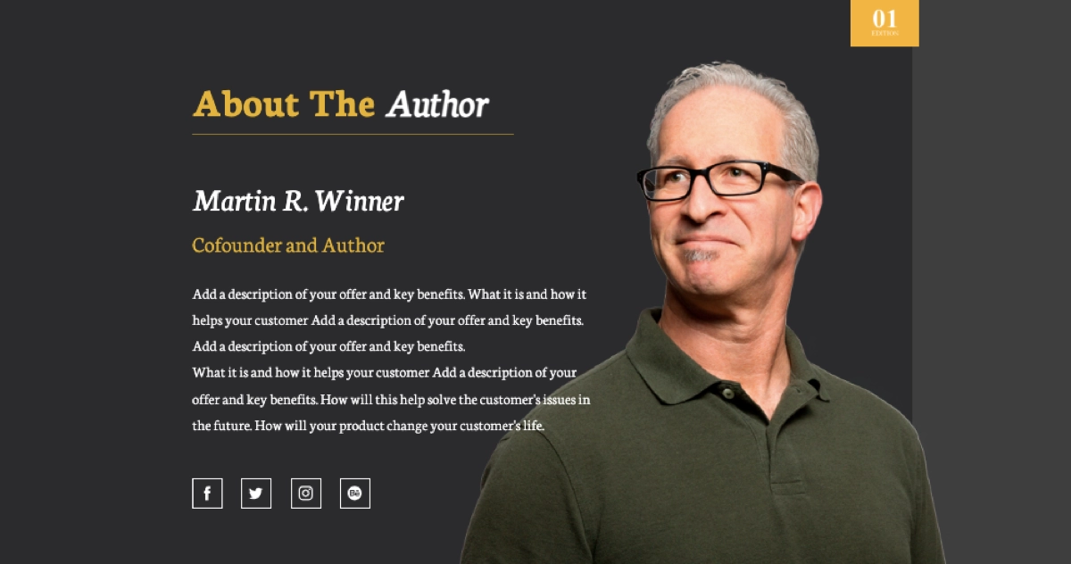
Choose the perfect pattern from the Landingi template gallery and create your own high-converting white paper download website with its user-friendly landing page builder. Don’t forget about trust-building elements – an author’s note increases credibility, leading to higher conversions.
6. Brewers INSIGHT
The white paper landing page of Brewers Insight is a good example of a conversion-focused resource hub for a niche B2B audience – craft brewers. The page promotes the white paper with a clear, benefit-driven headline. The supporting copy dives into how brewery management software helps streamline operations, attract new markets, and solve challenges as businesses scale. The messaging is short and precise, which enhances clarity for time-strapped professionals.
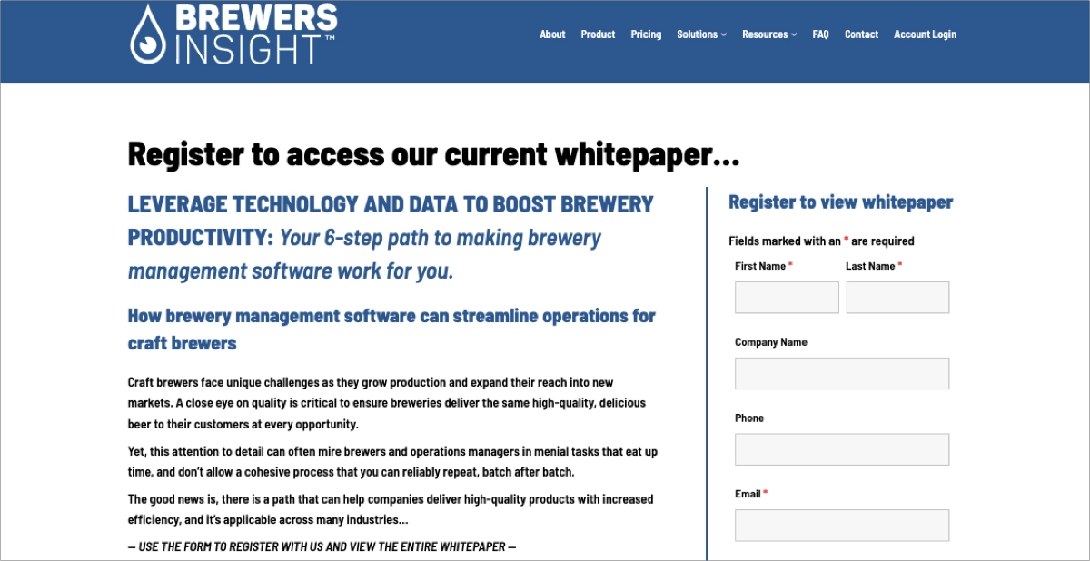
The design is straightforward and aimed at maximizing conversions. Its two-column layout directs the viewer’s attention right to the objective: signing up for the white paper. The use of a professional yet approachable aesthetic strengthens trust. Additionally, the streamlined form facilitates smooth lead capture.
Key takeaways to learn from this example:
- Strong, industry-specific value proposition,
- Clean layout with a single focus: download the white paper,
- Trustworthy design with consistent typography and clean branding,
- Efficient form design,
- Responsive setup.
Improvement areas:
- Including a preview image of the white paper or success metrics would enhance visual interest and credibility.
7. LG
The page for LG’s VRF Control Solutions whitepaper stands out as a benchmark for corporate-level B2B content marketing. It clearly delivers its value proposition: improving energy efficiency and control in modern buildings through LG’s smart solutions. The introductory message is concise and SEO-rich, using industry-specific terms to position LG as a thought leader in HVAC technology immediately.
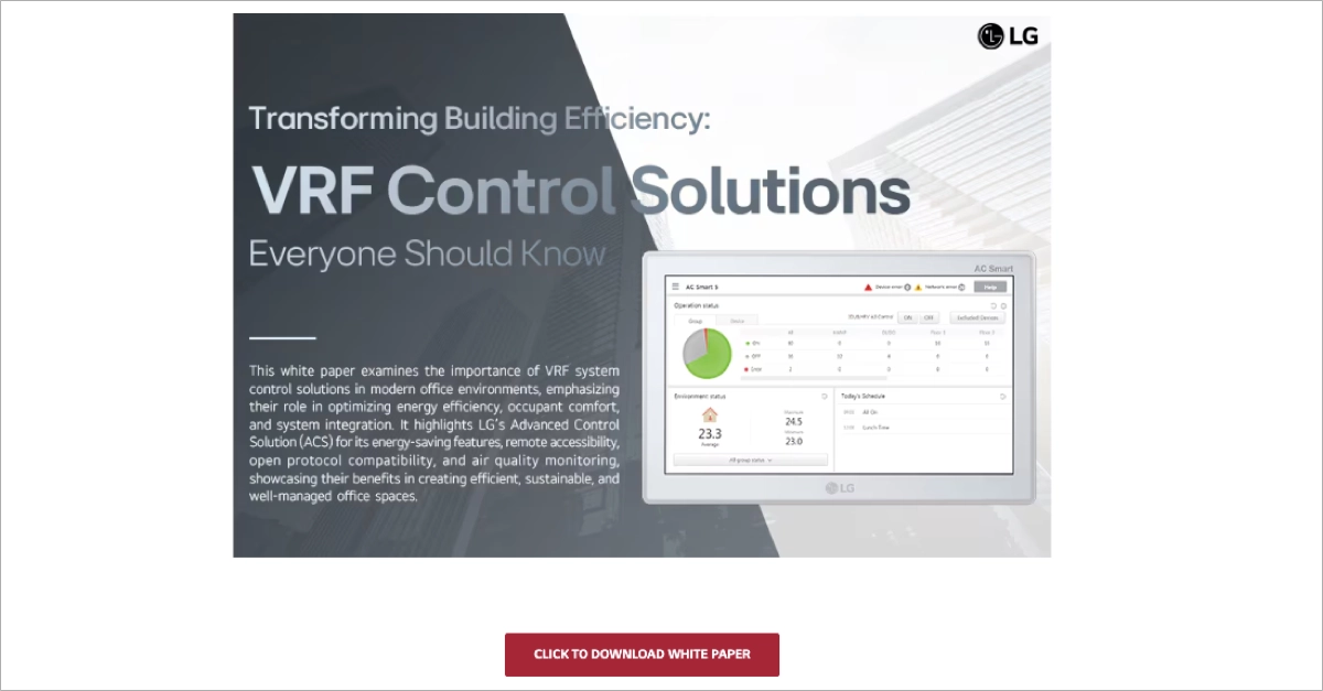
Visually, the page is sleek and minimalistic, designed to align with LG’s global brand aesthetics. A strong headline, a clean hero image, and a direct call to action invite immediate interaction. Although the actual download form is a step deeper into the site, the user journey feels seamless due to intuitive navigation and clear linking.
Key takeaways to learn from this example:
- Industry-specific focus,
- SEO-optimized content that ensures discoverability via organic search,
- Strong, benefit-driven headline,
- Professional branding,
- Easy access to download.
Improvement areas:
- The actual lead-capture form could be placed on the landing page itself rather than requiring an extra click – instead of a download resource form, there is a newsletter signup form displayed on the page.
See top white paper landing page examples—start building yours with Landingi!
8. GetInData
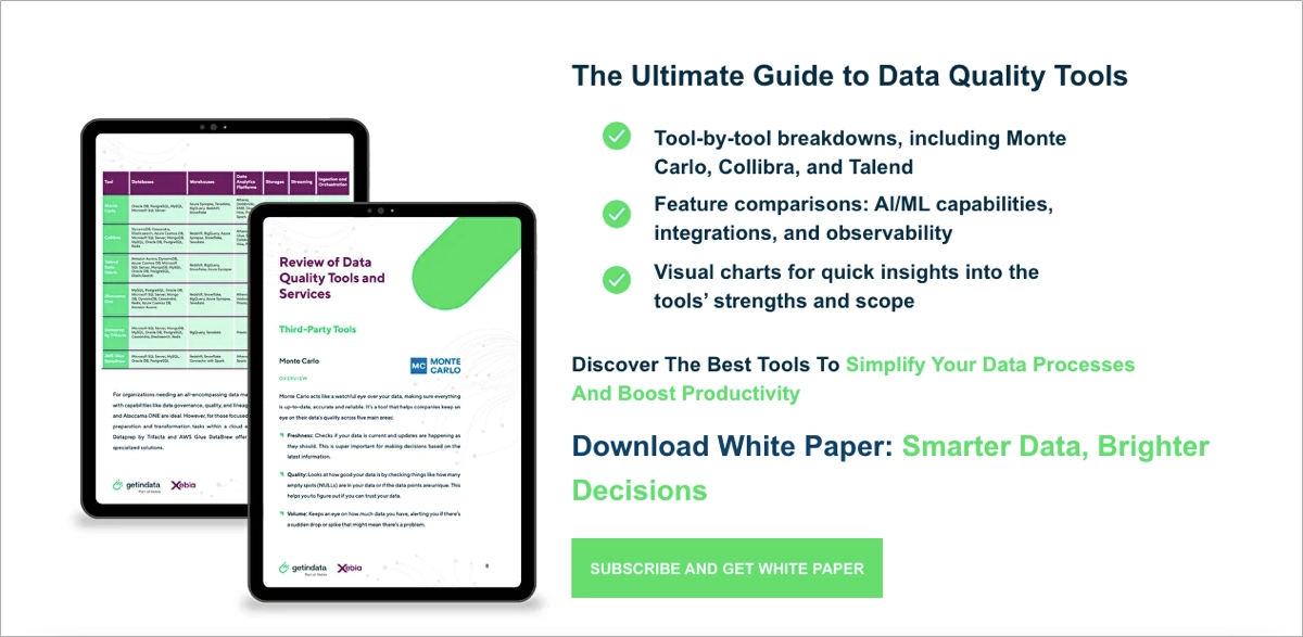
The GetInData white paper landing page is another great example of a high-performing B2B lead-generation page. The page zeroes in on data engineers, analysts, and decision-makers by offering deep insights into data quality tools and machine learning integration. The headline is strong, and subheadings clearly explain what the user will gain. The messaging is clear and supported by bold text, color accents, and bullet points to highlight key white paper content.
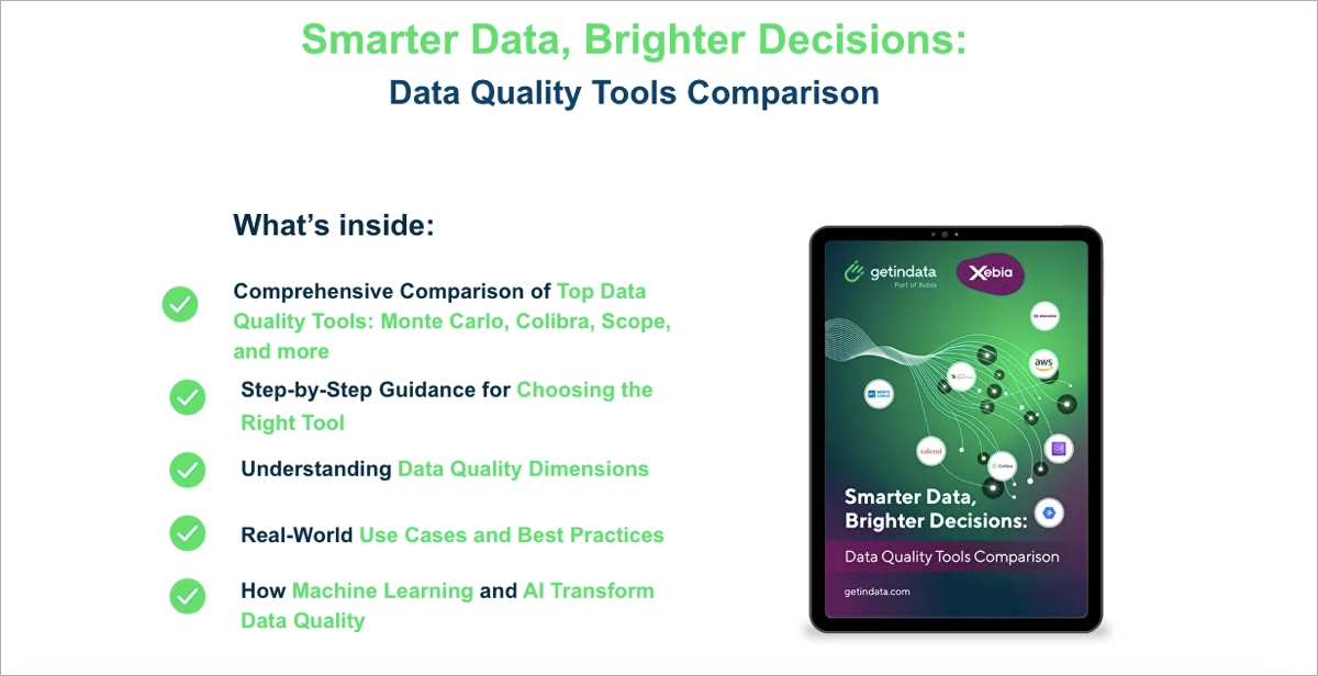
Design-wise, the layout is well-balanced between technical authority and modern web aesthetics. A compelling hero section introduces the content, while a well-structured form (name and email only) sits just below, making conversion friction-free. Visual elements such as checkmark icons and a preview image create a sense of value and completeness, reinforcing credibility and engaging the viewer further. The CTA button – bright and centered – makes it easy to commit.
Key takeaways to learn from this example:
- Clear promise of value,
- Conversion-optimized layout with easy-to-complete form,
- Well-designed visuals that create a strong visual hierarchy,
- Compelling CTA.
Improvement areas:
- Adding testimonials or recognizable client logos could strengthen credibility and trust.
9. JobElephant
The JobElephant website’s white paper section showcases how a professional service brand can deliver valuable content while staying true to its clean corporate identity. Focused on recruitment advertising and employer branding, the website section offers visitors access to insightful resources, such as industry-specific white papers, in exchange for minimal contact information. The presentation is polished, using refined fonts, consistent brand colors (navy and lime green), and a well-organized structure that aligns with JobElephant’s trusted reputation in education and public sector recruitment.
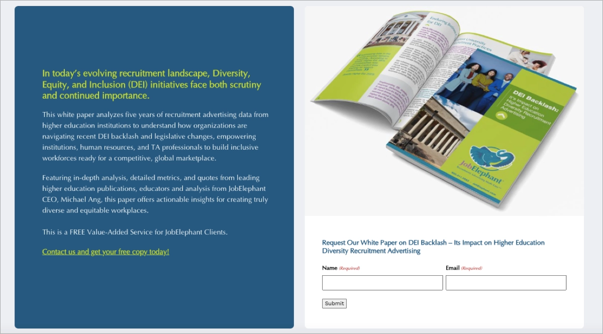
The call to action is subtly integrated into a seamless browsing experience. Instead of aggressively pushing visitors, the site creates a sense of natural discovery through smooth navigation and content-driven appeal. The white paper signup form is minimal, ensuring an effective lead generation.
Key takeaways to learn from this example:
- Clean, brand-aligned design,
- Minimal form friction,
- Effective hierarchy where white paper CTA doesn’t interrupt the browsing flow.
Improvement areas:
- Placing the white paper offer more prominently (using, e.g., a pop-up or sticky bar) could help increase awareness and signups.
Promote your white paper effectively—design an engaging landing page with Landingi!
10. Inspira Marketing
The page from Inspira Marketing is a compelling example of how to turn thought leadership into lead generation. Focused on the future of experiential marketing, the page highlights their latest resource, Shaping Experiential Marketing Trends for 2025 white paper, with a headline that immediately communicates value – fostering deeper relationships through in-person brand experiences. The page blends creativity and clarity by using succinct subheads and a clean, three-column layout that separates visual, narrative, and form content elegantly.
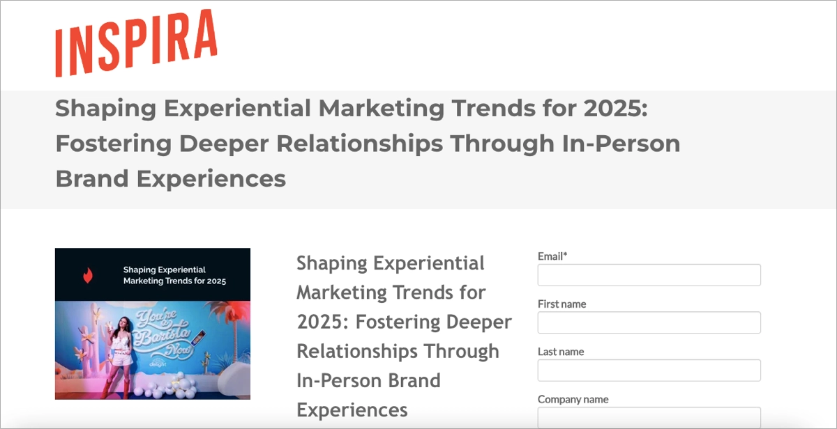
A high-performing lead capture form is placed in the right column for easy visibility. The copy focuses on three core benefits – creativity, technology, and inclusivity – providing visitors with immediate reasons to convert. Supporting text reinforces the brand’s role as a guide in experiential strategy, helping establish authority and credibility. Additionally, the mobile-optimized design ensures that users on any device have a smooth experience.
Key takeaways to learn from this example:
- Powerful headline and subhead that sets expectations,
- Visual balance,
- Content-driven pitch,
- Trust through professionalism.
Improvement areas:
- Adding a prominent CTA with action-driven language like “Get the Guide” or “Start Reading” could further increase engagement.
11. EQUEST ASIA
The white paper landing page from Equest Asia presents a strong example of how to combine emotional relevance with professional insight. The layout immediately captures attention with a bold headline, emotionally resonant subject matter, and a clean two-column format. On the left, a visually engaging white paper cover adds legitimacy, while the right side offers concise copy explaining the benefits of the download – focusing on emotional intelligence, cultural differences, and strategies for stronger relationships.
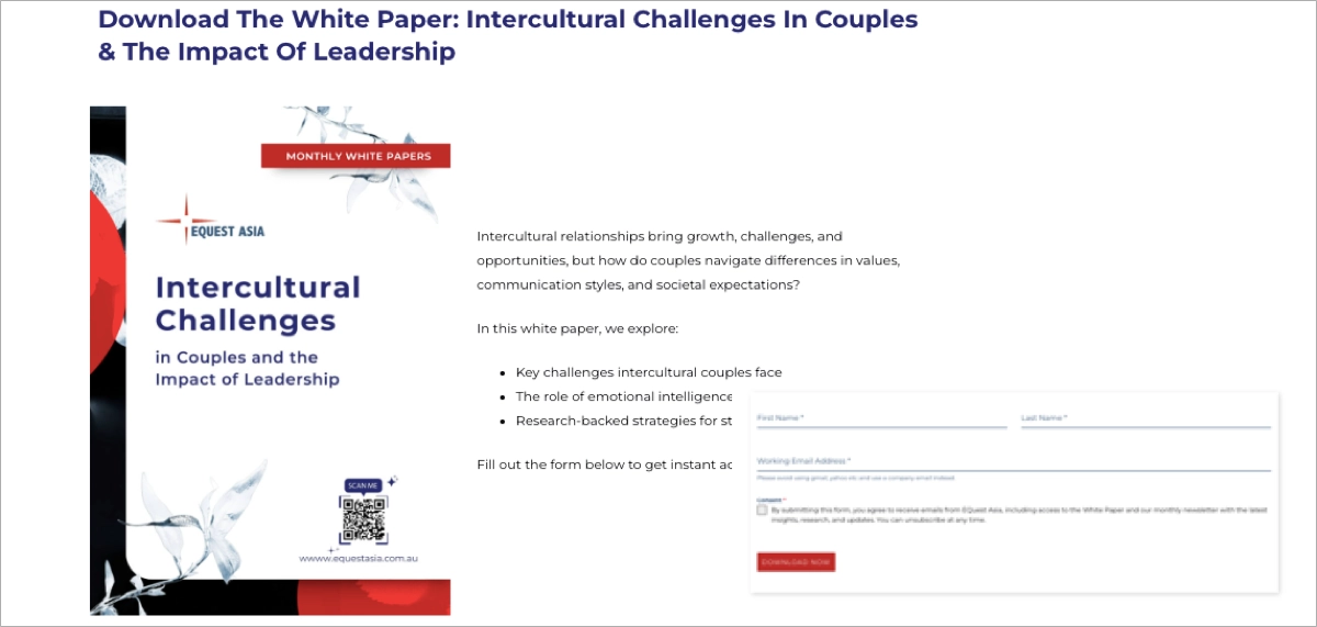
The landing page also smartly integrates a lead form with only essential fields (first name, last name, and email), streamlining the user experience and boosting the likelihood of conversion. A red CTA button is clear and action-oriented, standing out against the clean white background.
Key takeaways to learn from this example:
- Emotional and educational appeal that combines personal relevance with professional insight.
- Clear contrast between content, visual, and form elements,
- Minimalist lead capture form,
- Well-structured bullet points.
Improvement areas:
- Including a preview page or infographic could increase perceived value and engage visual learners.
12. GSPANN
The GSPANN landing page for the white paper “Transform Retail with Composable Commerce: A Strategic Guide for Leaders” is a top-tier example of content marketing done right in the tech and retail innovation space. Designed for executives and digital strategists, the page uses a rich, content-forward layout to walk users through the benefits of composable commerce, contrasting it with monolithic and headless architectures. The storytelling draws in readers with real-world analogies, while data points and forecasts elevate the white paper’s perceived authority.
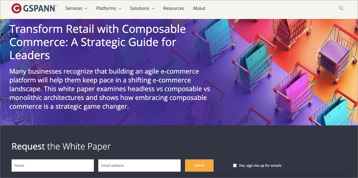
The page is clean and modern, combining a full-width hero image with a dark-themed form section that breaks the visual monotony while guiding user focus to the conversion area. The form itself is brief – just name and email – and is smartly paired with an optional email signup checkbox. The entire page is SEO-optimized, and it balances credibility, technical depth, and user experience beautifully.
Key takeaways to learn from this example:
- Story-driven content strategy,
- Well-defined page structure,
- High-level positioning,
- Short, clear, and visually distinct from the rest of the page download form,
- Visual professionalism.
Improvement areas:
- While functional, the “Submit” button could be more emotionally engaging with action verbs like “Get the Guide” or “Start Reading Now.”
Maximize white paper downloads—build an optimized landing page with Landingi!
13. Seuss+
The white paper landing page by Seuss+ Consulting showcases how to target a niche life sciences audience with both authority and approachability. The hero section immediately captures attention with a compelling title, supportive subtitle, and – importantly – a visible and accessible download form placed right within the hero area. This strategic placement minimizes friction and encourages immediate action, making it ideal for time-conscious biotech leaders looking for proven strategies to improve vendor selection processes.
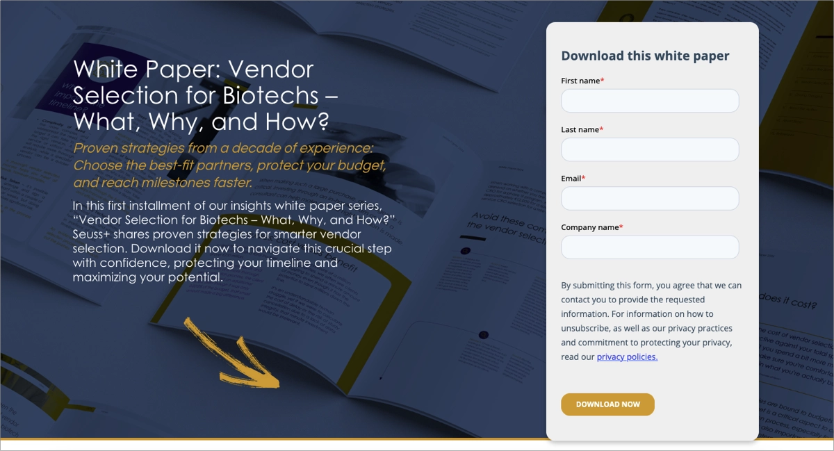
The design is clean, editorial-inspired, and aligned with Seuss+’s brand, using trust-enhancing color schemes, clear typography, and an authoritative tone. Strong SEO elements such as optimized metadata, structured headings, and social sharing tags boost organic discoverability. The page also benefits from an emotionally intelligent narrative that touches on the risks of poor vendor alignment, delayed trials, and overspending – anchoring the white paper’s value in real-world biotech pain points.
Key takeaways to learn from this example:
- Hero section form placement,
- Value-rich messaging,
- Professional design aesthetic,
- Concise and strategic content structure that balances information with conversion goals.
Improvement areas:
- More dynamic CTA language with stronger verbs like “Access the Guide” or “Unlock Insights” might increase engagement.
14. IGNITE CTRM
The page by IGNITE CTRM, created for a white paper titled 5 Signs It’s Time to Transition to a CTRM from Excel, is an example of focused lead generation targeting commodity trading professionals. The page clearly outlines the practical pain points of using Excel for trade risk management and positions IGNITE’s platform as a streamlined, modern alternative. It opens with a bold headline and supporting copy that speaks directly to inefficiencies, scalability issues, and risk exposure – key concerns for its intended audience.
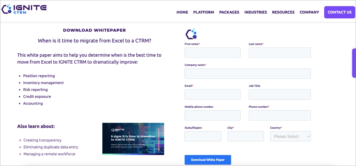
Crucially, the lead gen form is placed directly within the hero section, surrounded by a clean, professional layout with consistent branding and call-to-action elements. The CTA button is bold, encouraging immediate engagement. A white paper thumbnail and strategic subheaders guide the user smoothly toward conversion.
Key takeaways to learn from this example:
- Targeted messaging that speaks directly to operational and risk-focused trading professionals,
- Immediate access to the white paper download form,
- An uncluttered layout that supports credibility and ease of use,
- Clear, benefit-oriented title.
Improvement areas:
- A visual content preview, showing an excerpt, stat, or sample page from the white paper, would boost perceived value.
15. EY
The EY landing page for the Cybersecurity in the Age of Geopolitical Crises and Global Uncertainties white paper is built on a clean, modular structure. The page provides immediate access to the download form, which is bold and visible. The content communicates urgency and relevance, effectively grabbing the visitor’s attention and prompting them to take immediate action to secure the valuable insights within the white paper.
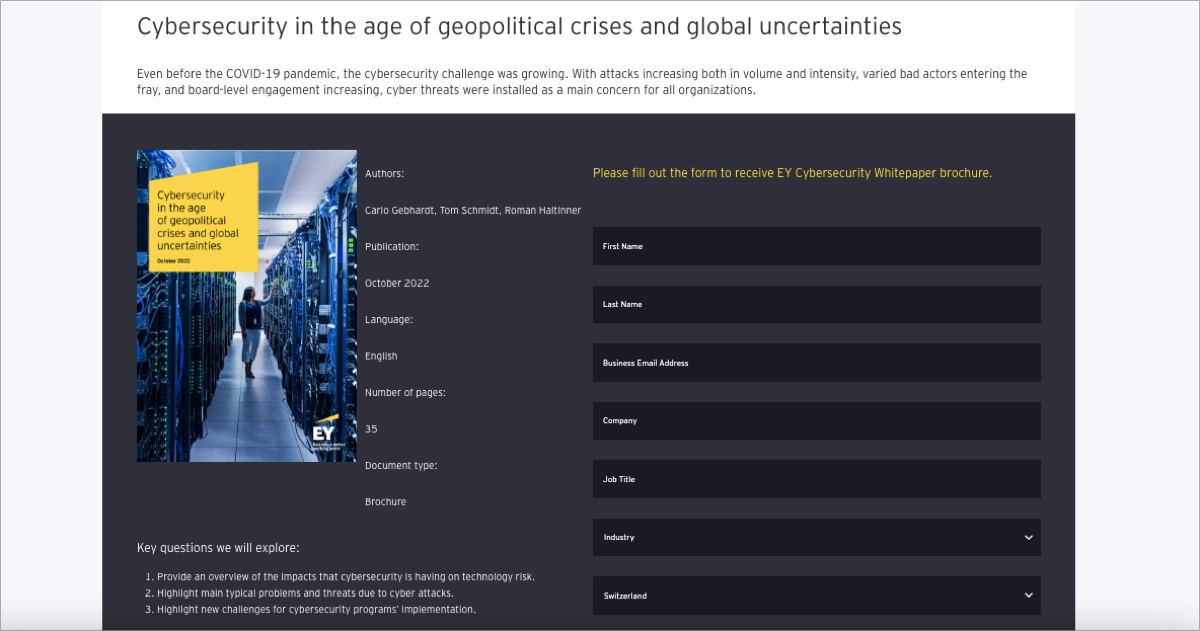
Designed within EY’s global brand system, the page exudes professionalism. Using white space, consistent typefaces, and dark-accented EY branding elements gives the page a refined corporate aesthetic. The form itself could be better optimized, asking only for the essentials to reduce friction.
Key takeaways to learn from this example:
- Bold, visible form, prominently placed for immediate conversions,
- Top-tier brand alignment.
Improvement areas:
- Adding previews or key insights could increase perceived value and boost downloads.
Promote your white paper effectively—design an engaging landing page with Landingi!
16. HAMILTON
The Hamilton landing page for the white paper is a high-impact example of how a technical B2B brand can deliver value-driven, sector-specific insights through a conversion-focused design. The page opens with a visually engaging hero section that features a large banner image and offers an accessible content summary, clearly highlighting the white paper’s value.
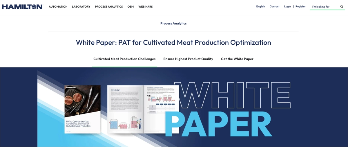
The page is structured to inform and convert – outlining specific cultivated meat production challenges, introducing Process Analytical Technology (PAT), and emphasizing benefits through a clean, scannable layout. An outstanding CTA kept in vibrant color invites interested visitors to take action and download the resource. Additionally, the use of custom illustrations, scientific language, and rich SEO metadata positions the page as a trusted, authoritative resource for professionals in foodtech and biotech.
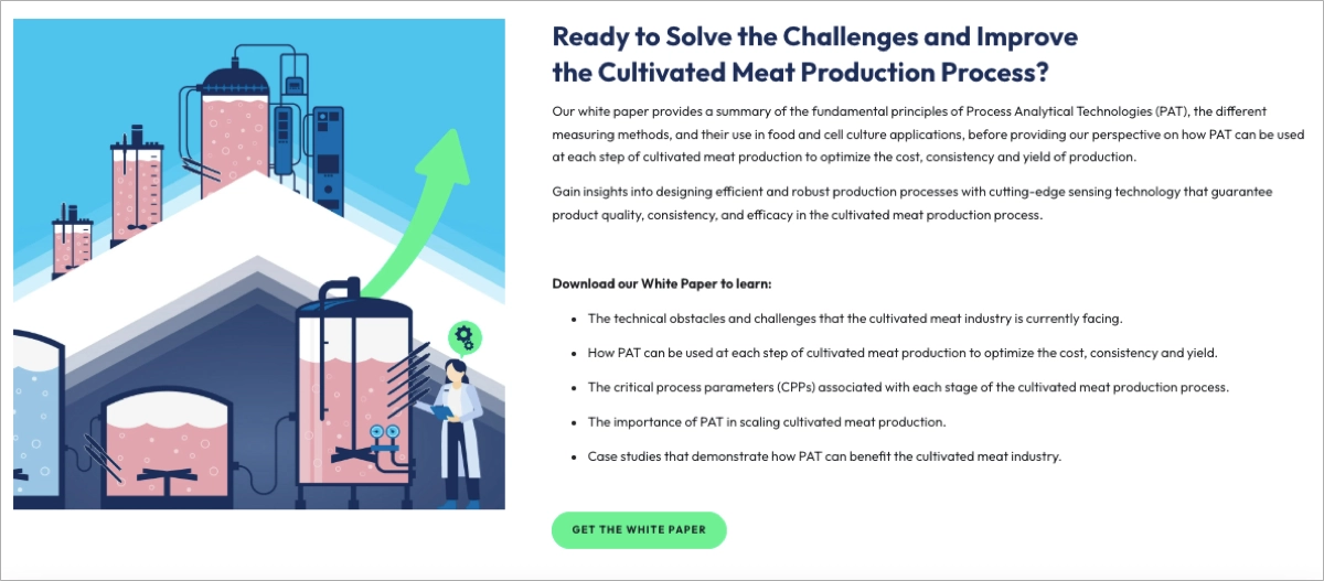
Key takeaways to learn from this example:
- A modular layout that guides visitors step by step through the problem, solution, and CTA.
- Sector-specific messaging,
- Scientific and technical depth,
- Strong visual storytelling.
Improvement areas:
- Strengthening CTA language by using wording like “Access Full Report” may encourage stronger click-through behavior.
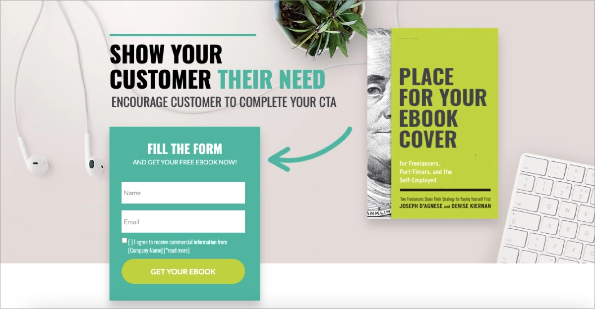
Use the form to gather user data for further marketing campaigns – the conversion rate is high if the form isn’t complex and keeps the form fields to a minimum. Try out one of the Landingi templates and promote your white papers efficiently!
17. Mitie
The landing page for Mitie’s white paper stands out as a prime example of a targeted content hub designed specifically for decision-makers in the public sector. The landing page opens with a clear, outcome-driven headline that immediately addresses the pain points of local authorities managing complex estates under pressure. The introductory text emphasizes a sense of urgency, highlighting critical issues such as sustainability goals, constrained budgets, and stakeholders’ evolving expectations.
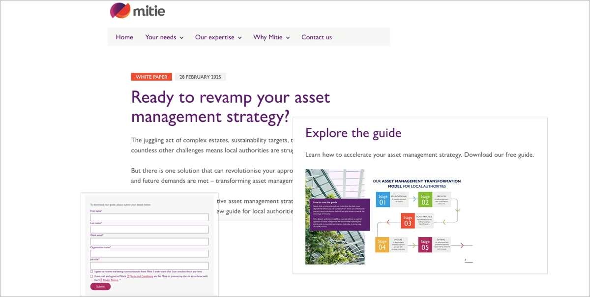
What makes this page effective is the strong call-to-action section embedded mid-page – titled “Explore the Guide” – which pairs a brief explanation of the white paper’s value with a prominent download form. The form itself is visually separated yet cohesive with the overall design and brand. Supporting visuals, clean fonts, and a responsive layout, all contribute to a trustworthy and user-friendly experience.
Key takeaways to learn from this example:
- Messaging tailored to local authorities and estate managers,
- Visually distinct CTA section that encourages engagement,
- White paper cover preview,
- Clean, brand-consistent design.
Improvement areas:
- The form should be less complex, with a minimal number of fields and a more engaging CTA button.
18. Reaktor
The white paper page from Reaktor stands out as a remarkable example of experience-driven content marketing specifically designed for the gaming industry. Aiming at game developers, publishers, and growth strategists, the page emphasizes emotional engagement and strategies for retaining players over the long haul. The visually striking hero section features a sleek, modern banner complemented by a compelling title and description that effectively conveys the white paper’s value.
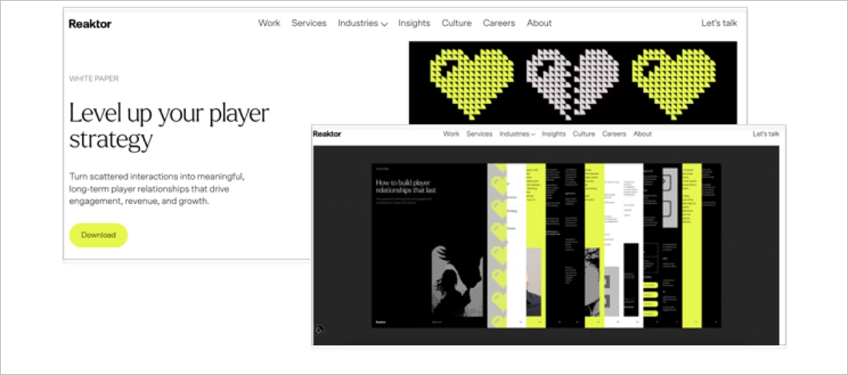
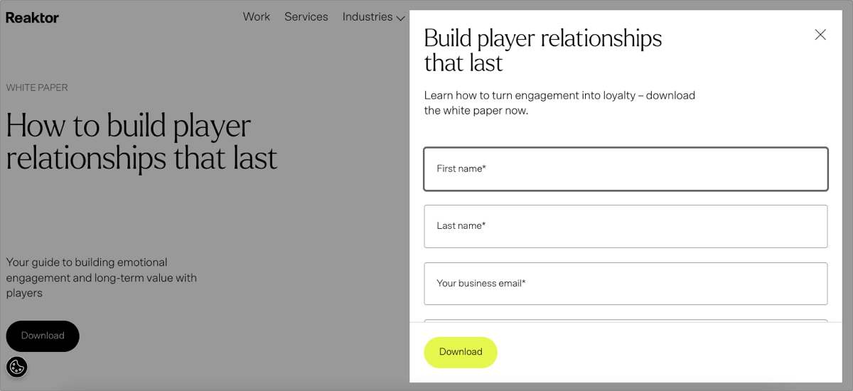
This landing page uses a lead gen form, placed smartly underneath a vibrant CTA button, ensuring visibility without disrupting the content flow. The layout reflects Reaktor’s polished brand identity – clean typography, responsive design, and consistent use of color. Industry-specific language further reinforces authority and relevance. The result is a conversion-friendly, high-trust environment that leads users naturally from interest to action.
Key takeaways to learn from this example:
- Content tailored to a niche industry,
- Strong visual hierarchy,
- Outstanding CTA and a simple form,
- Content-backed credibility.
Improvement areas:
- A teaser excerpt or bullet-point summary of the white paper would further entice users.
19. World Economic Forum
The World Economic Forum promotes one of its newest white papers with a well-designed page. The headline is sharp and timely, addressing urgent themes. The page immediately positions the white paper as a response to systemic global risks – financial instability, healthcare strain, and workforce challenges – adding a layer of urgency to the download.
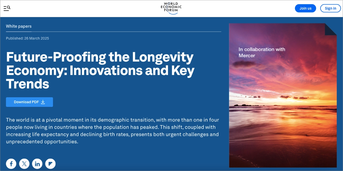
Design-wise, the page follows the Forum’s polished, minimal aesthetic. The download CTA is clear and linked directly beneath the core content. A well-designed hero image and standardized layout create an intuitive reading experience that appeals to decision-makers and academics alike.
Key takeaways to learn from this example:
- Clear content summary that helps visitors assess the white paper’s value instantly,
- Clean, consistent design that maximizes trust through professional layout and brand alignment,
- Accessible download flow.
Improvement areas:
- Offering a visual preview, including a visual table of contents or key charts, would further entice users to download.
Maximize white paper downloads—build an optimized landing page with Landingi!
20. Future foHRward
The future foHRward white paper download page, along with its timed popup, is a creative and well-executed example of how to blend community engagement with content-driven lead generation. The page sits within a minimalist, editorial-style layout consistent with the future foHRward brand – clean, modern, and community-first.
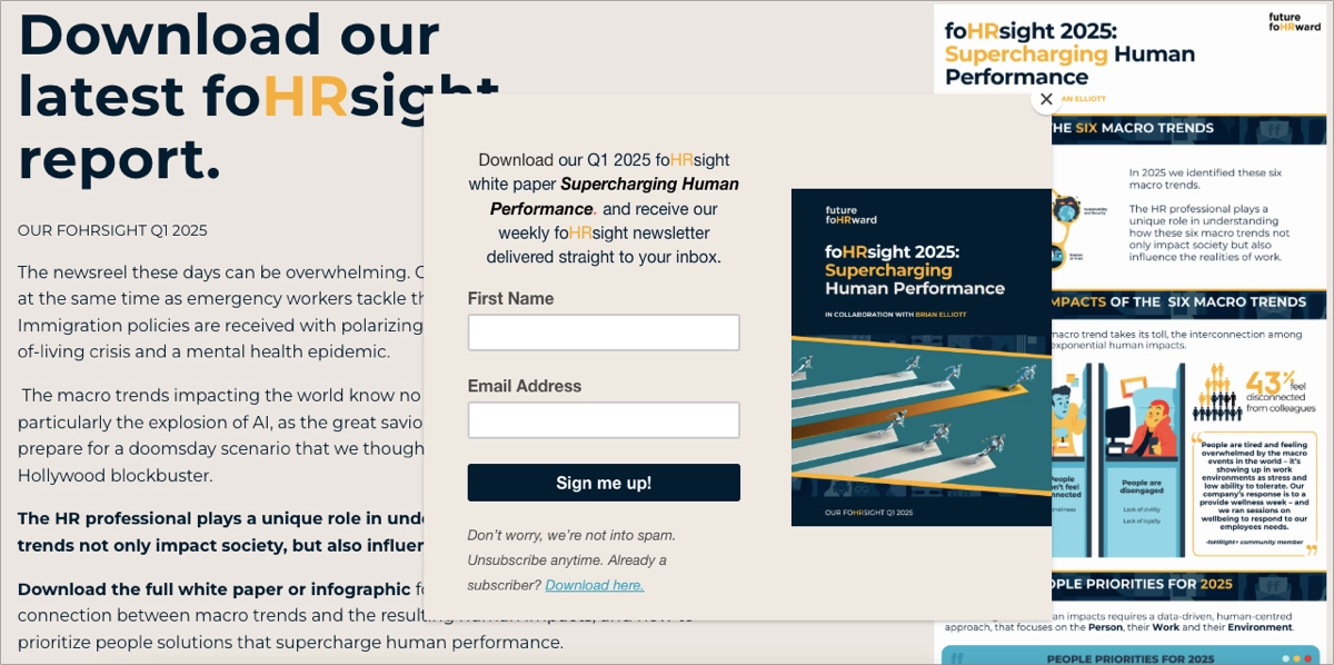
What elevates this page further is the use of a popup overlay that appears after a short delay, inviting visitors to sign up and download the white paper. The popup is well-timed, visually consistent with the rest of the brand, and unobtrusive – serving more as a thoughtful nudge than a disruptive request. The signup form within the popup is concise, asking only for essential contact details, helping maximize conversion while maintaining user trust.
Key takeaways to learn from this example:
- Timed popup CTA,
- Minimalist form fields that maximize user engagement and lead capture,
- Brand-consistent design,
- Community-first tone.
Improvement areas:
- The form on the page should be limited to just essential fields to improve lead gen results.
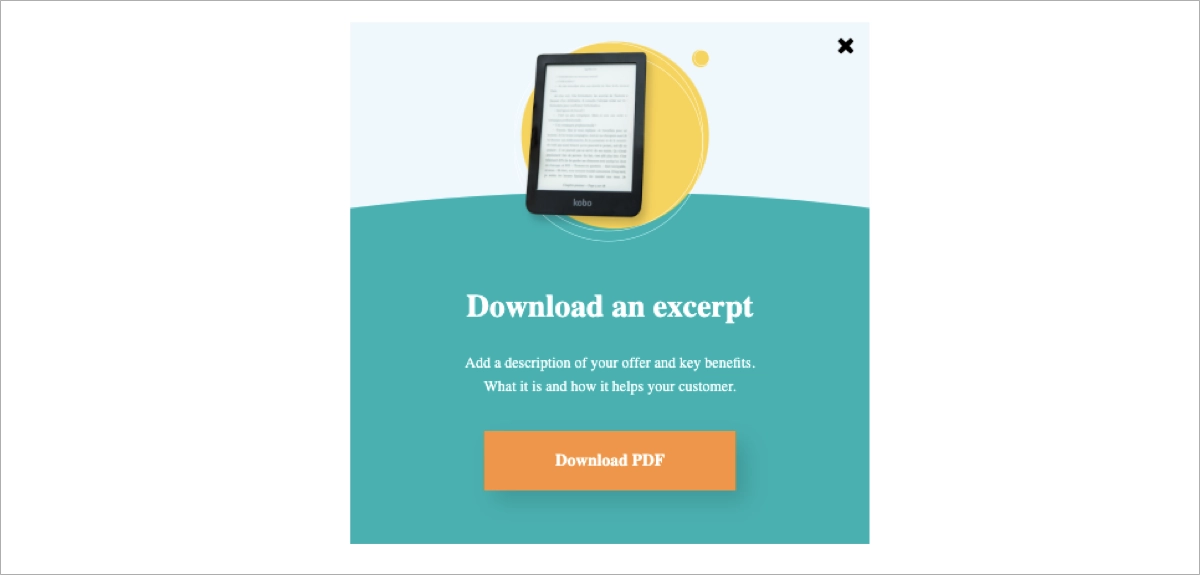
Use pop-ups on your webpage to promote white paper – with Landingi, you can create effective, high-converting pop-ups effortlessly within its user-friendly landing page builder.
21. 3SS
The white paper download page from 3SS is a highly polished example of a modern B2B technology-focused content hub. The page opens with a visually engaging hero section that combines a clear headline, sleek branding, and a strong-featured image that visually reinforces the innovation theme. This is followed immediately by a clear call to action to access the white paper, supported by a simple and well-integrated lead gen form in the midsection.
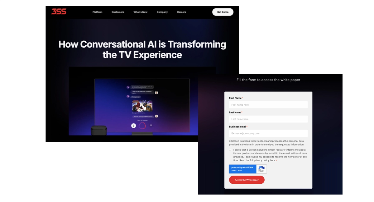
The form is straightforward – minimally invasive yet prominently placed to catch attention. Additional navigation pathways at the bottom give users avenues for deeper exploration. However, including social proof elements like testimonial-style quote cards would further enhance the page’s efficiency in lead generation.
Key takeaways to learn from this example:
- High-end visual storytelling,
- Well-placed lead gen form,
- Clear headline and purpose.
Improvement areas:
- Adding testimonials or quotes with real client or expert endorsements would enhance credibility.
3 White Paper Landing Page Best Practices
After analyzing the components of successful white paper landing page examples, look at the 3 best practices that will help you succeed in conversions. These practices are distilled from analyzing what works across various industries and can be applied to almost any white paper landing page to enhance its performance.
#1 Use bullet lists
Firstly, use the bullet points – they help organize information effectively, making your content easily digestible and potentially improving conversion rates. However, it’s important to keep bullet points short and simple, using straightforward language to ensure clarity.
Take a look at the example below:
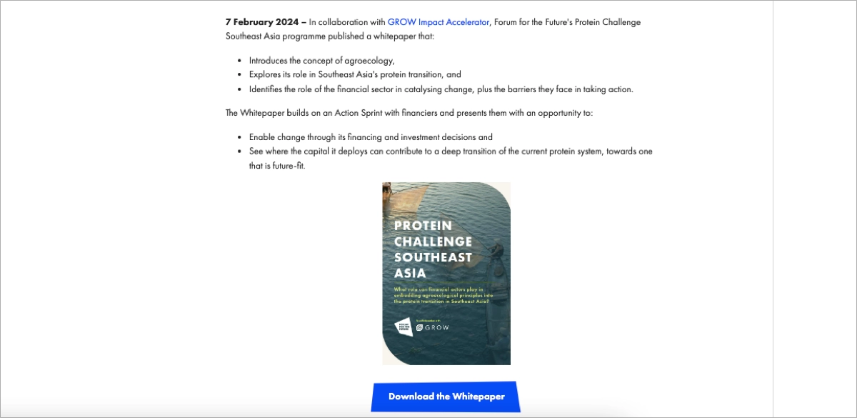
Bullet lists can aid in the visitor’s cognitive processing by categorizing and prioritizing information, which can lead to better retention and understanding of the content. You can use bullet lists to highlight the benefits, breaking up large blocks of text – it affects intuitiveness and effectively draws attention to the most important information, ensuring that visitors don’t miss out on critical details that could influence their decision to download.
Learn from top white paper landing page examples—create yours with Landingi!
#2 Use visual elements
Secondly, incorporate images, charts, and graphs not only to enhance the visual attractiveness of the page but also to reinforce the content of the white paper. It’s also crucial to align these elements with the main message of the landing page, ensuring they support the overarching goal of converting visitors into leads or customers.
Take a look at the example below:
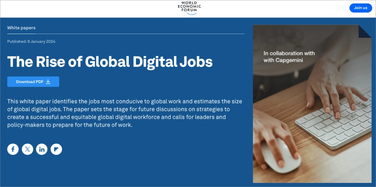
Visual elements can quickly communicate complex information that might take paragraphs to explain, such as statistics, workflows, or hierarchies. By presenting data in a visual format, you can help visitors grasp the white paper’s value at a glance, increasing their interest and engagement.
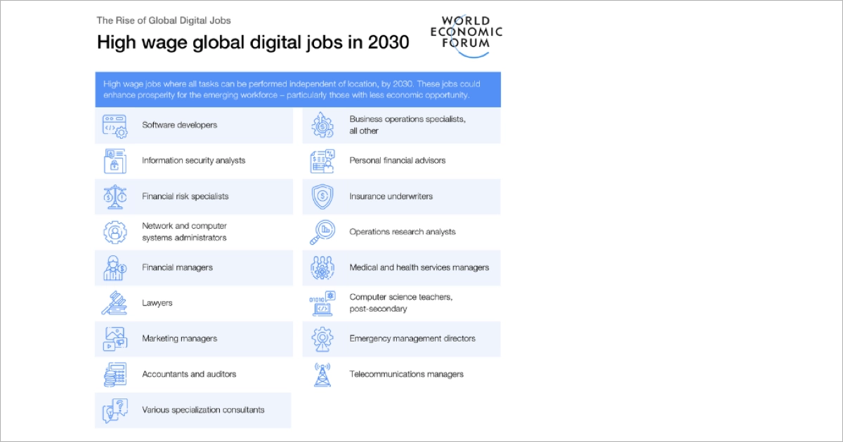
Additionally, using brand-consistent and high-quality imagery can create a professional and trustworthy atmosphere, further encouraging visitors to proceed with downloading the white paper. Remember, every visual should have a purpose and add to the narrative you’re creating on the landing page, guiding visitors toward the action you want them to take.
Grow your audience—create a high-converting white paper landing page with Landingi!
#3 Use the short form and clear CTA
Thirdly, use short form and unique CTAs in strategic page sections. It’s important to make this goal clear and visible, using strategic placement of CTA buttons and concise, compelling language that motivates visitors to take the desired action. Forms should be as brief as possible – requesting only essential information – to reduce user fatigue and prevent potential leads from abandoning the process.
Take a look at the example below:
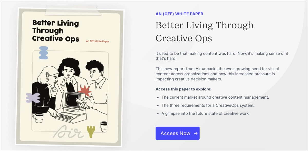
When it comes to CTAs, uniqueness is key. Instead of using generic phrases like “Download”, tailor the language to align with the specific white paper or audience you’re aiming for. Ensure that the CTA buttons are of a contrasting color to stand out on the page, and consider testing different shapes and sizes to see what works best.
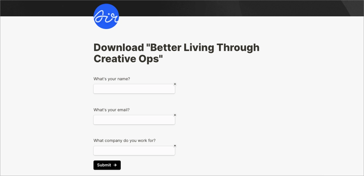
Use clear forms with a minimum of fields to deliver a seamless experience. Short forms increase conversions. Don’t forget about the visual side of your forms – they should align with general landing page design and positively affect brand visual identity building.
How Can I Optimize My White Paper Landing Page for Higher Conversion Rates?
To optimize a white paper landing page for higher conversion rates, focus on the following strategies:
- Design and brand alignment
- Engaging content
- Strong call-to-action
- Credibility
Ensure the landing page’s design is professional, aligns with your brand’s aesthetic, and uses high-quality images related to the white paper topic. Include a compelling headline, concise bullet lists, and short paragraphs. Clearly articulate the value of the white paper, and set the unique call-to-action button with straightforward messaging. Use testimonials and social proof to establish trust, and consider adding an author note to boost credibility.
A great layout with smooth design is not enough – to have real impact on improving conversions, you have to learn a few techniques:
- Ensure that your landing page loads quickly. It should take less than three seconds to reduce bounce rates, as more than 50% of visitors abandon a site that takes longer to load.
- Keep consistency between the ad and landing page. The images and messaging in the ad should be consistent with those on the landing page.
- Remember about mobile responsiveness. Critical information should be available within the first two viewports, CTA buttons should span the entire width of the mobile page, and the whole page should suit various screen sizes.
- Run A/B tests to experiment on different variants of your landing page to determine which one resonates best with your target audience and leads to higher conversions.
For creating an effective landing page, consider platforms like Landingi. Its offer involves a user-friendly landing page builder with a wide template gallery, and side features that allow for better optimization. You can conduct A/B tests effortlessly, track user behavior and micro conversions within the built-in EventTracker tool, and measure your page’s effectiveness within an intuitive dashboard. The Landingi platform also helps create practical forms and pop-ups for higher engagement and conversions.
Enhance Lead Generation with a High-Converting White Paper Page
White paper landing pages are an invaluable tool for businesses looking to generate high-quality leads. From understanding what a white paper landing page is to knowing how to create one and optimize it for higher conversion rates, we’ve covered a lot of ground.
By incorporating these key elements of an effective page:
- compelling headline,
- visual storytelling,
- strategic placement of CTAs,
- a clear value proposition,
- social proof for credibility,
- and a user-friendly form and navigation.
adhering to best practices and learning from real-world examples, you’re now equipped to create a white paper landing page that captivates your audience and converts them into leads. Take an opportunity, and try out the best landing page builder – Landingi, to create your own high-converting white paper landing page. It’s free!

