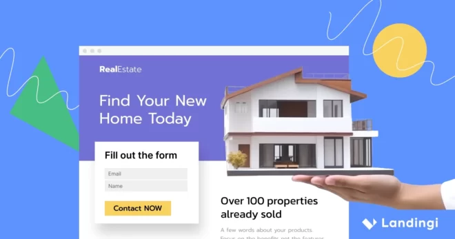
A real estate landing page is a focused, high-impact web page designed to capture the attention of buyers, sellers, or renters and seamlessly guide them toward taking action. Unlike a general website, it serves a singular purpose – whether it’s promoting a property, generating appointments, or growing an email list for real estate agents or agencies. With compelling visuals, persuasive content, and strategic calls to action, a well-crafted real estate landing page acts as a digital sales assistant, guiding visitors toward the next step in their property journey.
In this article, you’ll discover how to leverage landing pages to enhance your real estate marketing strategy. We’ll explore what makes a high-performing real estate landing page, share expert-backed optimization strategies, and showcase twelve inspiring landing page examples that turn digital interest into real-world transactions. Whether you’re looking to attract homebuyers, showcase a rental property, or generate leads for your agency, these insights will help you build a landing page that drives results.

What is a Real Estate Landing Page?
A real estate landing page is a dedicated webpage designed to capture the attention of potential buyers, sellers, or renters interested in real estate properties. This type of landing page typically showcases a specific property, real estate service, or special offer, aiming to convert visitors into leads by encouraging them to take a particular action, such as scheduling a tour, signing up for a newsletter, or requesting more information. The page is often isolated from the main website navigation to focus solely on its primary goal without distractions.
Real estate landing pages are important tools in the industry, providing a platform to highlight a property or service’s unique features and benefits. They often include high-quality images, virtual tours, detailed property descriptions, and key selling points that appeal to the target audience. All these elements work together to create an engaging and informative experience for visitors, making it easier to envision themselves in the property or using the service offered.
Why Real Estate Landing Pages Matter?
Real estate landing pages matter because they streamline the buying and selling process by providing a direct and compelling way to engage potential clients. Unlike traditional websites that require users to search for relevant information, a well-crafted landing page delivers a focused message tailored to a specific property, offer, or service. This approach keeps visitors engaged, increases the likelihood of conversion, and reduces distractions that could lead them away from taking action. By offering a seamless experience with clear calls to action, landing pages help real estate professionals connect with serious buyers and sellers more efficiently.
Beyond lead generation, real estate landing pages enhance brand credibility and marketing effectiveness. They allow agents and agencies to showcase their expertise, demonstrate market knowledge, and present properties in the best possible light. With strategically placed testimonials, market insights, and unique selling points, these pages position real estate businesses as trustworthy and reliable. Additionally, they serve as an essential component of paid advertising campaigns, ensuring that ad clicks lead to highly relevant and conversion-focused experiences. This not only maximizes return on investment but also helps build long-term relationships with potential clients.
Maximize your listings’ potential! Engage buyers instantly with high-impact landing pages.
How Do I Create a Real Estate Landing Page?
To create a landing page that will be a perfect tool for your real estate business campaign, start by identifying your goal and understanding your audience, and then choose the right platform, like Landingi, which will simplify the whole process. Design your landing page by creating a catchy headline, adding immersive visuals, and writing persuasive copy. Add trust elements to build your brand credibility, implement a strong CTA directing users toward the desired action, and use a lead capture form to gather potential customer data. In the end, ensure mobile responsiveness to provide a seamless experience for all users, regardless of the device they use.
Follow the detailed 7-step guide below and create a well-performing real estate landing page for your digital marketing campaign:
Step 1. Define Your Goal and Audience
To start, determine the goal of your landing page. Are you promoting a specific property, capturing leads for future listings, or offering free market insights? A well-defined goal will shape the structure and content of your page. Understanding your audience is equally important. Consider their demographics, preferences, and pain points. For example, a first-time homebuyer may respond to educational content, while an investor may prioritize ROI metrics. Tailoring your messaging accordingly will increase engagement and conversions.
Step 2. Choose a High-Converting Template
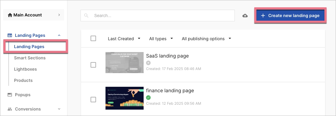
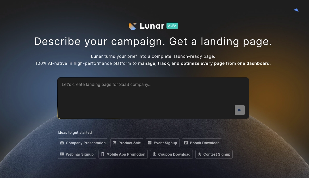
Landingi offers over 400 professionally designed templates optimized for conversions. To use one, click Create new landing page and browse the template library to find one that aligns with your real estate objectives. You can also build from scratch, upload a .landingpage file, or use Lunar – Landingi’s AI landing page generator, which creates a complete, launch-ready page based on your input, already structured around the essential elements of a high-converting real estate landing page.
Once selected, customize the template using the drag-and-drop editor, which allows you to adjust layouts, add elements, and refine the design without coding. Use Smart Sections to maintain consistent branding across multiple pages, making it easier to scale your marketing efforts.
Build your real estate landing page with a template created by professionals!
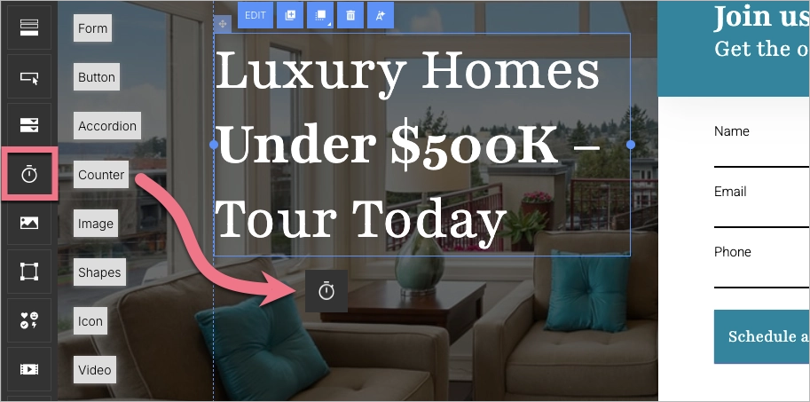
Step 3. Craft a Compelling Headline and Engaging Copy
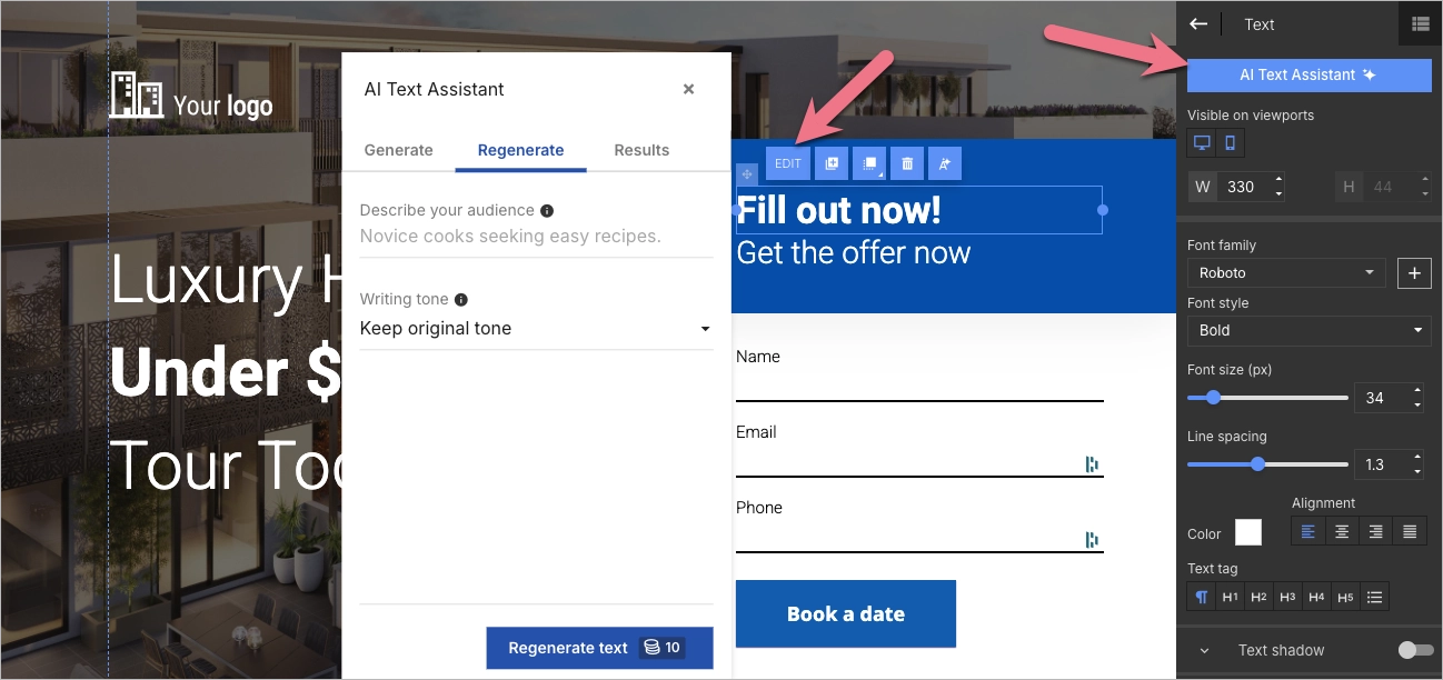
Your headline should immediately capture attention and convey the value of your offer. Phrases like “Luxury Homes Under $500K – Tour Today” or “Exclusive Pre-Sale Condos – Limited Availability” create urgency and appeal to potential buyers. Utilize Landingi’s AI Assistant to generate engaging, persuasive copy that highlights property features, unique selling points, and benefits.
Break up text with bullet points and subheadings for readability, and ensure every section moves the visitor closer to taking action. As real estate businesses often provide their services locally, you should leverage local keywords, especially when preparing a landing page for PPC purposes.
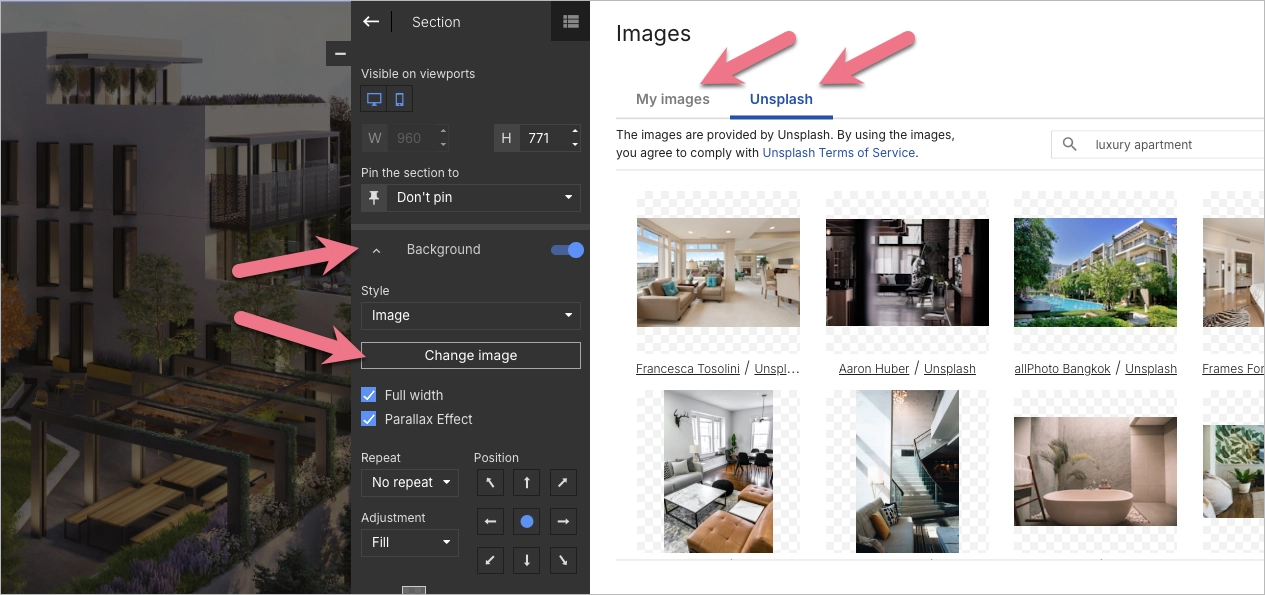
Step 4. Enhance Visual Appeal with High-Quality Images and Videos
Real estate is a visually driven industry, and high-quality images significantly impact buyer interest. Upload professional photos and videos to showcase properties effectively. Landingi’s background image removal tool can help you create cleaner, distraction-free visuals.
Include virtual tours or property walkthrough videos to provide an immersive experience, and ensure all images are optimized for fast loading speeds to prevent user drop-off.
Step 5. Implement a Lead Capture Form with a Strong CTA
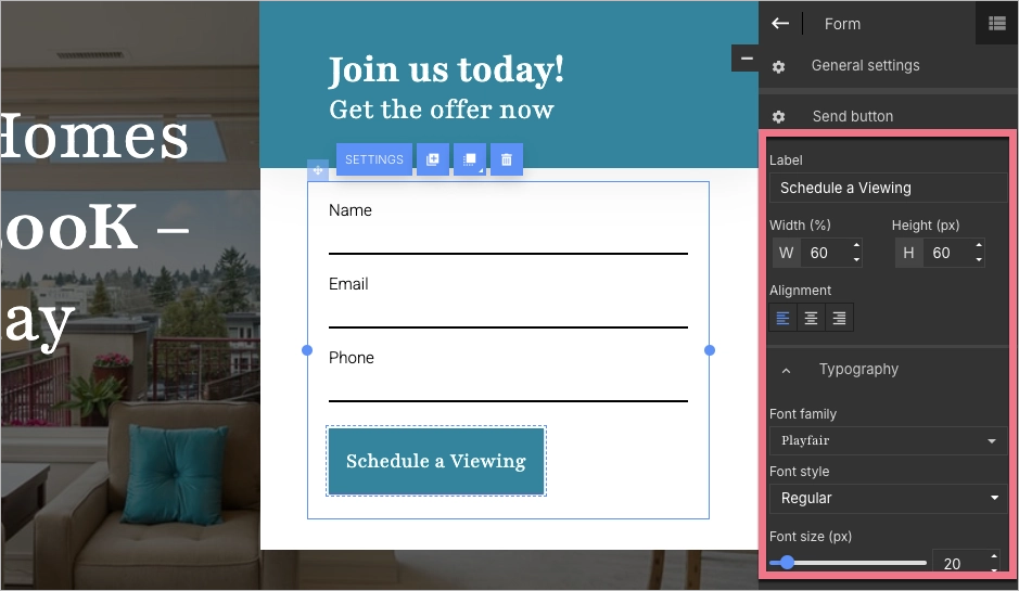
A well-designed lead capture form is crucial for converting visitors into leads. Use Landingi’s form builder to create a user-friendly form requesting essential details such as name, email, and phone number. Keep it short and simple to reduce friction.
Pair the form with a compelling call-to-action (CTA) like “Schedule a Viewing” or “Get Instant Property Alerts.” Ensure CTA buttons are highly visible, using contrasting colors and strategic placement throughout the page.
Step 6. Add Interactive and Trust-Building Elements
Boost engagement and credibility by incorporating interactive features such as countdown timers for limited-time offers or pop-ups promoting exclusive deals. Display trust elements like testimonials from satisfied buyers, real estate certifications, and media mentions to build credibility. Linking to social media pages also reassures potential clients and encourages further engagement with your brand.
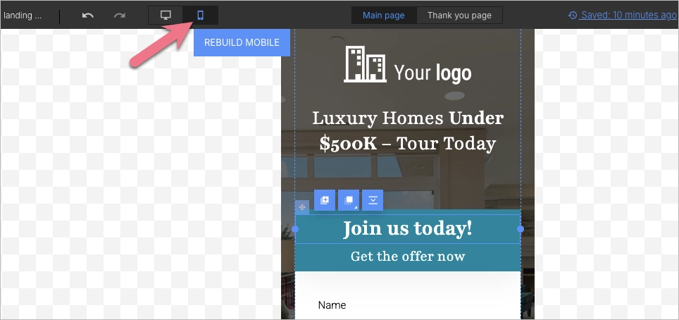
Step 7. Optimize for Mobile and Publish with a Custom Domain
Since a significant portion of real estate searches happen on mobile devices, ensure your landing page is fully responsive. Use Landingi’s mobile view editor to adjust layouts, text sizes, and button placements for an optimal mobile experience.
Before publishing, connect your custom domain to enhance professionalism and brand consistency. Learn more about domains in Landingi.

After launching, track performance using Landingi’s built-in analytics and A/B testing features to refine your page for better results. You can also use Solis, Landingi’s AI-powered landing page optimization tool, to uncover performance insights and identify smarter opportunities to improve conversions based on real user behavior.
12 Best Examples of Real Estate Landing Pages
Check out the 12 best examples of real estate landing pages and learn how theoretical knowledge meets practice. Each example showcases the best strategies that effectively guide users through compelling content to take the desired action. Inspire yourself with these real-life page designs and find a way to create a well-performing landing page for your real estate business.
1. Joy Bolger – Real Estate Agent
The first example is the Joy Bolger Real Estate page, an illustrative model of a landing page for real estate professionals. It showcases Joy Bolger as an experienced and reliable real estate agent in Los Angeles, particularly on the Eastside. The page immediately captures attention with a bold, compelling headline and clear services description. A contact form is strategically placed to capture leads, allowing potential clients to reach out for personalized assistance easily.
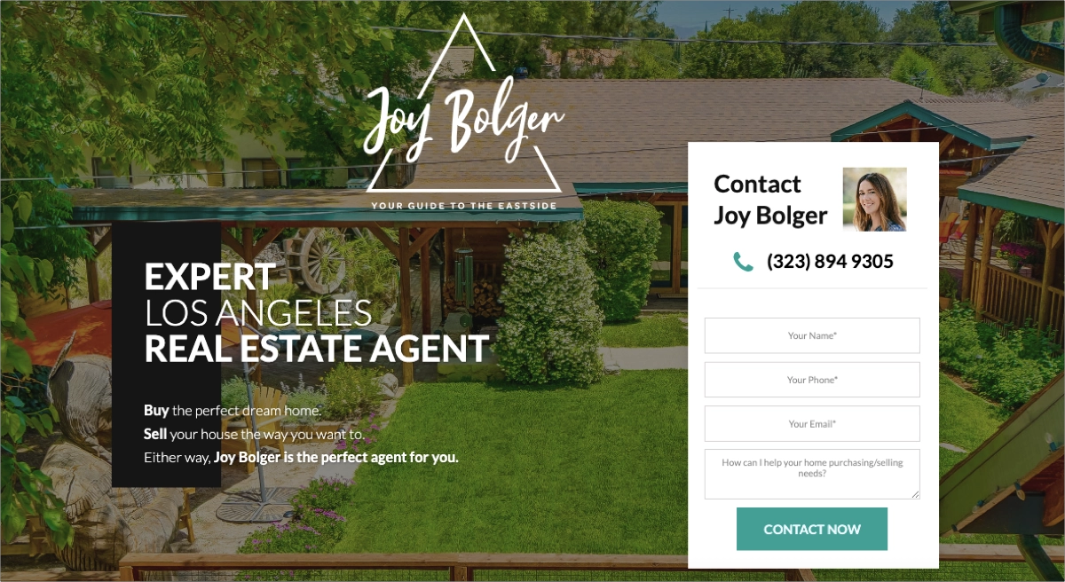
The page layout is intuitive and user-friendly, effortlessly guiding visitors through various sections. The visually appealing design features professional images, including Joy’s portrait, which fosters a personal connection with visitors. Logos from reputable organizations like Compass and the National Association of Realtors further establish Joy’s professional credentials. The page is designed with a user-first approach, offering a simple contact path for those searching for professional real estate agents, which makes it highly effective.
Key takeaways to learn from this example:
- High-impact visuals,
- Trust signals,
- User-friendly layout,
- Specific audience targeting,
- Simple contact form,
- “Call Now” button,
- Strong CTAs.
Improvement areas:
- Testimonials – while the page includes a single review, it should display more testimonials from satisfied customers to enhance credibility.
Choose the Meet Developer template from Landingi’s gallery and customize it with your logo, professional pictures, and attention-grabbing headline to encourage visitors to contact you.
2. Opendoor
The second example is the Opendoor landing page. The secret of high-converting landing pages is a straightforward, single CTA, and Opendoor’s page perfectly implements this strategy. Their outstanding CTA, “Get cash offer”, is placed strategically across the page – in a hero section, on a sticky bar, and under social proof elements. The page catches the eye with a bold headline conveying the value proposition from the first moment the user enters the site. The subheadline emphasizes the convenience and ease of the service, appealing to homeowners looking for a quick and hassle-free selling process.
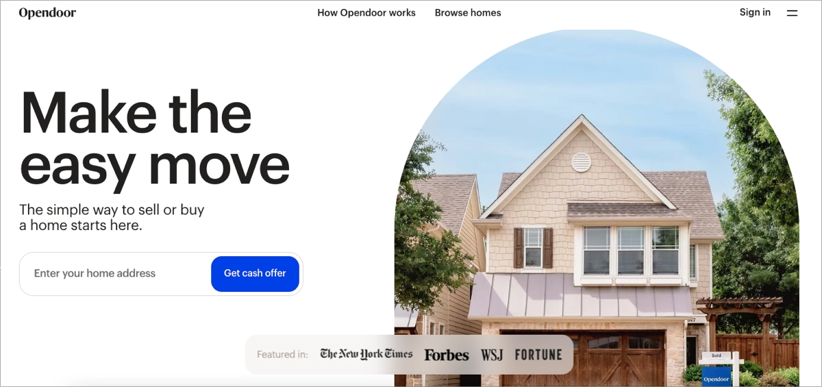
The layout is clean and modern, with high-quality images and intuitive navigation. Trust signals such as customer testimonials and partnerships with reputable organizations add credibility. The page displays the number of their customers, which is a great addition, convincing visitors to take the desired action. As the key element of this page, the “how it works” section allows visitors to understand the offering and help in the decision-making.
Key takeaways to learn from this example:
- Clear value proposition,
- Strong visuals,
- Prominent CTA,
- Trust signals,
- Social proof elements,
- “How it works” section.
Improvement areas:
- Mobile optimization – enhancing the mobile user experience could improve accessibility and conversion rates.
Use Landingi and choose the Real Estate template to showcase your value proposition. Use immersive visuals and incorporate a strong CTA to boost conversions effectively.
3. Island Seeker
The third example is the Island Seeker landing page. It’s a great inspiration for real estate professionals specializing in unique properties. The page’s design is immediately engaging, featuring a prominent headline, “Private Islands for Sale,” which clearly sets the theme and captures the visitor’s attention. The subheadline reinforces the site’s authority in the niche market of private island real estate.
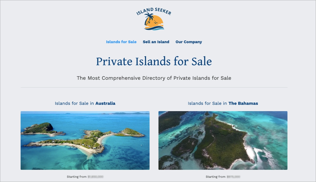
The layout is clean and well-organized, with high-quality images of islands available for sale in various locations worldwide. Each island listing includes a direct link for more details, ensuring easy navigation for users interested in specific regions. Compelling visuals paired with concise, informative text make it easy for visitors to explore and find what they are looking for. Each offer includes a strong CTA leading to an inquiry form, which allows users to request more information. The secondary CTA leads to a short form allowing to request a callback. Transparency and a strong focus on user experience are the strongest features of this page, making it not just a static brochure but a well-performing digital marketing tool.
Key takeaways to learn from this example:
- Clear and engaging Headline,
- High-quality visuals,
- User-friendly navigation,
- Detailed listings with general price information,
- Strong CTAs,
- Clear inquiry forms.
Improvement areas:
- Interactive elements – adding features like virtual tours or an interactive map could enhance user engagement and provide a more immersive experience.
Pick the Apartments Newsletter template from Landingi and build interest among potential customers. Customize the template with high-quality visuals, add your logo, and leverage an effective lead-generation form.
4. Gulf Land Property Developers
The fourth example is a landing page for one of Gulf Land Property Developers’ offerings, The Serenity Lakes 2. It’s a great inspiration to create a high-end real estate landing page. This page is designed to promote luxury apartments for sale in Dubai, effectively capturing the attention of potential buyers with a sophisticated and visually appealing layout. The headline immediately conveys the premium nature of the property, while the imagery of the apartments and their surroundings underscores the luxurious lifestyle on offer.
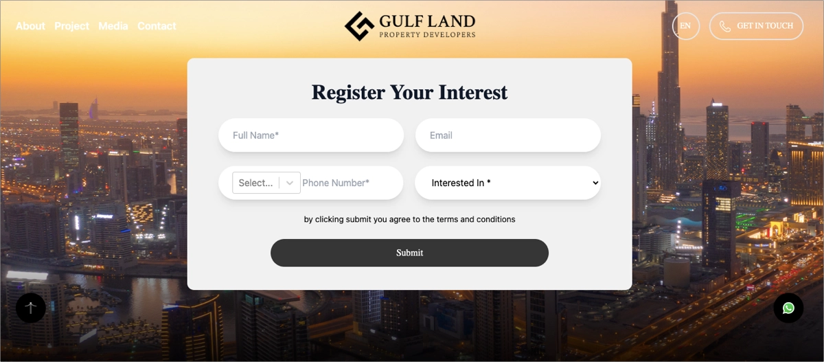
The page is well-structured, with a clean design that makes navigation intuitive. Key information about the apartments, such as amenities, pricing, and location, is presented clearly, helping visitors quickly understand the value proposition. The inclusion of a “Get in Touch” CTA, allowing for direct phone contact, encourages immediate engagement, making it easy for potential buyers to ask for more details. This landing page also features a clear lead-capture form, encouraging visitors to leave their contact details and register interest in the offering. Additionally, the page is optimized for mobile devices, ensuring a seamless experience for users on the go.
Key takeaways to learn from this example:
- Compelling headline,
- High-quality visuals,
- User-friendly layout,
- Effective CTAs,
- Mobile optimization,
- Clear form.
Improvement areas:
- Testimonials and reviews – including testimonials from current residents or satisfied clients could build trust and credibility with potential buyers.
Pick the Real Estate Offer template from Landingi – customize it to reflect your business offer and leverage a well-designed lead-capture form to achieve the best conversion results.
5. Galliard Homes
The fifth example is a Galliard Homes landing page created to promote Belgrave Village residences for sale. It effectively markets new builds in Birmingham City Centre, capturing the attention of potential buyers with a prominent and compelling headline that immediately communicates the key offering. The subheadline adds credibility by associating the development with well-known real estate entities.
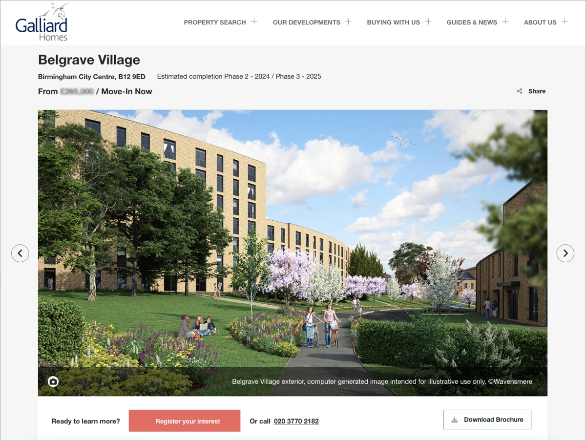
The page layout is visually appealing and user-friendly. High-quality images of the properties, both interior and exterior, are prominently featured, helping to showcase the modern design and luxurious features of the residences. An image slider allows potential buyers to easily browse through various property images, enhancing the overall user experience. Key information such as property prices, availability, and completion dates is presented, aiding in quick decision-making. The main CTA button is outstanding, encouraging users to register their interest.
Key takeaways to learn from this example:
- Engaging headlines and subheadlines,
- Image slider with high-quality visuals,
- Video presentation,
- Clear information presentation,
- User-friendly layout,
- Credibility signals,
- Strong CTA.
Improvement areas:
- FAQ section – adding an FAQ section would address common objectives, greatly impact the decision-making process, and encourage visitors to register interest.
Present your offers with a well-structured landing page – choose the Real Estate Selling template to build interest and engagement among visitors. Use the contact form and collect leads effectively!
6. Strada
The sixth example is the Strada landing page for real estate in Dubai, which showcases excellence in capturing user attention and driving engagement. The page features a sleek, modern design with intuitive navigation, prominently displaying options to buy, sell, or rent properties. A background video, high-quality images, and interactive elements like hover effects enhance visual appeal, creating an immersive experience for visitors. The strategic use of CTA buttons directs users to key services, facilitating smooth transitions between browsing and decision-making stages.

The landing page effectively leverages trust-building elements, showcasing their experience and introducing the team of real estate professionals. Additionally, it incorporates responsive design, ensuring optimal performance across various devices and enhancing accessibility for mobile users. The inclusion of a clear form encourages visitors to contact. It’s one of the most effective real estate landing page examples.
Key takeaways to learn from this example:
- Clean, professional look,
- High-quality pictures and videos,
- Interactive elements,
- Outstanding alternative CTA buttons,
- Trust signals,
- Clear contact form.
Improvement areas:
- Social proof – the page should include testimonials from satisfied clients to build trust among visitors more effectively.
7. Golden Home
The seventh example is the Golden Home landing page, which exemplifies the best real estate web page design practices. The page opens with a professional and visually appealing layout that immediately captures the user’s attention. A prominent search bar at the top lets users quickly find properties by specifying location, price range, and property type. This feature ensures visitors can easily navigate the vast portfolio of over 50,000 properties available for sale and rent. High-quality images and a clean, modern design reflect the brand’s credibility and commitment to providing top-notch real estate services.
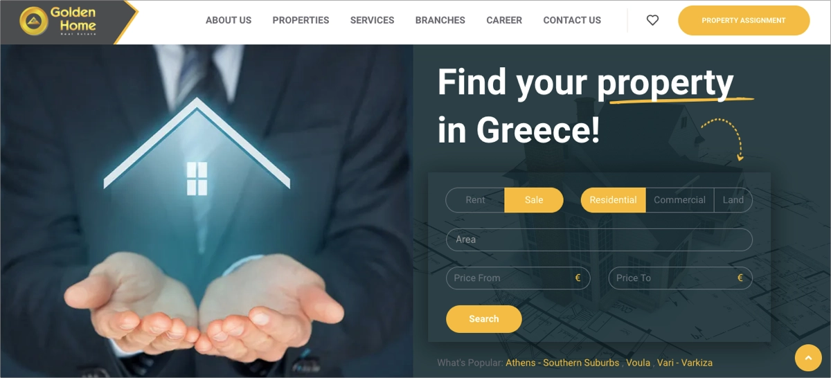
Additionally, the landing page highlights key features and services offered by Golden Home. It communicates their extensive experience in the real estate market, which is a great trust signal for potential clients. The page also emphasizes the value proposition for both property owners and buyers. The inclusion of contact information with a “Call Now” button ensures that users can effortlessly engage with the agency.
Key takeaways to learn from this example:
- Professional layout,
- High-quality images,
- Extensive property search functionality,
- Trust-building elements,
- Clear CTA buttons,
- “Call Now” button,
- Contact info.
Improvement areas:
- Enhancing mobile user experience – optimizing the mobile layout could lead to better engagement and higher conversion rates from mobile users.
Choose the Flat Sale template to showcase your properties for sale. Leverage its clear layout and strategic white space to describe property details and engage visitors to contact your company!
8. Sotheby’s International Realty
The last example is the Sotheby’s International Realty landing page for the luxury home in Laglio, Como, Italy. It exemplifies the highest standards in real estate landing page design. The page opens with a striking, full-screen hero image of the property, immediately capturing the viewer’s attention with its breathtaking visuals. The prominent headline effectively communicates the property’s exclusivity and grandeur. The page uses a sophisticated color scheme and high-quality images to maintain an elegant and luxurious aesthetic.
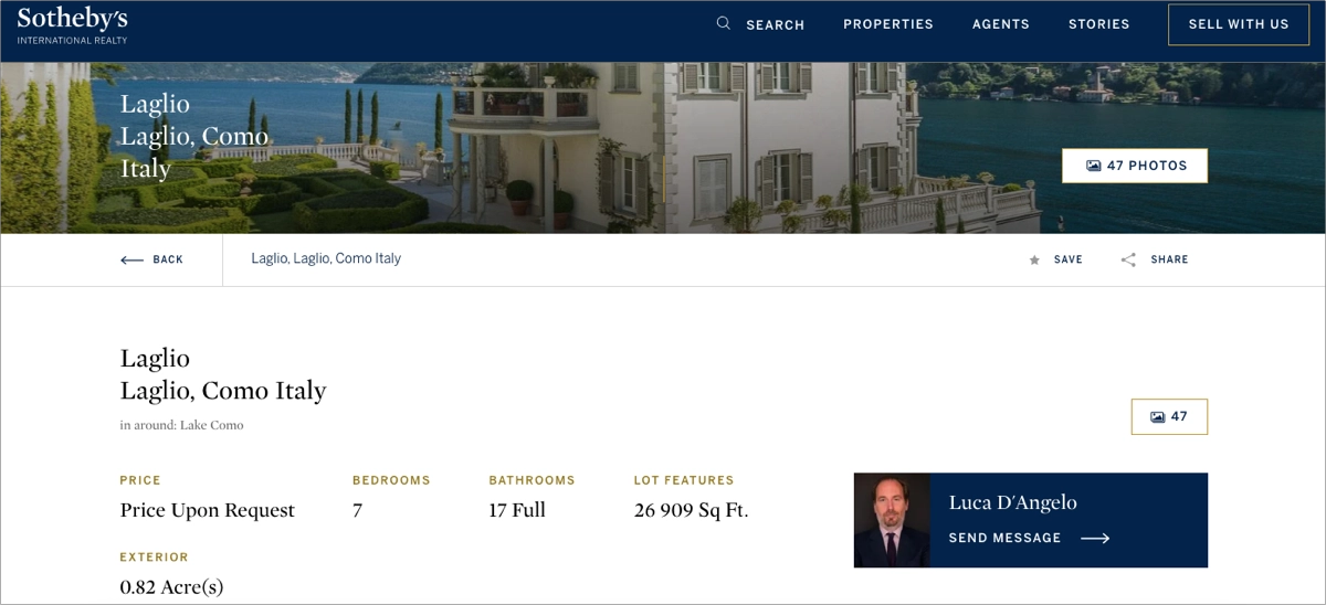
Key property details are clearly displayed, including the number of bedrooms and bathrooms, property size, and unique features such as the outdoor pool, guest apartment, indoor pool, and extensive wine cellar. The inclusion of a “Price Upon Request” tag emphasizes the exclusive nature of the listing. The page also features an interactive photo gallery with 47 high-resolution images, allowing potential buyers to explore the property in depth. A dedicated section for amenities and lot features further highlights the property’s luxurious offerings. The page includes a special CTA button showing the name and picture of the real estate agent handling this offer, encouraging interested visitors to direct contact.
Key takeaways to learn from this example:
- Stunning visuals,
- Clear property details,
- Interactive photo gallery,
- Elegant design,
- Exclusive presentation (price upon request),
- Outstanding, effective CTA button,
- Google Maps plugin.
Improvement areas:
- Additional interactive elements – integrating virtual tours or video walkthroughs could provide a more immersive experience for potential buyers.
Choose the Property for Sale template from Landingi and customize it to show potential customers your exclusive offer – add immersive visuals and your brand’s logo, and allow visitors to contact you with a clear form.
9. YieldStreet
The Yieldstreet Real Estate Investment landing page effectively targets potential investors with its compelling headline, “Discover private real estate investing.” This phrase immediately conveys exclusivity and opportunity, positioning Yieldstreet as a unique platform for real estate investment. The landing page provides clear and concise information about investment opportunities, historical performance data, and FAQs, giving users confidence in their decision-making process.
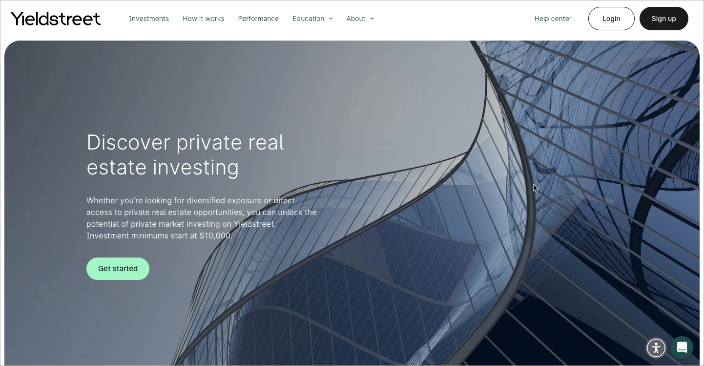
The page’s minimalist and professional design enhances credibility, featuring a strong call-to-action that encourages visitors to explore investment options. However, the “Get started” CTA is too generic and lacks a sense of urgency or uniqueness that could make it more compelling. Additionally, the navigation menu may be distracting, potentially leading users away from the main conversion goal instead of keeping them focused on signing up or learning more.
Key takeaways to learn from this example:
- The exclusive headline,
- Modern design,
- Intuitive layout,
- Clear and informative content and FAQ section.
- Trust elements,
- Mobile optimization.
Improvement areas:
- Stronger CTA messaging. Instead of “Get started,” using something more action-driven like “Start Investing Today” or “Explore Opportunities Now” could create more urgency and engagement.
- Simplify navigation. Minimizing or restructuring the navigation menu could help reduce distractions and guide users toward the intended action.
- More social proof. Adding video testimonials or real investor success stories would further increase trust and user engagement.
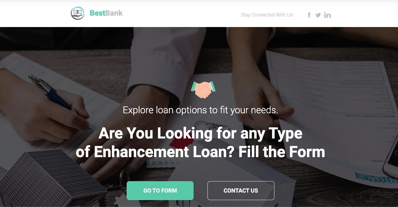
Present your offer with a sleek and modern Best Bank landing page template. Add your visuals and do not forget about a strong call to action.
10. Amazon Falls
The Amazon Falls landing page is a great example of a well-designed real estate website that effectively showcases a pet-friendly apartment community in Eagle, ID. It features high-quality visuals, parallax scrolling, and an embedded video, creating an engaging user experience. The “Feel at Home” message helps establish an emotional connection. The page also integrates trust-building elements, including social media links, a pet policy, and direct leasing options, streamlining the rental process.
However, it’s a pity that the headline is below the fold, meaning visitors must scroll down to see the core message, which could impact engagement. Additionally, the call-to-action (CTA) buttons, such as “Contact Us Today” and “See The Gallery,” are not very prominent, reducing their effectiveness in guiding users toward conversions. Enhancing button visibility and adjusting the layout so the headline appears immediately upon loading could improve the overall impact and usability of the page.
Key takeaways to learn from this example:
- High-quality visuals,
- Background video,
- Clear navigation,
- Award badge,
- Emotional appeal with the “Feel at Home” tagline.
Improvement areas:
- Headline visibility. The headline should be placed above the fold to ensure visitors immediately see the main message.
- More prominent CTAs. The call-to-action buttons should be larger and more eye-catching to improve conversions.
- Better mobile optimization. The mobile experience should be optimized to ensure seamless functionality across all devices.
Choose the Architecture Offer Page template to craft an eye-catching landing page for your real estate offer. Highlight high-quality images that draw in visitors, and pair them with concise copy that conveys your message.
11. Veterans United Realty
The real estate landing page for “Connect with a local, VA-friendly real estate agent!” is a strong example of an effective lead generation page. It is designed to guide users smoothly through the process of connecting with an agent. A standout feature is the multi-step form, which simplifies data collection by breaking it into smaller, manageable steps. The form uses drop-down menus and radio-button selects, ensuring ease of input and minimizing user friction. This structure enhances user experience, keeping the process quick and intuitive.
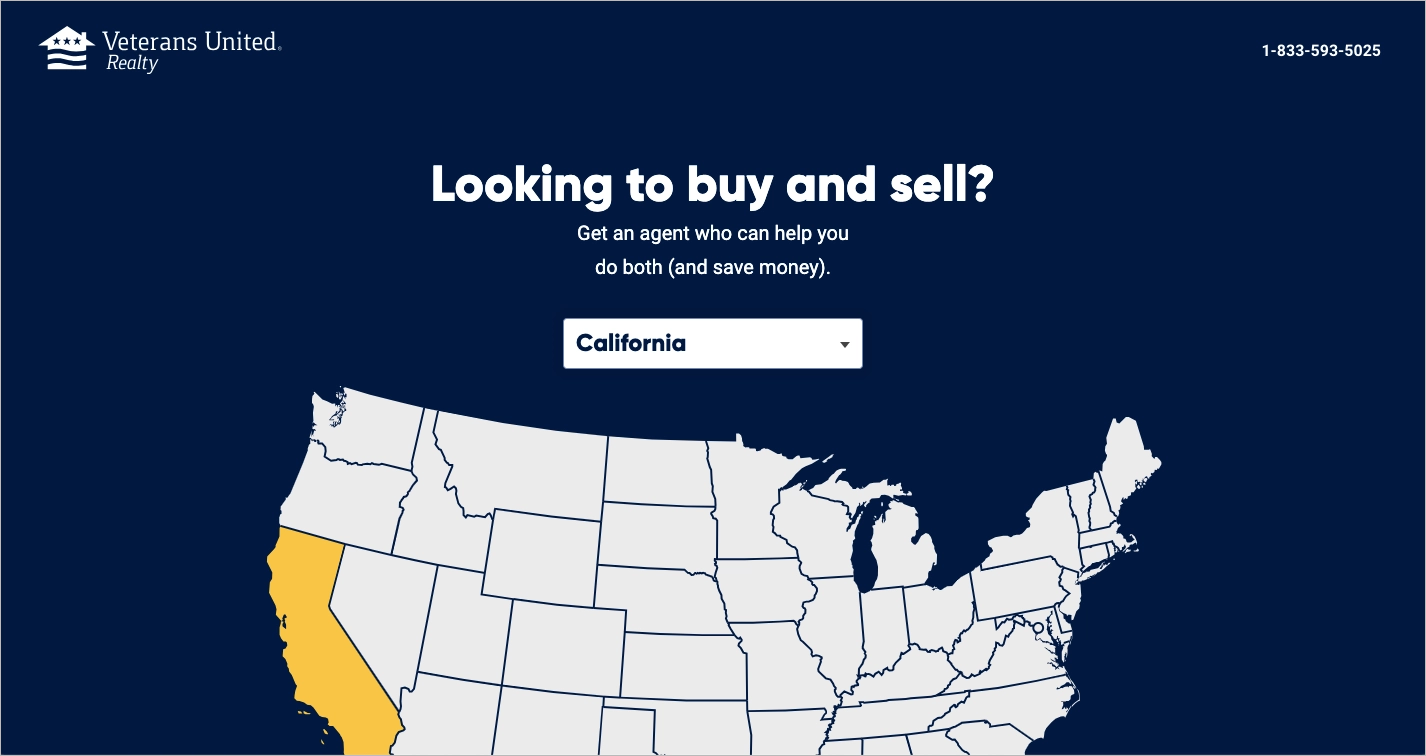
Another excellent feature is the interactive map, which allows users to engage visually with the selection process. By clicking on different locations, users can specify their area of interest, making the experience feel more dynamic and personalized. This not only improves usability but also keeps users engaged longer, increasing the chances of conversion.
Key takeaways to learn from this example:
- Multi-step form,
- Interactive map,
- No distractions,
- Social proof,
- Clear and compelling copy.
Improvement areas:
- More prominent trust signals, such as testimonials or agent credentials, to boost credibility.
12. Acorn Group
The real estate landing page for Acorn Estate Agents’ free property valuation is a well-structured lead generation page. The page features a clear and engaging headline: “Free Property Valuation”, immediately conveying its purpose. The form is the most prominent element on the page, encouraging visitors to provide details for a free valuation. However, the CTA itself is not as prominent, which could impact conversion rates. The form requires essential details like property address, valuation type, and contact information, but it may feel overwhelming due to the number of fields.
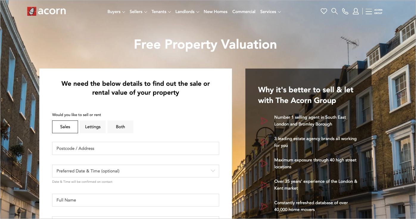
The page builds credibility with customer testimonials, social proof, and key selling points, such as “No Sale, No Fee”, over 35 years of experience, and a constantly refreshed database of home movers. Trust signals like the Acorn Group’s market expertise and professional valuation services further enhance confidence. Additionally, the inclusion of Google and Facebook Pixel tracking scripts suggests a well-integrated marketing approach.
Key takeaways to learn from this example:
- Strong lead generation form,
- Trust-building elements,
- The valuation process explained,
- FAQ section,
- SEO optimization,
- Mobile-friendly design.
Improvement areas:
- Reduce form fields. Simplifying the form by removing optional fields or condensing inputs could improve the user experience and decrease drop-offs.
Draw in your potential customers by directing them to a landing page that highlights your unique value proposition. Use the Real Estate Sale Page template to build excitement and share all the key details they need to know.
What is the Best Real Estate Landing Page Builder?
The best real estate landing page builder is Landingi, a multifunctional platform designed to simplify creating, testing, optimizing, and automating landing pages for various digital marketing campaigns. This powerful platform will help you uncover the real potential of dedicated web pages and leverage them to drive high conversions.
You can start creating the real estate landing page by choosing one from over 400 templates in Landingi’s gallery. Each template was designed to inform, engage, and maximize conversion. You can easily customize your chosen template in the intuitive editor, which provides AI landing page features for generating content, mastering visuals, and improving SEO. Landingi’s automatic translations support over 35 languages, making it the best tool for businesses that want to reach specific audiences of different nationalities.

Landingi platform provides an A/B testing tool that allows you to experiment with various page versions to find the best-performing one. You can also collect specific data, track user behavior, and analyze crucial KPIs, thanks to the built-in analytics tool EventTracker. With such a toolkit, you can effortlessly study your landing page efficiency and make adjustments based on real data to achieve the best results in your landing page campaigns.
The platform offers Form Builder, a tool for creating the most effective forms for your real estate landing pages. You can also leverage its Smart Sections feature, designed to streamline implementing bulk changes across multiple landing pages so that you can manage all your pages with just a few clicks. If you expect more and want experts to create a professional real estate landing page for you, check out Landingi’s page design services.
Moreover, with more than 170 integrations offered by Landingi, you can easily connect the platform with your existing toolkit to professionally manage your campaigns based on landing pages. This platform is exactly what you need. Thanks to its advanced features and user-friendly builder, Landingi is marketers’ top choice.
How Can I Optimize My Real Estate Landing Page for Higher Conversion Rates?
To optimize your real estate landing page for higher conversion rates, refine its design and optimize performance. Focus on creating persuasive content, improving CTA buttons, using social proof and trust signals, simplifying forms, making data-driven adjustments, and enhancing loading speed.
Check out the detailed guide to leverage the proven conversion optimization strategies in your real estate landing pages:
#1 Create persuasive and engaging content
Firstly, focus on creating persuasive and engaging content. Start with the hero section and create an attention-grabbing headline that clearly communicates your value proposition and entices visitors to discover the benefits of your offering. Incorporate professional photos, virtual tours, and videos of the property to captivate visitors and give them a realistic sense of the space. Then, highlight key features and benefits of the property or service in an engaging and concise manner. Use bullet points for easy readability and ensure your copy speaks directly to your target audience’s needs and desires.
#2 Refine CTAs
Secondly, refine your CTAs. Place prominent, action-oriented CTA buttons, such as “Schedule a Tour” or “Get More Info,” at strategic points on the page. Don’t limit your CTAs to a single location on the page – place prominent CTAs throughout the landing page, particularly at key decision points where users may be most receptive to taking action. This reinforces the desired action and ensures users have multiple opportunities to convert.
Ensure each CTA is clear and compelling, guiding visitors toward the desired action. Utilize clear and concise language for your CTAs, and remember it must be outstanding – use contrasting colors, clear fonts, and sufficient button size to ensure they are visually appealing and user-friendly. This enhances click-through rates and creates a more positive user experience.
#3 Leverage social proof and trust elements
Thirdly, leverage social proof and trust elements. Showcase genuine client testimonials and positive reviews on your landing page. These elements allow visitors to hear success stories from previous clients, fostering trust and demonstrating the value proposition of your services. Display any relevant trust badges or professional accreditations your agency holds. These visual cues signal competence and expertise.
Provide clear and readily accessible contact information on your landing page. This includes your phone number, email address, and physical address, if applicable. Link to social media profiles to add transparency and trustworthiness.
#4 Simplify lead capture forms
Fourthly, simplify lead capture forms. Your real estate landing page should include a lead capture form, so ensuring it’s well-optimized can significantly boost conversions. Keep your form concise and ask only for the information essential for initiating contact. The more information you request, the higher the likelihood of users abandoning the form altogether. A streamlined form with minimal required fields minimizes friction and encourages form completion.
Utilize clear and concise language throughout the form. Then, design the layout for optimal readability and user experience, ensuring easy navigation and completion on various devices. These elements contribute to a positive user experience and encourage successful form submissions.
See how easy form building can be. Explore powerful form builder options designed for higher conversions!
#5 Optimize for mobile devices
Fifthly, optimize your landing page for mobile devices. Ensure it’s fully responsive and provides an excellent user experience on all devices, including smartphones and tablets. Test the page across different devices to ensure it loads quickly and functions smoothly. The majority of web traffic now originates from mobile devices. Users encountering a poorly formatted or slow-loading landing page on their mobile phones are highly likely to bounce and explore competitor offerings.
Mobile responsiveness ensures a visually appealing and user-friendly experience for visitors accessing your landing page on various devices. This includes clear navigation, optimized image sizes, and appropriately sized buttons for easy click-throughs on touchscreens. Moreover, major search engines prioritize mobile-friendly websites in their search rankings. A responsive landing page enhances user experience and improves your website’s search visibility, organically attracting more potential clients to your offerings.
#6 Conduct A/B tests
Sixthly, conduct A/B tests. This ongoing process involves creating multiple variations of your landing page, each featuring a different element or combination of elements. These variations are then presented to website visitors in a controlled manner, allowing you to statistically analyze which version performs best at driving conversions.
A/B testing eliminates the guesswork from landing page optimization. By analyzing user behavior data, you gain objective insights into which elements resonate most effectively with your target audience. This data-driven approach ensures you prioritize changes that will have the most significant impact on conversion rates. Through A/B testing, you can pinpoint specific elements on your landing page that have the greatest potential to influence conversion rates. By focusing optimization efforts on these high-impact areas, you maximize the return on your investment in landing page improvement.
#7 Analyze and optimize performance
Seventhly, analyze and optimize performance. For this purpose, you can leverage EventTracker, a built-in Landingi tool that tracks events and user behavior, giving you clear data about key metrics without the necessity of using external, complex tools. You can also use Solis to turn performance data into AI-powered optimization insights and identify better ways to improve conversions.
Performance analysis uncovers potential friction points within the user journey. By identifying areas where users drop off or fail to engage with your call to action, you can address these roadblocks and create a smoother user experience that fosters conversions.
Use EventTracker to analyze engagement and maximize your real estate leads!
Based on your analysis, extract actionable insights to guide your optimization efforts. This might involve revising specific sections of your landing page copy, adjusting CTAs for increased visibility, or optimizing images for faster loading times. By implementing these adjustments, you refine your landing page based on user behavior, ultimately leading to a more effective conversion funnel.
What are the Key Elements of an Effective Real Estate Landing Page?
An effective real estate landing page is built on key elements, starting with compelling headlines, high-quality images, and engaging content. Trust-building testimonials, clear CTAs, lead-capture forms, and a responsive design ensure a seamless experience for all users. When well-designed and strategically optimized, these elements work together to attract buyers or sellers and convert them into leads.
A strong headline should be clear, attention-grabbing, and highlight the property’s unique selling proposition. High-quality images and videos create a strong visual impact, while detailed property descriptions or service explanations help potential buyers understand the value. Interactive elements like virtual tours and video walkthroughs enhance engagement.
Clear and well-placed CTAs guide visitors toward the next step, while simple, concise lead capture forms encourage inquiries. Testimonials and reviews build credibility, reassuring potential buyers or renters. Contact information should be easily accessible, ideally with clickable buttons and a map plugin. A responsive design with intuitive navigation and fast loading times ensures a smooth experience across all devices.
What are the Real Estate Landing Page Best Practices?
The 3 real estate landing page best practices involve prioritizing user experience, building trust and credibility, and providing immersive visuals.
#1 Prioritize user experience and clarity
The first best practice for creating high-converting real estate landing pages is to prioritize user experience and clarity. Pay attention to the hero section, which invites users to meet your offer. The attention-grabbing headline in the hero section must immediately convey your services’ value and entice visitors to learn more.
Focus on creating frictionless lead capture forms. Use simple and user-friendly forms to collect visitor information – ask only for essential details to encourage form completion. Ensure your landing page is fully responsive and provides an excellent user experience on all devices, including smartphones and tablets.
By adhering to these principles of user experience and clarity, you create real estate landing pages that are not only visually appealing but also functionally optimized. This approach fosters trust, simplifies the user journey, and ultimately drives conversions by guiding visitors toward the desired action, be it scheduling a consultation, requesting a property tour, or submitting a contact form. Remember, a user-centric landing page is an investment in your digital marketing strategy, paving the way for successful lead generation and client acquisition in the competitive real estate market.
#2 Build trust and credibility
The second best practice for winning real estate landing pages is to build trust and credibility. Showcase genuine client testimonials and positive reviews to foster trust and demonstrate your services’ value proposition. Provide transparency through contact information. Include clear and readily accessible contact information on your landing page, including your phone number, email address, and physical address, if applicable.
Link your social media profiles on the landing page. This allows users to explore your online presence, gain further insight into your company culture, and connect with you on additional platforms.
By strategically incorporating these elements, you cultivate a positive perception of your agency and foster trust with potential clients. People are more likely to do business with companies they believe in, and showcasing social proof and transparency demonstrates your commitment to excellence. This ultimately leads to increased conversions on your real estate landing page and positions your agency as a trusted resource within the competitive market.
#3 Use immersive visuals
The third best practice for effective real estate landing pages is to use immersive visuals. As landing page serves as a great real estate marketing tool, use high-quality images and videos to showcase the property in the best light. Virtual tours and 360-degree views can provide an immersive experience for potential buyers. If your services extend beyond property listings, showcasing your team is just as crucial. Include professional photographs of your real estate agents, highlighting their expertise and approachable nature. Ensure all pictures and videos are optimized for fast loading times to keep visitors engaged.
Remember, impactful visuals are a powerful tool for real estate marketing, allowing potential buyers to envision themselves in the space and ultimately converting interest into action.
Bringing all these best practices together – clear messaging, trust signals, immersive visuals, and strong CTAs – can take time. Lunar, Landingi’s AI landing page generator, helps streamline the landing page building process by creating complete, launch-ready real estate pages built around the elements that drive engagement and lead generation.
What is the Average Real Estate Landing Page Conversion Rate?
The average real estate landing page conversion rate is 7.4%, while the median is 2.6%, according to Unbounce in Conversion Benchmark Report. This positions the real estate industry as the second-lowest performer in landing page conversions across all sectors. As the competition is high, leveraging analytics is key to a successful digital marketing strategy based on landing pages.
The best you can do to achieve conversion rates higher than your competitors is to leverage A/B testing and gather user behavior data with professional tools like EventTracker from Landingi. Data analysis lets you make informed decisions regarding landing page design, content strategy, and user experience. This ensures your efforts are focused on the adjustments most likely to drive conversions.
The key to unlocking the full potential of your landing page lies in harnessing the power of analytics and continuously optimizing based on user behavior. In doing so, you can outpace industry benchmarks and achieve significant growth in your digital marketing efforts for the real estate sector.
Build Landing Pages for Your Real Estate Business with Landingi
Even though statistics show a relatively low average landing page conversion rate for the real estate industry, a well-crafted page is a powerful tool that can significantly enhance your online presence. Once you remember that ongoing optimization is key to success, you’ll quickly discover how to win over competition and drive conversions.
This article has equipped you with a comprehensive understanding of real estate landing pages, their purpose, and the key elements that contribute to their effectiveness. With the provided insights and real-world examples, you can create high-performing landing pages that capture attention, foster trust, and convert website visitors into qualified leads. Don’t hesitate to leverage A/B testing and data analytics to optimize your landing page continuously, ensuring it remains a dynamic and impactful tool within your digital marketing strategy.
Try Landingi now for free and discover the full potential of well-optimized real estate landing pages in your digital marketing strategies!