
Higher educational institutions generate interest in multiple ways. Having a strong online presence is important, as it allows potential students to get to know more about the school itself, the degrees, and the facilities.
Whether your visitors end up on a page from search results or from paid ads, it’s helpful to direct them to a landing page instead of regular websites.
Using landing pages works better when a goal is clearly defined, and most colleges know exactly what they want: to get as many enrollments as possible in order to pick and choose the best candidates. Let’s explore college landing pages, including best practices and nine examples you can use for inspiration.
If you’d, however, like to uncover what an educational landing page (in a broad sense) may look like, you’ll find some inspirations here.

Best Practices for College Landing Pages
Just like any other business, you want the visitors of your higher education landing pages to be engaged and take the next step, which usually involves filling out a contact form to request further information.
The effectiveness of your education landing page may vary significantly depending on whether you follow best practices. Let’s take a look at what you can do to make your college landing page stand out from the competition.
Create a Landing Page for Each Major
Future students usually know what major they are interested in, so when they get to the main page of a university, they have to click a few links before they can find out more about their desired degree.
Shortening this journey and giving applicants all the information from the get-go gives you a head start. It’s easier to click once or twice to fill out the form than through a litany of pages and then be asked to submit your contact information.
Not to mention the fact that the landing page for each major can be measured separately in terms of its effectiveness. You can optimize the underperforming ones and let the most popular or highest-converting majors keep shining.
Use Visuals That Showcase the Campus
In most cases, your future students will spend a lot of time in various university facilities. Whether it’s lecture halls, gyms, libraries, or dorm rooms – all of those places represent your institution.
A university landing page serves as a great opportunity to present those places. Focus on the most important ones and add high-resolution images so visitors can see the locations in detail.
Promote the Benefits of a Degree From Your College
Colleges compete with other universities that offer a similar degree, which means you need to stand out. What is it that makes your degree more desirable than a similar one from a different university?
It’s a section that should find its way to your college landing page. Pick a few reasons why future students should choose your school and this particular degree.
Include Testimonials of Alumni
The point of getting a degree is to set the graduates on a path towards a better future, a well-paid job, and a stable career. When former students make use of their diplomas, present that on your higher ed landing page.
Add a section with testimonials of your alumni where they talk about what getting a degree at your university meant for them and what they do now. Such real-life stories will make a great impact on those who are considering different options, and that section might sway potential candidates your way. This is what we actually call social proof.
Include a picture of the person giving the testimonial, their full name, and their job title. That way, the opinions have a more personal touch. Plus, it’s more reassuring to see someone graduated and landed a good job.
Examples of College Landing Pages
Now that you know the best practices, it’s time to take a look at some examples of college landing pages and see whether they follow these tips. You will see where each one excels and what areas could be improved to engage future students better.
1. Grand Canyon University
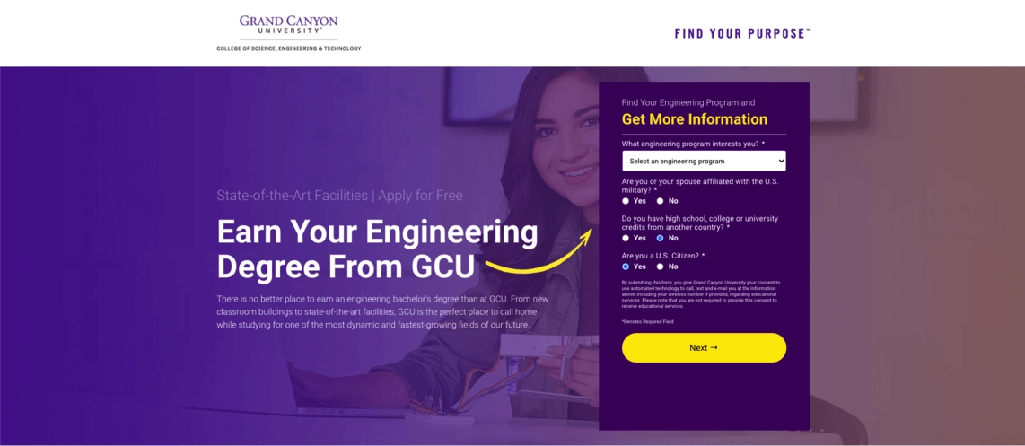
What Works
A lack of distracting links that take the visitors outside of the page is a great decision. The use of multiple CTA buttons leading to the form improves the user experience. The descriptions of degrees as well as the campus are short and to the point.
Adding a testimonial of a current student instead of an alumni serves as a suitable substitute and is in line with the best practices. Dividing the form into a few parts makes it seem shorter and easier to complete than it really is.
How to Improve It
This college landing page could do with a short gallery of the campus. That way, potential students could see their future facilities instead of just reading about them.
2. UCLA Extension
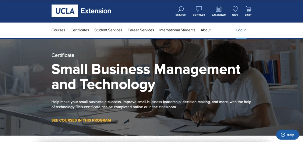
What Works
The page is comprehensive. It features lots of sections with important information such as the costs, what the students can learn, who the program is for as well as some enticing statistics.
Adding a video testimonial gives the visitors a perspective of multiple students and it’s easier to consume than reading all of them. The video helps with reducing space, too.
How to Improve It
There are way too many links taking the visitors outside of the landing page. Furthermore, the page lacks a clear vision of what it wants to achieve. A form is there, as are the CTA buttons, but they all lead to different places.
3. Trinity Law School
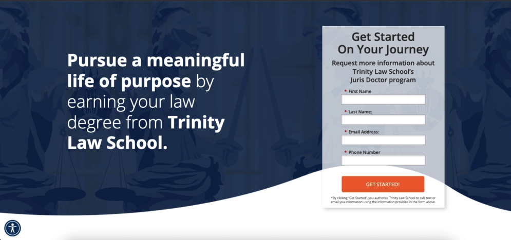
What Works
Trinity’s college landing page summarizes the degree in a few paragraphs. In fact, the entire page is short, so there is little scrolling involved, even on smaller screens.
The testimonial adds a personal feeling to the page, and the form is short with only the necessary fields to fill out. The “Get Started” call to action is dynamic and enticing.
How to Improve It
The page needs more visuals since there is only one image of the campus, a hero image, and nothing else. The space for the description is basically a wall of text that could use images to break it apart.
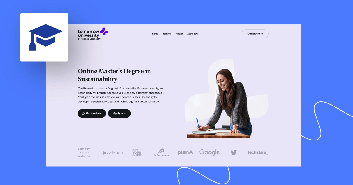
4. Tomorrow University

What Works
Aesthetically, this page is pleasing. Using various background colors clearly divides the landing page into separate sections. Adding logos and icons is a nice touch, too.
Most parts use short copy to convey the main messages, which makes reading rather easy and quick. Showcasing the experience of mentors can be a convincing tactic for someone eager to learn. The inclusion of a video with a mission statement and student testimonials works well here.
How to Improve It
The form is too long. Dividing it into parts like Grand Canyon University did would provide a smoother experience.
The main goal gets a little confusing since there seem to be two main CTAs here: getting a brochure and filling out the application form.
5. Berlin University of Applied Sciences
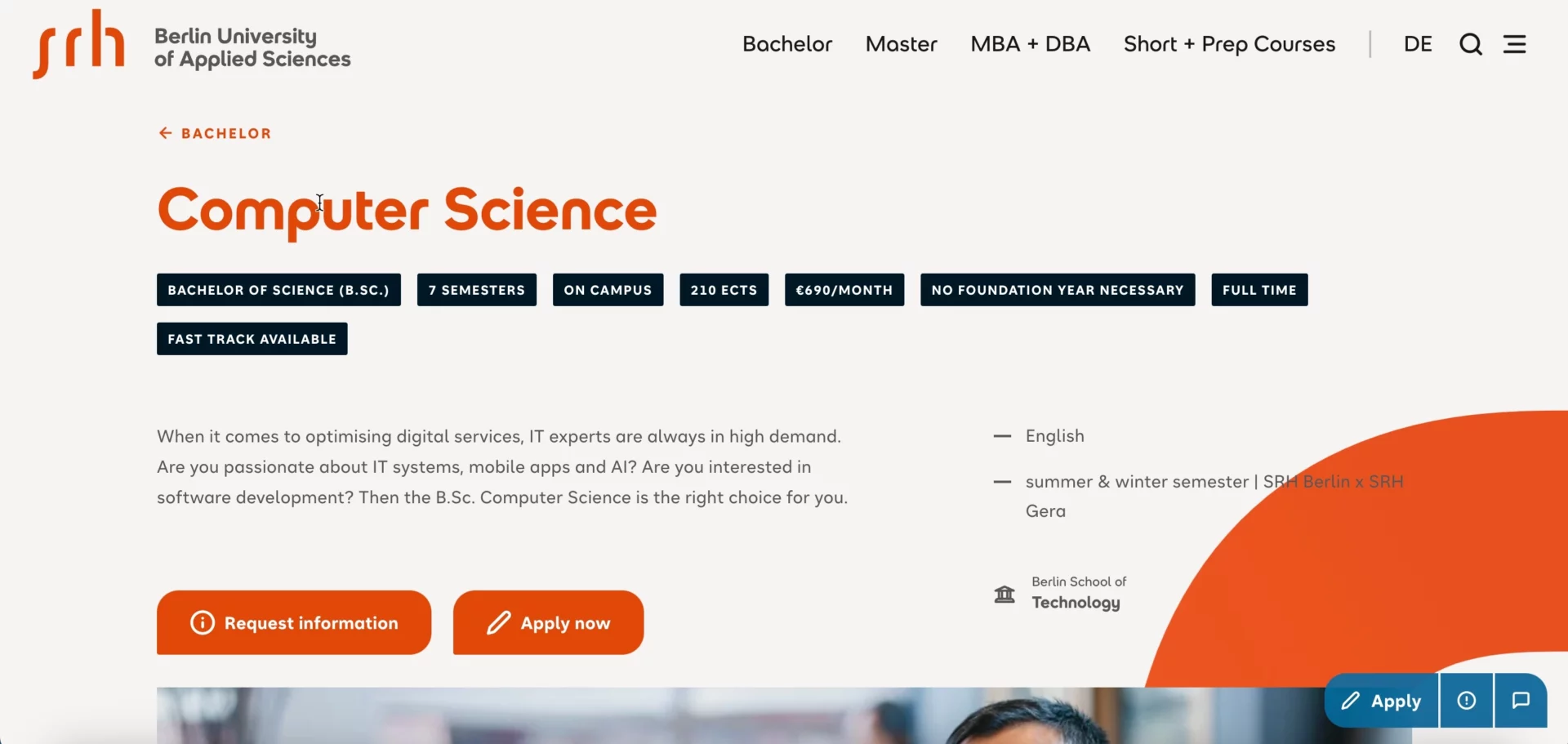
What Works
This site structure is in line with a vast pool of others next step is clear as day: complete the form to request a brochure. The CTA is repeated multiple times and there are no other links to speak of.
The sections are scarce, but there is enough information to get the gist of the university and the degree. The testimonial shows aspects of the college the rest of the copy doesn’t, so it complements the page nicely.
How to Improve It
The headline is not very intriguing. It’s purely informational, and may not be memorable enough for some students who are in their research phase.
What’s more, the multiplicated CTAs are hardly ever good ideas, as they split attention. Here, the “Request information” button seems redundant – its place is in a footer (contact section) and students in need surely find it. Furthermore, removing it may quickly increase conversions through “Apply now”.
6. Vienna University of Economics and Business

What Works
Kudos for the description of the degree. It lets visitors know what they are going to get out of it, not just what it is. The part of the page showing 5 reasons to study this major is executed well.
Presenting the entire structure of the program in detail might seem a bit much, but it’s shown succinctly – a great choice. It’s clear and detailed, giving visitors all the information about the subjects taught during the course. The addition of relevant stats is easily digestible for the viewers.
How to Improve It
The “Experiencing Campus WU” part takes the visitors to a different page. Instead, it would be better to create an abridged version with a gallery and include it on the landing page.
The two main CTA buttons are one too many. What’s more confusing is the one that catches the eye is the one that takes the visitors elsewhere. The less noticeable one scrolls down to the contact form. Leaving the latter as the main focus of the page would likely work much better.
7. Bellevue University
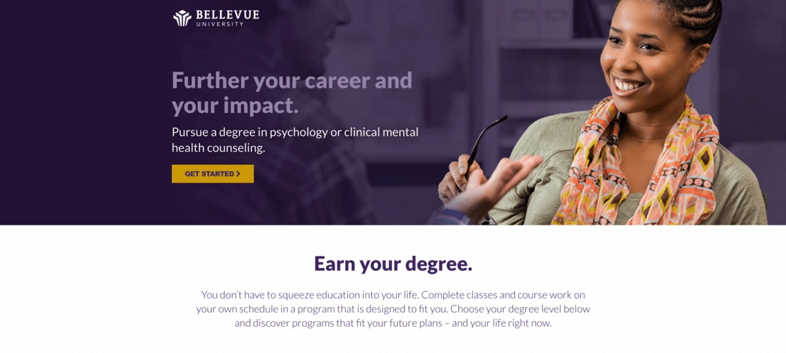
What Works
This college landing page manages to speak to four different target groups at once. The “See yourself at Bellevue University” section has four tabs, one for each persona. Clicking one hides the others, and they have been personalized.
Picking a type of degree and showing the list of available options works the same way. It’s a great use of animations from the UX standpoint. Having an FAQ box is a sound choice, as is the fact the full-screen contact form slides over after clicking the CTA button.
How to Improve It
What would improve the informational quality of this page is the inclusion of another section that describes the degree in more detail. There is space for that on this landing page.
8. Oregon State University
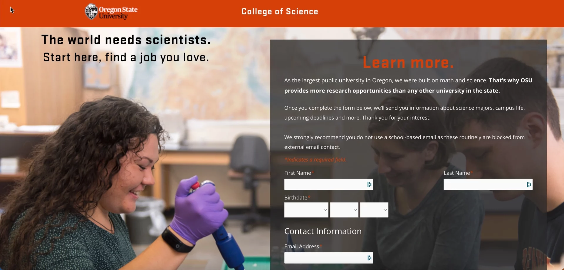
What Works
This college landing page is used to generate interest in the institution itself, so there are only a few pieces of concrete information. It does work well as a starting point that gets visitors’ attention.
The benefits look interesting, as does the copy that focuses on science and research. The statistics further reinforce a positive impression.
How to Improve It
The form is too large, both in terms of the font size as well as the number of fields and checkboxes required to complete it. I hope the university removes the WordPress logo from the tab in a web browser and replaces it with its own.
9. International University of Monaco
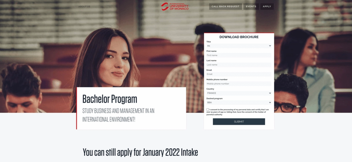
What Works
Thanks to a video, you can find out why other students have chosen the International University of Monaco. The recordings have an organic and genuine vibe to them.
The admission process is explained in three simple boxes and it takes no time to get the full picture. The implementation of tabs in the Program Structure saves space and separates the information about each school year.
How to Improve It
Even though it is a landing page rather than a regular website, there are still some aspects that could be removed to optimize the on-page experience. For instance, there is a box with events, where each meeting is clickable and redirects to a separate page.
While there is a lead capture form in the hero section, visitors can also see other CTA buttons that have nothing to do with it. Each sends the interested people somewhere else. Speaking of the form, it’s a bit long, with fields like title or phone number that don’t serve any particular purpose.
Build College or University Landing Page With Landingi
Your institution can also benefit from creating higher education landing pages, especially now that you are armed with enough knowledge to do it right. But before you start, make sure you’re using the best landing page builder.
If you’re looking for an easy-to-use platform that has lots of useful features, Landingi is your best bet. Thanks to a drag-and-drop editor, you can create an engaging and effective landing page even if you have no coding or design skills at all.
Adding, sections, copy, images, and any other part of your college landing pages is going to be a breeze. You can use one of 300+ landing page templates and duplicate your creations to save time on building multiple examples for various college degrees. Compare results, manage leads, and run A/B tests in the dashboard to get more control over your marketing efforts.
Now, choosing the Free plan you can create and run your first landing page at zero cost!